Why Switch to the New Look? Key Benefits at a Glance
Introduction
The New Look UI is more than a visual upgrade — it’s a strategic step forward for usability, performance, and innovation across the Matrix42 platform. With powerful new features, better customization options, and exclusive capabilities that aren’t available in the Classic UI, the New Look is designed to future-proof your workspace.
This page gives you a quick overview of the key benefits and feature availability of the New Look compared to the Classic interface, helping you make an informed decision about the switch.
If you are still using Classic UI — fully or in part — we encourage you to review the comparison and let us know what’s holding you back.
👉 Take the short survey to share your feedback.
✅ - improved or introduced. ✔️ - was already available ❌ - was not available
| Capabilities overview | New Look | Classic Look | Availability | Subscription |
|---|---|---|---|---|
| Intuitive, streamlined user experience | ✅ | ❌ | 12.1.1 | no additional license required |
| AI Search in Self Service Portal | ✅ | ❌ | 12.0.5 | Matrix42 Intelligence and (ITSM 2023 Advanced/Enterprise or ITSM 2025 Enterprise) Action Credit not in use |
| AI Assist for Service Desk | ✅ | ❌ | 12.1.0 |
Matrix42 Intelligence and |
| Configurable & Modern Dashboards | ✅ | ❌ | 12.1.0 | DWP License or all subscriptions 2020+ |
| Configurable & Modern Reports | ✅ | ❌ | 12.1.1 | DWP License or all subscriptions 2020+ |
| Reporting Toolkit: Scheduled Report Subscriptions | ✅ | ❌ | 12.1.3 | ITSM 2023 Advanced/Enterprise or ITSM 2025 Enterprise is required; |
| Multilingual Ticket Communication (between Agent and End Users) | ✅ | ❌ | 12.1.3 | ITSM 2023 Advanced/Enterprise or ITSM 2025 Enterprise is required; In case of Matrix42 Intelligence as Translation Provider - Matrix42 Intelligence Subscription required (Action Credit Model in use); Alternatively Open AI can be used as translation provider (customer API key required) |
| AI Automatic Content Localization | ✅ | ❌ | 12.1.3 | ITSM 2023 Advanced/Enterprise or ITSM 2025 Enterprise is required; In case of Matrix42 Intelligence as Translation Provider - Matrix42 Intelligence Subscription required (Action Credit Model in use); Alternatively Open AI can be used as translation provider (customer API key required) |
| AI-Powered Text Enhancement for Agents | ✅ | ❌ | 12.1.3 | ITSM 2023 Advanced/Enterprise or ITSM 2025 Enterprise is required; In case of Matrix42 Intelligence as Translation Provider - Matrix42 Intelligence Subscription required (Action Credit Model in use); Alternatively Open AI can be used as translation provider (customer API key required) |
| AI Knowledge Discovery for Agents | ✅ | ❌ | 12.1.3 | Matrix42 Intelligence and (ITSM 2023 Advanced/Enterprise or ITSM 2025 Enterprise) Action Credit model in use |
| Configurable AI | ✅ | ❌ | 12.1.3 | ITSM 2023 Advanced/Enterprise or ITSM 2025 Enterprise |
| AI Knowledge Discovery for End Users for OnPrem | ✅ | ❌ | 25.4 | TBD soon |
| End User to Agent chat | ✅ | ❌ | 25.4 | TBD soon |
| Matrix42 Enterprise in Microsoft Teams Application | ✅ | ❌ | 25.4 | ITSM 2023 Advanced/Enterprise or ITSM 2025 Enterprise |
| Decision maker gets notification about required approval in MS Teams | ✅ | ❌ | 25.4 | ITSM 2023 Advanced/Enterprise or ITSM 2025 Enterprise |
| User mentioning produce notifications in MS Teams | ✅ | ❌ | 25.4 | ITSM 2023 Advanced/Enterprise or ITSM 2025 Enterprise |
| Smart Service Provisioning | ✅ | ❌ | 12.1.2 | no additional license required |
| Sign In Insights | ✅ | ❌ | 12.1.2 | DWP License or all subscriptions 2020+ |
| BITV-Test certified | ✅ | ❌ | 12.1.3 | no additional license required |
| AI Native Workflow Designer for Business Users | ✅ | ❌ | 25.4 |
ITSM 2023 Advanced/Enterprise or ITSM 2025 Enterprise Some actions may require addition subscriptions e.g. AI Actions and Triggers will need Matrix42 Intelligence subscription |
| Service Availability Center | ✅ | ❌ | 25.4 | ITSM 2023 Advanced/Enterprise or ITSM 2025 Enterprise |
| Major Incidents processing | ✅ | ❌ | 25.4 | ITSM 2023 Advanced/Enterprise or ITSM 2025 Enterprise |
| Major Incident Prediction | ✅ | ❌ | 25.4 | Matrix42 Intelligence and (ITSM 2023 Advanced/Enterprise or ITSM 2025 Enterprise) Action Credit model in use |
| Multi-Recipient Requests | ✅ | ❌ | 12.1.2 | no additional license required |
| New Search Experience | ✅ | ❌ | 12.0.5 | DWP License or all subscriptions 2020+ |
| Global Search: Fast ID-Based Lookup for Objects | ✅ | ❌ | 12.1.3 | no additional license required |
| Configurable Login Page | ✅ | ❌ | 12.1 | no additional license required |
| Multiple Themes for Users e.g. Light or Dark | ✅ | ❌ | 12.0.5 | no additional license required |
| Department-specific UI Themes | ✅ | ❌ | 12.1.2 | no additional license required |
| Department-specific Login Page | ✅ | ❌ | 12.1.3 | ITSM 2023 Advanced/Enterprise or ITSM 2025 Enterprise |
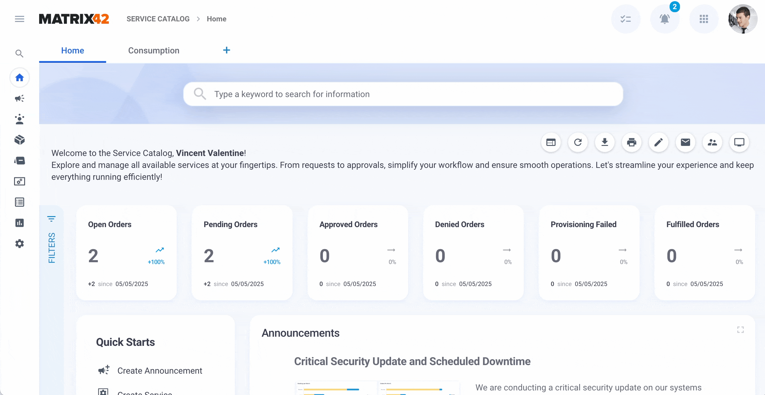
| New Self Service Portal Landing Page | ✅ | ❌ | 12.0.5 | DWP License or all subscriptions 2020+ |
| Mobile-friendly and responsive design | ✅ | ✔️ | 12.1.1 | no additional license required |
| Personalizable & modernized Navigation | ✅ | ❌ | 12.0.5 | no additional license required |
| User Mentioning from the Journal | ✅ | ❌ | 12.1.1 | ITSM 2023 Advanced/Enterprise or ITSM 2025 Enterprise |
| Quick Reply to Journal Comment | ✅ | ❌ | 12.1.1 | no additional license required |
| Product & Feature tours | ✅ | ❌ | 25.4 | no additional license required |
| Navigation Badges for Quick Notifications | ✅ | ❌ | 12.1.0 | ITSM 2023 Advanced/Enterprise or ITSM 2025 Enterprise |
| Sound Notification for New Information Received | ✅ | ❌ | 12.1.2 | no additional license required |
| Recents | ✅ | ✔️ | 12.0.4 | no additional license required |
| Favorites | ✅ | ✔️ | 12.0.4 | no additional license required |
| Dialog Opening Behaviour (Dialog Tabs, Multi-state Save button) | ✅ | ✔️ | 12.0.5 | no additional license required |
| Action Groups to combine actions of the same kind | ✅ | ❌ | 12.0.5 | no additional license required |
| Multi-context Action Panel | ✅ | ✔️ | 12.0.5 | no additional license required |
| Frequently used actions bar | ✅ | ❌ | 12.0.5 | no additional license required |
| Preview opening as Full Screen | ✅ | ✔️ | 12.1.0 | no additional license required |
| Keyboard Shortcuts | ✅ | ❌ | 12.0.5 | no additional license required |
| Personalizable Column Search on Grids | ✅ | ❌ | 12.0.5 | no additional license required |
| Filter Panel simplified | ✅ | ✔️ | 12.1.0 | no additional license required |
| Simplified view of Structure Filters | ✅ | ❌ | 12.0.5 | no additional license required |
| Personalizable & Resizable Filter and Action/Details panels | ✅ | ❌ | 12.1.0 | no additional license required |
| Notification Panel (Clean up, In-App Notifications) | ✅ | ❌ | 12.1.0 | no additional license required |
| One Login Button for all Entra ID tenants | ✅ | ❌ | 12.1.2 | no additional license required |
| Seamless integration with the Archive Database from Grids | ✅ | ❌ | 12.1.2 | no additional license required |
Capability details
Intuitive, streamlined user experience
The New Look brings a modern, intuitive experience designed for speed, clarity, and ease of use, making everyday tasks smoother and faster. The updated design brings a clean, unified layout that improves clarity, reduces cognitive load, and makes navigating search results easier.
|
New Look ✅ Clean, modern design that aligns with familiar patterns from widely used apps — easier to learn and adopt. ✅ Focus on what matters: only essential data is shown, reducing clutter and cognitive load. ✅ Faster interactions thanks to streamlined workflows and improved responsiveness. |
Classic Look ☑️ Outdated layout with mixed visual patterns, making it harder to learn or scale across teams. ☑️ Information overload: too much content shown at once without clear prioritization. ☑️ More manual UI adjustments were needed before presenting it to end users or prospects. |
|
See also New Look Overview |
|

Matrix 42 AI Intelligence
Leveraging the power of Matrix42 Intelligence, the New Search Experience goes beyond traditional keyword matching. It employs semantic understanding to interpret the context and intent behind user queries, delivering more accurate and relevant results. Key AI-driven features include:
-
Semantic Search: Understands natural language queries, allowing users to search using everyday language without worrying about exact keywords or spelling errors.
-
Contextual Recommendations: Provides intelligent suggestions based on user behavior and historical data, enhancing the relevance of search results.
-
Actionable Insights: Enables users to take immediate actions, such as requesting services or creating tickets, directly from the search results.
These AI capabilities ensure that users receive the most pertinent information swiftly, enhancing overall efficiency and user satisfaction.
See also AI Search in Self Service Portal and AI Assist for Service Desk for details.
Matrix42 Configurable AI
Matrix42 Configurable AI is a flexible, customizable AI solution built on the Matrix42 Enterprise Service Management Platform. It allows you to build and deploy tailored AI use cases using GenAI, with seamless integration of OpenAI compatible services and models. Choose between proprietary, open-source, or custom LLMs/SLMs per use case, and integrate actions like classification, text generation, summaries, or rewriting based on enterprise data.
See also, Configurable AI for Matrix42 Enterprise.
AI Knowledge Discovery for End Users
The Knowledge Discovery add-on enriches the Self Service Portal with AI-powered conversational search and live chat capabilities. End users can obtain contextual answers from multiple sources and seamlessly escalate to a support agent, all within a single interface. This improves self-resolution rates, reduces the Service Desk load, and ensures continuous support availability. Now available for On-Premise.

Knowledge Discovery for End User: end user conversation with Helpdesk Assistant chatbot and switching to a conversation with a live Agent
See also, Knowledge Discovery for End Users.
Matrix42 Enterprise in Microsoft Teams Application
The M42 Enterprise Teams application embeds the full Matrix42 Enterprise Service Management Platform (ESMP) experience directly into Microsoft Teams. After a one‑time “Configure Teams Integration” wizard and tenant‑wide consent, users simply add the app from Teams and are up and running.
The seamless integration of the Matrix42 Enterprise in the Microsoft Teams Application enables employees to access self-service features like incident logging, service ordering, and knowledge base search without leaving the chat environment:

See also, Microsoft Teams Integration.
Smart Service Provisioning
Starting with ESM v.12.1.2, you no longer need to wait for every item in the order to be fully approved before starting provisioning. Instead, the provisioning begins immediately for any approved bookings that have no dependencies on other bookings. This improvement speeds up service delivery by allowing parts of the order to move forward independently, avoiding unnecessary delays that previously occurred when provisioning could only begin after the entire order had received approval.
The Start Provisioning process before all Approved option in the Service Catalog settings controls when the provisioning of services begins.
See also, Service Catalog settings.
Multi-Recipient Service Requests
Managing multiple service requests for a team or group can be cumbersome when each request needs to be handled individually. Starting from v.12.1.1 with the introduction of the multi-recipient order feature in the Self-Service Portal, it is possible to order the same services for a group of users by submitting only one request.
Example Use Case: A manager purchasing the same device for all subordinates can now complete the process in a single order instead of creating multiple requests:

Adjust the Service Catalog to allow the role manager, organizational unit manager, location principal, cost center decision-maker, or their delegates to order services for the members of the managed role, or specify a filter expression to restrict the list of recipients who can be selected when making a service request. Additionally, define the criteria that allow making service requests only when the recipients have a common attribute, for instance, are from the same location, department, cost center, etc.
For more details, see Ordering services for a group of users and Service Catalog Settings: Recipients Filtering Options.
New Search Experience
The New Search Experience is not only smart and fast, it’s also flexible and adaptable to your needs. With a possibility to adjust search configuration, the administrator gets control over how search behaves in different areas of the platform.
In the Service Desk and Self Service Portal, administrators can enable Full-Text Search to deliver faster and more accurate results across Incidents, Requests, Tasks, Changes, and Knowledge Base Articles. If needed, this can be switched off to follow advanced configurations defined in the Administration application.
In Administration, search settings can be fine-tuned to:
-
Choose between lightweight Display String search (default) or deep keyword search across configured data columns.
-
Show or hide the “All” context for better performance and relevance.
-
Limit or expand Recent Searches, Column Search visibility, and ticket creation options directly from search.
-
Adjust how hidden values and text filters behave, including setting the max number of searchable words per filter.
See also, Global System Settings:Search
With a set of powerful yet easy-to-manage options, the New Search Experience delivers the right balance of performance, precision, and customization adaptable to every organization’s workflow.
|
New Look ✅ Searched areas preselected for better performance and search results relevance. Additionally, the search can be extended to search in all areas ✅ Recently viewed items accessed directly from the search panel ✅ Search history for quick access to your frequently used search queries |
Classic Look ✖️ By default, the search is performed in all areas and might impact system performance and decrease the search results relevance ✖️ Recently viewed items accessed only through the Recents menu ✖️ No search history suggested |
|
|
|


Search History
All your previous searches are automatically saved and easily accessible via the Search History feature. This makes it simple to revisit past queries or reuse them in similar scenarios. It’s especially useful for users who frequently work with similar topics, services, or support cases to improve their productivity.

Search with no results found
The New Look offers a smarter, more helpful search experience: it is faster, clearer, and more action-oriented, making it easier for users to find what they need or get help when they don’t.
|
New Look ✅ Searched areas are instantly highlighted ✅ Search is not limited only to the title of the search context ✅ Prompt to create a ticket if the search results do not match expectations |
Classic Look ✖️ No search context explicitly displayed ✖️ Searching for relevant results in the title of the search context items ✖️ No further action suggested |
|
|
|


Global Search: Fast ID-Based Lookup for Objects
ID-first logic streamlines how you find objects like tickets, bookings, or knowledge articles using reference numbers.
When searching for a keyword that matches known object ID patterns (e.g. INC123456, PRB00001), the system now:
-
Recognizes the object type based on the prefix (e.g.
INCfor Incidents,PRBfor Problems) -
Performs a direct lookup in the correct table for immediate results
-
Returns the exact match instantly when available
-
Offers a “Show More” button to expand the search across all objects if needed
This enhancement improves accuracy and speed when searching by object numbers, a common habit for both end users and support teams.

Fast ID-based search results example
Configurable Login Page
The Configurable Login Page allows administrators to customize the look and feel of the login screen through a simple configuration interface. It supports personalized welcome messages, brand-specific colors, logos, background images, and panel layouts. This enhances brand consistency, improves user experience, and offers flexibility for different use cases.
|
New Look ✅ Text & Titles: Localizable welcome title and text, with customizable text and title colors. ✅ Buttons & Branding: Adjustable button color and text color; custom logo support. ✅ Configurable background image for the entire page. ✅ Configurable left and the possibility to add a right panel and define foreground color/image |
Classic Look ☑️ Login page styling was fixed to the selected theme. ☑️ Only the logo from the theme appeared ✖️ No configurable background/foreground ✖️ No splitting into different configurable panels
|
|
|
|


See also, Login Page Configuration.
One login button for all Microsoft Entra ID tenants
The login page offers flexible configuration options for displaying Microsoft Entra ID tenant login buttons. Administrators can choose how login options appear depending on the number of Microsoft Entra ID tenants integrated in the system, or even disable all other login options and allow Microsoft Entra ID login only.
By default, the system is configured to show one login button for all Microsoft Entra ID tenant. Administrators can define the button title shown on the login page. Upon clicking the button, other login options are blurred, and the user is prompted to enter their user name or email, which redirects them to the Microsoft authentication page.

Login page: one button for all Microsoft Entra ID tenants example
If multiple tenants are configured and this option is disabled, each tenant will have its own dedicated login button on the login page.
See also, Global System Settings: Auth.
Department-specific login page
Starting with v.12.1.3, it’s possible to tailor the login experience per organization. This means that each customer or department (Organizational Unit) can have a dedicated login page theme, including colors, texts, and background images, significantly improving branding and user experience.
The login page is configured in Themes and assigned to the department in the Master Data application → Organizational Structure → Organizational Units edit page → General → Login Theme field, as shown in the following example:

See also, Login Page Configuration: Configuring Login Theme for the Organizational Units.
Multiple Themes for Users
In the New Look, it is possible to choose from multiple standard themes, including light or dark themes. Personalize the interface to match your preferences: choose the dark theme to improve comfort and reduce eye strain, especially in low-light environments. Dark theme is often preferred by users who work long hours or have light sensitivity.
The flexibility in switching themes also supports inclusivity, as it accommodates different visual needs and work styles. Ultimately, this choice helps create a more user-friendly, modern, and engaging experience:

Themes in the User Profile
See also Themes.
Department-specific UI Themes
A department-specific user interface theme allows different departments within an organization to have customized visual styles for their Service Desk or Self Service portal. This includes tailored colors and logos that reflect the identity or needs of each department. With that, the interface becomes more relevant and familiar to each team, helps reduce confusion by clearly distinguishing departmental portals, supports brand consistency within business units, and improves user adoption by aligning the look and feel with each department’s culture or workflows. Overall, it supports a more personalized and efficient service experience.
Define who can select the Theme with the Set Audience action in the Theme settings of the Administration application:

See also, Themes: Managing Theme Audience.
Department-specific login page
Starting with v.12.1.3, it’s possible to tailor the login experience per organization. This means that each customer or department (Organizational Unit) can have a dedicated login page theme, including colors, texts, and background images, significantly improving branding and user experience.
The login page is configured in Themes and assigned to the department in the Master Data application → Organizational Structure → Organizational Units edit page → General → Login Theme field, as shown in the following example:
See also, Login Page Configuration.
User Mentioning from the Journal
Starting with v.12.0.5, it became much easier to quickly bring the right people into the conversation. The user mentioning in the journal improves collaboration, speeds up issue resolution, and ensures that relevant team members are notified directly, without needing to switch tools, copy and paste, or send separate messages.
While working in the Service Desk on Tickets, Incidents, Service Requests, Change Requests, or Problems, simply start typing with @ in the comments section of the journal and select the user from the list:

Service Desk: User Mentioning in the Journal
After adding a journal entry, the mentioned user will be notified about the new message in the notifications monitor.
See also, Journal: User mentioning.
Quick Reply to Journal Comment
Starting with v. 12.1.1, the Service Desk agents can respond directly to any journal entry by clicking Quote & Send. This automatically includes the original journal entry in the edited e-mail, making it easy to provide clear, contextual replies without needing to copy and paste. It saves time, reduces misunderstandings, and keeps communication threads easy to follow.

Service Desk: Quote & Send in the Journal
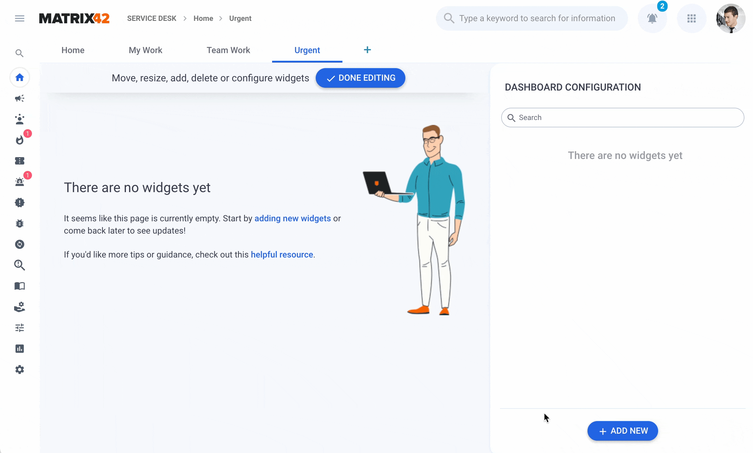
Configurable Dashboards and Reports
The newly introduced Interactive Dashboards and Reports functionality transforms how users interact with data, removing technical barriers and making powerful analytics accessible to all. Whether you're a business user, team lead, or department head, you can now create, extend, and share fully functional dashboards and insightful reports effortlessly, without any coding knowledge.
Simplicity, Power, and Zero Coding
Building a dashboard has never been easier: with a single click, users can start a new dashboard or report and populate it using a clean, intuitive interface. Just filter the relevant data and add it to your dashboard with no scripting and no back-end configuration required.
Creating a new dashboard
The process is designed to be entirely mouse-driven, with configuration done through drop-downs, toggles, and simple property adjustments, which are ideal for non-technical users who want full control over how their data is presented. Choose the best way to visualize your data and reorder it on the canvas with drag and drop.
To see how it works, visit Managing Dashboards and Reports in New Look page.
Empowering Non-Technical Users
This functionality was not present before and is available in the New Look only. Previously, dashboard creation required technical expertise or backend customization. Now, any user can:
-
Design personal dashboards tailored to their needs
-
Build reports dynamically based on the filtered data
-
Track trends using live data
-
Share insights easily with individuals, teams, or entire departments
This new flexibility empowers teams to make data-driven decisions faster and more independently than ever before. The provided autonomy also significantly reduces reliance on IT or admin teams and simplifies the configuration.
Start with Defaults
A wide selection of standard, prebuilt dashboards and reports is provided out of the box. These dashboards and reports cover key business areas and can be used as a starting point:
-
User Sign-In Insights for Administrators
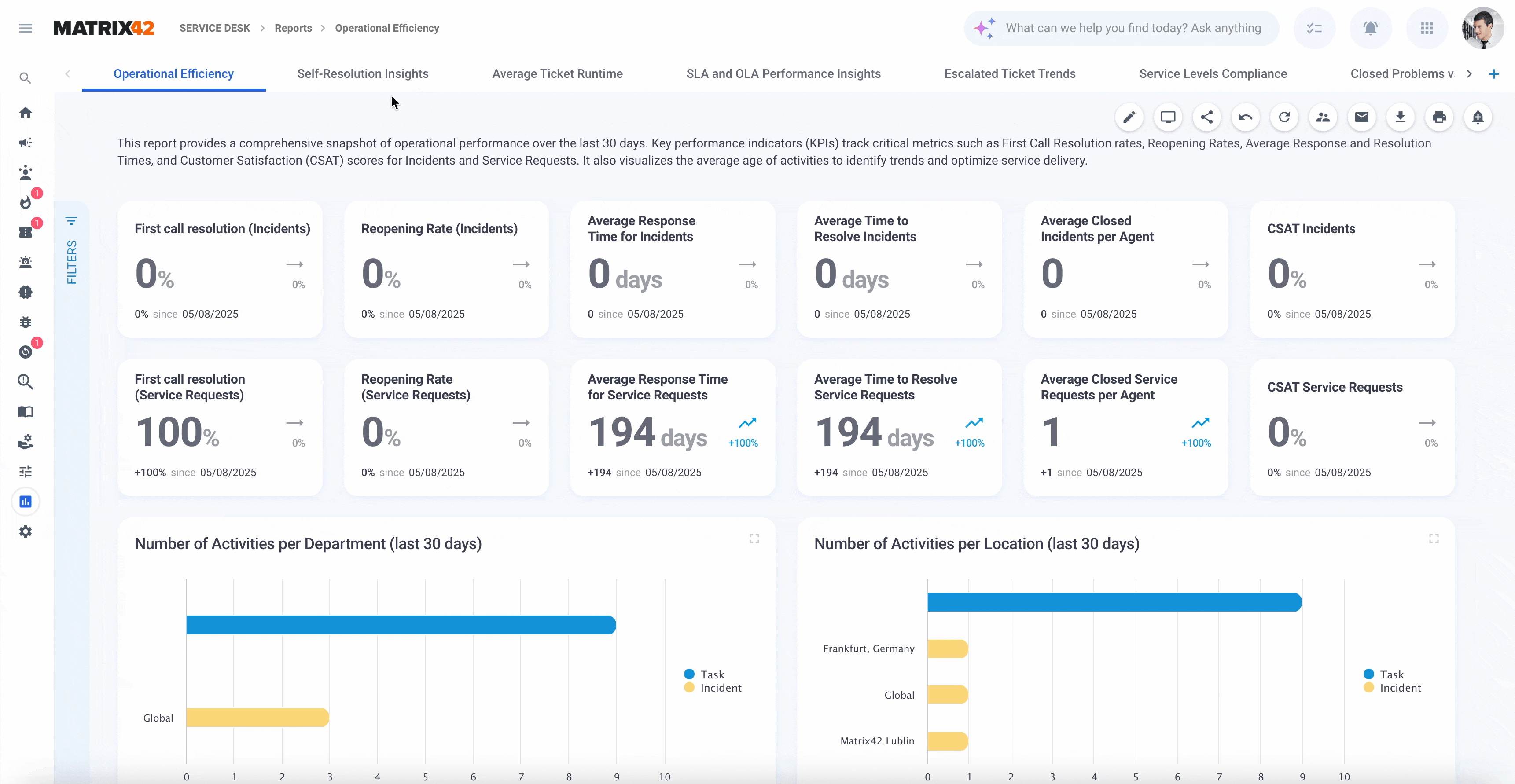
New Look: standard Service Desk Reports
Users can immediately use these dashboards for operational insight or extend them to fit their specific team or department needs by adding new data sources, either using the existing widgets as a basis or creating completely new ones by customizing visuals, or reformatting layouts, all within the same intuitive interface.
Rich Library of Standard Widgets
The introduced toolkit includes a wide selection of standard widgets for:
-
Data representation (e.g., tables, metric, and percentage cards)
-
Visualization (e.g., bar charts, pie charts, stacked charts)
-
Comparison and analysis (e.g., trend lines, KPIs)
Each widget can be added and configured directly from the UI with just a few clicks. There’s no need to write formulas or customize backend settings: just choose, click, and visualize.
|
|
Widget Library 25 configurable widgets are already available ✅ Comparison: bar and column charts ✅ Proportion: segmented List, pie/donut chart ✅ Card: single value, percentage, metric cards ✅ Relationship: DataQuery list or table, Value and Dataset Lists ✅ Composition: combo and stacked charts ✅ Distribution: Area / Line Charts ✅ Miscellaneous: map, embedded web page ...and more |
To learn more, see Widgets: Standard Widgets Library & Configuration page.
Collaboration Made Easy
Once created, dashboards and reports can be shared securely with the relevant audience, whether that’s a single colleague, a specific team, or an entire department. This encourages alignment across business units and helps ensure that everyone works with the same data and insights.
|
Actions & Options ✅ Edit ✅ Full Screen ✅ Share in-app ✅ Send via email ✅ Export ✅ Subscribe ✅ Force Reload ✅ Publish ✅ Delete |
|

Flexible Sharing and Presentation: Inside and Outside the App
Sharing dashboards and reports goes far beyond the boundaries of the application:
-
In-app sharing with individuals, groups, or departments ensures relevant stakeholders have access to live dashboards
-
Export options allow users to:
-
Choose from PDF, PNG, or JPG formats
-
Select portrait or landscape orientation
-
Pick between light or dark theme
-
-
Dashboards can be emailed directly to recipients with the selected format and styling
For team meetings or executive presentations, dashboards support a Full Screen Mode, perfect for displaying live data on a large screen, eliminating the need to prepare external slides or screenshots.
For details, see also Actions on the example of the Service Desk Dashboard.
Scheduled Report Subscriptions
Starting from v.12.1.3, with the Subscribe action, you can set up scheduled e‑mail delivery of your personalized dashboards/reports, ensuring stakeholders receive the latest data in their inbox on a cadence you define (e.g., daily, weekly, monthly). Subscribe yourself and other users, roles, or even specific email addresses of the users who are not registered in the system, ensuring the right stakeholders always stay informed. Choose among PDF, PNG, or JPG formats, with options for theme, layout orientation, color contrast, and optional header/footer:

Each subscriber gets the content as seen through the owner's view, while keeping both personalization and individual access permissions in the application unmodified.
Administrators can manage all active subscriptions, view scheduling patterns, formats, upcoming deliveries, usage limits, and edit recurrence or recipient parameters as needed via the Report Subscriptions dashboard.
For details, see also Subscribe to Dashboards and Reports and Report Subscriptions.
A Brand-New Capability
This tool marks a significant improvement in user autonomy and reporting efficiency, delivering previously unavailable functionality in a user-friendly and accessible toolkit. It’s not just a redesign, it’s a brand-new capability designed to bring data to everyone’s fingertips.
Major incident
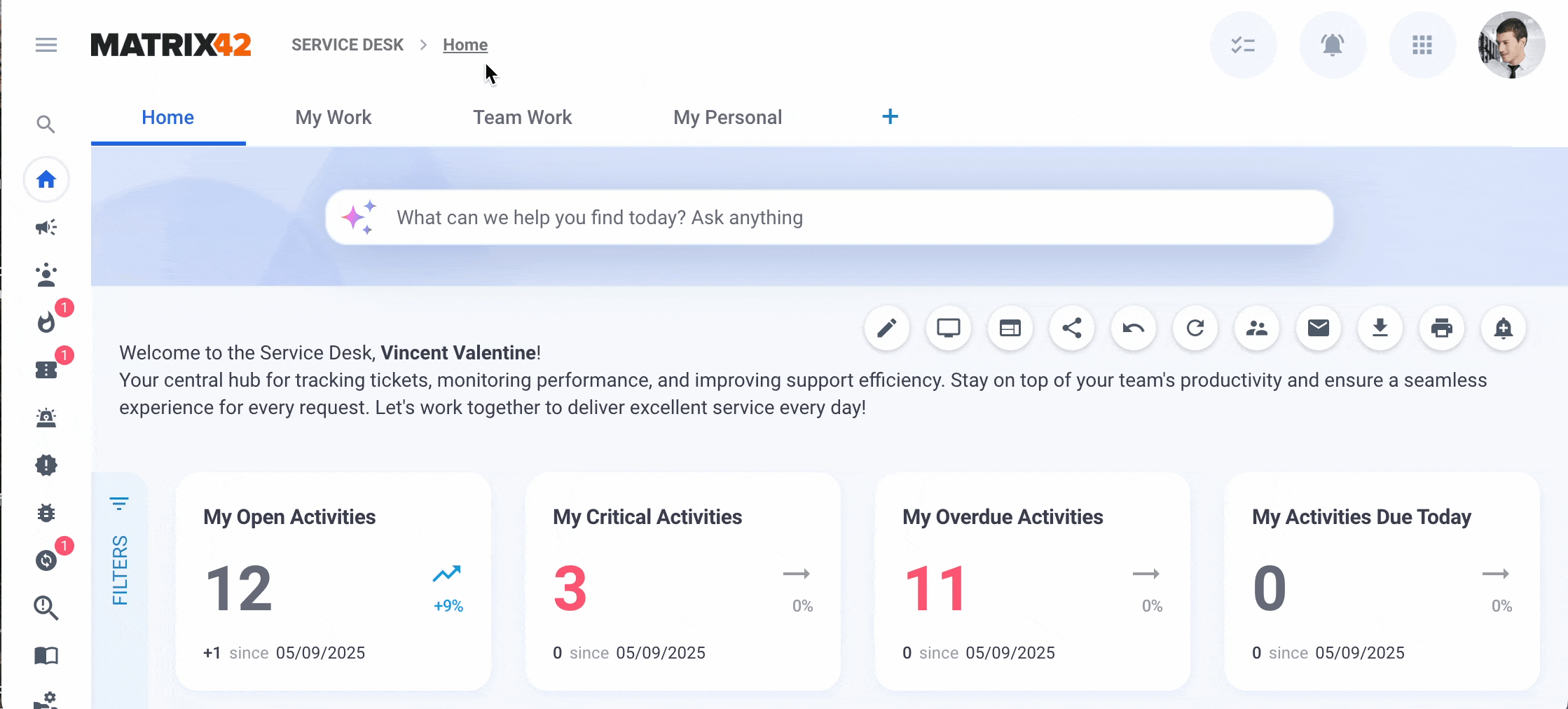
A Major Incident is a high-impact incident that causes significant disruption to business operations or IT services and requires an urgent, coordinated response. Starting with v. 25.4, Enterprise Service Management offers the end-to-end support for Major Incident handling, starting with Major Incidents proposal flow, including incidents proposed by the agent or detected by AI, to the transparent communication to the end-users of the Self Service Portal via Service Availability Center and reporting through new data filters, Service Desk Home page metrics and reports in Service Desk and Service Catalog.
Major Incidents Proposal Process
A Major Incident is an incident that was detected and qualified as a Major Incident. An incident is created by a user, system integration, or automated detection, and a Service Desk agent can propose to escalate any standard Incident to a Major Incident. Incident Manager reviews the proposal and either accepts (promotes) or rejects it:

Active Major Incident Proposals and Open Major Incidents are highlighted in the Service Desk Home page dashboard.
See also, Major Incident.
Major Incident Prediction
Additionally installed AI Proposals for Service Desk extension helps you proactively discover potential and ongoing Major Incidents in your environment, minimizing downtime impact. It also enables you to handle them through a standard end-to-end Major Incident management process and integrate it into the Workflow Designer to trigger automated cross-team workflows.
Major Incident proposals detected by AI and their conversion rate into accepted proposals can be tracked in the Service Health and Disruption report:

See also, AI Proposals for Service Desk extension and Service Desk Reports: Service Health and Disruption.
Service Availability Center
Service Availability Center (SAC) page in the Self Service Portal provides end users with a central view of service health status, related Major Incidents or Change Requests, maintenance information, and communication details. From this page, you can subscribe to receive email updates when the health status of selected services changes:

See also, Service Availability Center (SAC).
BITV-Test certified
Our product is now BITV certified, confirming that it meets Germany’s official BITV 2.0 accessibility standards aligned with EU standard EN 301 549 and WCAG 2.1 AA. This demonstrates that core modules like Self Service Portal, Service Catalog, Assets, and Licenses meet official accessibility guidelines and ensures that people with disabilities can use our digital services effectively.
This certification not only confirms compliance with legal obligations under the German Barrier‑Free Information Technology Ordinance (BITV 2.0) but also shows our dedication to digital inclusion and high-quality user experience.
See also, Matrix42 Accessibility Statement.
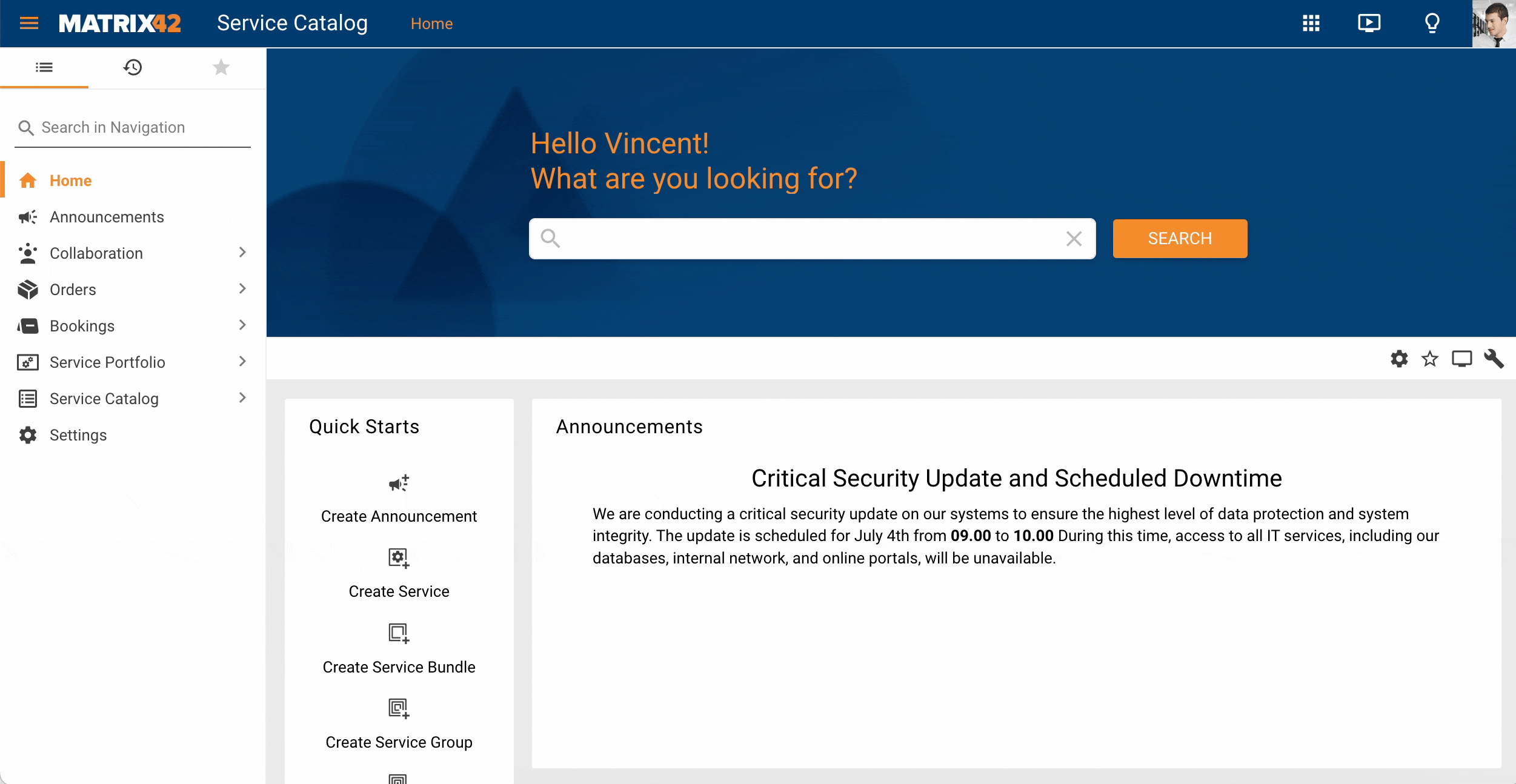
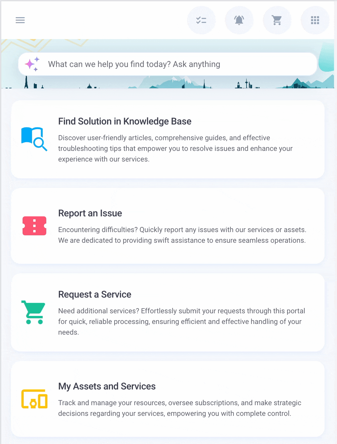
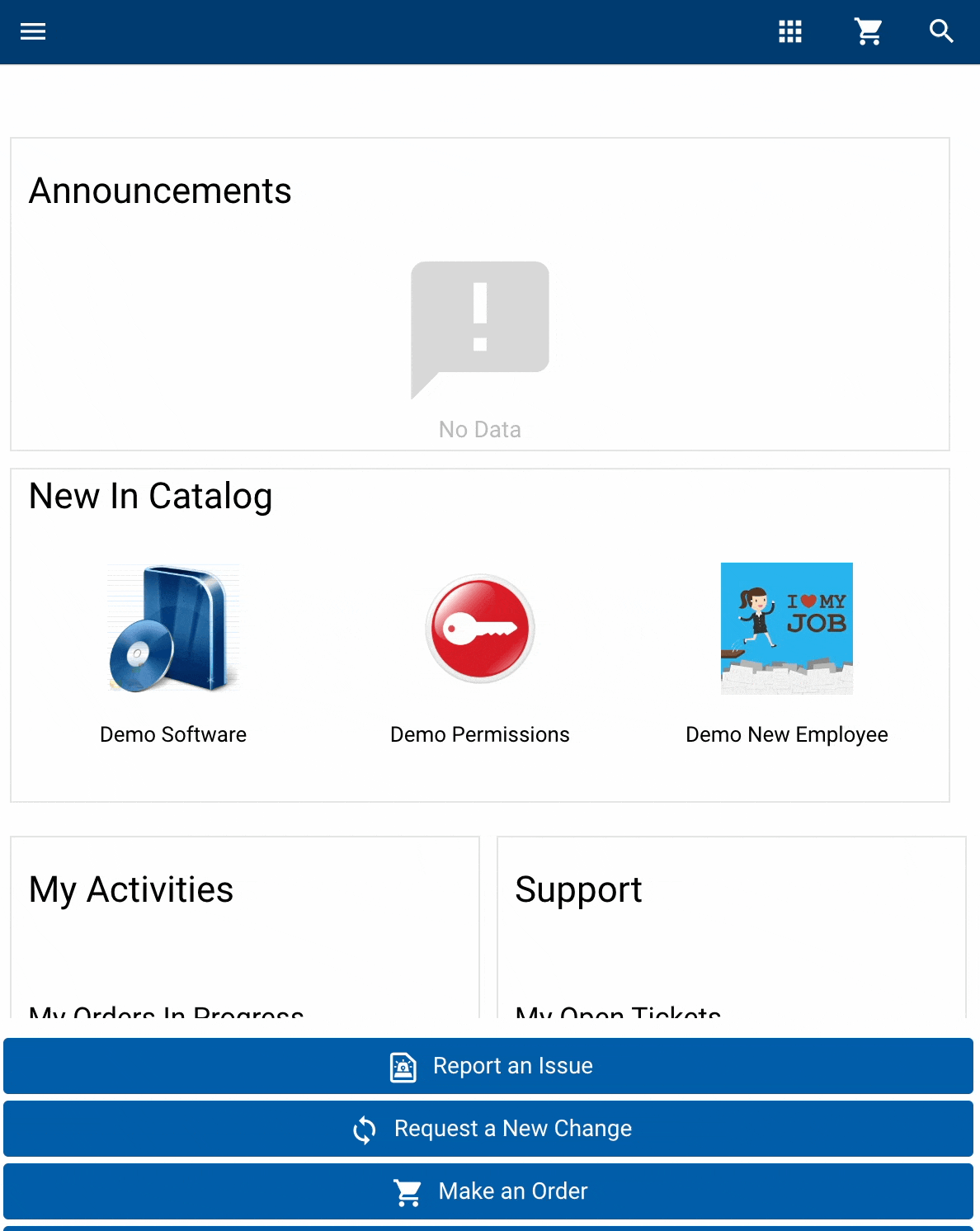
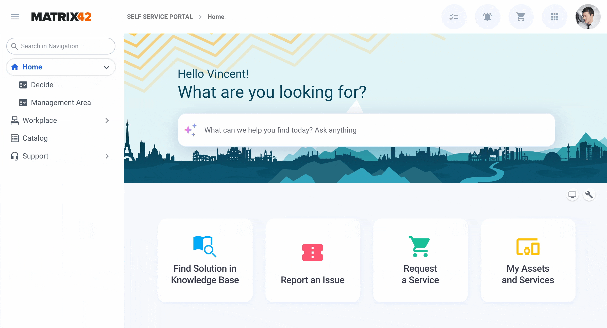
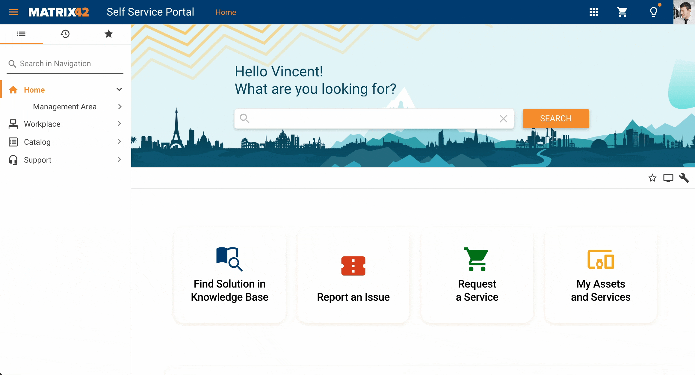
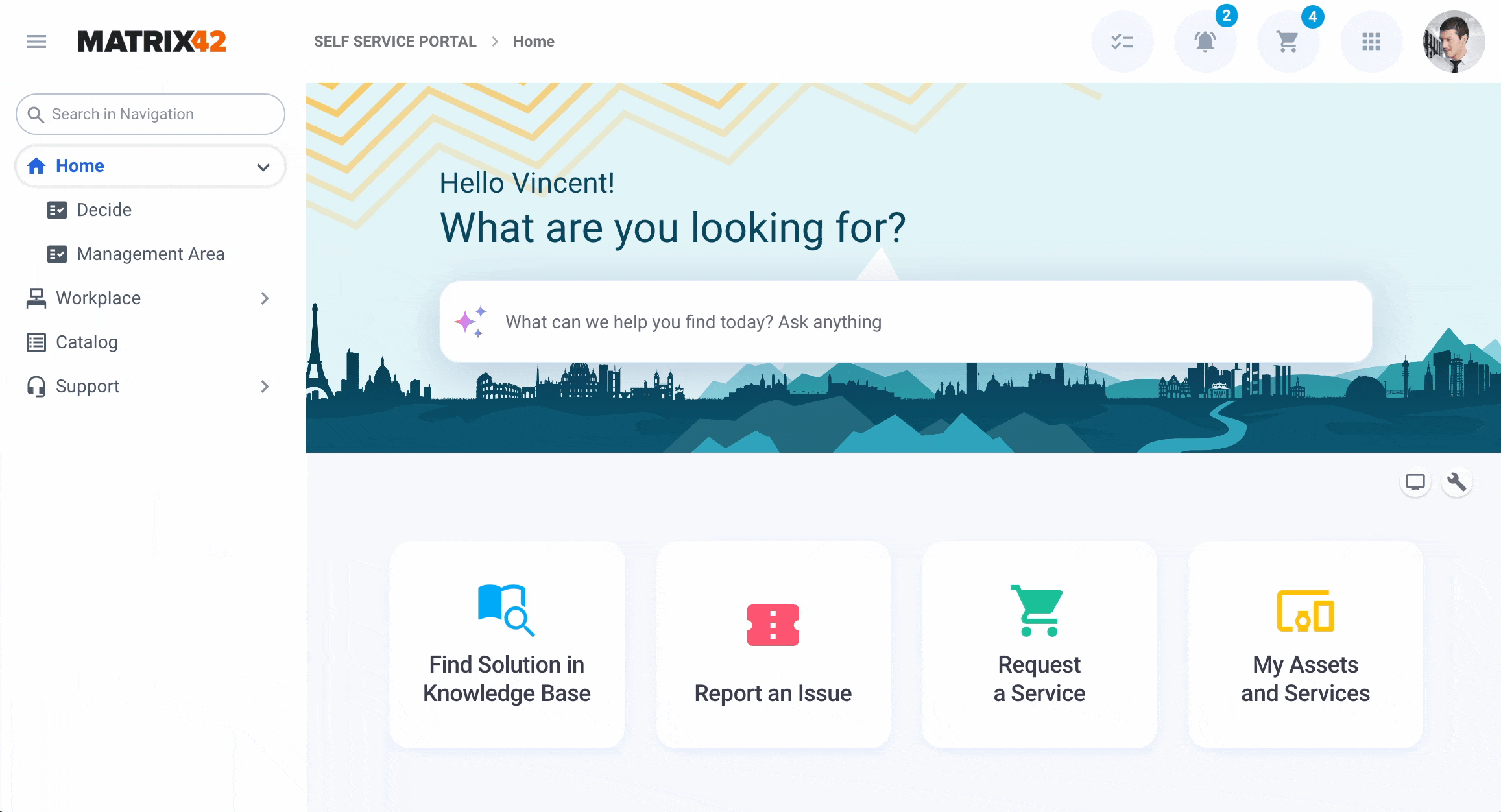
New Self Service Portal Landing
The new Self Service Portal landing page significantly reduces the time spent searching for services, improves task completion rates, and enhances overall satisfaction, especially for less experienced users.
|
New Look ✅ More context for basic actions with helpful explanations, especially for less experienced users. ✅ Improved discoverability for the search bar and clearer content categories reduce effort. ✅ User-friendly design with modern visuals improves usability and appeal. ✅ Personalized real-time data like tickets, requests, approvals, and their status at a glance. ✅ Responsive layout, optimized for mobile and latest accessibility standards. |
Classic Look ☑️ Welcome message and basic actions: Report an Issue, Request a New Change, Make an Order, Find Solution in Knowledge base. ☑️ Harder-to-spot search bar and less intuitive content structure increase the effort to find information. ☑️ Flat, utilitarian, and dated design with limited visual appeal and focus on user experience ☑️ Limited personalized data overview for current activities and orders. ☑️ Responsive layout trimming out necessary details and not up-to-date accessibility standards. |
|
|
|


Mobile-friendly and responsive design
The New Look includes a significantly improved responsive design, delivering a smoother, faster, and more user-friendly experience across all devices.
|
New Look ✅ Responsive layout, optimized for mobile and latest accessibility standards. |
Classic Look ☑️ Responsive layout trimming out necessary details and not up-to-date accessibility standards. |
|
|
|
Sound Notification and Badges for New Information Received
Users can turn on the sound for notifications when there is new information received about Tickets, Service Requests, Incidents, Problems, and Change Requests in the user profile:

See also, User Profile: managing personal data.
In addition to the badges displayed in the Navigation Items area, the user will be notified with the sound selected from the notification sounds library:
See also, Track activities with new information received and Service Desk: New Information Received Flag Configuration area.
Recents
Introducing the Recents function directly accessible from the header bar provides a straightforward yet impactful usability enhancement. It streamlines your workflow by allowing instant access to previously visited pages, frequently used items, or favorite actions without interrupting your current task. This significantly simplifies navigation, reducing the need to retrace steps, making it easier to switch between tasks, and accelerating your productivity.
|
New Look ✅ Enhanced visibility positioned near other commonly used actions, creating a familiar user experience ✅ Simultaneous access to recent and menu items, enabling faster navigation ✅ Clear and intuitive, offering users a shorter learning curve and quick adoption ✅ Smooth interactions, providing improved usability aligned with common industry standards |
Classic Look ☑️ Blended with the main navigation, reducing clarity ☑️ Either menu items or recents are displayed, restricting navigation options ☑️ Limited and unclear visibility, slowing user navigation ☑️ Less intuitive, leading to longer learning times and reduced productivity |
|
|
|
See also New Look Overview: Recents
Favorites
Introducing the Favorites function in the header bar adds a simple but powerful usability enhancement: visible, functional, and user-friendly. It enhances the self-service experience by letting users quickly access commonly used features and services, thereby reducing time spent navigating the application.
|
New Look ✅ Enhanced visibility next to other frequently used actions in the header bar ✅ Both Favorites and menu items are displayed at the same time ✅ Clear, functional, and more intuitive ✅ Smooth and improved usability interaction |
Classic Look ☑️ Blended with the main menu in the navigation bar ☑️ Either menu items or Favorites are displayed ☑️ Minimal and unclear visibility ☑️ Less intuitive |
|
|
|
See also New Look Overview: Favorites.
Rethinking Actions
Actions have been completely rethought: they're now more visible, logically grouped, and easier to access.
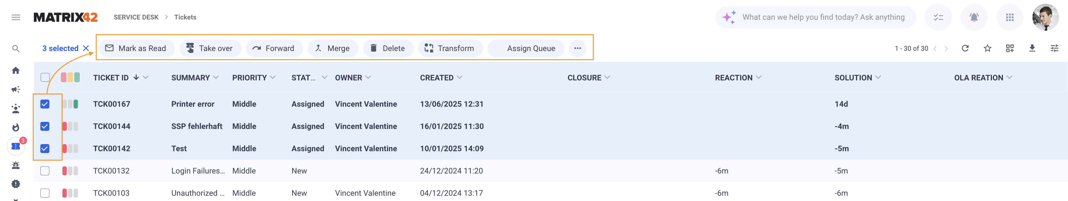
Multi-context actions
In multi-context dialogs, actions appear directly in the grid header and adjust based on what you’ve selected:
New Look
✅ Relevant actions for multiple selected items are immediately shown on top of the grid, without the need to switch context:
Classic Look
☑️ Actions for multiple selected items require one more step, as they are suggested only on the preview page:

Preview opening as Full Screen
Starting with ESMP v.12.0.5, two view opening modes let you customize how previews and actions are displayed across Landing Pages, Dashboards, and Tiles. These modes help tailor your interaction experience based on the content that should be displayed on the page and your needs.
|
New Look ✅ Full Screen (default) is ideal when a preview contains a large amount of content that doesn’t fit well within the page layout or when you need a focused, distraction-free view. ✅ Side Panel is useful when you want to keep the context of the current page while interacting with the preview, making it easier to compare information or multitask without navigating away.
|
Classic Look ☑️ Side Panel view opening mode is the default and the only available. The limited space in the Side Panel can make it difficult to view complex or content-heavy previews, requiring more scrolling and reducing readability. ✖️Full Screen mode cannot be opened by default. To open the preview in full screen, an additional click is required, which slows down navigation and disrupts the user flow.
|


Keyboard Shortcuts
Enjoy faster, more accessible navigation with smart, OS-aware keyboard shortcuts – only in the New Look.
|
New Look ✅ Basic list of keyboard shortcuts ✅ Extended list of 16 keyboard shortcuts ✅ Access through the user profile menu ✅ Relevant shortcuts suggested based on the user's OS (Windows / MacOS)
See also Keyboard shortcuts and navigation. |
Classic Look ☑️ Basic list of keyboard shortcuts ✖️ Missing shortcuts for Save, Save & Close or Delete actions ✖️ Access through "?" key only ✖️ Only Windows OC keyboard shortcuts suggested
|

Seamless integration with the Archive Database from Grids
Easily switch between the current and archived data without extra search or filtering, additional navigation items, or complex configuration. Define the archiving criteria in the Configuration Item settings and enable the Archived data toggle in the Dataset View:

Customization Compatibility Assurance with New Look
We understand migrating to a new interface can raise concerns, especially regarding the compatibility of your existing customizations and forms.
Here's our commitment to you:
-
Seamless Compatibility: Your existing customizations should function identically in both the Classic and New Look interfaces without any required changes from your side.
-
Zero Additional Investment: If your customizations or forms behave unexpectedly, we classify these scenarios as product defects, not customer responsibilities.
-
Rapid Resolution: Our product team prioritizes resolving any such compatibility issues quickly. Please report them immediately through our support channels.
Your feedback is crucial—if you encounter concerns or have specific questions regarding your customizations, please reach out through the survey or directly via support.
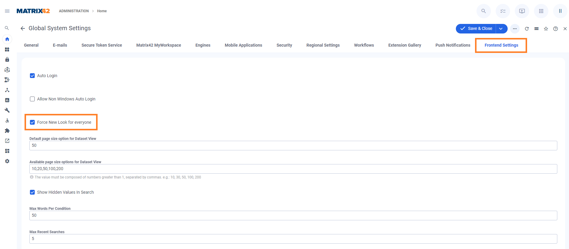
How to Activate the New Look
▶️ To activate “Force New Look”:
-
Open the Administration application
-
Navigate to Global System Settings
-
Go to the Frontend Settings tab
-
Enable the checkbox “Force New Look”
Once enabled, all users in the tenant will be automatically switched to the New Look UI, overriding individual UI preferences or pilot group assignments.