Navigation Items
Overview
Navigation Items are the menus that allow users to navigate through the applications.
On this page you will learn how to:
- Manage multi-level menus hierarchy:
- create New Navigation Items of any nesting levels;
- edit provided by default Navigation Items of the Matrix42 platform;
- build static sub-menu items hierarchy ;
- generate sub-menus dynamically using structures;
- Configure menu's actions on click:
- set up navigation within the pages of an application;
- redirect users to external target resources;
- set a menu item as a container for other Navigation Items;
- Customize menus displaying:
- set audience and show relevant navigation items to particular users;
- extend navigation structure using custom search filters;
- share custom menu settings based on search filters with other users, user roles, etc.
As a rule Navigation Items are located in the navigation panel and depend on the application's Navigation type:
- Standard navigation is placed on the left of the screen;
- Simple navigation is on top of the page.
Navigation Item settings are common for all applications regardless of their Navigation type and are managed in Solution Builder.
Navigation Items for any application of the Matrix42 platform are managed in Administration application → User Interface → Navigation Items.
Types of Navigation Items
Configured Navigation Items of an Application are well structured and visually similar, although their internal settings differ.
Navigation Items can be conventionally classified as follows:
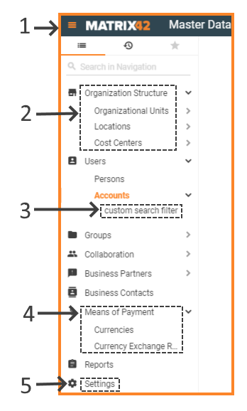 |
1. Application navigation: standard Navigation type preview of the hierarchically organized menu items of an entire application. |
| 2. Structures: dynamically generated navigation structure based on the available in the application data; | |
|
3. Search filters: custom items which serve as quick filters for the data of the parent navigation item. Search filters are configured via Administration application → User Interface → Search Filters page. |
|
| 4. Static menu: manually configured navigation items structure containing a parent menu (Root Element) and sub-items (Child Element). | |
| 5. Non-editable navigation items: some of the Matrix42 applications have default-provided navigation items that are not listed along with the other navigation items and available for restricted user roles. Such system navigation items cannot be deleted, modified or customized, for instance, Settings. |
Continue reading to learn how to use each configurable option of the Navigation Items in the order in which they are listed in the Solution Builder or proceed directly to particular use cases.
Creating a Navigation Item
Solution Builder allows creating new and managing existing Navigation Items from the following pages:
- User Interface menu → Applications dialog → Navigation Items tab:
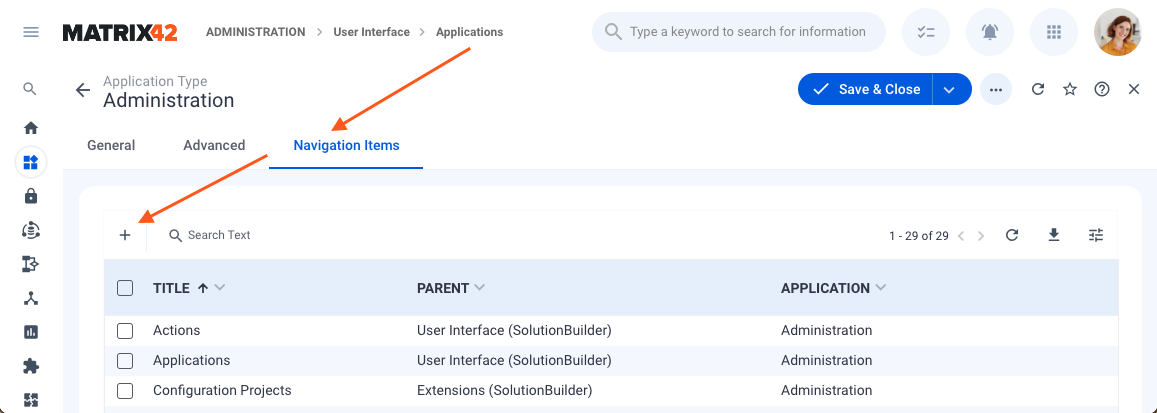
- User Interface menu → Navigation Items grid:
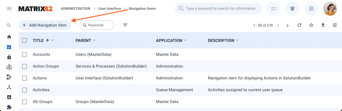
If you are creating a Navigation Item for a new application, in any case, you will need to create and save the Application first.
Navigation Item settings
To create or edit a Navigation Item, specify the settings listed below:

Mandatory settings are marked with an asterisk*:
| Setting name | Description | |
|---|---|---|
General Info: basic settings of the Navigation Item |
||
| Title* |
a name of a Navigation Item displayed to the end-users in the Application. Initially entered in the Title field data defines the auto-generated Navigation Item's Technical name. |
|
| Icon |
optionally select an icon from the available library. Settings particularities depend on the Item Type settings:
|
|
| Description |
internally used text description of the Navigation Item. Optionally enter a short description of the Navigation Item that characterizes its purpose or use case. |
|
| Position |
Specify integer or leave empty:
|
|
| Technical name |
a system name of a Navigation Item. Technical Name is auto-generated based on the entered Navigation Item Title field data and cannot be modified. |
|
| Visibility condition |
optional field for specifying additional restriction criteria for the Navigation Item displaying.
|
|
| Enabled |
check-box options:
The actual displaying of the Navigation Item for each particular user also depends on a number of settings:
|
|
| Hide for users for whom no child Navigation Item is permitted |
check-box options:
The out of the box Matrix42 Administration application contains a number of pre-defined system settings for the Navigation Items. "Hide for users for whom Navigation Item is permitted" option is selected by default only for the Decide menu of the Self Service Portal. For the rest of the Navigation Items, this property can be enabled manually.
|
|
Item type: select one of the suggested options |
||
| Child Element | the Navigation Item will be a part of a multi-level menu. In this case, currently edited Navigation Item is a subordinate element which depends on the Parent navigation Item. | |
| Parent* | start typing Navigation Item name for auto-suggestions or click the search icon to see a complete list and structure of the possible parent navigation items. | |
| Root Element | the edited element will be placed in the first level of the Navigation Items hierarchy and assigned to an Application. | |
| Application* | start typing the Application name or click the search icon for a complete list of Available applications. | |
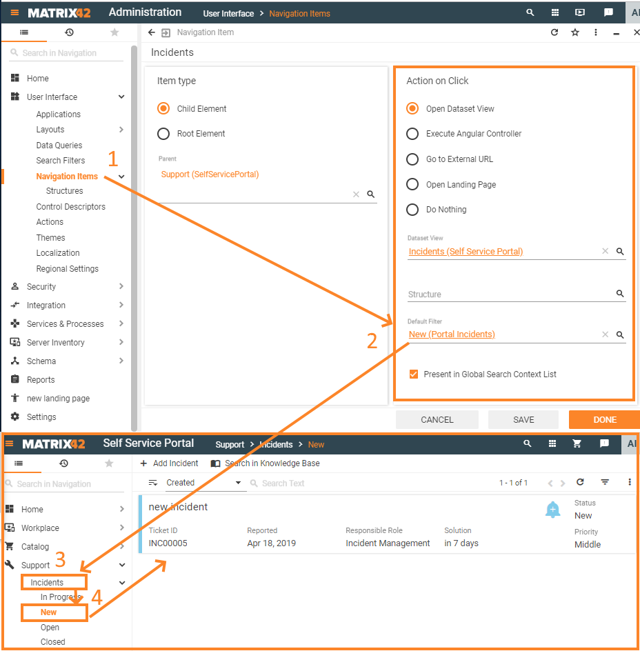
| allows specifying a Dataset View which serves as a source of specific data which grouped in a set of particular columns or fields that can be browsed through and displayed in the application as a grid, a list, tiles, on a board or in a calendar. | ||
Dataset View* |
start typing the Dataset View name for auto-suggestions or click the search icon to select an option from the complete list of the available in the application Dataset Views. Dataset Views are configured in the Administration application → User Interface → Layouts menu. |
|
Structure |
Optionally specified for the currently edited Navigation Item structure allows dynamically generate the sub-items hierarchy based on the defined in the structure rules, relations and sub-items filtering conditions. start typing the Structure name for auto-suggestions or click the search icon to select an option from the complete list of the available in the application Structures. Structures are configured in the Administration application → User Interface → Layouts → Navigation Items → Structures. |
|
Default filter |
search filter applied by default to the data displayed on the specified menu item page. Start typing the Search Filter name for auto-suggestions or click the search icon to select an option from the complete list of the available Search Filters in the application. Every time a user opens a Navigation Item with a pre-defined default filter for the first time, the page lists only records corresponding to the default search filter conditions. In the New Look, the default filter will be used until the user changes it in the UI, for instance, applies other search filters, or clears the default filter. Once the user modifies the filter, the system will save their preferences and apply them the next time. The default filter is only used if the user has not changed the filters manually. For proper functioning of the search filter during the application's runtime make sure that the specified default filter is based on the same Data Query as the selected for the Navigation Item Dataset View. For instance, let's consider an example when every time a user opens an Incidents Navigation Item the very first time, by default we need to show all incidents on status "New":
|
|
Badge Configuration (New Look only) |
Badges are intended to draw attention and inform the application users about some changes, new items, or requests that should be checked in the particular navigation item. The traced event depends on the badge configuration filter and the conditions it checks. Badge Configuration is available starting ESMP 12.1.0 and can be displayed only in the New Look design.
To configure the badge select the
Adding many Badges might affect the system's performance. The Navigation items that contain other navigation items with a configured Badge also automatically get a Badge shown as a dot, informing that there are some new items to check:
Badge display example configured for Tickets navigation item in Self Service Portal Badge calculation is possible when the Navigation Item is configured to open a Dataset View as the Action on Click, and the Dataset View is based on the Data Query that gets data from the Data Definition. With the assigned badge, the number in it will only grow unless the record is deleted. To make it go down, an additional logic should be implemented. As an example, see Track Activities with New Information Received. |
|
| Present in Global Search Context List |
check-box options:
Navigation Item: Present in Global Search Context list option is enabled |
|
Execute Angular Controller |
the Navigation Item leads to the page which is defined by the AngularJS Controller. This option is the most flexible as allows to develop any layout with absolutely any logic but on the other hand is the most complex as it requires strong Front-end developer skills. | |
| Controller* | See more on Understanding Controllers and UUX Front-end Workspaces pages. See "HOWTO: Implement Custom Controller for Action Implementation" for more details |
|
| URL | ||
| Template URL | ||
| specify to redirect users to external target resources. | ||
| URL* | URL address of the external resource. | |
| Open in new window |
check-box options:
|
|
|
Navigation Item leads to a specially designed page of an application which is intended for directing or guiding the users to specific parts of the website. Landing pages content stands out of a commonly used in the application page formatting like listing data in grids, tiles, as a calendar, etc. and can be reinforced with visuals, such as graphs, charts or images. As a rule, this option is intended for those types of pages which may serve as an entry point for the application, for instance:
|
||
| Landing Page* |
start typing the Landing page name for auto-suggestions or click the search icon to select an option from the complete list of the available in the application Landing pages. Landing pages are configured in the Administration application -> User Interface -> Layouts menu. |
|
Open Dashboard (New Look only) |
this option is available starting from ESMP v.12.1.0 for the New Look design only. Use this property for the Navigation Item that should open the Dashboard, for instance, how it's configured for the Service Catalog Dashboard or Service Desk Dashboard. | |
| the navigation item will act as a container for other sub-items in the navigation structure | ||


Click SAVE to apply changes and save the provided data.
You can add as many navigation items as you need to create the navigation structure in the Application you are building or editing.
Use cases
Creating static menu structure
Static menu structure is a manually created Navigation Items hierarchy that can consist of multiple levels.
Example: 3-level menu using Navigation Item settings:
- Create a Root Element and assign it to an Application;
- Create a Child Element and assign it to the Parent item from the previous step;
- Create another Child Element and assign it to the Parent item from the previous step.
You may create as many nesting levels as you need.
Tend to avoid multiple level menus if your application has simple navigation.
Minimize the number of menu items and their nesting levels as complex menu structure may result in poor user experience. An overloaded menu may cause items' overlapping, as all the sub-items of the main menu are grouped and all nesting levels are listed in the drop-down straightaway:

Configuring dynamic menu using structures
Structure is a dynamically generated menu items hierarchy based on a specific set of data, organized and filtered according to the specified criteria.
For details see Administration application → User Interface → Layouts → Navigation Items → Structures.
Reordering menu items
Use the Position field of the Navigation Item settings to reorder manually created menu items of the same nesting level.
Using menu as a divider
Use the Do nothing Action on click of the Navigation Item settings to display a non-clickable menu item that acts as a container for other sub-menus.
Choosing action on click
Action on click property of the Navigation Item settings defines the target or page that opens when clicking on the menu item.
Using internal resources of the application
Each menu of the application is intended to display a specific page. Matrix42 platform stores each page as a manually configured Layout. Specify the menu's target page from a configured in advance Layout of a Dataset view or Landing page types.
Dataset view
Use the Dataset View field of the Navigation Item settings to show a Layout based on the internally stored in the Martix42 platform data that can be displayed in the application as a grid, a list, tiles, board, or in a calendar.
Landing pages
Use the Landing page field of the Navigation Item settings to show a Layout based on the internally stored in the Martix42 platform data that is organized on a page in a particular way with an intention to inform, guide or direct the users of your application.
External resources: redirect to a specific URL
Use the Go to External URL field of the Navigation Item settings to redirect users to a specific page that is not a part of the Martix42 platform. Set an absolute or full URL path to the necessary page.
Advanced options: Develop and Execute Angular Controller
See more on Understanding Controllers and UUX Front-end Workspaces pages.
Managing Navigation Items visibility levels
The same application may have different menu structure for different users. This can be explained by a number of criteria and restrictions that are applied before the Navigation Item is shown to a specific user. These criteria are checked when the user opens an application and are verified one by one as described in detail below.
Global visibility settings
Enabled property of the Navigation Item settings defines whether the Navigation Item can be displayed in the Navigation Items hierarchy.
Set audience
Set audience setting of a Navigation Item defines a set of users, user roles and user groups who can access the specified menu item.
For more information see SET AUDIENCE page.
Set user-specific visibility condition
An additional step allows setting specific conditions verified for a current user. The condition is applied after the audience restriction and may include a set of rules that are too specific and may not be covered by the Set audience settings.
Use the Visibility condition field of the Navigation Item settings and set additional restriction as an ASQL expression.
Hiding redundant Navigation Items
If the sub-items of the menu are not available to the users due to previously enumerated conditions and the Navigation Item is used as a container for sub-items such Navigation Item is considered as redundant. Enable Hide for users for whom no child Navigation Item is permitted to hide such Navigation Items from the application's menu.
Deleting Navigation Items
Delete Navigation Item option depends on the Navigation Item type:
- Manually created Navigation Items can be deleted from the system by the Administrator user.
Use the Delete action to remove the Navigation Item from the Application settings:
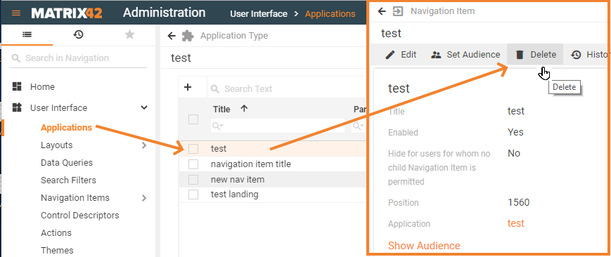
- choose an Application;
- click the Navigation Item;
- click Delete action and follow the instructions.
Delete action does not only removes the Navigation Item from the Application but removes it completely from the system so that the menu settings are no longer available in the list of Navigation Items and this change cannot be reverted.
Change the Enabled field property of the Navigation Item if you prefer to keep the settings in the system but do not show them to any of the intended application users.
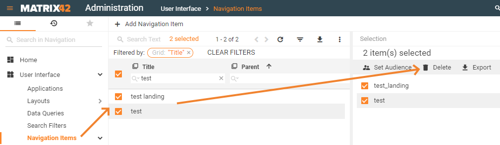
Delete multiple items option is available from the Navigation Items list. This change cannot be reverted:
- Structures and dynamically generated sub-items of the menu cannot be deleted by a user or an Administrator. The displayed elements and menu's hierarchy entirely depends on the structure settings and available in the system data.
- Default-provided system Navigation Items cannot be deleted by an application user or an Administrator. Administrator can change the Enabled field property of the Navigation Item settings and disable menu item display for all users of a specific application.
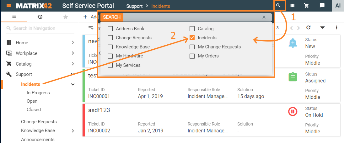
- Search Filters: although the search filters technically are not managed as Navigation Items they can be removed from the Navigation menu structure under certain conditions and by specific users, for example:
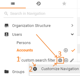
- application user manually creates a search filter. Right-click the necessary item, click Customize Navigation and click the Delete Filter button if provided:
The search filter is completely removed from the system if it's available only for a specific user.
Search filters with shared user access remain in the system, are available to other authorized users and can be removed only by an Administrator. - any user (application user or an Administrator) has created a search filter and the search filter is assigned as default filter of a Navigation Item. Such filter can be removed by an Administrator only.
- application user manually creates a search filter. Right-click the necessary item, click Customize Navigation and click the Delete Filter button if provided: