Widgets: Standard Widgets Library & Configuration
Overview
Widgets are reusable visual components designed to display data or other content in an interactive and easily digestible format. Standard widgets are not only used in the Service Catalog Dashboard, Service Desk Dashboard and Service Desk Reports, but also allow adjusting and customizing existing dashboards, extending them, or creating new ones.
This page provides a detailed description and configuration of standard widget visualization types in the application.
To add and configure a new widget to show your data on the Dashboard, see Managing Dashboards in New Look page.
Chart Types and Configuration Properties
For convenience, charts are divided into categories and each category includes the following charts and configurable properties:
|
Category |
Chart Name |
Title/ Record Type / Filters |
Drill down (Data List) |
Timeline Configuration |
Configure Axis Title |
Conditional Coloring |
Show legend |
Show Total |
Interactive Filters since v.12.1.1 |
|---|---|---|---|---|---|---|---|---|---|
|
Comparison
|
Bar Chart |
✅ |
✅ |
✅ |
✅ |
✖️ |
✖️ |
✖️ |
✅ |
|
Column Chart |
✅ |
✅ |
✅ |
✅ |
✖️ |
✖️ |
✖️ |
✅ |
|
|
Proportion
|
Pie Chart |
✅ |
✅ |
✖️ |
✖️ |
✖️ |
✅ |
✖️ |
✅ |
|
Donut Chart |
✅ |
✅ |
✖️ |
✖️ |
✖️ |
✅ |
✅ |
✅ |
|
|
Card
|
Percentage Card |
✅ |
✅ |
✖️ |
✖️ |
✅ |
✖️ |
✖️ |
✅ |
|
Metric Card |
✅ |
✅ |
✖️ |
✖️ |
✅ |
✖️ |
✖️ |
✅ |
|
|
Composition
|
Combo Chart |
✅ |
✅ |
✅ |
✖️ |
✖️ |
✖️ |
✖️ |
✅ |
|
Stacked Bar Chart |
✅ |
✅ |
✅ |
✅ |
✖️ |
✅ |
✖️ |
✅ |
|
|
Stacked Column Chart |
✅ |
✅ |
✅ |
✅ |
✖️ |
✅ |
✖️ |
✅ |
|
|
Distribution
|
Percentage by Category |
✅ |
✅ |
✖️ |
✖️ |
✖️ |
✖️ |
✖️ |
✅ |
|
Area Chart |
✅ |
✅ |
✅ |
✅ |
✖️ |
✅ |
✖️ |
✅ |
|
|
Line Chart |
✅ |
✅ |
✅ |
✅ |
✖️ |
✅ |
✖️ |
✅ |
Miscellaneous category is not included in the table as its charts have little in common and each is described in detail below.
Comparison
These charts are used to compare different categories or groups. They help identify differences, similarities, and trends among various data sets.
Bar Chart
Bar Chart displays categorical data with horizontal bars where the length of each bar represents the value.
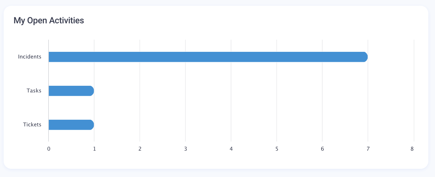
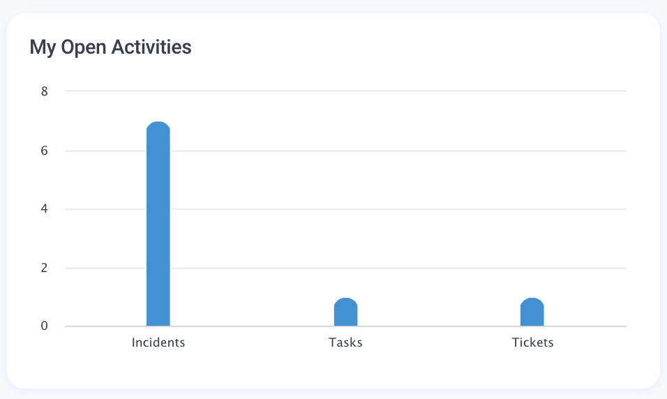
Column Chart
Column Chart is similar to a bar chart but with vertical bars.
Configuration
Bar Chart and Column Chart include the same set of configurable properties, the only difference is how the data is displayed on the Widget.
Data Source
To define the data source, fill out the following fields:
- Title: provide the title that will be displayed on the Widget and as the Widget name in the Dashboard Configuration panel.
- Record Type (mandatory): select from the list of the available in the system Configuration Items.
- Filters: optionally, apply the necessary filters to consider only those records that fall under the filtering conditions. Only those records that meet all specified conditions will be shown in the results. You can choose from the list of filers that are available for the selected Dataset (see Advanced mode configuration).
- Advanced Mode: click on the toggle button to switch on the advanced properties configuration
- Dataset (mandatory): the Data Query for the selected Record Type. It is set automatically when the Record Type is set and if the Data Query for the set Record Type exists.
- Grouping Column: Select by which column to group the data in the widget (e.g., Priority, Status). A list of available columns is suggested from the selected Dataset.
- Data List: optional property that is used to drill down the data. It is set automatically if the Record Type is set and Dataset View exists. Choose the Dataset View that should be opened when you click on the Widget title and you'll see a Dataset View with the details on the data records.
- Dataset (mandatory): the Data Query for the selected Record Type. It is set automatically when the Record Type is set and if the Data Query for the set Record Type exists.
Data displaying
Depending on the selected data source, you can configure data displaying on the Widget as a timeline or as top records:
- Configure Timeline: if the defined in the data source data can be organized in chronological sequence, select the checkbox to enable the timeline configuration and set Step and Rolling Period
- Step: choose from the suggested options (1 hour / 1 day / 1 month / 1 year)
- Rolling Period: choose from the suggested options (Last 7 days / Last 2 weeks / Last 4 weeks / Last 12 weeks / Last year)
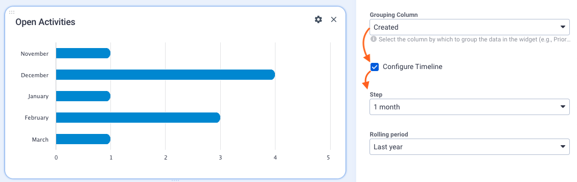
Timeline configuration example
- Top records: enable the Advanced Mode and fill out the following fields
- Top: set a number to limit how many records with the highest values should be shown on the widget

Top 10 Backlog Activities grouped by Responsible Role example - Aggregation Type: choose how the values will be aggregated across your Dataset. Possible values:
- Count (default): counts the number of records in the dataset
- Sum: adds up the values in a numeric column
- Max: shows the highest values of a dataset
- Min: finds the lowest value in a dataset
- Average: calculates the arithmetic mean of values in a dataset. Average= sum of values/ count of values
For all other aggregation types, except the default Count, choose the Column for Aggregation:
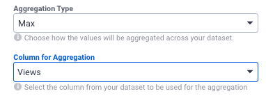
Column for Aggregation suggests suitable columns with numeric data type from the selected Dataset (Data Query).
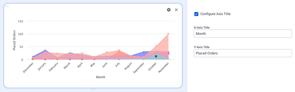
- Configure Axis Title: select the checkbox to enable the configuration and set Titles for X and Y Axis:
- X-Axis Title: set the title for the horizontally displayed values
- Y-Axis Title: set the title for the vertically displayed values

Configure Axis Title example
- Top: set a number to limit how many records with the highest values should be shown on the widget
Interactive filters configuration is described below.
Proportion
These charts display the parts of a whole, illustrating how individual components contribute to the total.
Pie Chart
Pie Chart is a circular chart divided into slices to represent the proportions of a whole.
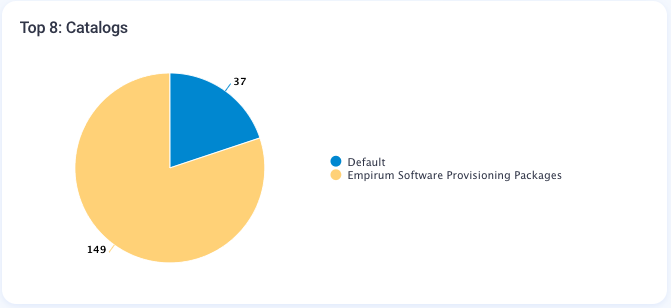
Additionally, the values in the pie chart are always visible automatically without hovering over the pie chart segments starting with ESMP v.12.1.1.
Donut Chart
Donut Chart is a variation of the pie chart with a hole in the center. Used to display proportional data, with the central space showing additional information, e.g. total number of items in the chart.

Additionally, the values in the donut chart are always visible automatically without hovering over the chart segments starting with ESMP v.12.1.1.
Configuration
Pie Chart and Donut Chart include the same set of configurable properties, the only difference is how the data is displayed on the Widget and that the Donut Chart can show the total in the middle of the chart.
- Title: provide the title that will be displayed on the Widget and as the Widget name in the Dashboard Configuration panel.
- Record Type (mandatory): select from the list of the available in the system Configuration Items.
- Filters: optionally, apply the necessary filters to consider only those records that fall under the filtering conditions. Only those records that meet all specified conditions will be shown in the results. You can choose from the list of filers that are available for the selected Dataset (see Advanced mode configuration).
- Grouping Column: Select by which column to group the data in the widget (e.g., Priority, Status).
- Show Legend: disabled by default. Select the checkbox to see the legend based on the selected Grouping Column;
- Show Total (Pie Chart only): disabled by default. Select the checkbox to see the total number of items retrieved to this widget in the middle of the chart;

- Advanced Mode: click on the toggle button to switch on the advanced properties configuration
- Dataset (mandatory): the Data Query for the selected Record Type. It is set automatically when the Record Type is set and if the Data Query for the set Record Type exists;
- Data List: optional property that is used to drill down the data. It is set automatically if the Record Type is set and Dataset View exists. Choose the Dataset View that should be opened when you click on the Widget title and you'll see a Dataset View with the details on the data records;
- Top: set a number to limit how many records with the highest values should be shown on the widget and retrieved to the legend (if enabled);
- Aggregation Type: choose how the values will be aggregated across your Dataset. Possible values:
- Count (default)
- Sum
- Max
- Min
- Average
For all other aggregation types, except the default Count, choose the Column for Aggregation:
Column for Aggregation suggests suitable columns with numeric data type from the selected Dataset (Data Query).
- Interactive filters configuration is described below.
Card
Cards display key metrics and KPIs in a concise, easily digestible format, providing at-a-glance insights.
Single Value Card
The widget displays one key value or a piece of information from the specified record type, such as the latest product version, latest run import, etc.

Configuration:
- Title: provide the title that will be displayed on the Widget and as the Widget name in the Dashboard Configuration panel.
- Record Type (mandatory): select from the list of the available in the system Configuration Items.
- Filters: optionally, apply the necessary filters to consider only those records that fall under the filtering conditions. Only those records that meet all specified conditions will be filtered to be selected in the result. You can choose from the list of filers that are available for the selected Dataset (see Advanced mode configuration).
- Advanced Mode: click on the toggle button to switch on the advanced properties configuration
- Dataset (mandatory): the Data Query for the selected Record Type. It is set automatically when the Record Type is set and if the Data Query for the set Record Type exists.
- Data List: optional property that is used to drill down the data. It is set automatically if the Record Type is set and Dataset View exists. Choose the Dataset View that should be opened when you click on the Widget title and you'll see a Dataset View with the details on the data records.
- Aggregation Type: Choose how the values will be aggregated across your dataset. Possible values:
- Count (default)
- Sum
- Max
- Min
- Average
For all other aggregation types, except the default Count, choose the Column for Aggregation:
Column for Aggregation suggests suitable columns with numeric data type from the selected Dataset (Data Query).
- Interactive Filters: see Interactive Filters configuration section
- Sort by: together with the Direction field configuration and Value column, defines which value will be shown in the Single Value Card. Select a column name from the previously set Dataset.
- Direction: the sorting order of the value that will be shown in the result. Available options:
- Descending
- Ascending
- Value Column: select the column from which the value will be shown. The list of suggested columns depends on the previously selected Dataset.
- Date Format: adjust the date format if the single value card is supposed to show the date. Possible values:
- fullDate
- medium
- shortTime
- yyyy-MM-dd
- Value Format: adjust the value format displaying by adding some text and the value in curly braces.

Single Value Card: Date Format and Value Format configuration example - Additionally, you can configure the Conditional Coloring for the Widget. If you configured the value format, the value will be highlighted with the selected color from the Conditional Coloring while other text will be shown in the faded color, for instance:

Percentage Card
The widget displays a percentage value in a widget layout:

Configuration: includes 2 sections, Comparison and Base. Base is taken as the 100% and the Comparison shows the percentage on the Widget relatively to the Base value. Configure the set of the following fields for both Comparison and Base sections:
- Title: provide the title that will be displayed on the Widget and as the Widget name in the Dashboard Configuration panel.
- Record Type (mandatory): select from the list of the available in the system Configuration Items.
- Filters: optionally, apply the necessary filters to consider only those records that fall under the filtering conditions. Only those records that meet all specified conditions will be shown in the results. You can choose from the list of filers that are available for the selected Dataset (see Advanced mode configuration).
- Advanced Mode: click on the toggle button to switch on the advanced properties configuration
- Dataset (mandatory): the Data Query for the selected Record Type. It is set automatically when the Record Type is set and if the Data Query for the set Record Type exists.
- Data List: optional property that is used to drill down the data. It is set automatically if the Record Type is set and Dataset View exists. Choose the Dataset View that should be opened when you click on the Widget title and you'll see a Dataset View with the details on the data records.
- Aggregation Type: Choose how the values will be aggregated across your dataset. Possible values:
- Count (default)
- Sum
- Max
- Min
- Average
For all other aggregation types, except the default Count, choose the Column for Aggregation:
Column for Aggregation suggests suitable columns with numeric data type from the selected Dataset (Data Query).
- Hide Trend: introduced in ESM v.12.1.1. Checkbox options:
- disabled (default): the percentage card shows automatically calculated data trends, including the change in the value, the date since the data was last updated, and the percent difference. See also, Trends in Metric and Percentage Cards section of this page.
- enabled: the trend is not shown, only the percentage value is displayed on the card

Additionally, you can configure the Conditional Coloring for the Widget.
Interactive filters configuration is described below.
Metric Card
Highlights a key number or metric within a widget layout. Used for KPIs, such as the total number of incidents within some period, the number of placed orders, etc.:
Configuration:
- Record Type (mandatory): select from the list of the available in the system Configuration Items.
- Filters: optionally, apply the necessary filters to take into account only those records that fall under the filtering conditions. Only those records that meet all specified conditions will be shown in the results. You can choose from the list of filers that are available for the selected Dataset (see Advanced mode configuration).
- Advanced Mode: click on the toggle button to switch on the advanced properties configuration
- Dataset (mandatory): the Data Query for the selected Record Type. It is set automatically when the Record Type is set and if the Data Query for the set Record Type exists.
- Data List: optional property that is used to drill down the data. It is set automatically if the Record Type is set and Dataset View exists. Choose the Dataset View that should be opened when you click on the Widget title and you'll see a Dataset View with the details on the data records.
- Aggregation Type: Choose how the values will be aggregated across your dataset. Possible values:
- Count (default)
- Sum
- Max
- Min
- Average
For all other aggregation types, except the default Count, choose the Column for Aggregation:
Column for Aggregation suggests suitable columns with numeric data type from the selected Dataset (Data Query).
- Hide Trend: introduced in ESM v.12.1.1. Checkbox options:
- disabled (default): the metric card shows automatically calculated data trends, including the change in the value, the date since the data was last updated, and the percent difference. See also, Trends in Metric and Percentage Cards section of this page.
- enabled: the trend is not shown, only the metric value is displayed on the card

Metric Card example with enabled Hide Trend property
- Value Format: adjust the value format displaying by adding some text and the value in curly braces, for example, {value} votes will be shown as follows, given that the value is 55

Additionally, you can configure the Conditional Coloring for the Widget. Similar to the Single Value Card, if you configure the value format, the value will be highlighted with the selected color from the Conditional Coloring while other text will be shown in the faded color:

Interactive filters configuration is described below.
Conditional Coloring
This property allows highlighting certain values or making them more prominent.

The added rule changes the displayed value color based on a specified condition. To add a rule,
- Scroll to the bottom of the Widget configuration
- Click + Add Rule
- Specify the Conditional Coloring rule:
- Color: Choose a color or enter a color code in HEX format
- Operator: Choose from the suggested operators and set against which value the rule will be checked and applied. Operators:
- < (default) less than
- > more than
- <= less than or equals
- >= more than or equals
- <> not equal to
- = equals to
You can manage the Conditional Coloring by adding as many rules as necessary or deleting them anytime.
Trends in Metric and Percentage Cards
The Metric and Percentage Card widgets can display trends starting with ESM v.12.1.1.
Trend includes:
- Change in value and the difference compared to the previously displayed value, e.g +9, 0, -6
- Date since the last data changes
- The value change in % is rounded up to the whole number and shows the trend direction:
- up

- no change

- down

The color of the trend depends on the currently selected Theme and is defined by the variables for upward going trend (mx-info-text-color), no change (mx-content-hint-color), downward going trend (mx-warning-text-color).
- up
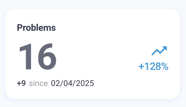
Trend Calculation Example: Metric Card
Current value is 16:
- The change in value is +9
The previous value is then the current value minus the change in value: 16 - 9 = 7 - The data is compared to the previous value dated 02/04/2025
- The trend is +128% and is calculated based on:
- change in value is +9
- previous value is 7
- change in the value of +9 is compared to a previous value of 7, which is +128,571429%. This value is rounded up to +128% that are shown in the trend:

Trend Calculation Example: Percentage Card
The same applies to the Percentage Card and the shown data and trend are as follows:
Current value is 75%:
- The change in value is +25%
The previous value is then the current value minus the change in value: 75% - 25% = 50% - The data is compared to the previous value dated 13/02/2025
- The trend is +50% and is calculated based on:
- change in value is +25%
- previous value is 50%
- change in the value of +25% is half of the previous value which is +50% that are shown in the trend:

Data for the trends:
Trends are shown per user and each user can see a trend based on the relevant for them data, for instance, in the Service Desk → My Work dashboard.
The trends are calculated automatically and the standard period to show the trend is 7 days, although there are other possible variants depending on the available data to trace back as described below.
- No trend is shown: when the trend displaying is disabled in the widget settings (Hide Trend checkbox is enabled) or in cases when it's a new widget and there is no data to track and trace back to show the trend, even though the widget is configured to show trends (i.e. when the Hide Trend property is disabled in the widget settings).
- Show the recently tracked data: e.g. if it's a new widget and the data starts coming in, the trend shows the recent changes and the starting point is the latest saved cached data. The data for showing trends is cached and saved automatically. For example, the new widget was created yesterday, and today there is new data, so the trend will be calculated for the change since yesterday.
- Standard time period: the system checks the data from the last 7 days (today - 7 days) and displays the trends based on this change.
- Older data: if the data for the last 7 days is not available (e.g. an employee was on vacation for 3 weeks and no changes occurred), the system checks if there were earlier records for the current user. The check can go up to 30 days in the past and if there was a record during this time, it's used in trends, and all other earlier records are deleted. Additionally, if no data was found for the last 30 days, the system can keep records that date back up to 60 days ago.
The 30-day value is set in the Clean Up Obsolete Objects Engine Activation in the Cached request history parameter and can be adjusted by the Administrator.
Composition
These charts illustrate the data composition, showing how different parts make up a whole and how they change over time.
Combo Chart
Combo Chart is a chart that combines two or more chart types (e.g., column and line charts) to show different data sets on the same axis. Useful for comparing multiple data trends over the same period.

Stacked Bar Chart
Stacked Bar Chart is a bar chart where each bar is divided into segments representing different sub-categories, stacked on top of each other. Shows the composition of different groups within a total.

Stacked Column Chart
Stacked Column Chart is similar to a Stacked Bar Chart but with vertical columns. Useful to show the contribution of parts to the whole over multiple periods.

Configuration
Stacked Bar Chart and Stacked Column Chart include the same set of configurable properties, the only difference is how the data is displayed on the Widget.
- Record Type: (mandatory): select from the list of the available in the system Configuration Items.
- Filters: optionally, apply the necessary filters to consider only those records that fall under the filtering conditions. Only those records that meet all specified conditions will be shown in the results. You can choose from the list of filers that are available for the selected Dataset (see Advanced mode configuration).
- Grouping Column: select by which column to group the data in the widget (e.g., Submitted on, Created date, etc.).
- Series Column: defines which data should be represented in the chart, each segment of a bar/column represents each of the series
- Configure Timeline: if the defined in the data source data can be organized in chronological sequence, select the checkbox to enable the timeline configuration and set Step and Rolling Period
- Step: choose from the suggested options (1 hour / 1 day / 1 month / 1 year)
- Rolling Period: choose from the suggested options (Last 7 days / Last 2 weeks / Last 4 weeks / Last 12 weeks / Last year)
- Show Legend: disabled by default. Select the checkbox to see the legend for the shown on the chart items, otherwise, it will be visible only if you hover over the chart data segments

Stacked Bar Chart configuration example. - Advanced Mode: click on the toggle button to switch on the advanced properties configuration
- Dataset (mandatory): the Data Query for the selected Record Type. It is set automatically when the Record Type is set and if the Data Query for the set Record Type exists.
- Data List: optional property that is used to drill down the data. It is set automatically if the Record Type is set and Dataset View exists. Choose the Dataset View that should be opened when you click on the Widget title and you'll see a Dataset View with the details on the data records.
- Top: set a number to limit how many records with the highest values should be shown on the widget and retrieved to the legend (if enabled);
- Aggregation Type: Choose how the values will be aggregated across your dataset. Possible values:
- Count (default)
- Sum
- Max
- Min
- Average
For all other aggregation types, except the default Count, choose the Column for Aggregation:
Column for Aggregation suggests suitable columns with numeric data type from the selected Dataset (Data Query).
- Configure Axis Title: select the checkbox to enable the configuration and set Titles for X and Y Axis:
- X-Axis Title: set the title for the horizontally displayed values
- Y-Axis Title: set the title for the vertically displayed values
- Interactive filters configuration is described below.
Distribution
These charts display the distribution and spread of data, showing the range, outliers, and patterns within datasets.
Percentage by Category
- Percentage by Category: displays the percentage of a total for different categories. Useful when comparing proportions across multiple groups.

Area Chart
Area Chart is a line chart where the area under the line is filled with color to represent volume. Ideal for showing cumulative trends over time:

Line Chart
Line Chart uses points connected by lines to show trends over time:

Area & Line Charts Configuration
Area Chart and Line Chart include the same set of configurable properties, the only difference is how the data is displayed on the Widget.
- Record Type: (mandatory): select from the list of the available in the system Configuration Items.
- Filters: optionally, apply the necessary filters to consider only those records that fall under the filtering conditions. Only those records that meet all specified conditions will be shown in the results. You can choose from the list of filers that are available for the selected Dataset (see Advanced mode configuration).
- Grouping Column: select by which column to group the data in the widget (e.g., Submitted on, Created date, etc.).
- Series Column: defines which data should be represented in the chart, each line/area represents each of the series
- Configure Timeline: if the defined in the data source data can be organized in chronological sequence, select the checkbox to enable the timeline configuration and set Step and Rolling Period
- Step: choose from the suggested options (1 hour / 1 day / 1 month / 1 year)
- Rolling Period: choose from the suggested options (Last 7 days / Last 2 weeks / Last 4 weeks / Last 12 weeks / Last year)
- Show Legend: disabled by default. Select the checkbox to see the legend for the shown on the chart items, otherwise, it will be visible only if you hover over the chart data items.
- Advanced Mode: click on the toggle button to switch on the advanced properties configuration
- Dataset (mandatory): the Data Query for the selected Record Type. It is set automatically when the Record Type is set and if the Data Query for the set Record Type exists.
- Data List: optional property that is used to drill down the data. It is set automatically if the Record Type is set and Dataset View exists. Choose the Dataset View that should be opened when you click on the Widget title and you'll see a Dataset View with the details on the data records.
- Top: set a number to limit how many records with the highest values should be shown on the widget and retrieved to the legend (if enabled);
- Aggregation Type: Choose how the values will be aggregated across your dataset. Possible values:
- Count (default)
- Sum
- Max
- Min
- Average
For all other aggregation types, except the default Count, choose the Column for Aggregation:
Column for Aggregation suggests suitable columns with numeric data type from the selected Dataset (Data Query).
- Configure Axis Title: select the checkbox to enable the configuration and set Titles for X and Y Axis:
- X-Axis Title: set the title for the horizontally displayed values
- Y-Axis Title: set the title for the vertically displayed values
Area Chart: Axis Title configuration example
- Interactive filters configuration is described below.
Interactive filters
Starting with ESMP v.12.1.1, all widgets from all categories except the miscellaneous have configurable interactive filters.
Interactive filters define which data should be available for filtering, which will be shown in the filters panel.
The configuration is available in the widget edit mode and is located at the bottom of the configurable properties:
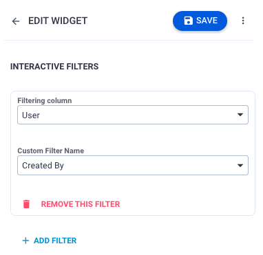
- Filtering column: suggests the lists of the columns from the Data Query specified for the edited widget in the Dataset field. This property within a widget's settings allows you to specify which column from the Data Query will be used to match the data entered in the search filter panel. This feature enables users to search within a particular column of the dataset associated with the widget. By configuring this property, you can ensure that user inputs in the search filter panel are matched against the designated column in your Data Query.
- Custom Filter Name: suggests the values from the
PDRReportsFilterOptinPickuppickup. Select the value that will be common for other widgets that have interactive filters configured to match this Custom Filter Name, i.e. the Custom Filter Name will be shown in the filter panel and when you filter data by this criteria this filter will be applied to all widgets that have configured interactive filters for the same Custom Filter Name.
Whenever the value you need is not present in the list, you can extend it by adding a new value to the Data section of thePDRReportsFilterOptinPickupin the Administration application → Schema → Data Definition. See also, Pickup Data Definition.
The example for such a configuration that creates a common interactive filter "Created Date" for different widgets of the same dashboard or report might look as follows:
Widget Name
(any name that is specified in the widget title field)
Dataset
(also called Data Query, which is specified in the widget configuration)
Filtering Column
(actual column name from the specified in the Dataset)
Custom Filter Name
(common filter name that is shown in the filter side panel and applied to all other widgets that have matching configured for this Custom Filter Names)
As a rule, different widgets of one dashboard or report are based on the same Dataset (DataQuery). The configuration might be as follows: 1 My open activities by status Backlog Items Created Created Date 2 My open activities by category Backlog Items Created Created Date 3 My overdue activities Backlog Items Created Created Date Additionally, the interactive filters can be also used when on the same dashboard you have different widgets that use different Data Queries, and the same type of data is called differently in the columns of these Data Queries. For example, you want to filter the results shown on the widgets by a specified period, but in the source data, the column names are Datetime, Created, Timestamp, etc. Thus, by creating the matching with the interactive filters you can search through various data via a single filter panel. The configuration might be as follows: 4 My activities close to escalation Backlog_ResponseTime30days DateTime Created Date 5 My activities close to escalation Backlog_CriticalTicketsCloseToEscalation Timestamp Created Date - Remove this filter: click to delete this filter from the widget configuration.
- Add filter: click to add and configure another interactive filter. The widget can have as many filters as you need.
Save the changes in the widget and click Done Editing to see them on the dashboard.
The interactive filter is added to the filters side panel of the current dashboard page:

The filter is applied to all widgets that have this interactive filter configured when searching by specified filter criteria

The keywords filter is always available in the filter panel by default.
Additionally, all widgets to which the specified filtering criteria are applied, are marked with a filter icon  in the bottom left corner of the widget.
Miscellaneous
These widgets offer additional functionalities and display options that don't fit into the other categories.
Embedded Web Page
The widget shows a live webpage integrated into a dashboard widget:

Configuration:
- Title: provide a title that will be shown on the widget
- Widget type: choose Embedded Web Page
- External URL: enter the complete URL address to the page you want to display starting with
https://.
The embedded page is interactive, you can scroll through it or, for instance, if it's a link to the video you can play it directly from the widget.
Quick Link Panel
A panel where you can configure links for quick access to other navigation items, actions of the current application, or access to specified external links.
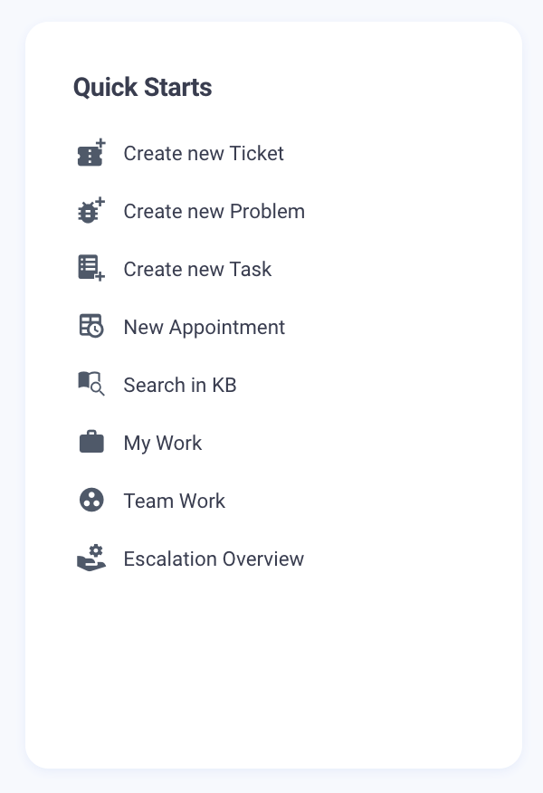
Configuration:
- Title: provide a title that will be shown on the widget
- Widget type: choose Quick Link Panel
- Configure suggested options:
- Label: textual element or a name of the added quick link
- Icon: visual element used for the quick link. Choose an icon from the suggested library
- Type:
- Go to Navigation Item: specify the Navigation Item suggested from the list and optionally apply Filter to choose from which Data Query the data should be displayed.
- Open Dialog: specify the Entity Type from the suggested list to open the necessary Dialog Layout.
- Run Action: choose the Action that this quick link should run.
- Show Dataset: Select the Dataset View available in the system and optionally apply a Filter to select which Data Query the data should be displayed from.
- Open External URL: specify the URL that should be opened.
- Remove This Link: deletes the link from the widget.
- Add New Link: add and configure as many Quick Links as necessary

Rich Text
Text with formatting options such as bold, italic, links, and images.

Configuration:
- Title: provide a title that will be shown on the widget
- Widget type: choose Rich Text
- Text: edit content in the Text area. Adjust the font size, color, create lists, tables, add media, links, change the content alignment, inline style (bold, italic, underline, strikethrough, superscript, subscript, code), add headings or blocks.

Announcements
Shows a carousel with all available in the system announcements:

Configuration:
- Title: provide a title that will be shown on the widget
- Widget type: choose Announcements type. All the Announcements from the system will be shown in this widget.
