Wizard
Overview
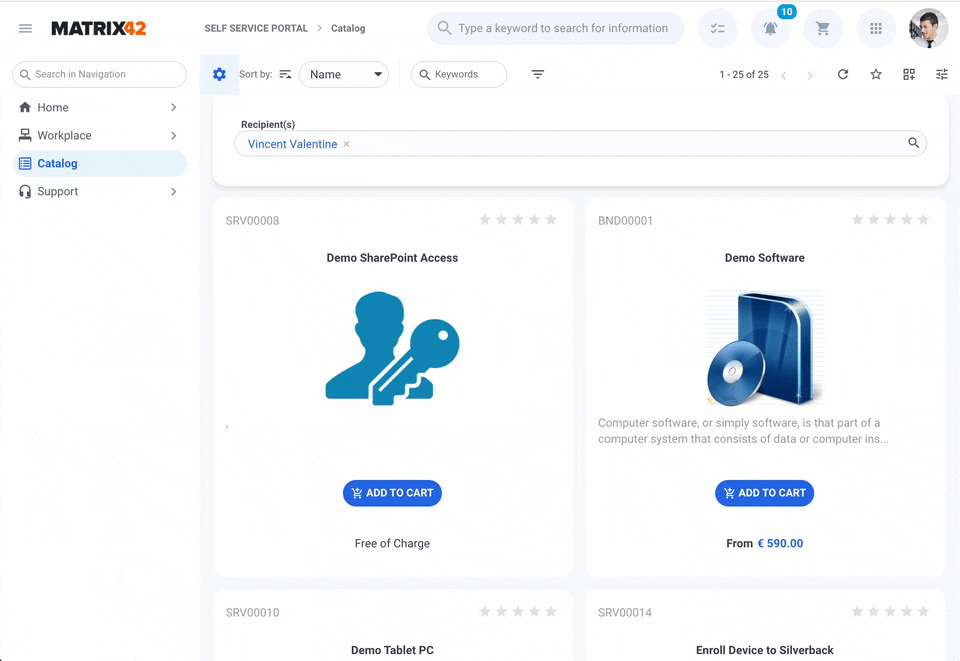
A wizard is a user interface feature that guides users through a complex task by breaking it down into a sequence of simple, easy-to-follow steps. Each step appears on its own screen, and the user is guided through them one at a time with Next, Back, and Finish buttons. Wizards are handy for tasks that require specific input in a particular order, for instance, the Add to Cart Wizard:
As a rule, the Wizard is assigned to and opened via an Action.
Creating a Wizard
General
To create a Wizard, open the Administration application → User Interface → Layouts → Wizards → click Add Wizard action:

Fill out the following fields:
- Name: internal name of the Wizard
- Description: optional short description of the purpose of the Wizard
- Implementation: defines the Data Model that will be suggested when configuring the layout in the Layout Designer. Choose one of the possible implementation types
-
Setup Wizard Operation: select the Service Operation. The Service Operation will be run when all the steps of the Wizard are successfully completed, and the Wizard is finished.
-
Setup Wizard Workflow: select the Workflow to run. The Data Model in the Layout Designer suggests arguments of the selected Workflow. The specified Workflows will be run when all the steps of the Wizard are completed, and the Wizard is successfully finished.
-
Setup data definition: select the Data Definition. In this case, a Wizard is similar to the Dialog layout, but unlike the one-page Dialog, such Wizard can be split into several steps or adding data with Wizard from a Multi Fragment Grid, for instance, the Compliance Rules:

When all the steps of the Wizard are completed and the Wizard is successfully finished, the data specified in the Wizard is saved to the corresponding attributes of the selected Data Definition. -
No operation: is used when there is no need to create several consecutive steps, but the page should show some information and provide some actions. It does not have a Finish button, but only Close button, and other buttons can be added on the canvas of the layout, for instance:
-
Download Recorded Changes Wizard on the Home page of the Administration application doesn't include any steps. It's just a single page with a list of changes made in the system and a Download button.

-
Uninstall Configuration Package Wizard consists of one step with Start Uninstallation button.
The Data Model in the Layout Designer for such a layout is empty, but can be defined through Add Source action.
-
-
-
Help Configuration: optionally, configure the help. Choose one of the suggested options:
-
None (default): the help icon is not suggested in the Wizard
-
Knowledge Base Article: select this option and choose from the available Knowledge Base articles in the system. A help icon appears in the Wizard and opens the selected Knowledge Base article in the help window, as shown in the example below.
-
External URL: specify the full URL. A help icon appears in the Wizard and opens the specified URL in a new browser tab.
-

Wizard Help Configuration: open Knowledge Base Article example
Click Save & Close to open the Layout Designer and proceed with configuring the Layout.
Layout
Design the look and feel of the new Wizard in the Layout Designer that appears once you provide all the required data and click Save & Close in the New Wizard creation dialog.
By default, the canvas of the Layout suggests two pages, where each page is a step of the Wizard, and the title on the page is used as the name of the next step button, for instance:

The Data Model section contains the data from the specified implementation type. For example, Data Definitions have Attributes and Relations assigned to them. Drag and drop these Attributes and Relations onto the canvas to create the layout of the wizard. These Attributes and Relations are the fields and other control descriptors that the user will see in the layout you are designing. Once you drag and drop an Attribute or Relation onto the canvas, select the type of control from the list of available options that appears. The new entity will be added to the canvas. You can now set properties for the newly added Attribute or Relation in the Properties view of the right-hand panel that appears.
You can also click the +ADD SOURCE button at the very bottom of the right-hand panel in the Data Model view and create a new Configuration Source from a Service Operation, Entity, Data Definition, or Data Query. Once you add a Configuration Source by filling out and saving the Add New Source dialog, you can use the data from the new source in the layout you are building. You can add the entities from the new configuration source to the canvas, likewise, by means of simple drag-and-drop.
You can also open the Toolbox by clicking the Toolbox (Wrench) icon in the right-hand panel of the Layout Designer, locate the controls you need under the available categories - Literals, Controls, Layout, Image Controls, Grid Controls, and Charts - and then drag-and-drop the selected entities onto the canvas, into the desired location.
The following non-visual controls are designed to be used only in the Wizard Layout:
- Wizard Manager: a control that provides various functionality for influencing the Wizard's behavior, appearance, or even actions the System needs to undertake when the Wizard is submitted.
- Validate Wizard: validates the entire Wizard
- Validate Wizard Page: validates a certain page or step of the Wizard
- Extra Wizard: allows opening another Wizard after completing the current one
Edit Wizard: Views
Configured pages or steps of the Wizard are listed in the Views tab when you edit the Wizard. For that, in the Administration application → User Interface → Layouts → Wizards → search for the necessary Wizard → click on the Wizard and run the Edit action.
In the Views section, you can find the following information:
- Title: the name of the step of the Wizard
- System: technical information that shows whether it is a system view
- enabled: marks the view as standard and provided in the system by default
- disabled: the view is not a part of the default product version and was created manually
- Position: denotes the order in which the views appear in the Wizard
- Published: denotes whether the view has a customization and is published
- enabled: the view is published for all users of the system
- disabled: the view is only a personalization and is visible only to the specified Owner

Edit Wizard: a list of Views or steps on the Wizard
Click on the view if you need to change the page title, technical name, header, description, or position:

Edit Wizard: edit View example
Links
Create Wizard example Car Tracking 3: Car Action "Track on Map"