Data Query
Overview
This feature is one of the most fundamental and important in Solution Builder. Data Query is a transitional level that takes data from various Data Sources and shows it in a unified user-friendly format. The data is represented in classical table format; each column can be configured in different ways depending on the source and target. The article below describes how Data Queries can be configured and used in different Modules of the Enterprise Service Management Platform.
Creating and Editing a Data Query
Log in to the Enterprise Service Management Platform with Administrator user and open the Administration application. To create a new Data Query, select the Navigation Item "Data Queries" and run Add Data Query action. Fill out the data as described below.
General Information
Certain general information, such as Name, Description, and Default can be set in this section.
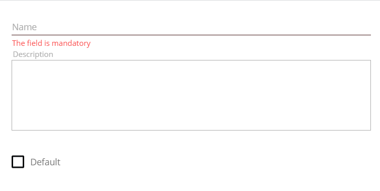
- Name: Name of Data Query should be unique. It is system information.
- Description: The purpose of Data Query should be described here.
- Default: For the same data source, for example, Data Definition, a user can create several Data Queries that can be used directly in different modules of the application. In this case, the name of the Data Query is referenced. But there are also cases, for example, if we use the Data Query in Layout Designer in Object Picker, when only a Data Definition is set, but the system uses corresponding Data Query. In this special case, the Data Query with "Default" = True is used by default.
There can only be one Data Query with "Default" = True for the same Data Definition. This option is always checked for the first Data Query created for the Data Definition. If the user sets "Default" = True for the next one, then this option will be automatically unchecked for the previous default Data Query for the corresponding Data Definition.
Data Source
A user can choose one of the three options for the data source to be used in the Data Query. Depending on the chosen data source, the corresponding sub-form for filling in necessary objects will be shown:

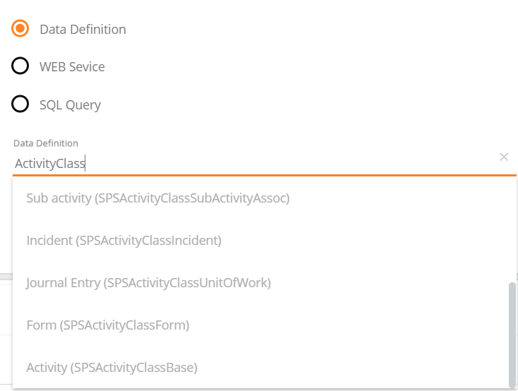
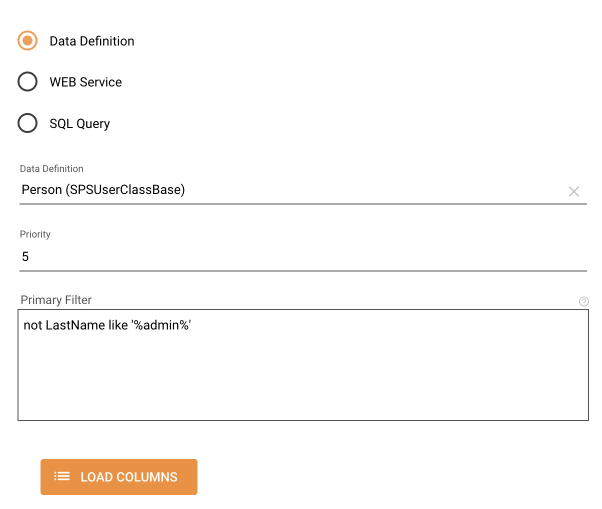
Option 1: Data Definition
Data Definition can be selected using Schema Picker. All Data Definitions are available for selection. See example of using this type of Data Source.
- Priority (since v12.0.1): a numeric value defines which Data Query will be displayed to the user if the Data Query is not explicitly defined, for instance, in the Object Picker control Data Query to Display property, Objects Picker control, or Object Link control. By default is 0.
If there are several Data Queries based on the same Data Definition, the Data Query with the highest priority is displayed. The higher the number, the higher the priority.
Other properties that define which Data Query is displayed to the specific user of the system:- Default: the highest priority has a Data Query that is marked as default. If the audience settings are restricted and the default Data Query cannot be shown, the priority is checked.
- Priority: the Data Query with the highest priority will be displayed to the user.
- Display Name: if all Data Queries for the Data Definition have a restricted audience and the user is not allowed to see any of these Data Queries (both Default or checked by Priority), the Display Name of the Data Definition is shown to the user instead.
- Primary Filter (since v12.0.1): an optional condition that is applied to the Data Definition and thus allows showing to the users only those entries that correspond to the specified filter. An ASQL filter that will be applied with the "AND" operator to all the data requests relying on this Data Query.
The following system Data Queries have a default Primary Filter:
- Announcements_Portal: shows active announcements that are relevant for the current user based on the user's Organizational Unit or Role.
- Changes_Portal: shows Change Requests that are relevant for the current user where he/she is the initiator or is in attached users of the Change Request.
- Changes_Portal_Approvals: shows pending or processing Change Approvals where the current user is the responsible user or member of the responsible role.
- Changes_Portal_Overview: shows Change Requests that are relevant for the current user where he/she is the initiator or is in attached users of the Change Request and a decider or delegated user of the Cost Center.
- Changes_Portal_MyChangeRequests: shows Change Requests for the current user where he/she is the initiator or is in attached users of the Change Request, is responsible, or is in the responsible role.
- Tickets: shows Tickets, Incidents, and Service Requests for the current user where he/she is the initiator or is in attached users.
- Portal My Hardware: shows Hardware that belongs to the current user.
For more details, see also Data Query Primary Filter Configuration Example page.
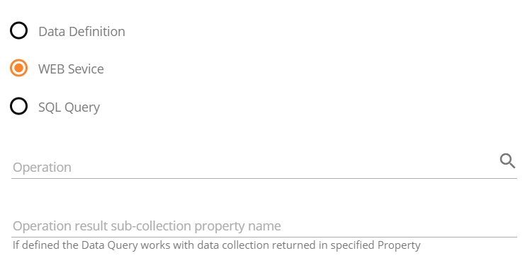
Option 2: Web Service
DataQuery can be based on the Web Service Method, which returns an array of Objects and supports OData interface for filtering data. See example.
Option 3: SQL Query
In case the "Data Definition" option does not cover the use case, the user can access data in the database directly using an SQL Query.
- SQL Query: valid SQL query should be set here. Users can validate the query using the "LOAD COLUMNS" Button, which will also generate the columns in the section below.
- Allow Cache: if checked the results of the query will be cached on the server. Users can also define how long it will be cached in the field "Cache Interval".
- Culture Sensitive: if checked then cache will be deleted after changing the culture.
- Cache Interval: how long the query result is cached on the server.
- Such parameters are available in SQL Query:
- @LCID_long - Long language code for the current user session. Ex. 1031
- @LCID_short - Short language code for the current user session. Ex. 9
- @CurrentUserId: SPSUserClassBase.ID of current user
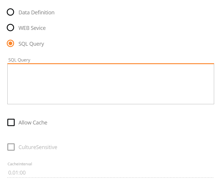
See example.
Columns
Columns can be added manually or generated using the button "LOAD COLUMNS". The second way is easier, for each attribute/field/property returned from the Data Source, one column will be generated. It makes sense first to generate columns using the button and then edit the generated columns, delete the columns that will not be used and add a new one if something special is needed.

The Edit dialog of the Column contains 3 sections.
Data
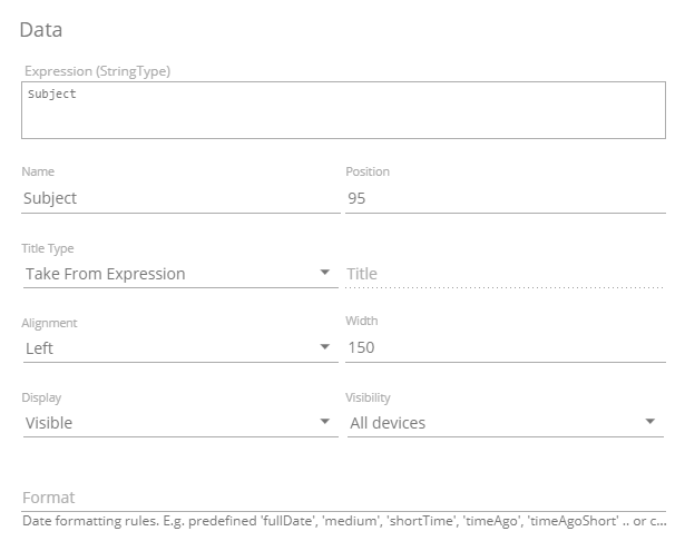
Expression |
The field contains the expression that defines the data taken from Data Source. The way to set the expression depends on the Data Source: If the Data Source is Data Definition then ASQL expression should be used. In this case, the title "Expression [(...)]" contains a hint, for example "Expression (Subject)" or "Expression (Pickup)". Example of simple Expressions: "Expression (StringType)" = Subject. If the Data Source is WEB Service then Java Script expression should be set using contract from the service operation. You can see the contract details when you click on the service operation in Data Query. If the Data Source is SQL Query then the only way to create the column is to use the LOAD COLUMNS button. Expression cannot be changed. All complex logic should be implemented at the level SQL Query. |
||||||||||||||||||||||||||||||||||
|---|---|---|---|---|---|---|---|---|---|---|---|---|---|---|---|---|---|---|---|---|---|---|---|---|---|---|---|---|---|---|---|---|---|---|---|
Name |
Technical name of the column. The name should be unique inside of the Data Query. | ||||||||||||||||||||||||||||||||||
Position |
Defines the order of columns in the Grid, based on the the the Data Query. | ||||||||||||||||||||||||||||||||||
Title Type |
Specifies the source of the column Title.
|
||||||||||||||||||||||||||||||||||
Title |
title of the column in visualizations of the Data Query, for example, in the grid. It is set depending on option "Title Type", see above. | ||||||||||||||||||||||||||||||||||
Alignment |
self-explanatory | ||||||||||||||||||||||||||||||||||
Width |
in visualizations of the Data Query, for example, in the grid, in px. | ||||||||||||||||||||||||||||||||||
Display |
The property specifies the way the column be displayed in Grid
|
||||||||||||||||||||||||||||||||||
Visibility |
Allows automatically show/hide the column depending on the kind of the client device, where the Grid is displayed. |
||||||||||||||||||||||||||||||||||
Format |
The Format property setups custom format for the data. Can be applied to data of types DateTime, Double, Float,.
|
Search & Sorting
The Search and sorting options are configured differently for different Data Sources. For Data Definition and WEB Service Data Sources, there are more possibilities. For SQL Query Data Source, the complex logic should be implemented at the level of the SQL Query.
For Data Definition and WEB Service Data Sources
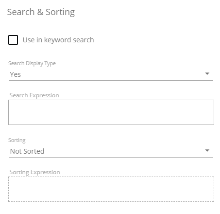
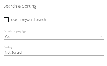
- Use in Keyword search: if checked then this column will be used in the keyword search, if not the only advanced search is possible. Involving of too many columns in keyword search can cause the slower work of the search, so this field should be used carefully.
If Data Query has no column explicitly marked as "Use In Keyword Search", then the System considers the Data Query as misconfigured, and automatically picks the Column for Keyword search - Search Display Type: "Yes" - the column is available in advanced search, "No" - the column is not available in advanced search.
- Automatically defined: the condition for the column will be automatically present for the newly created filter, run a standard advanced search.
- Search Expression: expression defining the value to be used in the search. This field should be set similarly to the "Expression" in the Data section of the column depending on Data Source (Data Definition or WEB Operation).
- Sorting: the options below are self-explanatory.

- Sorting Expression: expression defining the value to be used in sorting. This field should be set similarly to the "Expression" in the Data section of the column depending on Data Source (Data Definition or WEB Operation).
For SQL Query Data Source, the corresponding sub-form is more primitive. The fields are filled as described for the previous case.
Graphics
The formatting of the columns in the grid is configured here. There is a possibility to create conditional formatting and add images. See also examples of the possible configuration of the format in the grid.
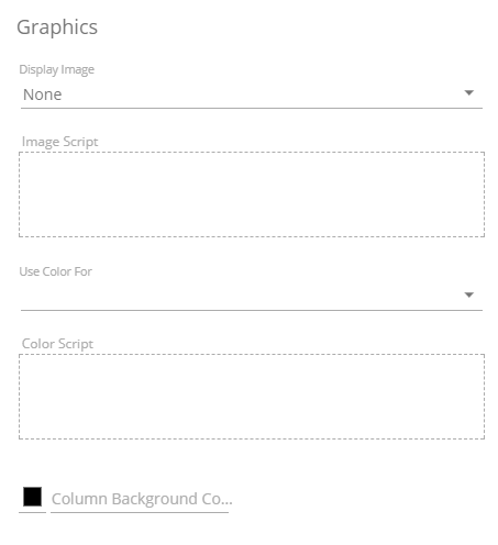
Configuration of image
- Display Image: it is possible to show in the column instead of the usual text the
"Image": 
or "Image together with the Text":  .
.

- Image Script: Javascript expression that returns the reference to the image. An image can be represented by the name of the available SVG icon, or just a relative or full URL to the image. You can operate with two variables in Script to specify the logic, $item - represents the whole data in grid row, and $value - value of the column where the Image script is defined. See the Graphics Configuration section of this page for more information.
All the available images are here https://material.io/icons/
Configuration of colors
- Use Color For:
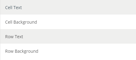
- Color Script: Javascript expression that configures the color of the Cell Text / Cell Background / Row Text / Row Background. The expression can return either the code of the color, e.g. #FF0000, or the whole definition of the CSS style, like 'font-weight:bold'. As well as for the Image Script, it is possible to use variables $item and $value to specify the logic.
See the examples for more information depending on the value set in "Use Color For". If several options Cell Text / Cell Background / Row Text / Row Background needed, use trick with invisible column.
- Column Background Color: is selected from the color picker. It has a higher priority than the color configuration above.
After the new Data Query is created you can specify users and user groups that are eligible to access the data of the Data Query with the Set Audience action. For more information, see also How to Set Audience in SolutionBuilder.
By default, access to the newly created Data Query is restricted. Only Administrators can access the data retrieved by the Data Query. Use the Set Audience action to modify the access.
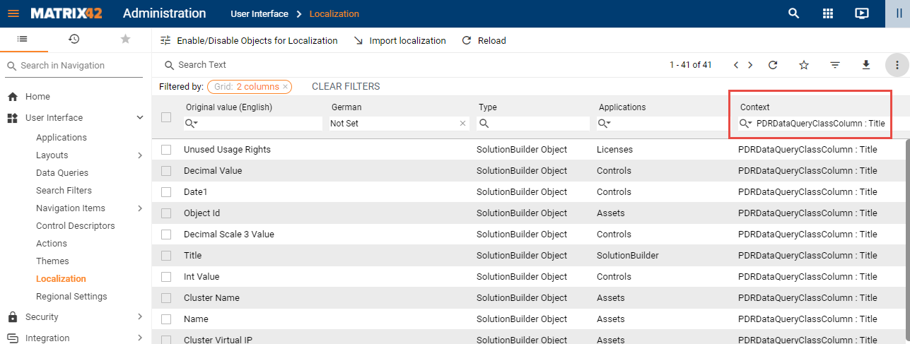
Localization
The Data Query dialog does not support the localization of the Columns in the "Localization Mode". The localizing of the Columns can be fulfilled in the "Administration / User Interface / Localization" area. To show only the Data Query Columns in the grid, filter the Localization string Context to "PDRDataQueryClassColumn : Title"
Data Query Settings
1. Data Query Response Records Count
The setting PDRDwpConfigurationClass.DataQueryMaxResponseRecords defines the maximum number of records returned by the "Data Query" Web Service.
Default Value: 10,000 records.
2. SQL Data Query Timeout
The setting PDRDwpConfigurationClass.SQLDataQueryTimeoutSeconds specifies the maximum time (in seconds) allocated for executing a SQL-based Data Query.
Default Value: 60 seconds.
If the Data Query utilizes the "Allow Cache" option, the timeout is doubled (default: 2 minutes).
Examples
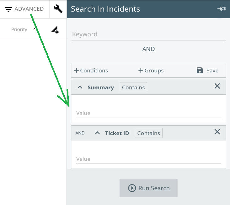
Data Definition >> Data Query >> Dataset View >> Navigation Item + Grid + Search Filters
This is the most common scenario in the Workspace Management Navigation Item creation. See for example the Changes Navigation Item. It is created on the basis of the Change Request Dataset view. It uses the Changes Data Query and represents data from the SPSActivityClassBase Data Definition. A user can create his/her own Navigation Item using this example.
The general information about Data Source option "Data Definition" is here.
WEB Service Data source
See Data Query "Portal Orders" as a nice example of the WEB Service Data Source.
The general information about the Data Source option "WEB Service" is here.
SQL Query Data Source
See, for example, Data Query "Top 10 Most Consumed Services". It uses the following SQL Query:
SELECT TOP 10
serv.ArticleID + ' - ' + serv.Name AS ServiceName,
Count(serv.ArticleID) AS Bookings_Count,
serv.[Expression-ObjectID] as ObjectId,
sot.Name as EntityType
FROM SVCServiceBookingClassBase ibook
INNER JOIN SPSArticleClassBase serv ON serv.ID = ibook.Service
INNER JOIN SPSCommonClassBase com ON com.[Expression-ObjectID] = serv.[Expression-ObjectID]
JOIN dbo.SchemaObjectType sot ON com.TypeID = sot.ID
WHERE ibook.OrderType = 10 AND ibook.ProvisioningStatus = 1 AND NOT EXISTS (SELECT * FROM SVCServiceBookingClassBase ubook WHERE ubook.OrderType = 20 AND ubook.ProvisioningStatus = 1 AND ubook.InstallationBooking = ibook.ID)

GROUP BY serv.ArticleID, serv.Name, serv.[Expression-ObjectID], sot.Name
ORDER BY Bookings_Count DESC
This Data Query is used for the following chart on the Service Catalog Landing Page:
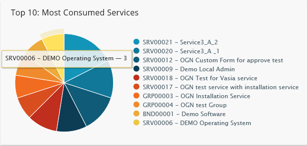
For such complicated constructions, it is logical to use an SQL Query Data Source.
General information about the Data Source option "SQL Query" is here.
Graphics Configuration
See the following screenshot showing how to configure formatting in a Data Query for a grid.
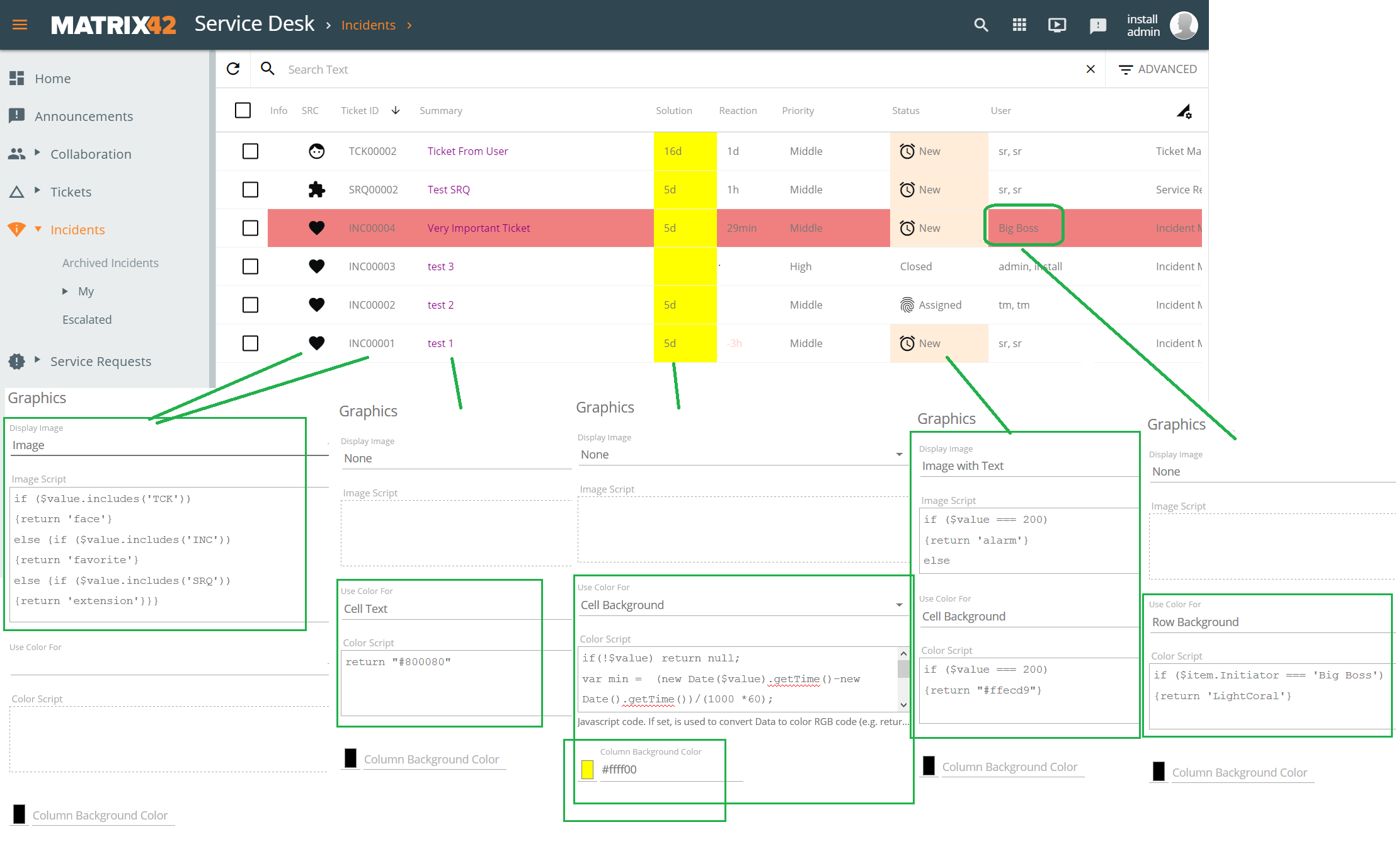
The trick with invisible Column
An attentive user can notice that the options Row Text, Row Background, Cell Text, Cell Background, and Column Background Color cannot be used at the same time. There is a workaround for this case. A user should create one (or two) more columns with the same Expression, make it invisible and configure the "Row" logic in it.
General information about Graphics configuration is here.
Actions
The following actions are available from the Data Query preview page:
- Edit: opens the Data Query edit dialog;
- Copy: creates a copy of the Data Query. Modify the suggested name and click the Copy button.
- Set Audience: allows users with appropriate rights to restrict access to the Data Query. Only the selected User Roles, Users, Organizational Units, and/or Locations will be granted access. By default, access to the newly created Data Query is restricted. Only Administrators can access the data retrieved by the Data Query. Use the Set Audience action to modify the access. For more information, see How to Set Audience in SolutionBuilder page.
- Delete: deletes the Data Query;
- History: shows the history of all the related transactions. You can filter the transactions by date, attribute, user, and/or transaction type. See also, History Wizard page.
- Export: exports the Data Query data into a file. See also, Export Data page.