Assign Button Control
Overview
The Assign Button control is a visual control that can be added to the layout page and shown under certain conditions, independently of the standard buttons like Close, Save & Close, etc.
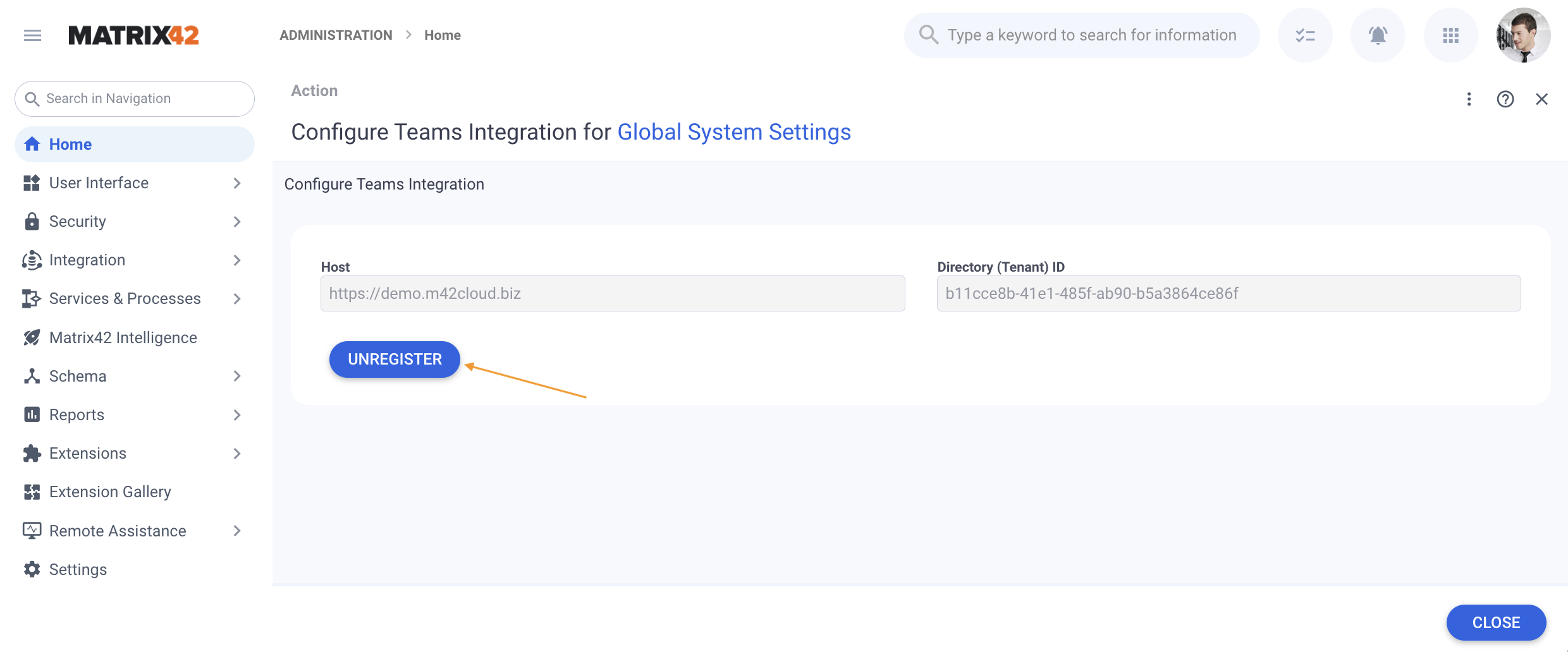
Assign Button display example in the Administration application → Settings → Configure Teams Integration action
For similar controls with an assign button configuration but for different use cases, see also Non Visual Controls: Message and Literals: Quick Link.
Supported Layout types
By default, the Assign Button Control is available for the following types of Layouts:
- Dialog
- Wizard
Assign Button Configuration
To configure the Assign Button in the Layout Designer, open the necessary layout in the Layout Designer, and in the Toolbox search for the Assign Button control. Drag & drop the control on the canvas of the edited layout and proceed with configuring the following fields:
Common
- Model: assign the destination or the field from the Data Model in which the Assign To value will be assigned
- Assign To: assign the source or the field from the Data Model that will be assigned to the Model field

Configuration example from the Licenses application → Purchased Licenses → Add New License Dialog - Disabled: defines the conditions under which the assign button is active (default value) and can be clicked or is disabled.
- Static value: check-box options
- disabled (false): the control is active and can be clicked or modified
- selected (true): the control is available in read-only mode
- Model: suggests boolean data type options from the data model (true/false values).
- Static value: check-box options
- Caption: text shown on the Assign Button. Possible data sources:
- Model: displayed data is retrieved from a specified data model field
- Localizable: plain text specified for each available in the system locale
- Static Value: manually entered text
- Control style: input field for redefining standard CSS styles for the control
- Help: help icon and tooltip for information displaying as:
- Not set (default): help icon is not displayed
- Model: displayed data is retrieved from a specified data model field
- Localizable: plain text specified for each available in the system locale. Shows appropriate localized help message according to the currently selected by the user language profile settings
- Static Value: manually entered text displayed in a pop-up window. The text of the prompted message is edited in a standard text editor and can include plain text, headings, links, and lists
- Name*: technical name of the control descriptor added to the layout
Appearance
- Visibility: defines the conditions when the control is displayed on the layout. Possible configuration options:
-
Static value: check-box options
- selected (True): displaying on the page layout template is enabled
- disabled (False): the control is not shown on the page layout template
- Model: select the source of the data model
-
- Margin: set property creates additional blank space outside of the borders of the element containing the control. Set control's margin offset in CSS format: '10px', '1rem', '1rem 2rem' (top-bottom, right-left) or '1px 2px 3px 4px' (top, right, bottom, left).
- Padding: the property is used to generate additional blank space around the control's content, inside of the borders of the element containing the control. Set control's padding in CSS format: '10px', '1rem', '1rem 2rem' (top-bottom, right-left) or '1px 2px 3px 4px' (top, right, bottom, left).
- Flex option: intended to adjust the width of the control automatically. Possible options:
- Fixed (default): control's width is static
- Flex: control's container width is responsive and adjusts automatically according to the user device's screen resolution
Device Visibility
This property allows improving user experience by managing device visibility options. For instance, the control can be hidden from the preview when it is too large and cannot fit the small screen of a mobile device.
The application checks the user device's screen resolution and displays or hides the control preview based on the selected checkbox options for Desktop, Tablet, and Mobile devices.
By default, the control is shown on all types of devices.