Search in UUX
Overview
This page describes the provided by default search options of the Matrix42 platform and outlines their configuration.
Global Search
The Global Search is placed in the easy-to-reach header part of the website, next to the application's icon:
Classic look
![]()
New look

The New look design allows for the integration of the Hamlet AI Search Engine to enable AI-powered search.

The Global Search is an application-specific keyword search performed among all the objects from all the selected areas. If none of the areas is selected, the search is conducted in all existing contexts.
Depending on the Application configuration, Global Search can be replaced with the Unified Search Experience.
Global Search allows performing search in all areas of the application, thus it's available from the homepage of the application:
Classic look
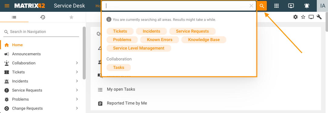
New look

To improve performance, the All option in Global Search is shown only if the Administrator enabled it in the Frontend Settings configuration of the Global System Settings, otherwise, only some search areas are preselected by default and can be redefined by the user in the Global Search every time the search is performed. See also, Hide "All" option from Global Search Contexts (New Look Only) property configuration in the Frontend Settings.
Self Service Portal has the following pre-defined search areas when the Hide "All" option from Global Search Contexts (New Look Only) property is enabled:
New Look with Hamlet AI
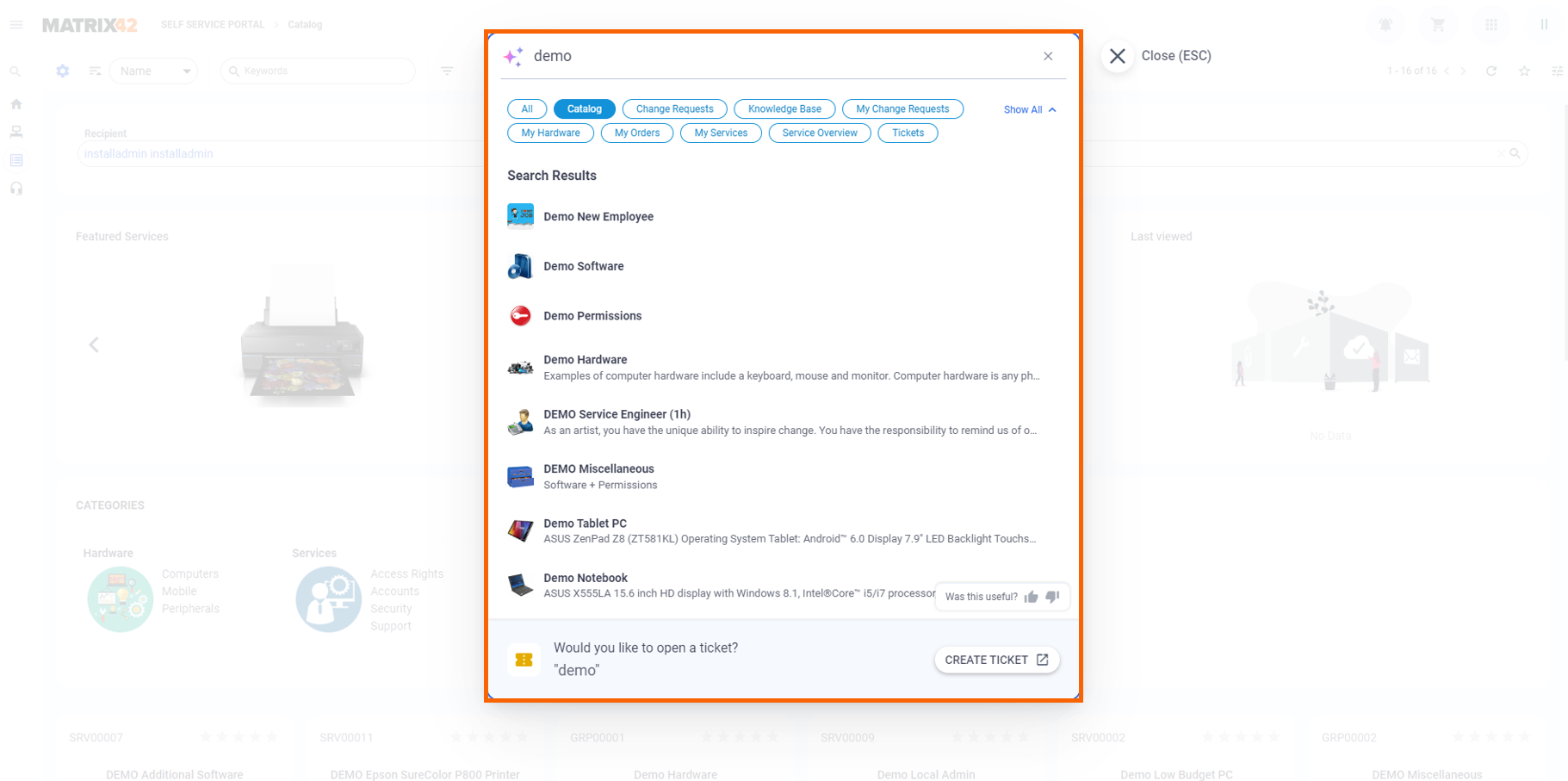
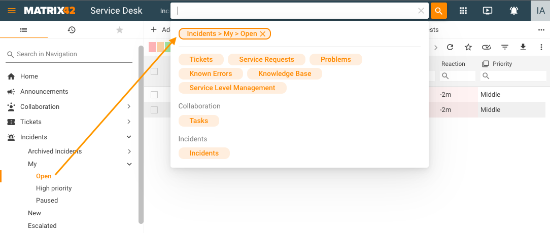
The Search area is pre-selected if the search is run on a corresponding page, for instance, when the search bar is opened on Incidents → My → Open this area is selected as a filter by default:
To run the Global Search, clear the search filters and enter at least 3 characters in the search field:
Classic look
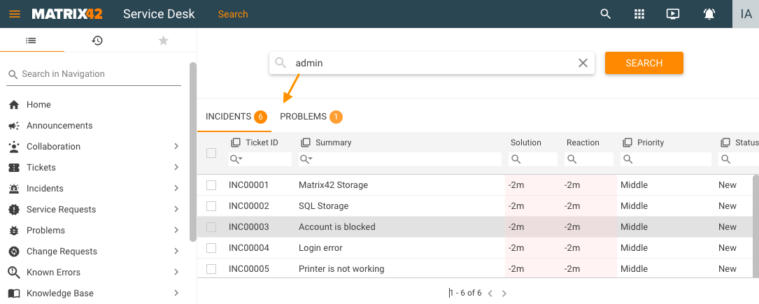
New look

If available, the search results are grouped by the areas that have relevant results.
The search is case-insensitive.
To run filtered search, enter the keywords, choose the necessary search areas and click Search:
Classic look -
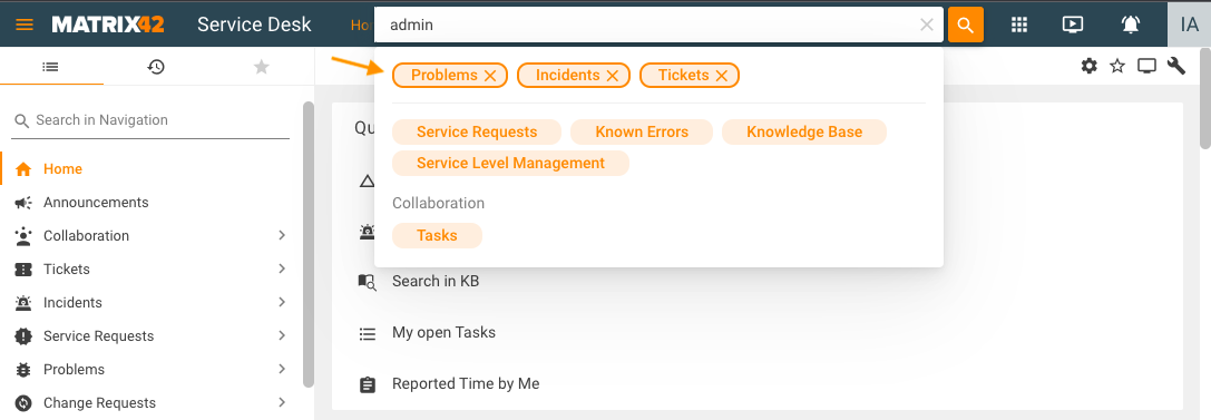
New look -

Selected areas are shown in the search filters and results show only those areas that have relevant results:
Classic look -
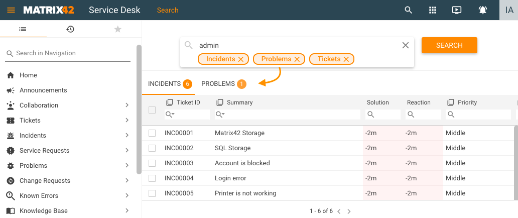
New Look -

Global Search Settings
Each of the global search areas is a navigation item that is present in the current application and appropriately configured. To change the search areas to the Global Search edit the Present in Global Search Context List property of the corresponding Navigation Item.
Search Text
The Search Text field is available in the Dataset View and Grids. This field and is located at the top of the grid:

This field searches for results in all columns of the grid that are included in the keyword search.
Search Text Settings
To change the settings edit the Use in keyword search property of the Data Query that is used by your Dataset View or Grid:
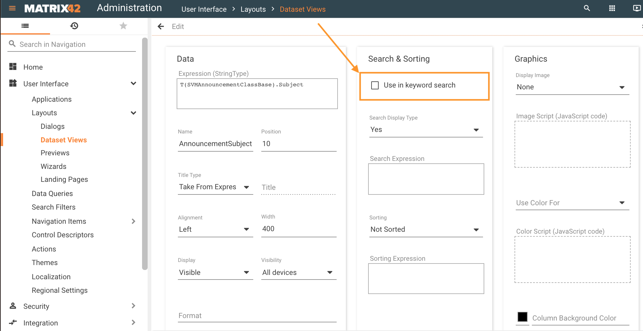
If, however, the Use in keyword search checkbox is cleared for all the Columns that are part of the Data Query, the keyword search is conducted in all Columns of the Data Query that have a string data type.
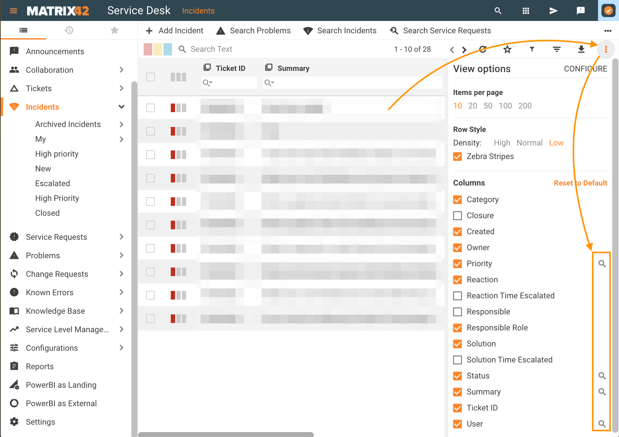
The columns that are used in keyword search are marked with the  lookup icon. Open the grid → click
  settings icon → see Columns section:
Column Search
The Column Search is available in the Dataset View and Grids.
By default, the column search field is hidden. Click on the column name and select the Filter by column... option to show the column search:

The column search will be displayed as follows:

The Administrator can define if the column search field is hidden or always shown by changing the Expand Column Search By Default (New Look) checkbox in the Frontend Settings configuration of the Global System Settings.
- Filter: to filter the grid by column, type a keyword into the column-specific search field to view only matching results in the grid. The filtered column is added to the Filtered by area on top of the grid and the grid includes only those results that match all criteria enumerated in the Filtered by area of the grid.
- Sorting: click a field name in the grid to filter it by column:
- a-z: an upward-facing arrow will appear next to the column name; click the field name again to reverse the sorting filter;
- z-a: downward-facing arrow; click the field name again to remove the alphabetic sorting filter and see the default view of the results in the grid.
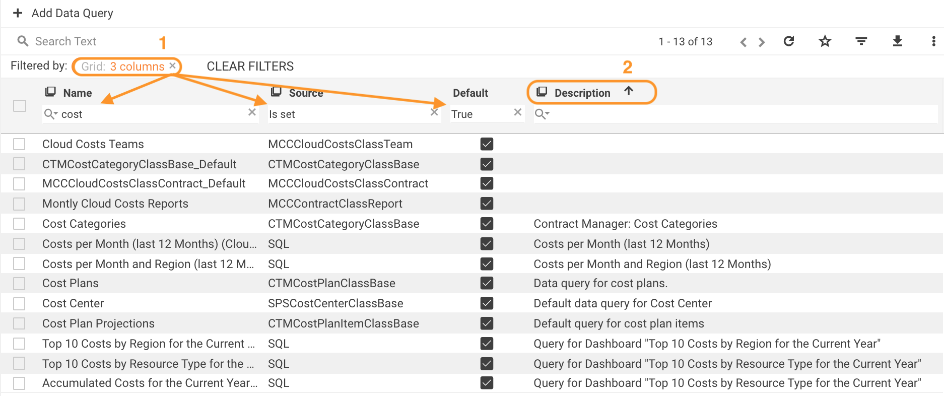
The sorting option in the column depends on the Data Query settings. For more details, see Data Query: Search & Sorting section.
Column search depends on the column data type and each column includes relevant filtering criteria, for instance, the time period for dates, checkbox list for a pickup, true/false for boolean, etc. Click the lookup icon under the column name to see a list of available options.
Text filtering criteria
The column with the text search additionally has various filtering criteria:
- Contains
- Not contains
- Equals
- Not equals
- Starts With
- Ends With
- Is set: the field is not empty;
- Not set: the field is empty;
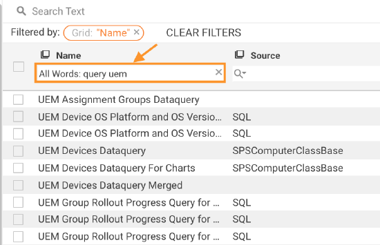
- Contains All Words: enumerate the search keywords or phrases using spaces. Any punctuation marks like a comma, semi-colon, etc. between the words are ignored. The search is case insensitive. The results include all entries that have each of the entered keywords in the column, despite their order in the search query:
- Contains Any Word: similar to the previous criteria, enumerate the search keywords or phrases using spaces. Any punctuation marks like a comma, semi-colon, etc. between the words are ignored. The search is case insensitive. The results include all entries that have at least one of the entered keywords in the column, despite their order in the search query.
- Does Not Contain Any Word: enumerate the search keywords or phrases using spaces. Any punctuation marks like a comma, semi-colon, etc. between the words are ignored. The search is case insensitive. The results exclude all entries that have at least one of the entered keywords, despite their order in the search query.
Text search is limited to maximum 50 words per text filtering criteria. To change the restriction, adjust the following value in the config.json file:
"maxWordsPerCondition": 50,
For EAP v.11.0.1 and higher, the number of search words can be changed by the Administrator in the Administration application → Settings → Frontend Settings → Max Words Per Condition property.
Clear Filters
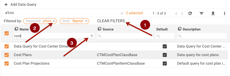
- To clear ALL the applied filters, click CLEAR FILTERS above the grid.
- To clear any of the filters, click x next to this filter.
- To clear the filtering search field, click x to the right of it.
Symbols in Keyword Search for Partial Matches
Use the % symbol to replace zero, one, or multiple characters in the keyword search and search for partial matches:
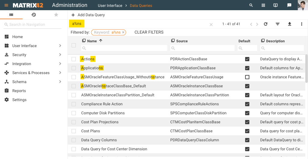
The _ underscore symbol represents one, single character in the search.
This symbol can be used in the Global Search, Search Text field, and Column Search options.
Advanced Search
Advanced Search is available in the header of the Dataset View:

For more information about Advanced Search configuration and usage see Search Filters page.
Query Filter
If configured, Query Filter is available in the header of the Dataset View:

For more information about Query Filter configuration and usage see Search Filters page.
Grouping
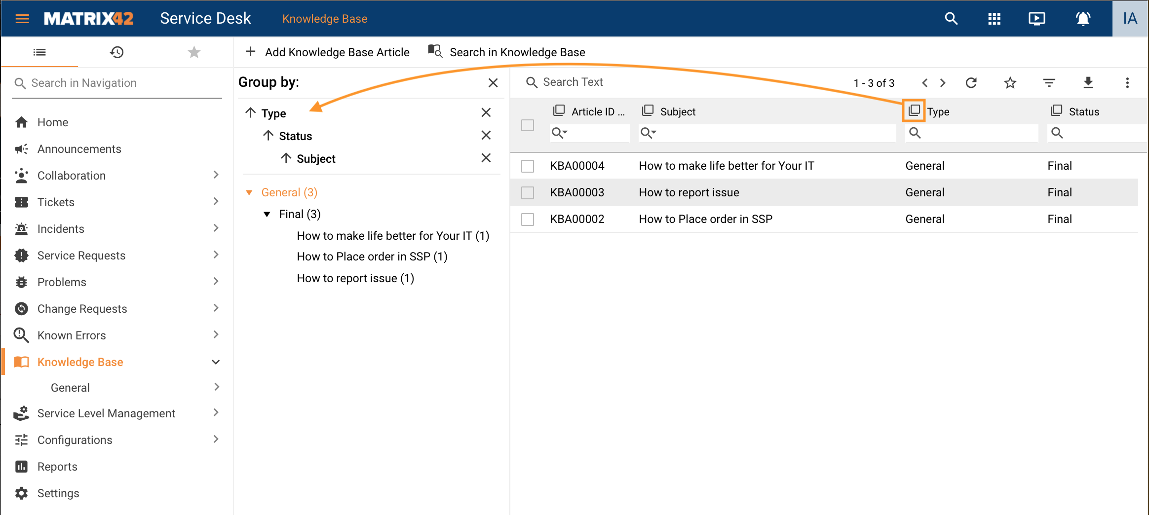
Grouping is available only for columns of the Dataset View.
Click the  icon in the heading row of the grid to group rows that have the same values into summary rows:
Paging
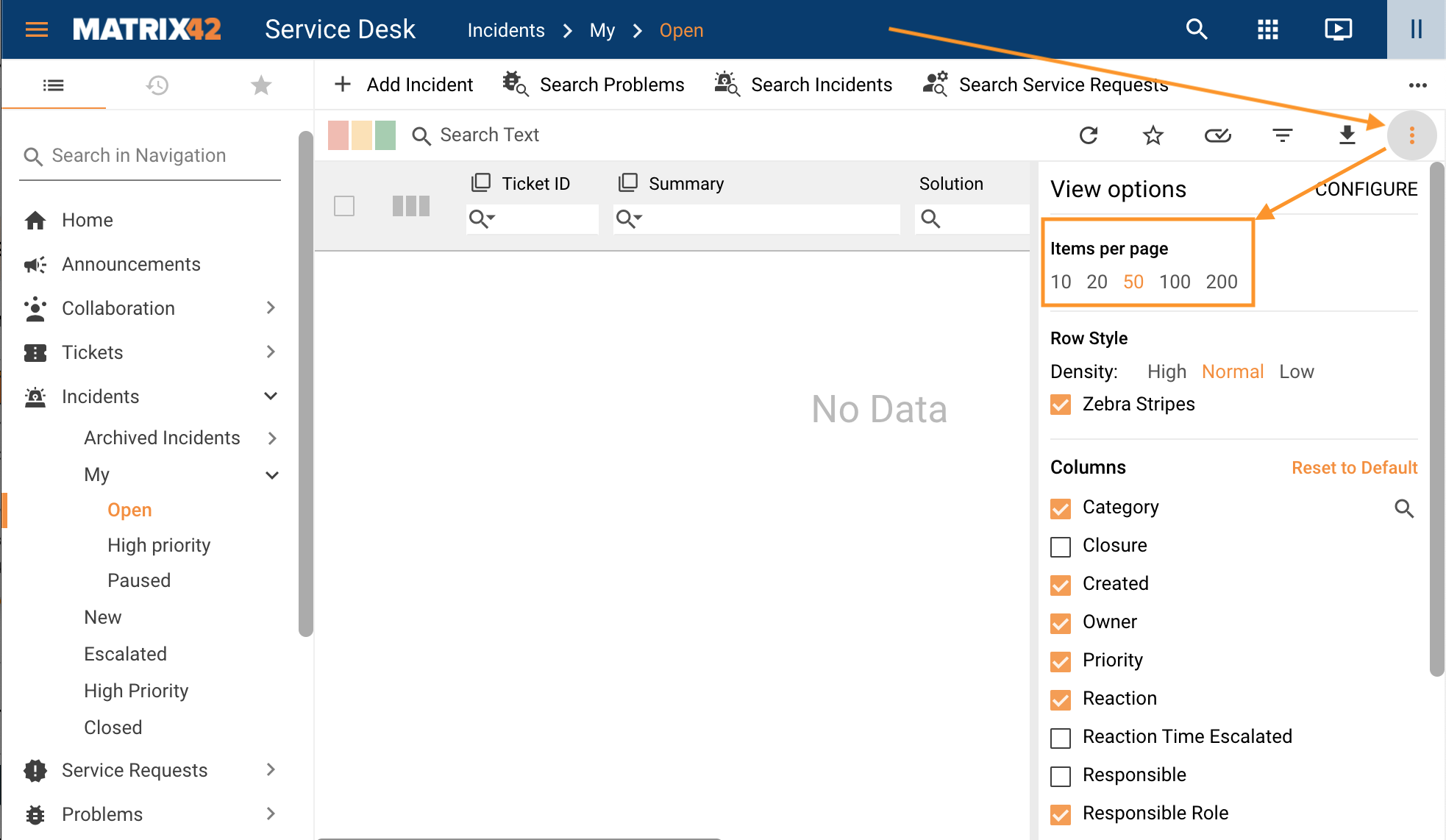
Paging or pagination number is assigned automatically based on the number of Items per page.
Click View options at the top of the grid to configure paging and other options:
- Items per page: the property defines how many rows are displayed on one page of the grid. Available options:
- 10
- 20
- 50 (default)
- 100
- 200
For EAP v.11.0.1 and higher, available and default options can be changed by the Administrator in the Administration application → Settings → Frontend Settings section, see Data Source Page Size for default number of items per page and Data Source Page Sizes property for a list of available options.
- Row Style: allows changing the spacing between rows within the page to view your data with the amount of spacing you prefer. Available options:
- High
- Normal (default)
- Low
- Zebra Stripes: is enabled by default and is also known as candy striping or half-shadow is the application of faint shading to alternate lines or rows in the grid.
- Columns: defines which columns are displayed in the grid by default.
