Control Descriptor
Overview
Any control available in the Layout Designer toolbox and which could be used for the authoring layouts, is registered in the Solution Builder as Control Descriptor object.
The system provides a set of pre-configured Control Descriptors. More detailed information about some of them you may find via the following links:
Description
The Control Descriptor keeps the definition how the control appears and behaves in the different areas of Layout Designer and also during the transformation of the Layout Document to the end-user form in run-time. The user with Administrative permissions are able to manage Control Descriptors in area Administration > User Interface > Control Descriptors.
More information on how the Control Descriptor is used in run-time rendering, see the Solution Builder Architecture.
Principals
The Control Descriptor defines the Technical Name, and the set of available properties. When control is dropped to Layout Designer Canvas the Solution Builder creates an instance of the Control Descriptor in the Layout Document, which keeps only the data configured in Layout Designer in a simple format without any specific of the final Platform it will be used (e.g. Angular, HTML, or WPF), what makes the Layout Document be absolutely agnostic from the frameworks and technologies used for rendering UI. The following example, how the configuration of the Text Literal control is stored in the Layout View Document.
{
 "Name":"literal1",
 "ControlName":"mx-literal",
 "IsSystem":true,
 "Type":4,
 "Id":"edc6d2b8-8c20-4df8-d9a5-4e493b041a83",
 "Properties":[
    {  "Name":"value", "Value":{ "__type":1, "path":"SPSPrinterType.SPSAssetClassBase.Name" } },
    {  "Name":"name",  "Value":"literal1"}
 ]
}
On client request to generate the end user User Interface for the Layout, The Solution Builder, in run-time, analyzes the client parameters, like which browser is use, on which platform, and transforms the Layout Document appropriately. Each Control Descriptor used in Layout Document, handles itself how it be transformed.
Transformation
The Control Descriptor has range of configuration settings which influence the was the Control Descriptor instance be transformed to the end-user UI. The main task of this operation is take the well-structured Control object and generate the correct HTML tags, which could be understood by the client browser.
In most of the cases, the default scenarios of transformation ("Auto"), when control name is transformed to HTML Tag, and all related properties is to appropriate HTML attribute, is enough, but there are cases when this approach does not work. For such cases, in the Control Descriptor Advanced View, section "Transformation" defines the properties which impact the transformation process.
Tag Name, defines the HTML Element the Control Descriptor will be transform to. If not set, the System uses Control Descriptor name as target HTML Element.
The System uses the XSLT transformation behind, what means the original Control Descriptor Instance object converted to XML, and then XSL templates is applied. Two Control Descriptor properties "Body XSLT template" and "Properties XSLT Template", allows to supplement the default transformation mechanism with additional logic. For example, define some control Properties which always need to be added to UI element, or provide a special rendering mechanism for Properties with marked Transformation type "None"
The target structure of the Control Descriptor transformation to the end-user UI element could be represented like:
<tag-name {properties}>{body}</tag-name>
The transformation could be also specified on each property level. Transformation for Property supports three different ways, which regulated by Property Transformation Type:
- Auto, the property transformed automatically to HTML, uses either Attribute Name (when present) or Name as transformed attribute name.
- XSLT, on transformation is fully relies on the XSLT Template defined for the Property
- None, property is not rendered to HTML, and Control Descriptor Body or Properties XSLT Temaples could be used to render this Property in a special way
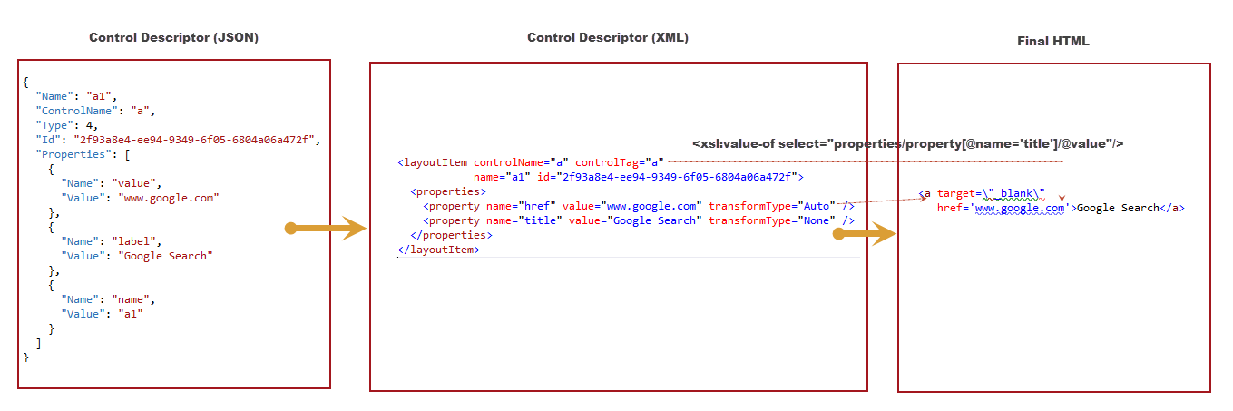
Example: Link Control (present in Control Library)
Link Control is a Control Descriptor for the standard HTML Element <A> (anchor). This control has only two properties Title and Url. And due to <A> element syntactics cannout be automatically transformed because element Title is not an attribute but Element body, e.g. <a href="{Url}">{Title}</a>. To achieve such transformation, we need redefine XSL template for Body rendering.
<xsl:value-of select="properties/property[@name='title']/@value"/>
Control Properties and Property Designers
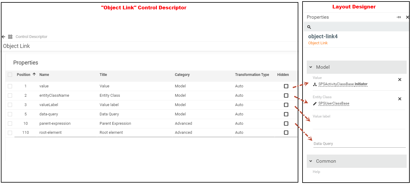
To configure Control usage for every single case, the Control Descriptor defines range of Properties, which are publicly available in the Layout Designer Properties View. The list of properties for the Control is automatically generated by aggregating all properties defined in Control Descriptor itself and all of its direct or indirect parents (inherited) Control Descriptor. The picture below shows as the Layout Designer displays properties declared in the Control Descriptor
Property Editors
To simplify the procedure of the Control configuration in Layout Designer, the Solution Builder provides a range of the Property Edotprs. Each available Editor has its own specifics, fit to each concrete purpose of the Property:
- Property Editor, allows to set static/constant values for the Property value. The System supports the following types of the Property Editor: String (allows specify single line string), Text (multi-line text), Integer (the Editor expects the integer as a value), Localizable (the Layout designer opens the Localization Strings popup, where the Localization String can be selected), Image (allows to pick the known SVG icon as the Propery value), Unit (allows to define values for HTML sizes, e.g. for attribute Width={value}px|rem|%), Complex Data (handles the cases when Property expected not a simple type, but complex data model, like array of Objects, e.g. property Columns for Grid control);
- Bindable Editor, allows to bind the Control Property with Data Model item. The Editor opens the popup which displays all Data Model items matches the Property type. On Picking this Editor in Control Descriptor Property dialog, the System shows the Editor Extensions controls, which allow to specify the Property supported data types;
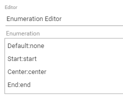
- Enumeration Editor, builds a in Properties Panel, a drop-down control with items defined in Editor extension control "Enumeration", in the following format: Title:Value
- Style Editor, used by property Style, which present in all Control. The Editor allows to pick an appearance style of the Control;
- Schema Editor, deals with the picking Schema entities, and allows to set the name of the Configuration Item or Data Definitions to Property value.
- Object Picker Editor, allows to set a static reference to Object present in Production database using the Object Picker control. On picking this Editor type, the System requests also to define the Data Definition from which Object needs to be selected, and also to restrict the Allowed Types,
Control Descriptor Inheritance
To simplify the definitions of the Control Descriptor properties, amount of which in some cases could exceeds dozens, and which repeating from control to control (e.g. all control has property Name) the Solution Builder support multi-inheritance mechanism. All the properties of the inherited controls are automatically extend the Control Descriptor, and becomes available for configuration in Layout Designer Properties. In case some of the inherited Property has wrong definition in perspective of the Control Decriptor, or just need to be hidden, this property could be easily redefined on the Control Descriptor, and in case of ambiguity, when there are a few definition of the property with the same name exists, the System picks the property with lower inheritance index.
Control Types
The Solution Builder differentiates two kinds of the Control Descriptors, which fro the end-user perspective are absolutely identical in a way they presented and used in Layout Designer, but, absolutely different in a way they implemented, and rendered in document transformation
Simple Control Descriptor
The implementation of the control relies on a HTML Element which is known in UUX application. Here could be used on of standard HTML element , as well as the self-defined HTML element. The UUX platform is based on AngularJS framework, which has well-defined mechanism of creating and registering "self-defined" HTML elements, which called Directives. The following guide describes how to develop a Directive "Creating Custom Directives".
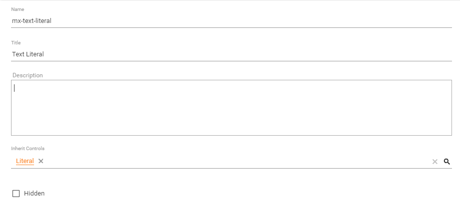
The good examples of the Simple Control Descriptor based on regular HTML element, as "Link control", which based on standard <A> anchor control. As for the alternative approach, take a look to Text Literal Control Descriptor, which relies on Directive <mx-literal>, which implemented by Matrix42 and delivered in JS library.
Pros: Using this approach has range of benefits:
- Allows implement absolutely any UI element behavior, literally, without limitation;
- Allows to integrate 3-d party components to the Solution Builder.
- Better performance
Cons:
- The implementing of Directives requires software development skills in area of Javascript and HTML
- The custom JS library need to be deployed, and correctly included to UUX application
For more information how to create and use Simple Control Descriptor, please read article "Add new Control to Layout Designer".
Composite Control Descriptor
It often happens that there is a section of the Layout, which contains a bunch of Controls, and a logic which handles these controls, need to be reused in several Layouts. Repeating the same actions, like constructing a model, arranging controls and their dependencies for each Layout not only very time consuming, but also error-prone, and significantly reduces the maintainability of such solution. Good approach for such case, is using Composite Control Descriptor, which besides the common Control Descriptor properties, has Layout Template behind, and behaves identically to other Layout objects, like Dialog, Preview, etc. Once the Composite Control Descriptor is created the System enables action "Customize" which triggers opening the Layout Designer.
For more details see Composite Control Descriptor page.
Properties
General (General Tab)
The section describes general Control Descriptor properties.
| Name | The technical name of the control descriptor. Only Latin letters without spaces are normally used. |
|---|---|
| Title | The localizable, user-friendly, name of the Control. The title is displayed in Layout Designer toolbox, and on Canvas. |
| Description | Description of the control descriptor for internal use. |
| Inherit Controls | The list of parent Control Descriptors, the properties of which extend the Control Descriptor. For more details see Inheritance |
| Hidden | Signals to hide the Control in Layout Designer Toolbox, what disables using Control in new created Layouts, but it keep working as before in Layouts it is used |
Toolbox Section (General Tab)
The Section keeps the Control Descriptor properties which influence appearance of the Control in the Layout Designer Toolbox.
| Icon | Control Icon displayed in Toolbox of Layout Designer |
|---|---|
| Category | Toolbox category (collapsible panel) where the control is displayed. Available Categories values can be managed in Pickup PDRControlDescriptorControlCategoryPickup |
| Position | Setups the sorting criteria of the Control Descriptor within the Toolbox category. |
| Ignore on Dropping |
On dropping Data Model Item to canvas the Layout Designer detects the data type of the Item and automatically shows the possible controls list which potentially works with the select data type. For data types like "String" the list of options is very big, and rather confusing then helpful. Using the Flag "Ignore on Dropping" the Control is not offered on drag&drop, and can be used only implicitly, on drag&drop the Control from Toolbox. |
Transformation (Advanced tab)
The properties of this section regulate the way the Control Descriptor is transformed to end-use UI element. For more details see chapter Transformation
| Custom Template | Defines the Control implementation type of the Control Descriptor. When set, the control becomes a Composite Control Descriptor, and the Layout Designer is used for the definition of the Layout and behavior of the Control. |
|---|---|
| Tag Name | The value of the UI element Tag Name to which the Control Descriptor is transformed. When not set, the Control Descriptor name be taken for the tag name. |
| Body XSL template |
XSL templates which redefines default mechanism of the rendering of the UI element body (e.g. <tag-name>{body}</tag-name>). For more details see chapter Transformation |
| Properties XSL template | XSL template which provides supplementary mechanism of the rendering target UI element Properties. |
| Non-visual control |
Non-visual control, is control which does not have UI representation, and fulfills exceptionally the functional role, e.g. "Config Reader" gets the value from the application config file. The Property signals the System that control is a Non-Visual control, and System has to treat it in a special way. See also Non Visual Controls: Message and Non Visual Controls: Dialog Manager. |
Designer (Advanced tab)
The section defines Control Descriptor behavior on the Layout Designer Canvas.
| Model Binding Property |
Property used as main when user drags data from Data Model and drops it onto the canvas. Example: specify a property of type integer here. When you drag some data of type integer from Data Model and drop it onto the canvas in Layout Designer, you will be offered several controls which have the Model Binding Property of type integer to select from. |
|---|---|
| Supported Widget Types | Restricts the area where the Control Descriptor is applicable. For example, Preview Layout does not have Submit functionality, so availability in Designer of many Input controls could be confusing. |
| Designer View |
HTML markup is used for displaying the Control on designing Canvas. |
Control Descriptor dialog (Properties tab)
These are the properties of the control available for setup in the Toolbox of the Layout Designer. Inherited properties (via the Inherited Controls field located under the General tab) are also available in the Toolbox. For more details see Control Properties and Property Designers
General tabulator (Property dialog )
| Name | The technical name of the Property. |
|---|---|
| Title | Display Name of the Property, shown in Layout Designer. The value could be localized |
| Description | Describes the purpose of the Control, displayed as prompt for the property in Layout Designer when users hover over the question mark icon. |
| Category | Defines the Property Category. The available Categories can be managed in Pickup PDRControlDescriptorPropertyCategoryPickup |
| Position | Position of the property within the specified Properties Category; the larger the number, the lower the property. |
| Hidden | Signals the Layout Designer to hide the Property in the Properties pane. |
| Required | Providing the value for the property is mandatory on configuring Control in Layout Designer. Otherwise the Layout Designer highlights the Property and the Control itself as invalid |
Transformation Info tabulator (Property dialog)
Attribute Name: you may specify how the property will appear in html; leave the field empty to use the default value (Name from under the General Info tab); the default value is the most frequently used one.
Transformation Type: the most frequently used value, Auto, sets the transformation to the Name value.
Default Value: default value prefilled for the property in Layout Designer.
Transformation Target:
XSL Template: you may provide a template for the xsl transformation of the property here; xsl templates are rarely used.
Render Anyway: select to always add attributes to the control irregardless of their values.
Designer Info tabulator (Property dialog)
See the chapter Control Properties and Property Designers for more details regarding available Property Editors
Binding Type:
- Two Way binding is used for controls data inside which may change and be transferred elsewhere; Two Way binding supports the Editor.
- One Way option is used for controls data inside which may change but is not transferred anywhere. One Way binding is used, for example, for literals which only display the value and change nothing. The One Way option is better for performance than the Two Way option.
Customization
The System Control Descriptors (delivered out-of-the-box) is not allowed to be modified and customized. For this case, it is recommended, to create your own custom Control Descriptor, and inherit it from the original System Control Descriptor. Using this approach you can easily bring your customization logic to control, and extend it with new Properties, overwrite existing, or adopt the transformation rules.
Related articles
For more information regarding Control Descriptors see also: