New Look Overview
Overview
New Look is a new design of ESM that emphasizes simplicity, ease of use, and intuitive navigation. Its essential feature is minimalism as the New Look is designed to be simple and clean, with redesigned buttons, menus, and fewer visual distractions. At the same time, the functionality and a set of standard features and modules remain the same with the only difference being that for some of them, a slight change in the location of the items took place.
To activate the new design of the system see Phased rollout for New Look page.
The key changes for the New Look are described below.
Navigation
Auto collapsing behaviour is now default behaviour for Navigation (Navigation Menu automatically collapses, when picking an item):
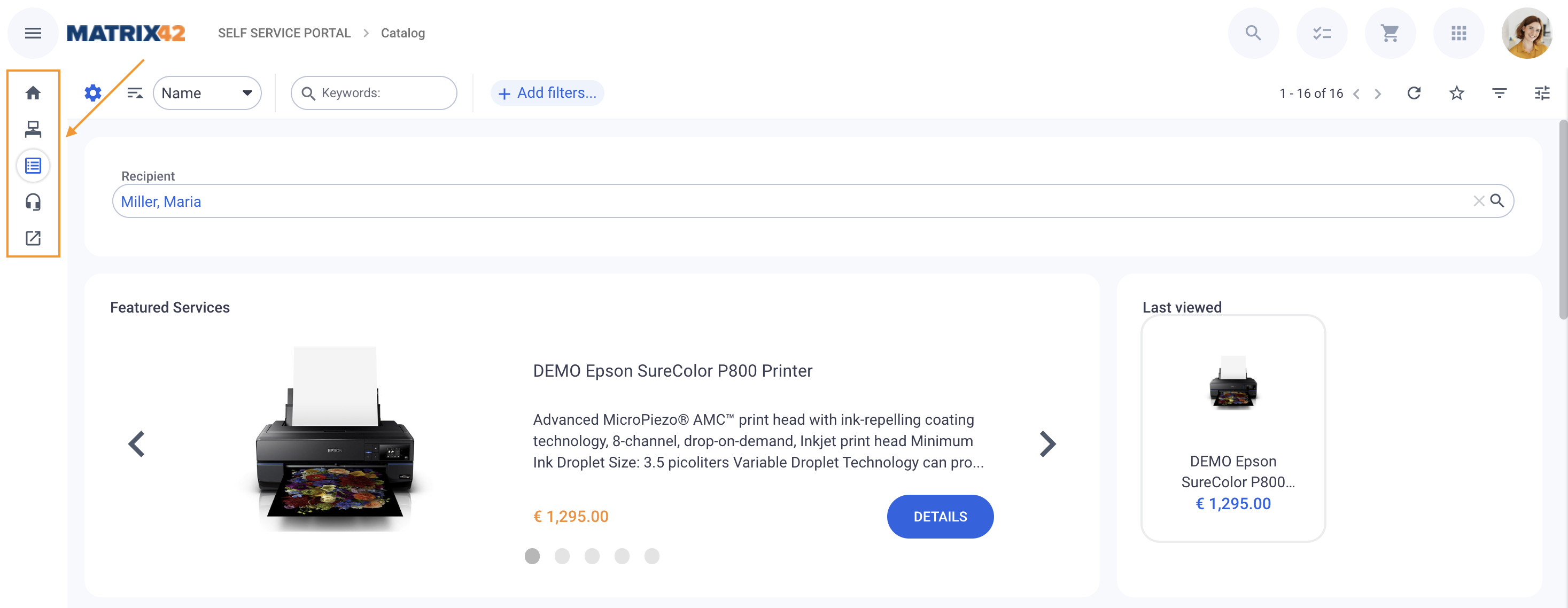
Menu with second level navigation item is shown when focusing on the element:
Click on the main menu icon  next to the logotype to expand the view:
Search by Navigation items is no longer available. Use the Global Search instead.
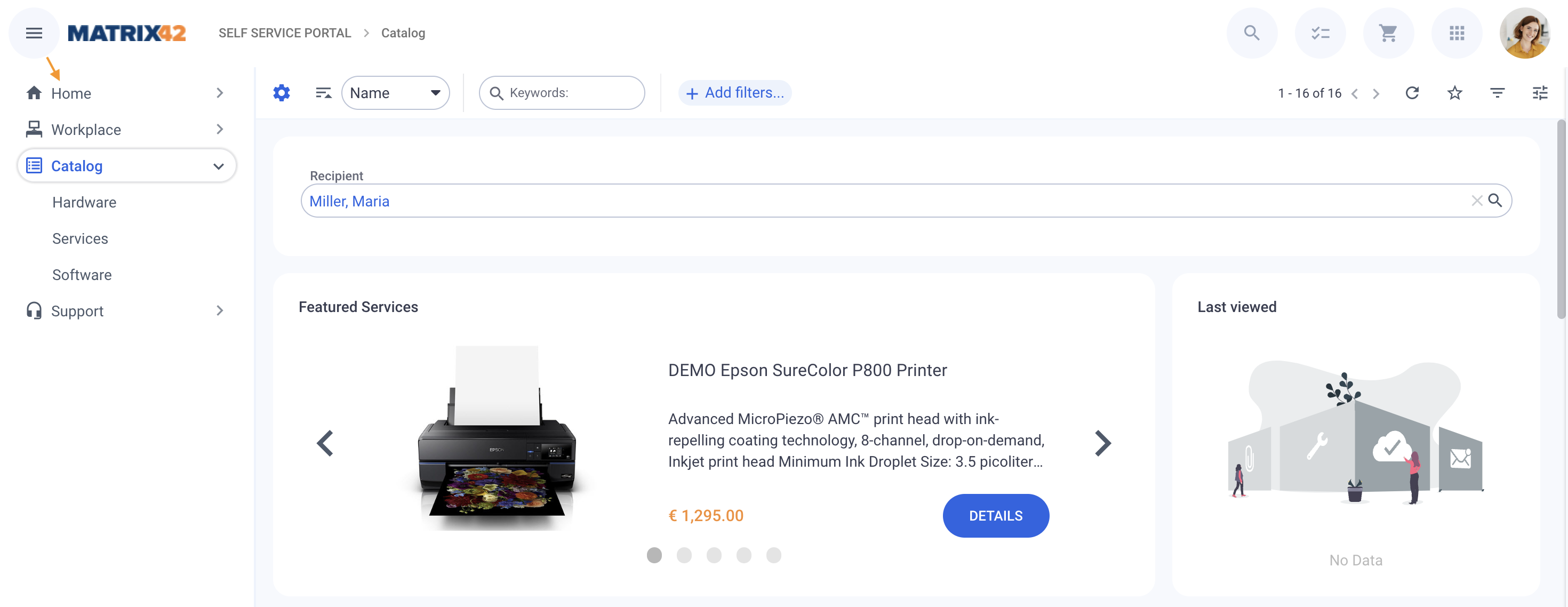
Navigation includes 2 levels, main and nested, while the other sub-levels are located on the selected page as follows:
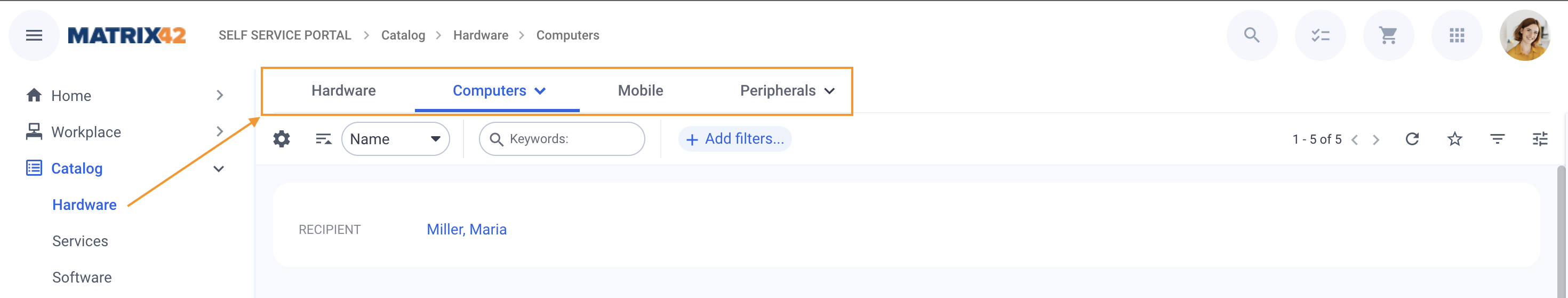
Expand the Navigation of the tab with the  icon to see other nested levels:
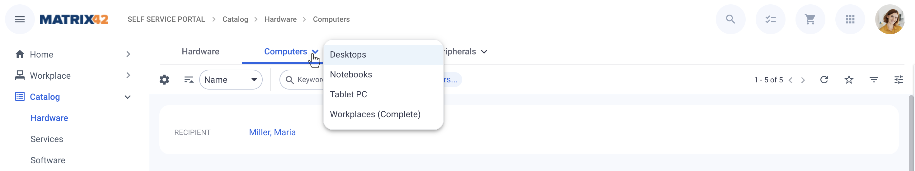
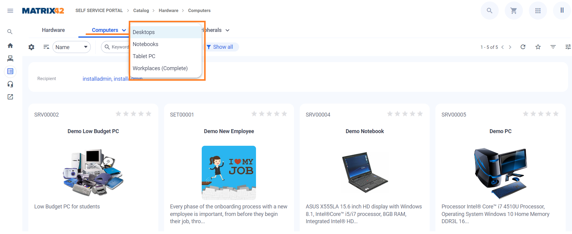
Structures have also only 2 levels in the Navigation, while other sub-levels can be browsed on the selected page. See also Structures page.
For more details, see also Navigation Items page.
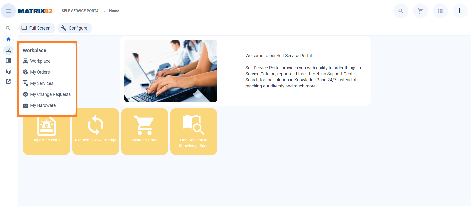
Navigation Options
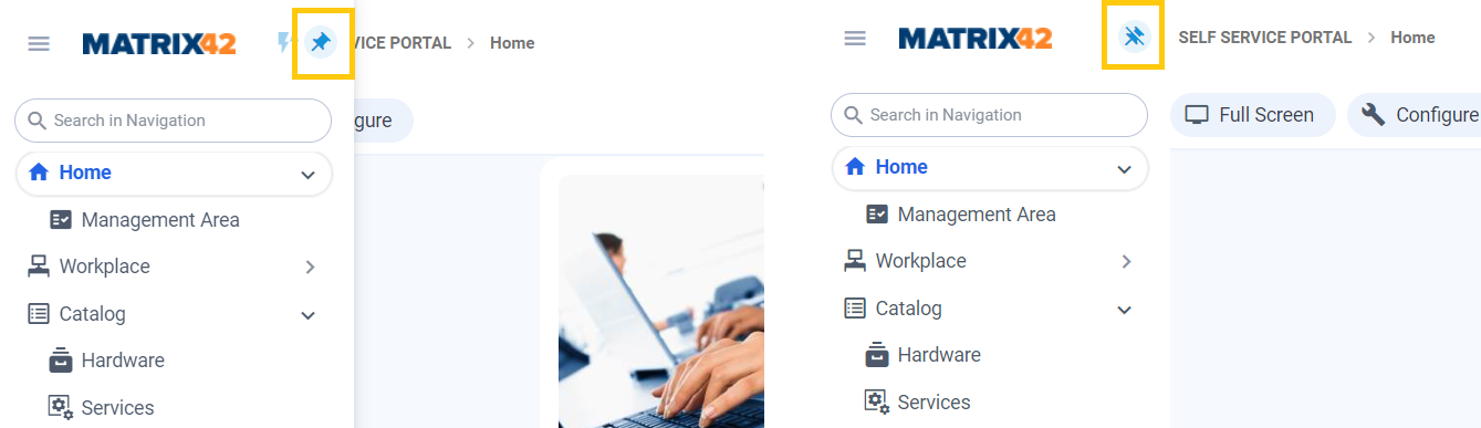
Users can personalize Navigation behavior according their taste:
- Pin Navigation, and obtain full control on it (click Unpin navigation button to switch back to automatically collapses of Navigation Menu mode):
- Auto expand full navigation on focus. in "auto-collapsing mode":
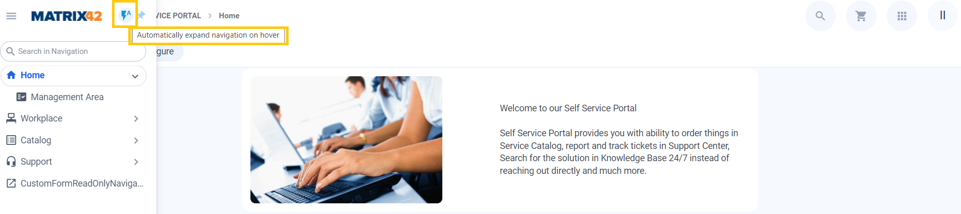
All settings are personalized to User Profile and can be different for every user.
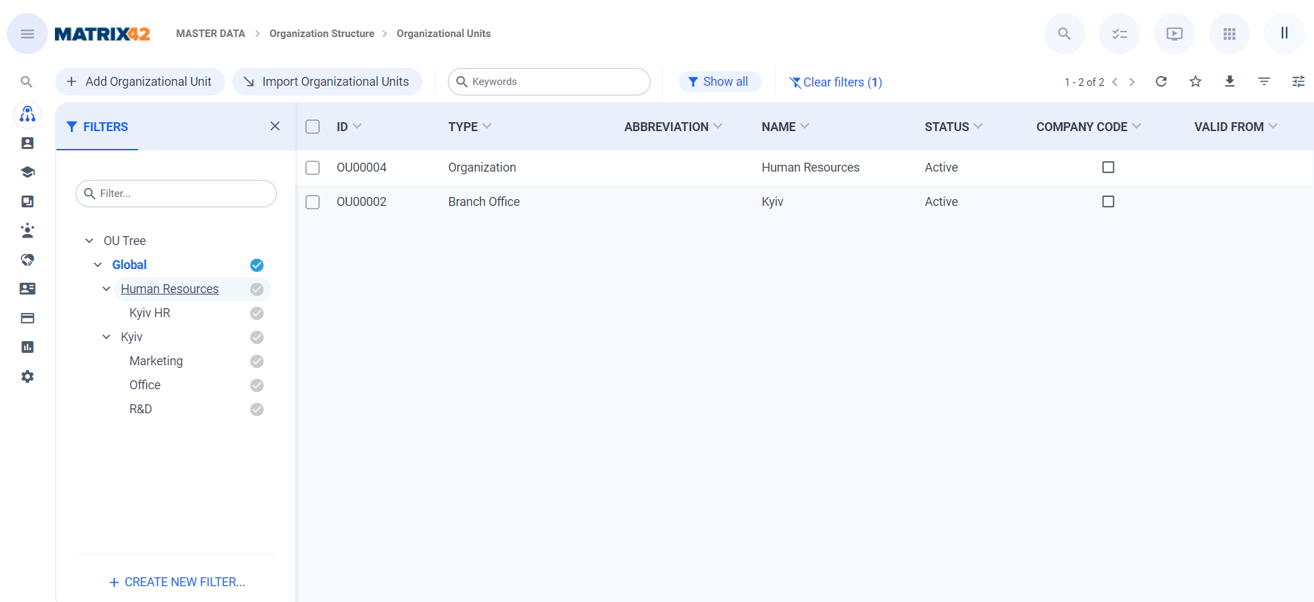
Structures
By Default, Structures are shown in the Filter Panel. First, User sees Search Filters created by Administrator or by him/her own. Secondly, User sees dynamic & hierarchical filters (structures). It is possible to apply both for the same grid. When Navigation has structure defined - Filter Panel will show up automatically.
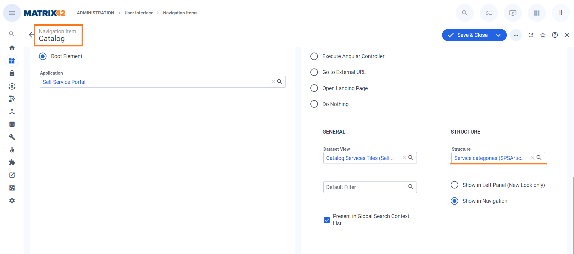
Structures in Header
In the Self Service Portal, structures are shown in the Header by Default.
It is possible to configure the way structure is shown in the Administration area by editing corresponding Navigation Item settings.
For more details, see also Structures page.
Preview & Wizard
We tried to achieve situation that max 2 panels can be opened at the same time: one on the left and one on the right to keep UI cleaner. Filters/Grouping panel and Preview/Action panel are resizable. All user changes to size panel are personalized. Opening Grid settings will close Preview panel and vice versa.
For more details, see also Preview page.
Dialogs
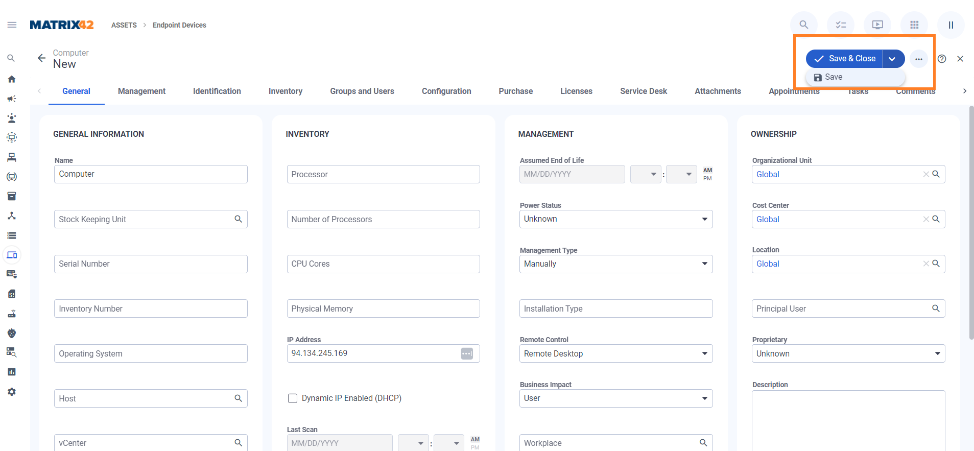
Tabs are shown at the top of the dialog. Scrolling dialog vertically will have no impact to Tabs and they are fixed. Save&Close / Save button is now a Multi status button. Action Panel is shown together with other actions in the same line.
For more details, see also Dialogs page.
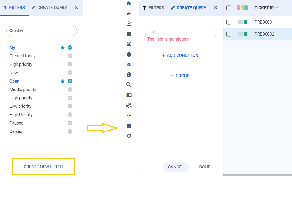
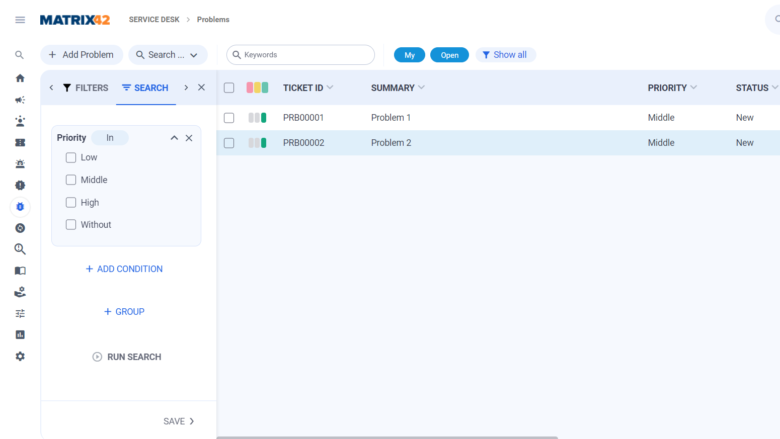
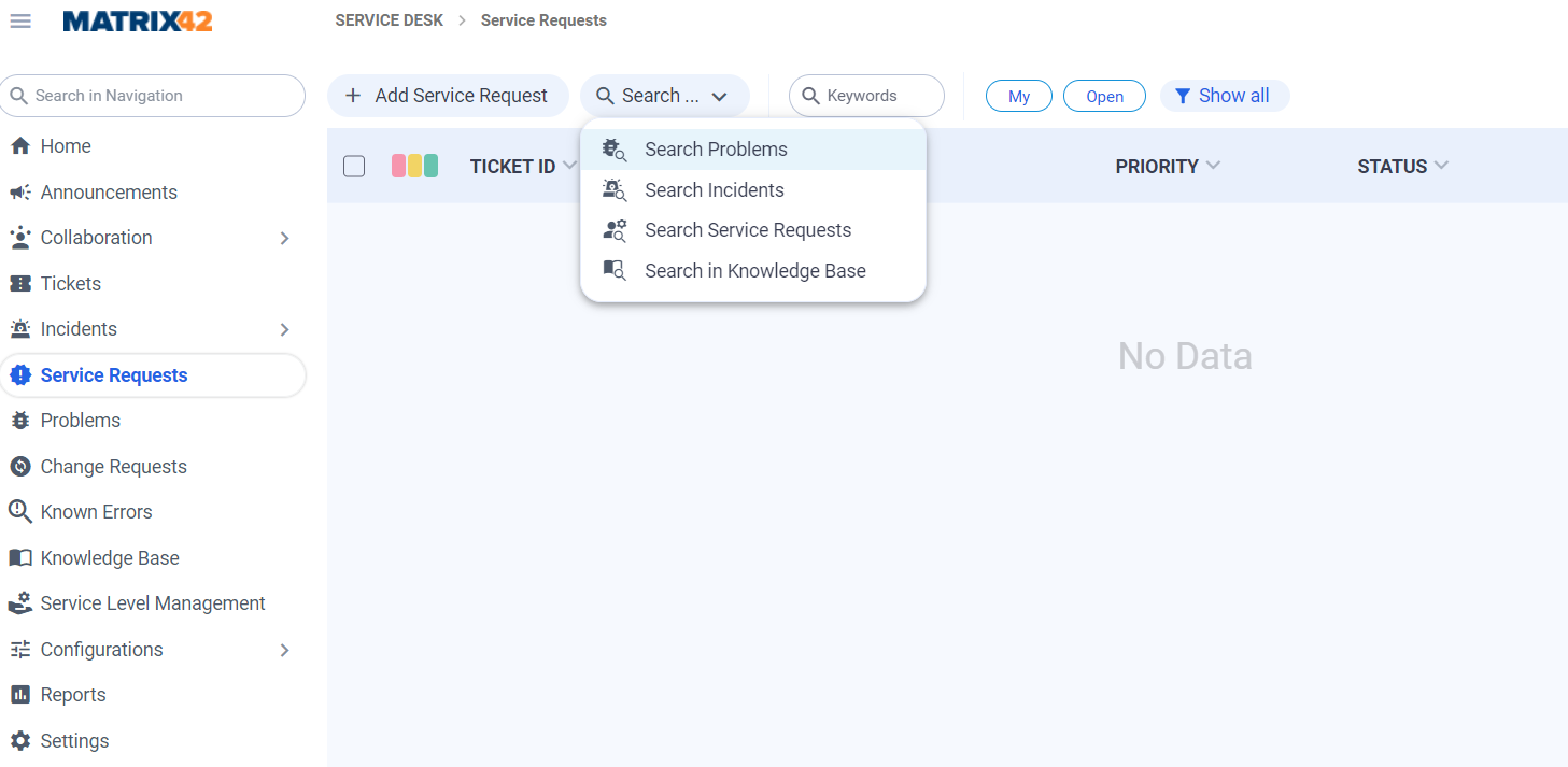
Search Filters
Search filters, that were previously shown as a part of the Navigation, are now located as follows and can not be a part of the Navigation anymore:
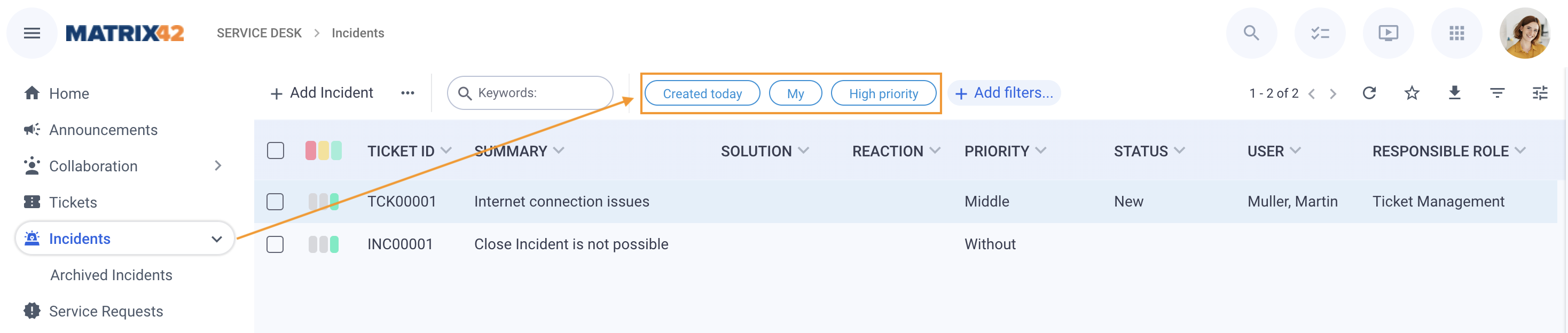
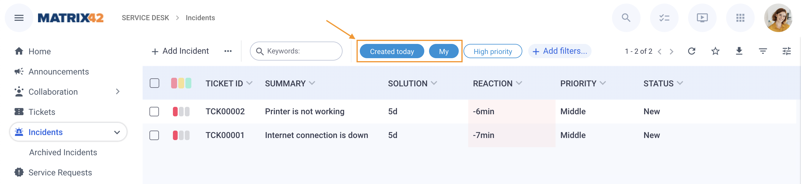
Additionally, you can apply more than one filter at the same, for example:
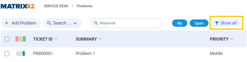
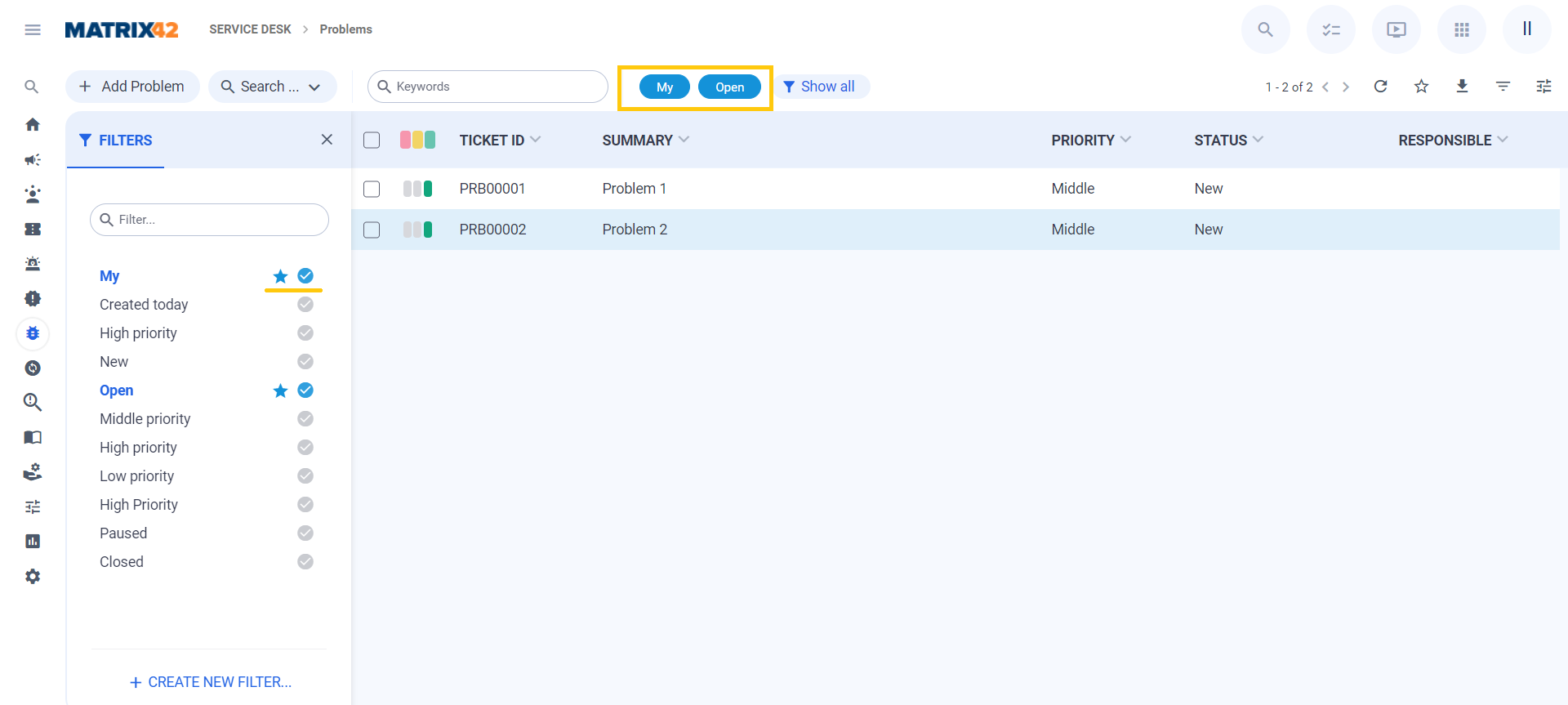
Managing filters panel has also more simplified navigation and configuration. Filter panel is now on the left and now it is possible to search for filters. Filter Panel will open when user clicks on "Show all" button.
Search filters marked with an asterisk are displayed in the Grid Toolbar and any changes made by user are personalized. Activated "favorite" filters will be also activated next time when user opens the grid. User can activate filter from the panel without adding them to "favorites".
Query Builder for creating new and editing existing filters has also a more laconic and simplified design. User can click "Create New Filter" action and Create Dialog will open. Create Filter Panel is on the left and all the functionality for the configuration is same as in Classic Look.
User can still use Advanced Search for complex queries. Panel will open on the left side. User can save filter after creation or just apply it without saving.
For more details, see also Search Filters page.
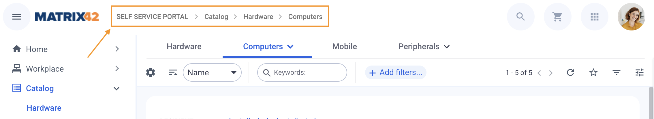
Breadcrumbs
Breadcrumb or breadcrumb trail that reveals the user's location in the application has a new styling and is no longer highlighting the current page, but the items remain clickable and you can navigate to any upper level as before:
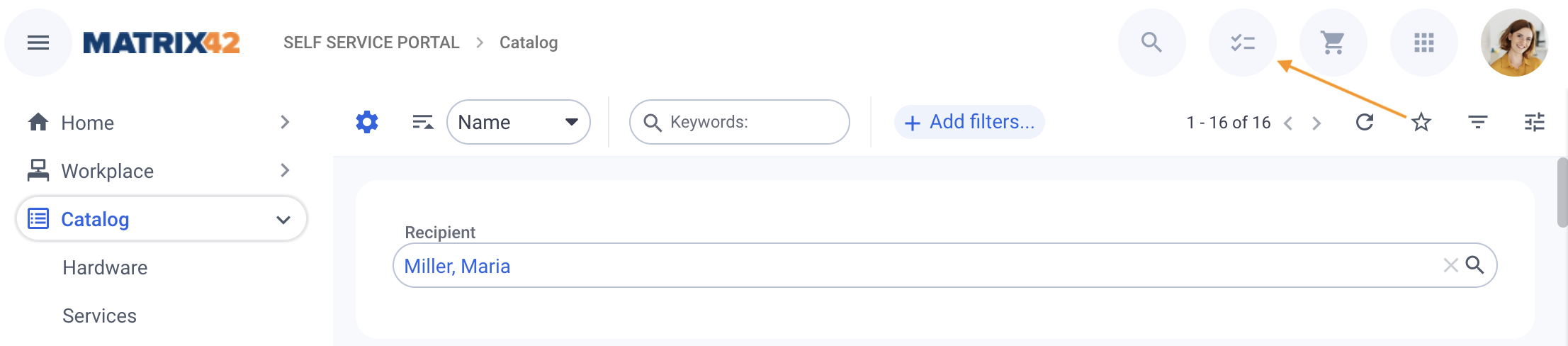
Recents & Favorites
The panel with Recents and Favorites is located in the right upper corner of the page and can be opened by clicking on the icon.
icon.
If the icon is not shown, there are no recently browsed items or nothing in the Favorites.
To activate, browse the application or add items to Favorites with the  icon:
icon:
The panel contains Recents and Favorites combined each having its tab:
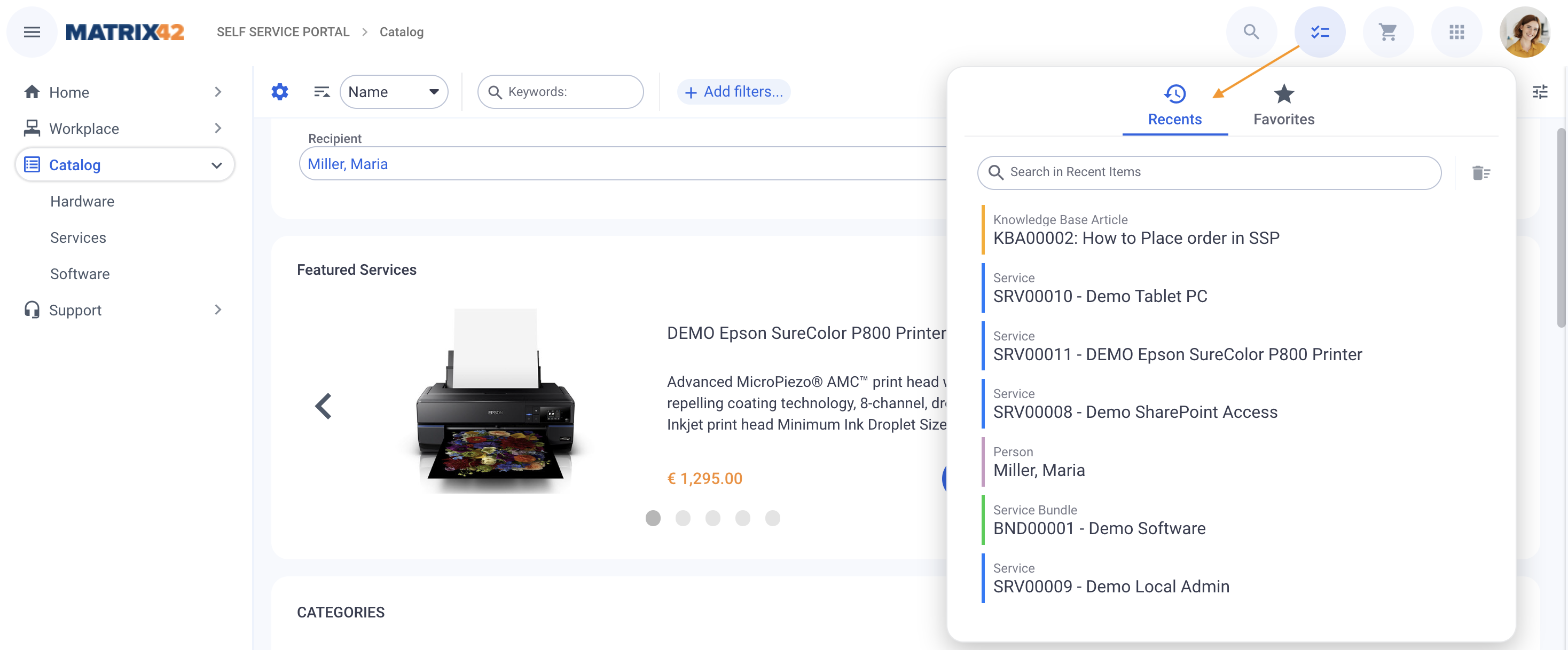
Click on the necessary item to open the page or use search for navigation in the items.
For more information about Recents, see also Applications page.
Favorites tab differentiates between the Navigation Items and Objects, for instance:
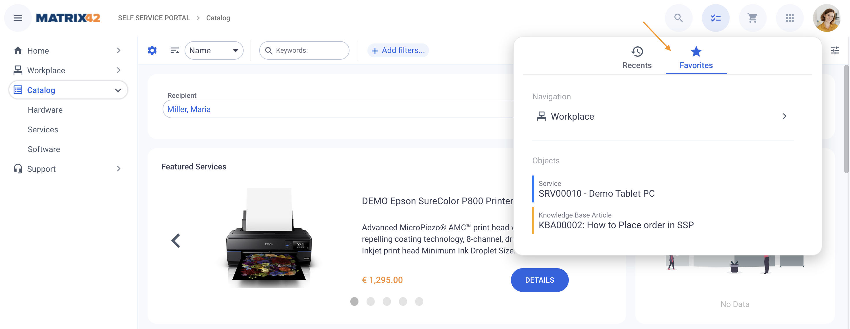
Additionally, you may expand the Favorite Navigation Items by clicking on the corresponding icon as follows:
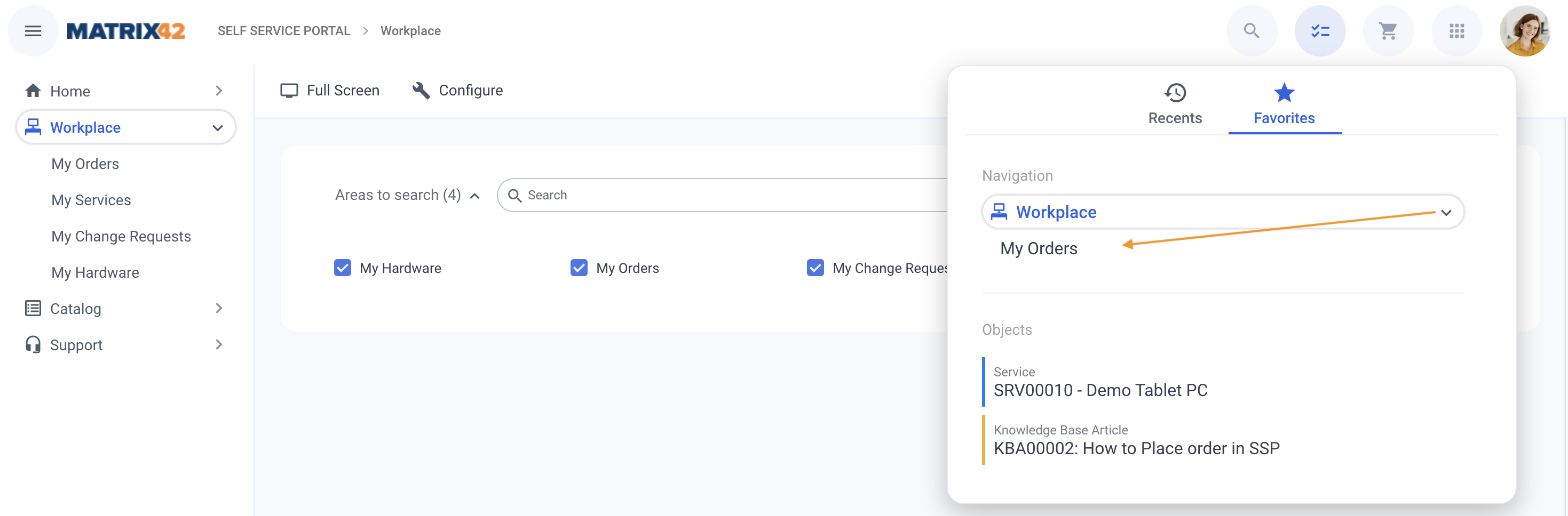
For more information about Favorites, see also Applications page.
Actions
Actions Panel
Dataset Views show only the first Action available for this page. This Action is now placed next to the search field, search filters, and other options of the Dataset View:
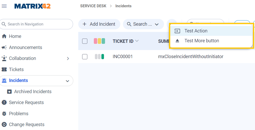
We introduced Action Group that combine actions of same kind. Up to 3 actions/action groups can be shown in the Grid toolbar. In case more than 3 actions/action groups are available - "more" button will be shown, click on the more icon action to see the complete list:
In standard product, we introduced action groups for "Add Item", "Search..." and "Import". Action Groups can be extended in administration area, in the Pickup DD.
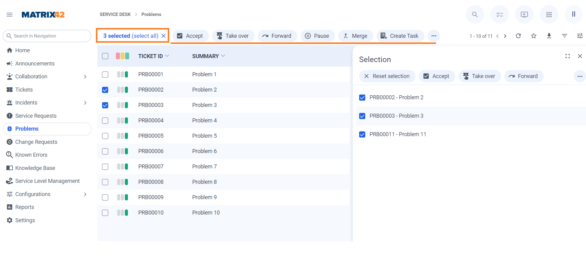
Actions for multi-context dialogs are now shown in the grid header. They are filtered by the context of selected elements. It is possible to select entires of multiple pages. User can click on "Selected" link and preview all selected items in dedicated view.
Context Actions
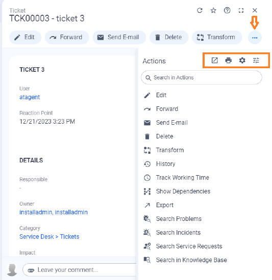
Most Frequently used actions are show in the top of Action Panel. "Open in New Window", "Print", "Configure", "Localize" etc. are moved to "Show More" action header.
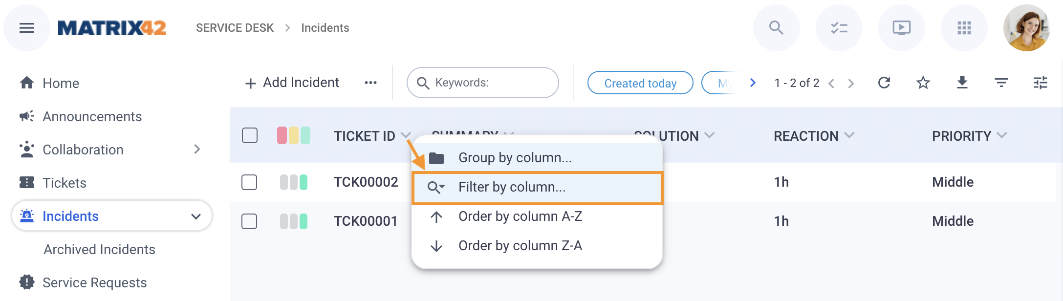
Column Search
The Column Search in Dataset Views and Grids can be activated through the grid header's row. In the column, click the  icon and choose Filter by column... option to enable the column search:
Column search is displayed for all columns of the grid:
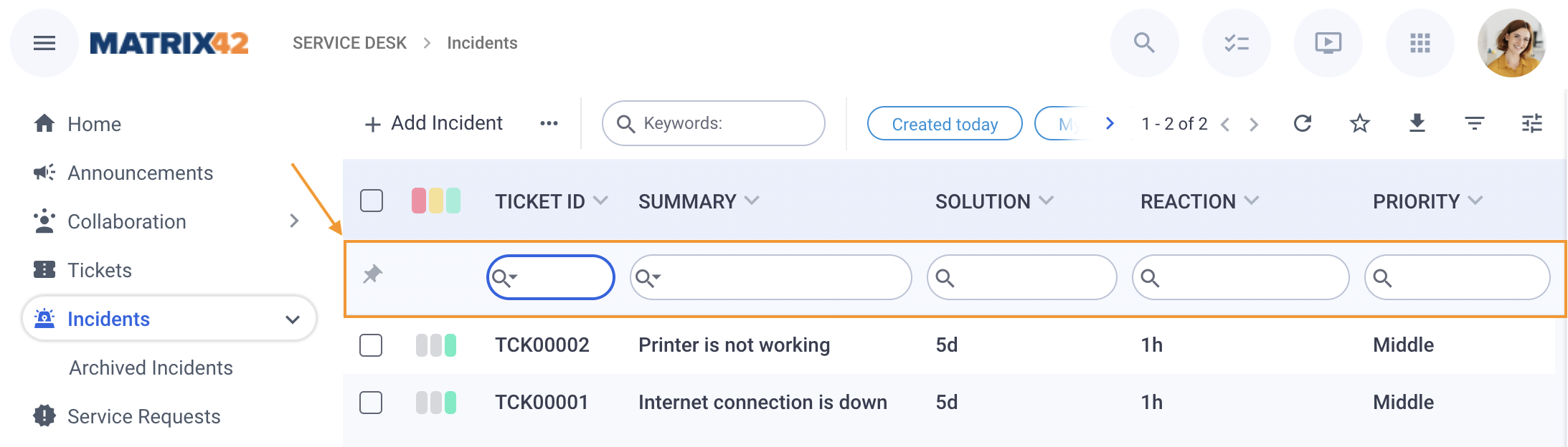
For more details, see also Search in UUX: Column Search page.
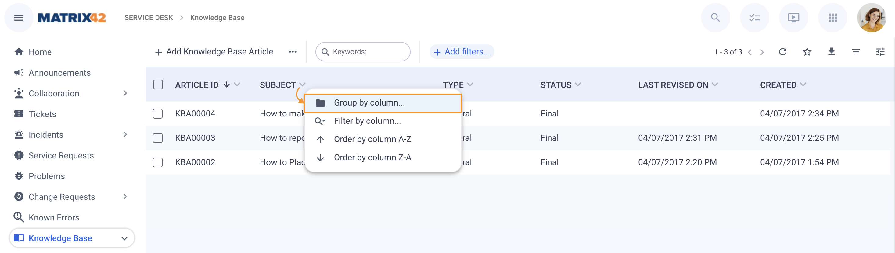
Grouping
Grouping can be run through the grid header's row. In the column, click the icon and choose Group by column... option to enable the grouping:
The Grouping Panel is shown on the left side and now it is visually more attached to the grid, but functionality remain as is. The grouping panel shows the applied criteria as follows:
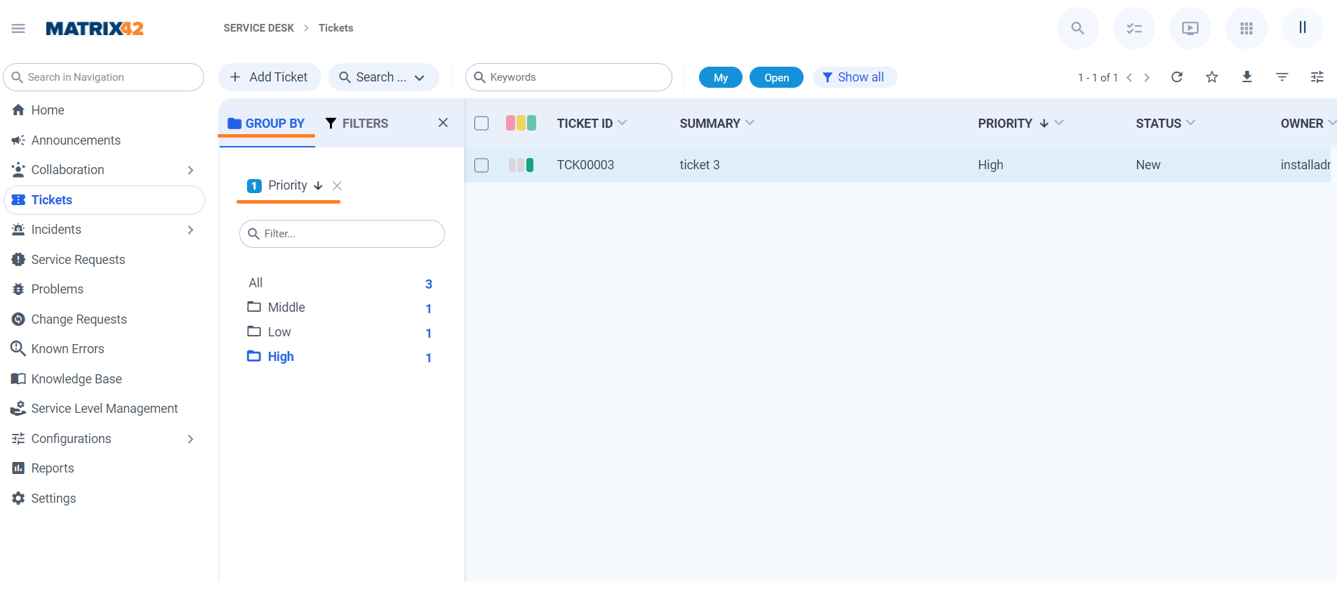
In the same way, you can also add several columns for grouping, for instance
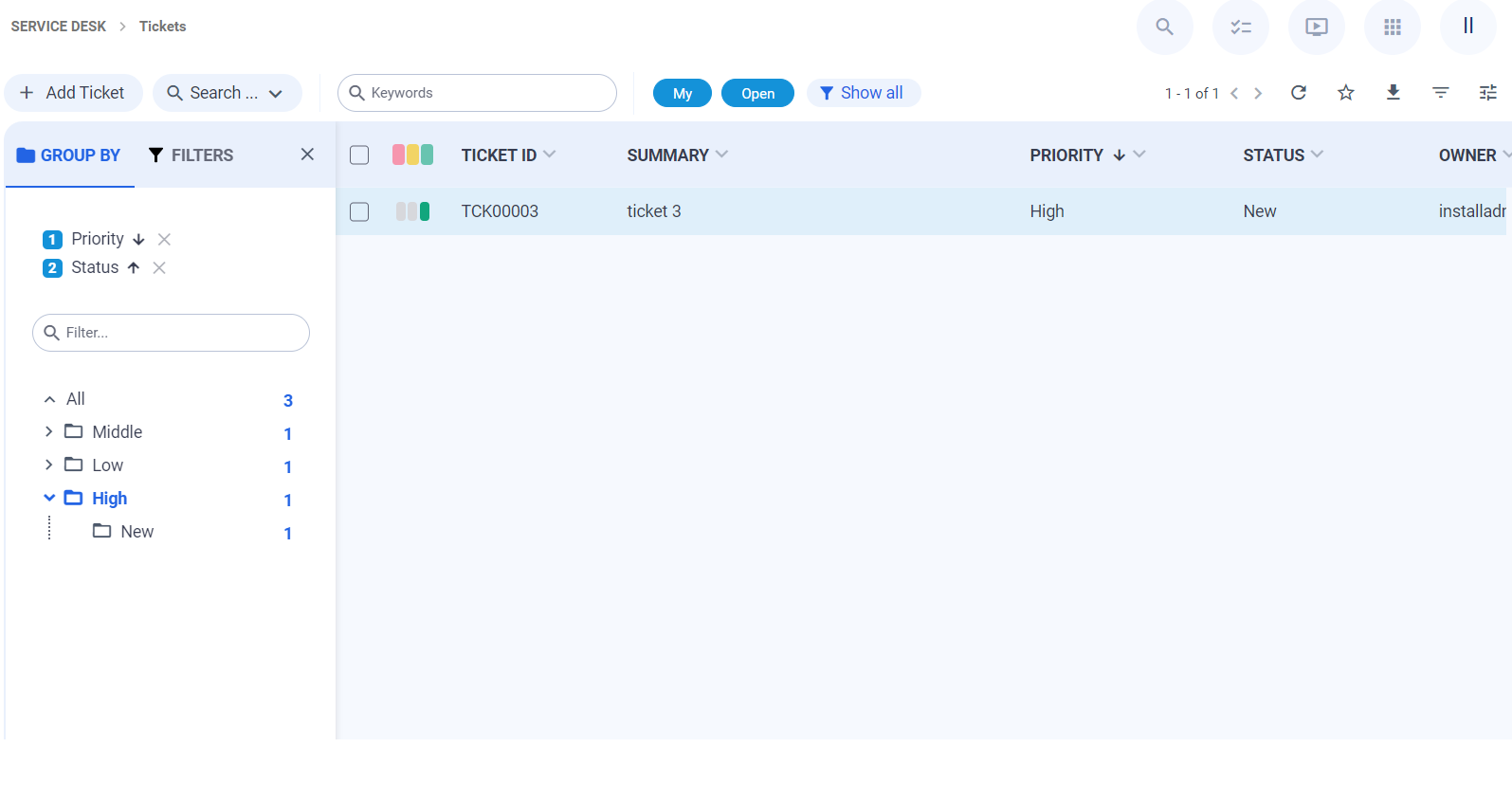
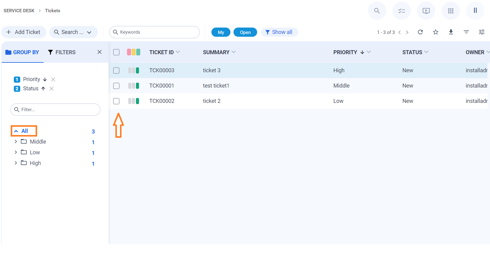
To quickly switch to all results without grouping, click All in the Group by panel:
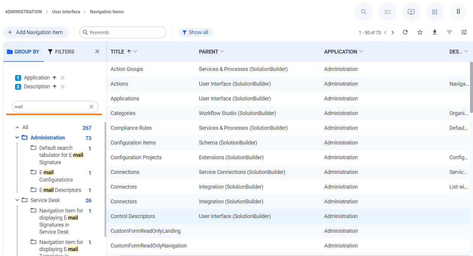
If there are multiple results, use the keyword filter for a better search result:
For more details, see also Search in UUX: Grouping page.
Themes
There are 4 new themes that are adapted for the New Look:
- Light (default)
- Dark
- MX42 Light
- MX42 Dark
They are located in the Administration application → User Interface → Themes. Additionally, the currently used theme in the New Look is marked as follows:
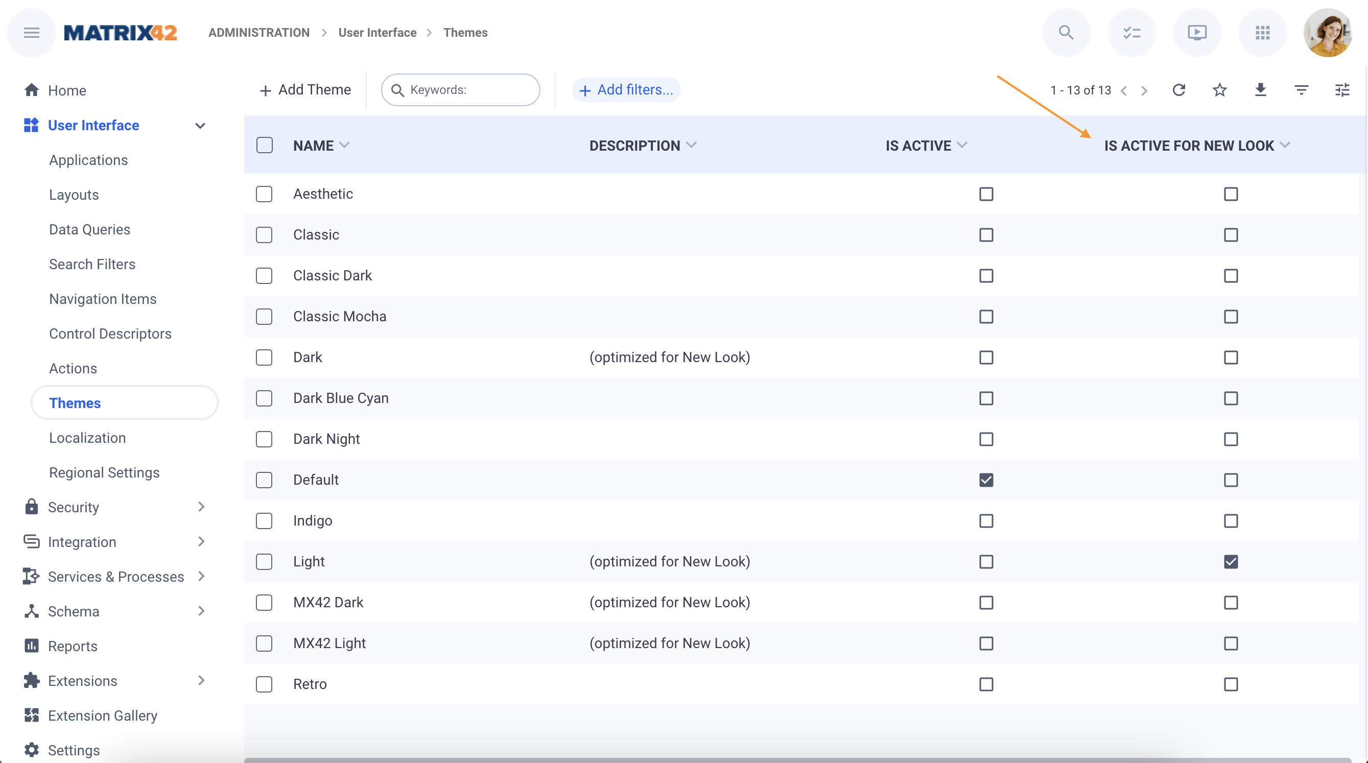
Currently active themes for the Classic user interface and the New Look can differ. Both themes run independently and are applied to each user interface separately.
For more details, see also Themes page.