Dataset View
Overview
A dataset view is a Solution Builder object which allows users to create search pages for specific data that can be represented as Grid, List, Tile, Board or Calendar.
Dataset Views are configured in Administration application → User Interface → Layouts → Dataset Views.
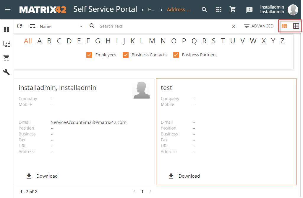
The screenshot below shows a sample Dataset View configuration which allows creating an Address Book search page with a Tile view:
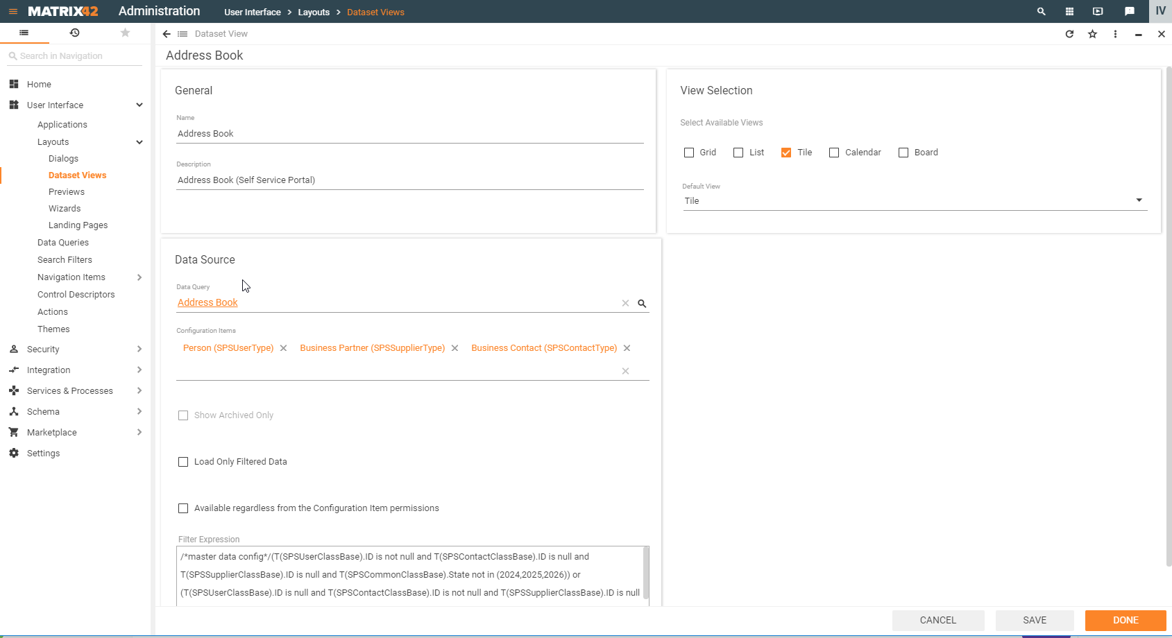
Such a Dataset View settings, in combination with a Navigation Item that also needs to be created, allows users to implement an Address Book search page:
.
You may configure the maximum amount of items to be exported with an "Export All" action by setting the appropriate value to an attribute "maxRowSize" of a node "update4u.SPS.BizLayer.Export" in SPS.config file. E.g. set <update4u.SPS.BizLayer.Export maxRowSize="20000" /> if you want to set a limit to 20000.
Starting from DWP v.12.1.1 instead of SPS.config check the value of the update4u.SPS.BizLayer.Export-maxRowSize Key in PDRDwpConfigurationClass table in the database. See also Advanced System Settings and Export Data pages.
Default value is 10000. Maximum value allowed - Excel limit of rows per page (65536).
Creating a Dataset View
To create a Dataset View, in Administration application, under User Interface → Layouts → Dataset Views → click Add Dataset View button and fill out necessary fields as described for each section. Specify general information, displayed data source and choose how the data should be organized and displayed in the application.
General
The following internally used information is common for any Dataset View representation type:
- Name: mandatory name of the configured Dataset View. The name is used internally in the Administration application only, for example, "Application Usage".
- Description: optional field for more detailed information that may help differentiate the Dataset View from the others having the same name, for example, "Contains usage tracking information collected on physical client devices and application hosts".
Data Source
Define the source of the data that should be retrieved to the Dataset View and optionally specify additional data filtering parameters:
- Data Query: mandatory field. Start typing the Data Query name for suggestions or click the search icon to see all available in the system options. Data Query defines a set of data, conventionally grouped in columns, that can be retrieved to the Dataset View and arranged on the page according to the view selection settings.
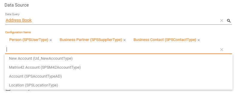
- Configuration Items: mandatory field for the chosen Data Query that has a Data Definition as a data source. Data Definition can be a part of several Configuration Items, therefore this property allows to filter only those Configuration items that should be retrieved to the edited Dataset View, for instance:
- Show Archived Only: in most cases, this field is disabled and becomes available if the Configuration Item has archived records, for instance, outdated incidents.
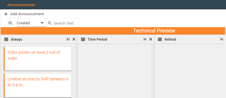
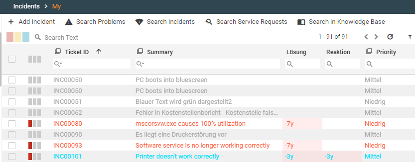
- disabled check-box (default): the Dataset View displays all records, both from the active database and archived records if they are available, for example, My Incidents Dataset view with archived and active incidents records:
- enabled check-box: Dataset View displays only archived records.
- disabled check-box (default): the Dataset View displays all records, both from the active database and archived records if they are available, for example, My Incidents Dataset view with archived and active incidents records:
- Show Archived Data Toggle (ESM v.12.1.2 and higher): defines whether to show the "Archived" toggle in the grig. Checkbox options:
- enabled: the "Archived" toggle is displayed above the grid header row, next to the grid options. By default, the grid still displays current objects from the production database, but the shown "Archived" toggle allows to switch to the objects that are no longer present in the production database and were moved to the History database according to the archiving rules defined in the Configuration Item settings for the objects.

- disabled (default): the "Archived" toggle is not shown.
- enabled: the "Archived" toggle is displayed above the grid header row, next to the grid options. By default, the grid still displays current objects from the production database, but the shown "Archived" toggle allows to switch to the objects that are no longer present in the production database and were moved to the History database according to the archiving rules defined in the Configuration Item settings for the objects.
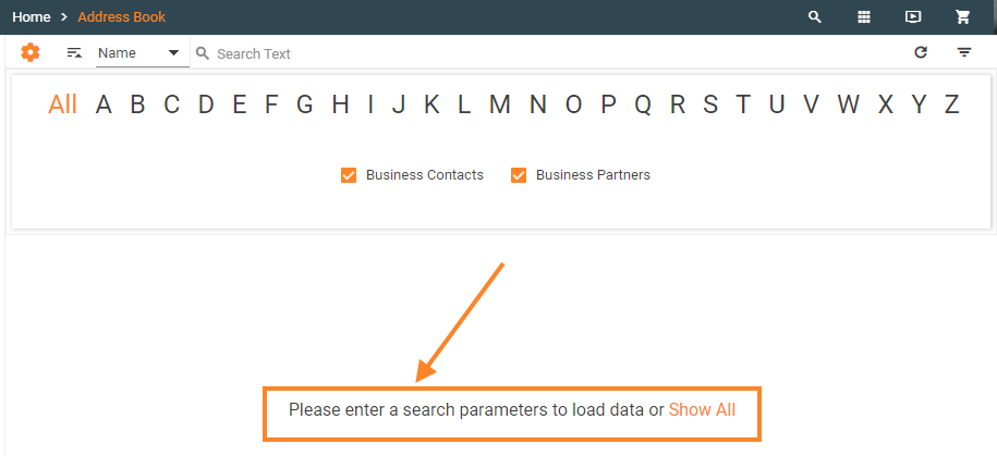
- Load Only Filtered Data: by default, this option is disabled. To improve performance and in cases when the dataset is not supposed to load all the data immediately, but only after applying certain filtering conditions select the check-box to enable "Load Only Filtered Data" option. If the check-box is checked the corresponding dataset will not show data but the message inviting to specify some filter criteria:
- Available regardless from the Configuration Item permissions: this option allows to override the standard Configuration Item permission settings for the user roles and enable data displaying regardless of the user account permissions.
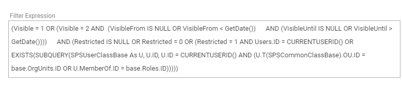
- Filter Expression: optionally, enter and ASQL expression for additional data filtering, for example:
Filtering a Dataset View based on a Web Service currently is not supported.
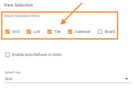
View Selection
This section provides a number of options for retrieved data arrangement on the page and visual representation in different forms.
The following views are available:
Not all views can be enabled at the same and correctly displayed in the corresponding navigation item. Each View Selection is designed for a specific set of data, for instance Calendar requires that the data has a duration, defined by such attributes as starting date and ending date etc.
Nonetheless, more than one View Selection can be enabled for the same Dataset View. For such configuration, choose the Default View from the suggested drop-down list.
Other enabled by the administrator views can be switched in the application by clicking the desired View icon located at the top of the corresponding page:
Several View Selections have additional settings for the displayed data look&feel. These particularities and data displaying examples according to the enabled View Selections are provided below.
Grid view
Grid view retrieves and organizes the Dataset View data based on specified data source as a spreadsheet or a simple table:
Additional settings:
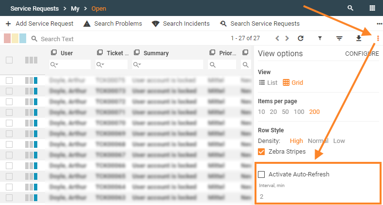
- Enabling Auto Refresh in Grids check-box:
- disabled (default);
- enabled: select the check-box to allow the application users to configure the data auto-refresh on the page. With this option enabled, an end-user can activate the auto-refresh from Grid view settings and specify the data refresh interval on the corresponding page:
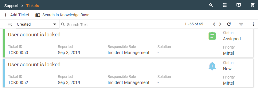
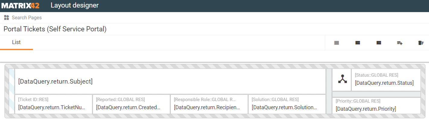
List
Dataset view with the appropriate for the list view and configured data source can be displayed as follows:
Select Data Query for the new Search Page in the Layout Designer that appears once you provide all the required data and click SAVE or DONE in the New Dataset View creation dialog:
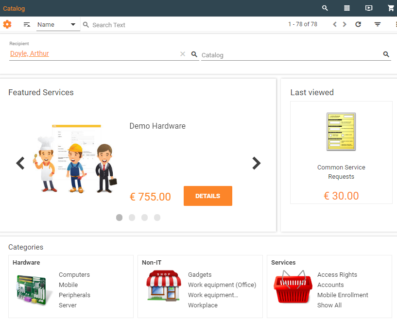
Tile
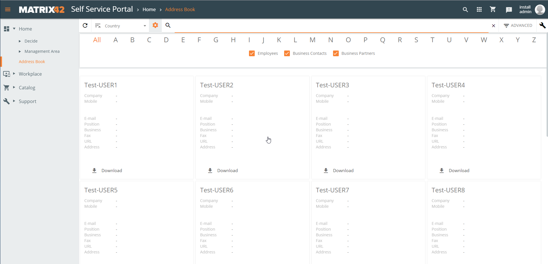
Data can be arranged as tiles, for instance:
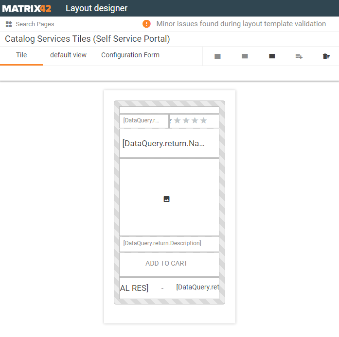
For proper data displaying, select Data Query for the new Search Page in the Layout Designer that appears once you provide all the required data and click SAVE or DONE in the New Dataset View creation dialog:
Calendar settings
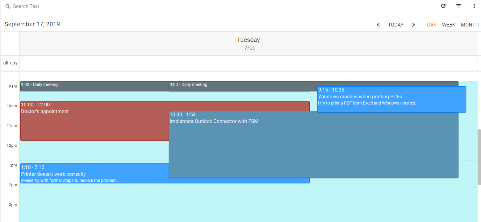
By default, the calendar with a configured data source and basic calendar settings without any extra dimension may look as follows:
Enabled Calendar View Selection has a number of additional settings, like extra dimension, that can result in the following data arrangement of the Dataset View:
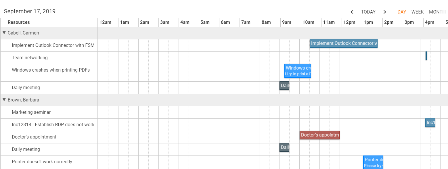
- the main dimension, based on the data source items, are shown on the Dataset View as Gantt chart:
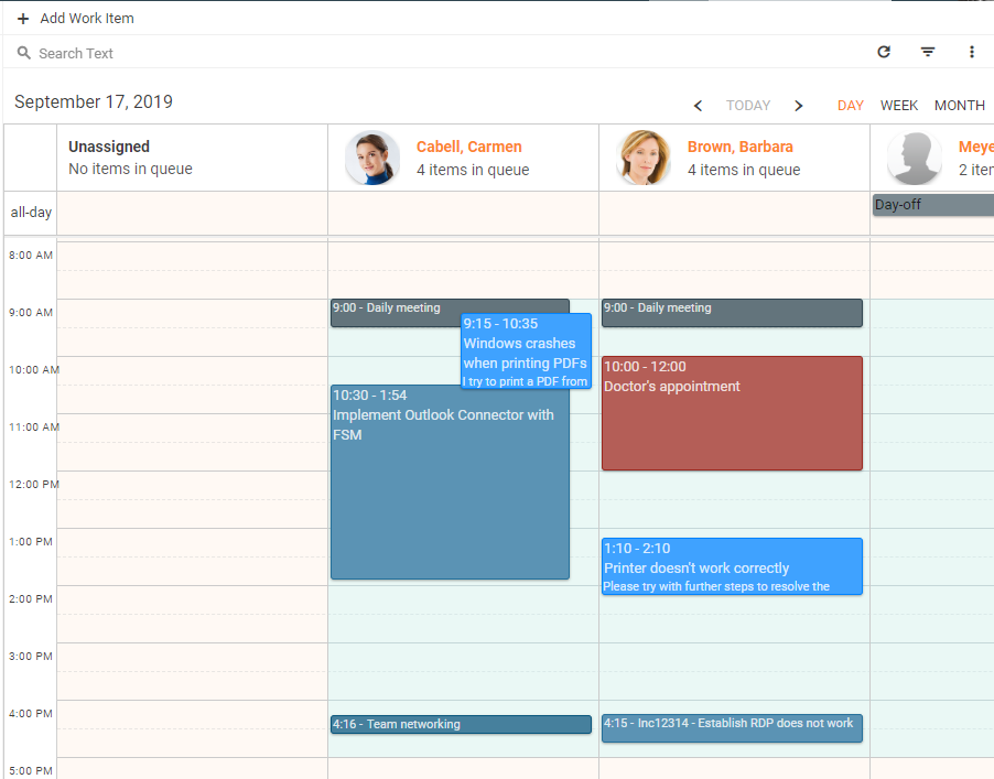
- switching to extra dimension view option results in a familiar calendar view:
- Select available views check-boxes define how the data can be grouped on the page:
- Day
- Week
- Month
- Default view: choose one of the enabled options (day, week, month);
- Title: this field suggests all columns of a string type from the previously specified Data Query. Retrieved from this column data will be used as a title of the displayed in the calendar event;
- Description: choose from the string types of files to specify the source of the displayed in the calendar description of the event, placed under the title;
- Start Date: choose from the suggested options to specify the source column of the event's starting date. Options are suggested based on the date-time data type of the available in the Data Query columns;
- End Date: dynamically retrieved based on the selected Data Query column intended to designate the data source for the event's end date;
- Read-only: choose from the available in the Data Query column of a boolean type. This filed defines whether the event will be in preview only mode or it can be clicked and edited right from the calendar.
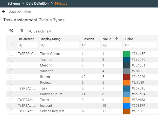
- Background color: optionally, choose the Data Query column that holds the color data that can be used as the background color of the event. For example, events can have different colors based on the type of event. These colors can be specified as hex attribute values of the corresponding data definition of a pickup type, for example, Task Assignment Pickup Types in Administration → Schema → Data Definition:
If left empty, the same background color from the currently active color theme will be used for all events displayed in the calendar; - Show as "Whole Day" item: choose from the available in the Data Query column of a boolean type. The value of the field designates whether the event should be placed in the all-day section of the calendar;
- Show as background item: this property is intended for configuration of an element that can be used to highlight the background area of the day in a calendar and placed under the displayed events, for example, the employee's working hours (9a.m.-5p.m.):
- Show holidays: select the check-box to show holidays in the all-day events section of the calendar view. Configured holidays are shown in all enabled for the calendar views (day, week, month). Holidays are managed in Service Desk → Configurations → Holidays and are shown for a specific user based on the Location specified for the Person.
Extra Dimension
Main dimension is specified by the Configuration Item of the Data Source, for example, a Work Item.
- Relation: main dimension can have a relation, for example, a work item can have a responsible. Specify the relation field to enable additional data grouping dimension along with the main one. Only one-to-one data relations are suitable for this property configuration;
- Image: the data source of an image for the specified Relation property, for example, a profile image of an employee responsible for the task;
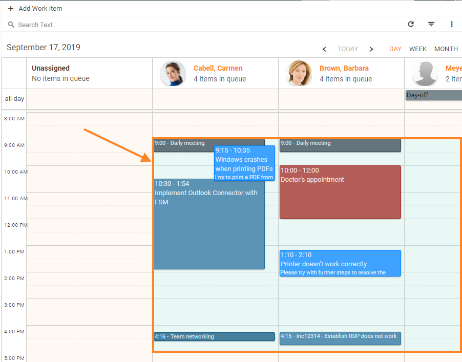
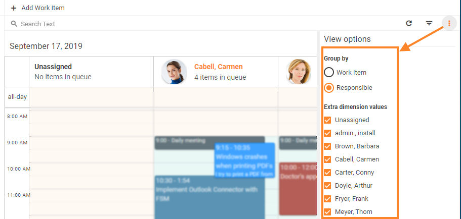
- Group by Extra Dimension by Default: select the check-box to open calendar data arranged based on the extra dimension by default. The standard data dimension can be later switched by the application user in the view options section of the page:
Board settings
- Default grouping attribute
- Enable Drag&Drop
Board displaying example: