Object Relations Grid
Goal
This how-to explains the basics of the Object Relations Grid settings and provides examples of the properties configuration.
Data type: object reference.
The main purpose of the object relations grid type is to display data that is stored as a collection of relations of the main object of the edited layout and affiliated by specific criteria entries. For instance, Incident as the main object and a list of related Services that were affected by the current Incident.
For more information about Grid Control types and use cases see Grid Controls page.
Prerequisites
Object relations grid is added and configured after the following steps:
- Administration application: open a Solution Builder;
- User Interface → Layouts: create new or edit existing layout;
- Data model: click "Customize" layout action and drag&drop an object reference data from the Data Model section on the layout designer canvas.
Object relations grid is most often used in such layouts:
- Dialog
- Wizard
- Preview
- Landing page
Minimal required property settings
For proper grid displaying it is necessary to define the source of the related entries retrieval to the grid and columns to show.
The following data model properties are minimum required for the grid displaying:
- Relation: defines both the data source for the grid and columns to display.
The rest of the properties are assigned by default and can be optionally modified if necessary. Other properties refine the displayed records by specified criteria, define the add, edit, delete modes of the grid records and grid's look&feel.
Default object relations Grid characteristics
By default, each object relations grid with the configured minimum required properties results in the following page elements:
- Heading row;
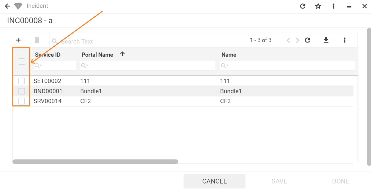
- Column with a check-box for records multiple selection;
- Columns data sorting order (ascending/descending);
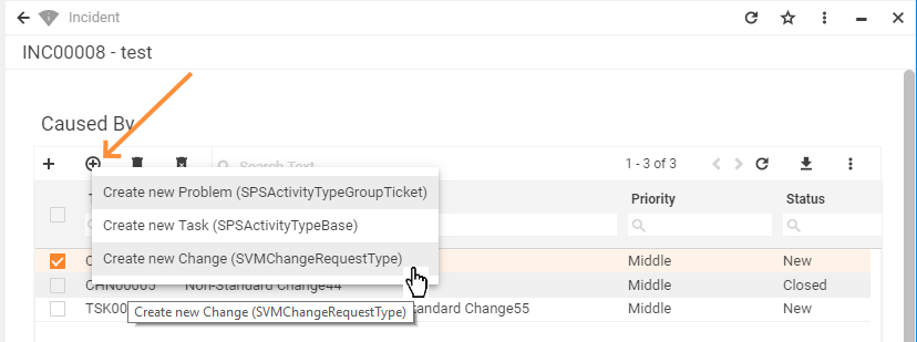
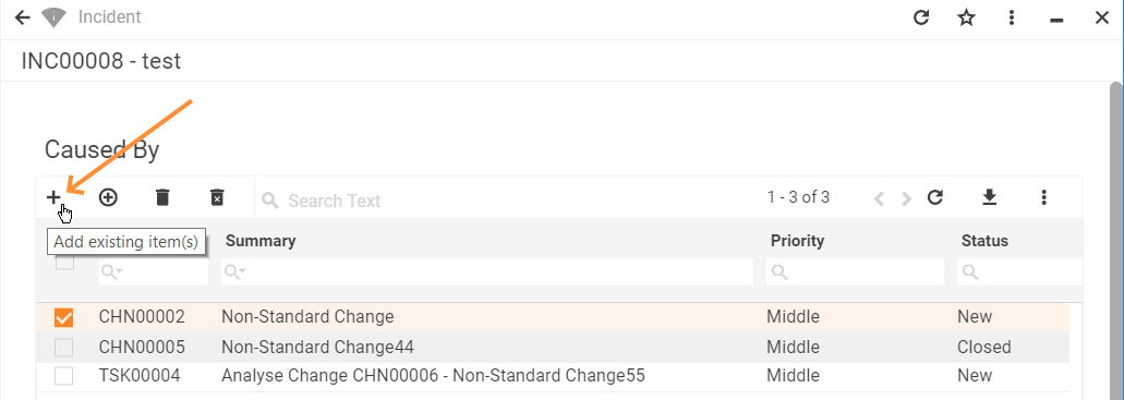
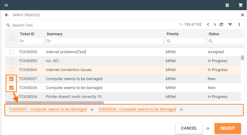
- Add record from a list of existing items;
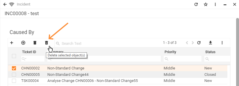
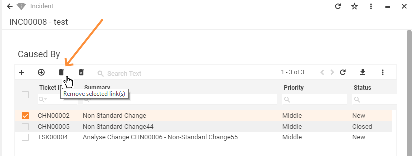
- Delete selected relation(s) button;
- Search field for displayed data filtering (global search and per each displayed field);
- Pagination: all records are not shown on the same page but can be navigated through by selecting the next or previous page;
- Refresh button for new records retrieval;
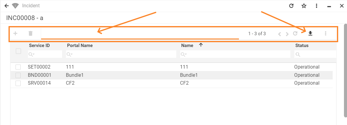
- Export data (download .xlsx spreadsheet);
- Column preview mode (show/hide specific columns).
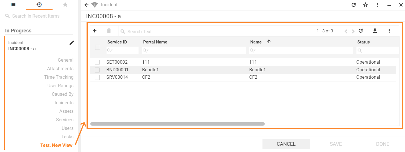
Object relations Grid: preview example with default grid characteristics
Properties and settings
The table provides a detailed list of configurable object relations grid properties, their settings, and particularities overview.
| Property group | Property name | Description | Default | Property setting example |
|---|---|---|---|---|
Model |
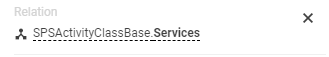
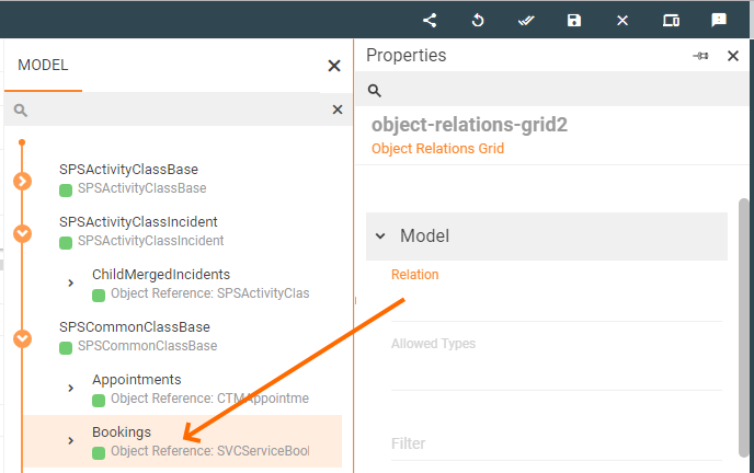
Relation |
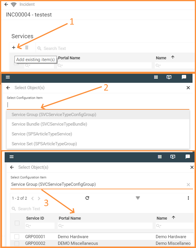
Defines which data will be displayed in the grid. This field is required and should be selected manually:
Relation field suggests data from the model of an Object Reference type only. Selected object reference is a relation attribute of a related to the main object Data Definition (see Administration → Schema → Data Definition → Relations tab) . Stored in the system Data Definition is a database table with its own specific structure. This Data Definition can have a default Data query which defines a set of columns that can be displayed in the grid (applicable for cases when the Data query is based on a Data Definition). Set Column definition property in order to have necessary columns retrieved to the grid's header row. If the default Data query for the selected Relation does not exist, the system results in error only during the application's runtime. Selected value acts as a raw data source of a collection of relations that is filtered before displaying in the application's runtime according to additional criteria set in other properties of the Model section which are listed below. |
❌ |
 |
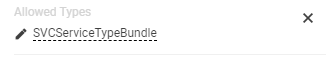
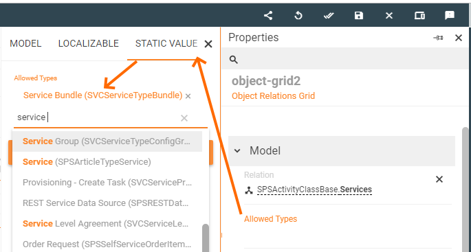
Allowed types |
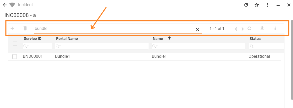
For instance, selected Relation field value shows all available Services which are related to the Incident. Specified Allowed Types narrow down the list of showed records by specifying the part of which Configuration Item the value of the Relation field must be. Currently, Martix42 platform has 4 types of services: service, bundle, group, and set. By specifying Service Bundle Configuration Item in the Static value bundle records only will be retrieved to the grid:
|
❌ |  |
|
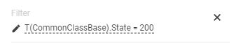
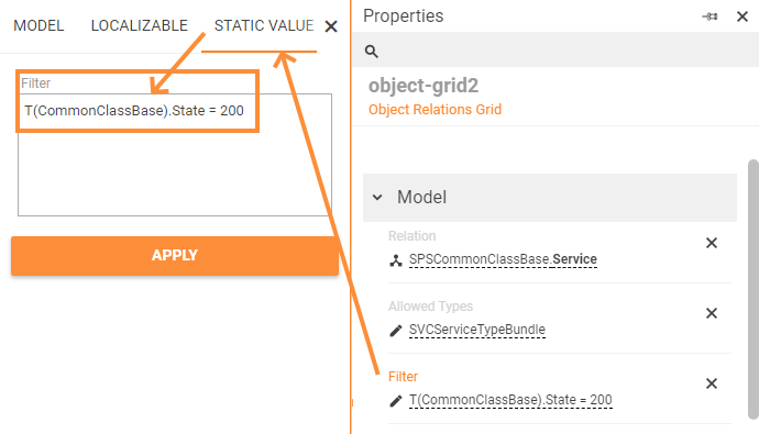
Filter |
For instance, the following condition retrieves only records with a specific state: A combination of the specified in the Model property group fields are applied one after another and filter out the records to show:
|
❌ |  |
|
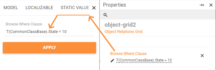
Browse where clause |
For instance, object relations grid shows all Services that are related to the current Incident. The services can have various statuses: operational, retired, approved, etc. Let's suppose that all the following services that can be added as related should be of an operational status only. Specify this condition in the Browse where clause using an appropriate ASQL expression:
|
❌ | ||
Data Query |
|
❌ |  |
|
Common |
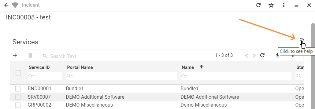
Help |
help icon and tooltip for information displaying as:
Help icon with a tooltip displaying example |
❌ |  |
Label |
title of the grid. Can be set via one of the following options:
Localizable grid label example |
❌ |  |
|
Show label |
Check-box options:
|
Disabled |  |
|
Disabled |
|
False |  |
|
Read-only |
|
False |  |
|
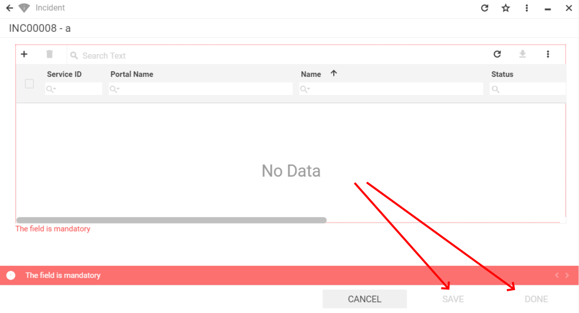
Required |
|
False | 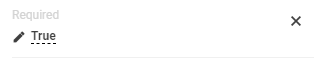 |
|
Enable filter of Configuration Item |
Check-box options:
|
Disabled | ||
Name |
automatically generated name or identifier of the grid. The only required field for the grid saving, although without properly configured Relation property the entire grid is poorly displayed. |
auto-generated |  |
|
Appearance |
Full Height |
Check-box options:
|
Disabled |  |
Minimal Height, px |
defines the fixed height of the grid displayed on the page. Set and measured in pixels, for instance: "100". The specified height is spread upon the entire grid representation, including grid's header with default buttons area (export, columns preview), grid heading row and displayed records data. |
❌ | 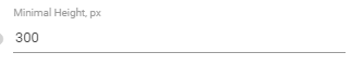 |
|
Disable create |
|
True |  |
|
Disable add |
|
False | 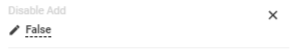 |
|
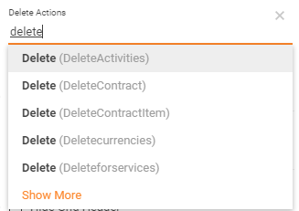
Delete Actions |
manually entered field value:
For Actions management see Administration application → User Interface → Actions. As a result, selected delete action allows deleting a relation and the entire related item record from the system via Delete selected object(s) button of the object relations grid: |
❌ |  |
|
Disable remove |
|
False | 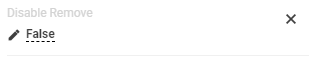 |
|
Visibility |
Grid display on the page modes:
|
True | 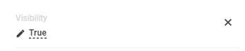 |
|
Hide Grid Header |
Check-box options:
|
Disabled |  |
|
Show "Selected items" panel |
Check-box options:
Selected items panel provides an overview of multiple items selected on different pages of the grid:
The panel shows the Display Name of the selected items. The Display Name property value is retrieved from the Configuration Item of the selected object. |
False | 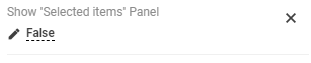 |
|
Enable row selection |
|
True | 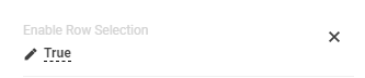 |
|
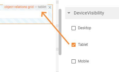
Device visibility |
Desktop |
This property allows improving user experience by managing device visibility options. For instance, the grid can be hidden from the preview when it is too large and contains a lot of columns that cannot fit the small screen of a mobile device. The application checks the user device's screen resolution and shows or hides grid preview based on the selected check-box options settings:
Device visibility settings example: object relations grid is enabled for tablets only. |
Enabled | 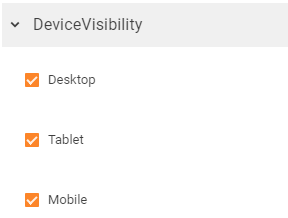 |
Tablet |
Enabled | |||
Mobile |
Enabled |
Use Case: Dynamically add data to Object Relation Grid
Value of the Relations property
The data is loaded to the grid based on the Data Definition, specified in the Relation field, but the changes like adding or removing items are reflected in Value. On submitting the From with Relation Grid only appropriate actions are executed which also solves the problem of concurrent editing of relations.
Value is a complex object which reflects the changes of data relations. Due to the possibility to deal with a huge amount of the related objects, the Value does not keep the array of all related objects but only a list of data changes made during the current session.
In simplified form, the modified by the Value data relations may look as follows:
{
    AddedRelations:['{id1}', '{id2}'],
    RemovedRelations:['{id3}']
}
// where {id1}, {id2}, {id3} are unique objects identificators (guid)
Pre-filling object relations grid dynamically
The example below shows how to modify existing object reference specified in the Relations property of the object relations grid in order to add an extra condition of data processing before showing it in the grid.
The described case is only applicable to those object references that were added to the Relation field directly from the Data Model and modified accordingly. That said, it is not necessary to create a new property in the Context of the Data Model, but it is required to edit the existing data property.
Dynamic data pre-filling in the grid can be useful when the data modified in one area of the layout affects records retrieved to the other area of the layout, containing the object relations grid. For instance, creating a Dialog for data editing: when the data entered in the edit dialog is saved and a new object is created, this object should be also immediately displayed in the Object Relations Grid of the same layout or of the other page layout due to some specific conditions or context, e.g. current user, some interactive input, etc.
The additional conditions that allow dynamical data pre-filling are specified in:
- the existing object reference, set as Relation source;
- defined via Edit property → Configure calculated property → Advanced Mode using JavaScript expression.
The example below shows how to modify the Value of the existing object reference property in order to retrieve all Incidents of the user defined as initiator and dynamically add these entries to the Related Incidents:
- Retrieving Incidents by Initiator: create Data Source which obtains all the related incidents depending on a specified Initiator (for example, InitiatorIncidents property);
- Specifying conditions for dynamic data retrieval: define special logic for the property which serves as a source of the data to show in the grid (Incident.ChildActivities) by
a. setting related data model properties that should be taken into account in the condition and trigger displayed in the object relations grid data changes;
b. specifying JavaScript expression which is a condition that results in dynamic data pre-filling of the object relation grid:
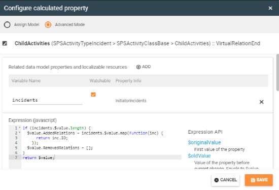 |
Code to copy:
if (incidents.$value.length) {
  $value.AddedRelations = incidents.$value.map(function(inc) {
      return inc.ID;
    });
  $value.RemovedRelations = [];
}
return $value;
|