Landing Page
Overview
A Landing Page is a web page that explains the product or service offer and places visual emphasis on the value of the product or service presented. Landing Pages usually contain clear, concise, and action-oriented headlines followed by clear and concise paragraphs reinforced with visuals, such as graphs and images.
Starting with v.12.1.0 such visual content can be easily created and managed with Dashboards and Widgets. For more details, see Managing Dashboards and Reports in New Look.
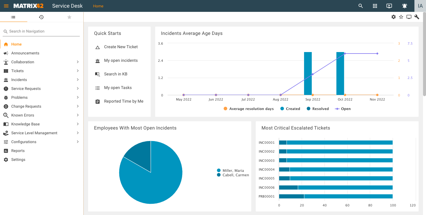
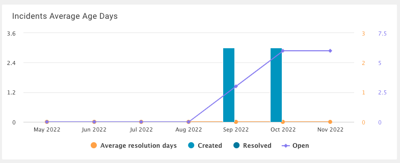
Below is a sample Landing Page created with the help of the Solution Builder:
To open the page in an Application, assign the created Landing Page to a Navigation Item.
Creating a Landing Page
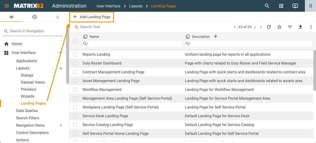
To create a Landing Page, in the Administration application, under User Interface open Layouts:
- Select Landing Pages and click Add Landing Page action:
- Fill out and save the dialog that appears:
- Name: provide a name of a Landing Page;
- Description: optionally, add a description;
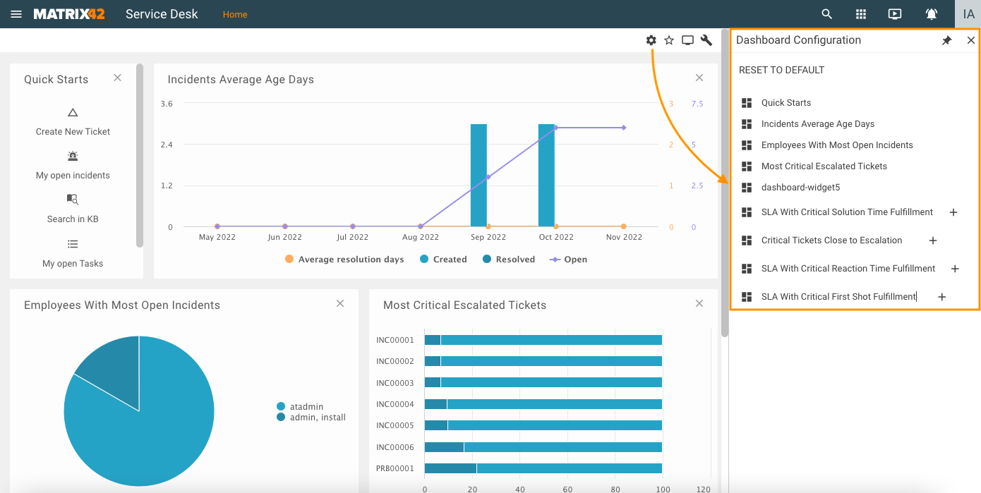
- Enable Personalization: in the dialog, select the Enable Personalization checkbox to allow end users to configure the Landing Page - hide entities, such as graphs and charts, from or add them back to the Landing Page - directly from the UI. This checkbox can be selected only on creating the Landing Page and cannot be changed later.
With Enable Personalization property selected, users can open the Dashboard Configuration with all the entities that can be added to the Landing Page with a click of the Configure button and then add the entities to the Landing Page by clicking the + button next to those entities in the Dashboard Configuration:
For more details, see also Dashboard Widget page.
- Click Save or Done in the New Landing Page Creation dialog once you provide all the required data.
- Design the look and feel of the new Landing Page in the Layout Designer that opens in a new tab:
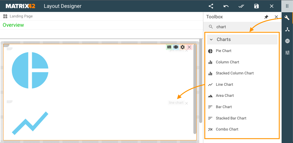
- In the right-hand panel of the Layout Designer, open the Toolbox by clicking the Toolbox (Wrench) icon, locate the controls you need under the available categories - Literals, Controls, Layout, Image Controls, Grid Controls, and Charts - and then drag-and-drop the selected entities onto the canvas, into the desired location.
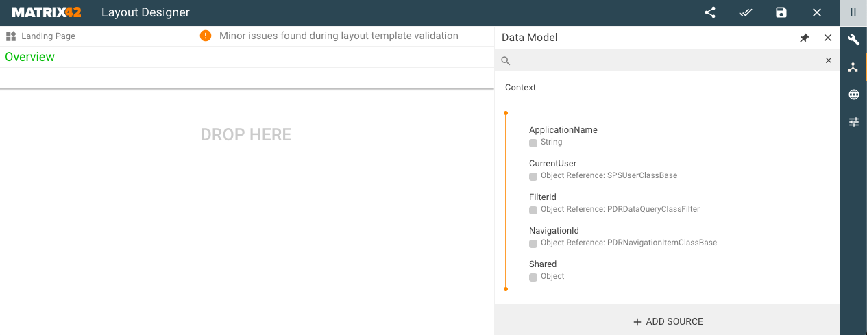
- You can also switch to the Data Model view in the right-hand panel by clicking the Data Model icon located in its rightmost part, at the top, right below the Wrench icon, click the +Add Source button at the very bottom of the right-hand panel and create a new Source Configuration from a Service Operation, Entity, Data Definition, or Data Query. Once you add a Configuration Source by filling out and saving the Add New Source dialog, you can use the data from the new source in the Landing Page you are building. Just drag the data from the right-hand panel and drop it onto the canvas to add fields and other controls to the dialog, exactly where you need them. Once you drag and drop an attribute or relation onto the canvas, select the type of control from the list of available options that appears. The new entity will be added to the canvas. You can now set properties for the newly added attribute or relation in the Layout Container that opens up in the right-hand panel. For more details, see also Data Model page.
- When done designing the layout, click the Save&Close button located in the Main Toolbar at the top of the screen.
You can modify the Landing Page in the Layout Designer at a later point in time by clicking … More → Customize in the toolbar of the entity’s Preview dialog. Once you open an entity in the Layout Designer, you can make changes to the layout of this entity by rearranging the data on the canvas, modifying its look and feel, removing the attributes and relations from the canvas, and adding new ones from the right-hand panel. For more details on the Layout Designer's basic functions, see also the Layout designer: Working with Layout Designer section.
The most usable controls for Landing pages are Quick Links and Charts.
Quick link
A Quick Link is a control that can be used to execute any actions in our system.
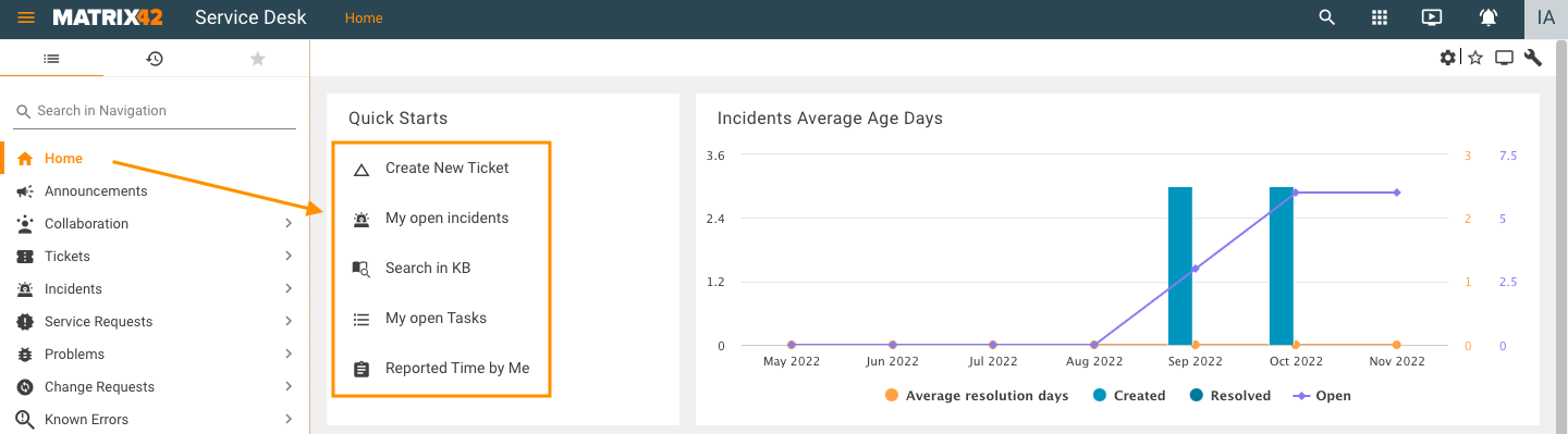
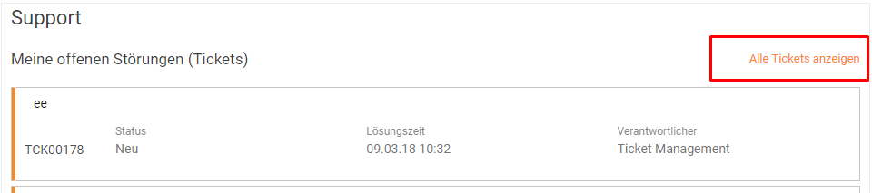
Quick Link display example in Service Desk Home page
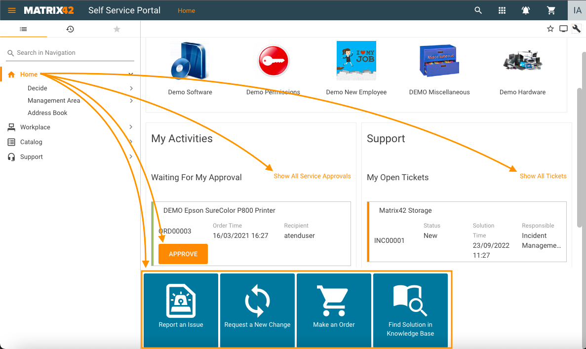
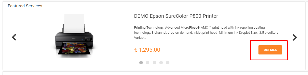
Quick Link display examples in Self Service Portal Home page
There are the following types of quick links which can be configured in the Model section:
- Go to Navigation
- Open Dialog (New/Edit/Preview)
- Execute Action
- Open external link
- Call service
- Assign some data (used to execute other calculation fields in Designer)
- Go to Landing Page
By default, a quick link will be shown only if the configured action is accessible to the current user. This behavior can be changed by the checkbox “Hide if unavailable” in the Appearance section.
Go to Navigation
Used to go to some navigation items in the system.
Attributes:
- Navigation item: choose which one should be opened;
- Filter: configure the filter of the selected navigation item;
- View type: dataset type (grid, list, calendar).
Dialog
Used to open any dialog for some object.
The object can be set by EntityType and ObjectID or by EntityClassName and ID.
- To open “New dialog”: choose only EntityType (but not ObjectID);
- To open “Preview”: choose both EntityType and ObjectID (or EntityClassName and ID);
- To open “Edit Dialog”: choose an object for Preview and set Edit Mode as true.
Action
Used to execute some configured action from the system.
Attributes:
- Action: choose an action;
- Action context: add context which should be added to the action. Action context is an array of JS objects which define the ID and the Type of the action context object:
return [{ _id: booking.Id, _type: "SVCServiceBookingType"}];
- Disable on action submit: if checked, this quick link will be disabled after the action (wizard) is submitted;
- Reload on action submit: reload Preview when action (wizard) is submitted.
External
Used to open external links.
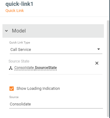
Call service
Used to execute a service.
Attributes:
- Source: the name of the source from the Data Model which should be executed;
- Source State: bind to Source State of the selected Source;
- Show Loading Indication: if checked, the “circle loader” will be shown near the quick link during Source loading.
Assign
Used to assign one field from the Data Model to another. It can be used to recalculate some logic in Calculated Fields.
- Assign Source: the field from the Data Model which will be assigned to the field selected in the Assign Destination.
Landing Page
Used to go to chosen Landing Page (for example, if this Landing Page is enabled for the current user but is not available for any navigation item).
Common properties
- Title: text which will be shown in the first line of the quick link;
- Description: text which will be shown in the second line of the quick link;
- Confirmation message: if this message is entered, then before the execution, the confirmation dialog will be shown with this message.
Appearance
- Mode
- Button: show the quick link as a button
- Link: show the quick link as a link
- Style: several pre-configured styles for the quick link (for mode “button”)
- Icon
- Icon color
- Text color
- Background color
- Darker hovered background to add “hovered styles”
- Hide if unavailable: if checked, then the quick link will be hidden if the configured action is not available for the current user
- Detect small size: quick link will change its layout when it is located on a widget with a small size (it uses for Landing pages with Personalization, where widget sizes can be changed by the user).
Advanced
There are some extra properties for all modes:
- Assign Before – Source
- Assign Before – Destination
These properties work like properties from “Assign” but they are executed before the main action. This is not often the case, usually, it is needed for Quick Links on Tiles (where a quick ink is added to the repeater). - Outer context: the data that will be added to Context.OuterContext of opened Dialog.
Charts
There are such types of charts:
- Pie
- Column
- Line
- Area
- Bar
- Stacked Column
- Stacked Bar
- Combo Chart
Most of the charts have very similar attributes (except for the Combo Chart).
Section “Model”
To configure charts, first, it is necessary to add some DataSource that returns an array of objects. These objects should have at least two properties that will be used as data for X- and Y- axes.
- Set some array with objects to attribute “Data”.
- After that, all property names of these objects will be loaded to attributes “Legend Field Name”, “Value Field Name” and “Stacked Field Name” (only for “stacked” charts). Choose them:
- Legend Field Name: property which contains legend data;
- Value Field Name: property which contains values data;
- Stacked Field Name: a property by which data combines in a stack (if these values of different objects are equal).
- Loading state: if it is necessary to show a loader while DataSource is loading, then this property should be set as “Loading state” of chosen DataSource.
- X-Axis Title and Y-Axis Title: titles of the axis displayed on the chart.
Section “Output”
- Selected Data Item: data of selected point on the chart. It is used to do any actions after a click on the chart.
Section “Legend”
This section contains parameters that configure legend visibility.
Section "Appearance"
- Chart title;
- Title Align: how the title should be displayed;
- Show Only Top Bars/Columns: show only the top bars/columns which are placed in the area. Other bars will be hidden until the chart will be resized (used on Landing Pages with personalization, where the widget can be resized by the end-user)
- Data Labels Format: the format of point labels on charts. Variables {x} and {y} can be used here to add values of x and y to label.
- Tooltip Format: format of the tooltip which is shown over charts. Variables {x} and {y} can be used here to add values of x and y to label.
- No Data Message: message which is shown if data is not available. By default: "There is no data available to generate this chart'
Section "Details"
Attributes from this section are used to configure which dialogs should be opened on clicking on the chart. It can be configured to open the Preview of some object or to open a grid of objects.
To open a grid of objects:
- Entity Class: object of which entity class should be displayed in the grid;
- Filter Expression: filter for objects in ASQL;
- Column Definition: the name of the Data Query which will be used to define visible columns.
To open a preview of an object:
- Entity Type: entity type of object
- Object Id: object id of an object
Details View Title: title of opened view.
To show Preview of some object related with a clicked point on a chart, it is necessary:
- array with data for the chart has to contain minimum such attributes:
- value of x which will be displayed on the chart (number)
- value of y which will be displayed in the legend
- EntityType of the related object (or any value which can help to define EntityType of the selected object)
- ObjectId of the related object (or any value which can help to define ObjectID of the selected object)
- add to DataModel new field "SelectedItem" (or any other name) and set it in chart property “Selected Data Item”
- add new field "SelectedEntityType"
- import field "SelectedItem" in "SelectedEntityType and get property "EntityType" from it (e.g. "return selectedItem.$value.EntityType;", or write some logic to define which EntityType is needed)
- set "SelectedEntityType" to chart property "Entity Type"
- the same for ObjectId
Combo Chart
It is possible to configure up to 4 charts in a combo chart. Each of them should be configured in its section: Chart 1, Chart 2, Chart 3, and Chart 4:
Combo Chart display example in the user interface
- Chart Type: first of all, choose the type of each chart in the attribute (line, column, or area).
- Attributes Data, Legend Field Name, Value Field Name: the data for these properties has to be configured in the same way as for a simple chart.
- Details Type: a type of view that will be opened after a click on chart. Available options:
- list (grid) or
- object (Preview)
Configuration is the same as in a simple chart.
- Chart Title: the title of this chart which will be shown in the legend of the combo chart.
- Individual Y-Axis: if checked, then this chart will use individual Y axis with different scales. It is useful when the values of the other chart are very different (e.g. hundreds for the first chart and billions for the second).
Best practices for "Quick Link"
Styles
1. Big squared colored button
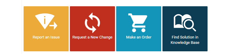
To make a quick link look like the Report an Issue example from the screenshot above, change the following attributes:
- Title: enter any title you need;
In the Appearance section:
- Mode: Button (chosen by default);
- Style: click on the property, in the opened menu click on Static Value and there choose Big Quick Link Without Description;
- Icon: choose any icon;
- Icon color: choose the white color in the color picker;
- Text color: choose the white color in the color picker;
- Background color: choose the yellow color in the color picker (or any other, also it is possible to choose one of the colors from the Theme);
- Darker Hovered Background: true
2. Material button with description for quick start widget
This is the default style for Quick Links. To make Quick Link looks like in the screenshot above, change the following attributes:
- Title: enter any title you need, e.g. New Application;
- Description: enter any description, e.g. Create Application;
- Mode: Button (by default);
- Icon: choose any icon from the library.
3. Quick Links for resizable widgets
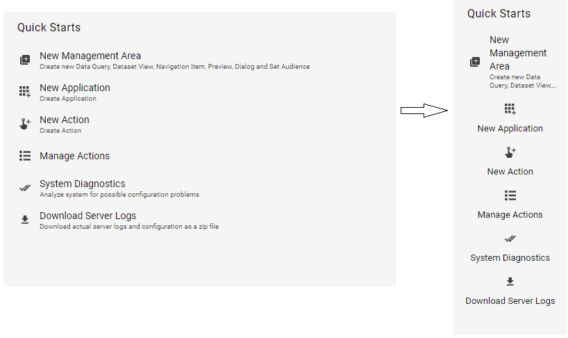
In the screenshot, all the quick links, except for "New management Area", have an attribute "Detect Small Size" = "true".
So, if this attribute is set as true and the end user changes the size of the widget where the quick link is located, then the quick link automatically hides the description and changes its layout.
4. Quick link as hyperlink
To make quick links look like hyperlinks, change the attribute Mode to Link and don't use Style in this mode.
5. Quick Link as an active button
Attributes:
- Title: any title;
- Mode: Button (by default);
- Style: Static Value => Active button;
- Full width: False;
- Detect small size: False
- Flex option: Fixed (by default);
- Icon: choose an icon if it is needed
By default, Layout Containers (or Dashboard Widgets) stretch their elements. So, it is also necessary to change the layout properties for the container where the quick link is located:
Functionality configuration
1. Open "New Dialog"
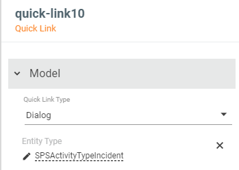
For example, to create a new Incident, set attributes:
- Quick Link Type: Dialog;
- Entity Type: entity type of required object. For incidents, it is "SPSActivityTypeIncident":
2. Open "Preview"
For example, to open the preview of an action "Withdraw" set attributes:
- Quick Link Type: Dialog;
- Entity Type: entity type of this object. For actions, it is "PDRActionType";
- Object ID: GUID of required object;
- Title: any title, e.g. "Open preview of action "Withdraw".
Usually, this case is used with ID which is loaded dynamically by some Source.
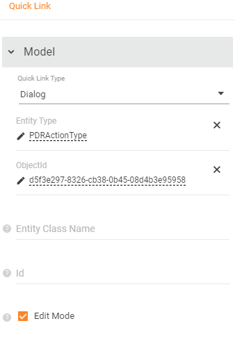
3. Open "Edit dialog"
For this use the same parameters as for "Preview" and also set "Edit Mode" as "true":
4. Active button with confirmation which calls some service
Add some Service Operation as Source to the DataModel. Set "Source Execution Mode" as "On Data Update" for it. Configure input values if it is necessary.
Add a quick link with the next attributes:
- Quick Link Type: Call Service;
- Title: Execute My Service;
- Source: input the name of the Source added to the DataModel;
- Source State: bind property "$sourceState" of added Source;
- Show Loading Indication: true to see loader during Source is working;
- Confirmation message: "This operation can take too much time. Are you sure?" or any other confirmation message;
- Mode: Button;
- Style: Active Button;
- Icon: any icon;
- Full Width: false;
- Detect Small Size: false;
Example with source "Consolidate"