Enhanced Color Contrast
Overview
Enhance Color Contrast mode is an accessibility feature designed to make it easier for visually impaired users to see the screen. When turned on, contrast mode changes the look of Matrix42 applications by adjusting the colors, backgrounds, and brightness of elements on the screen, highlighting, underlining, or accentuating some user interface elements to provide a higher level of contrast. This feature makes it easier for visually impaired users to differentiate between parts and areas of the page and read text.
Enhanced Color Contrast complies with the WCAG and BITV 2.0 guidelines.
Enhance Color Contrast mode is available starting from ESMP v.12.0.2.
Enabling Enhance Color Contrast Mode
To enable this mode, in the user profile, click Enhance Color Contrast mode:
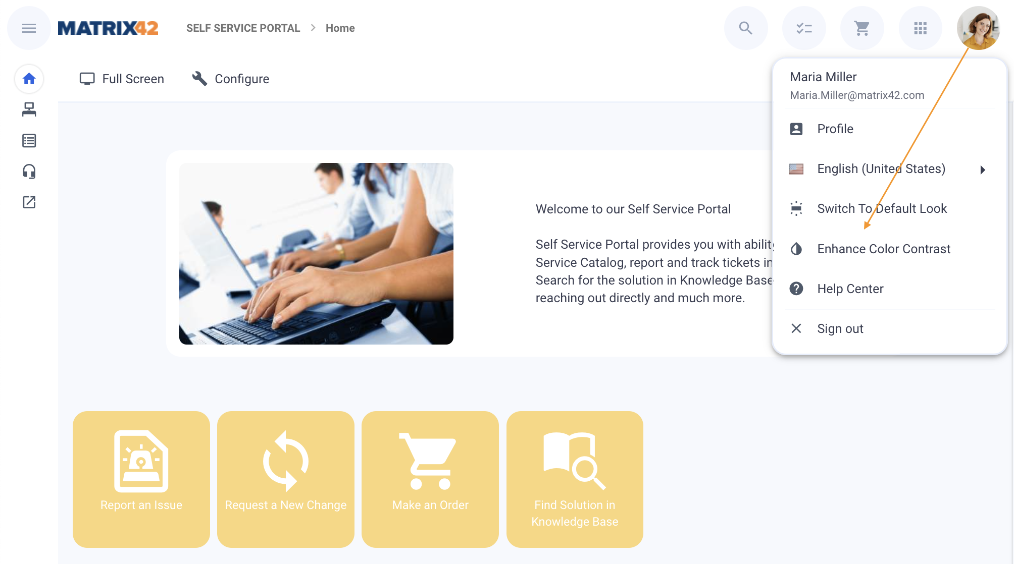
This mode is available not only in the Matrix42 Applications but also in the Layout Designer.
Color contrast is applied to the entire application and its layouts, both in the new look design and default look, standard Themes, or custom themes.
The checkmark  icon next to this mode denotes that the Enhanced Color Contrast is currently active:
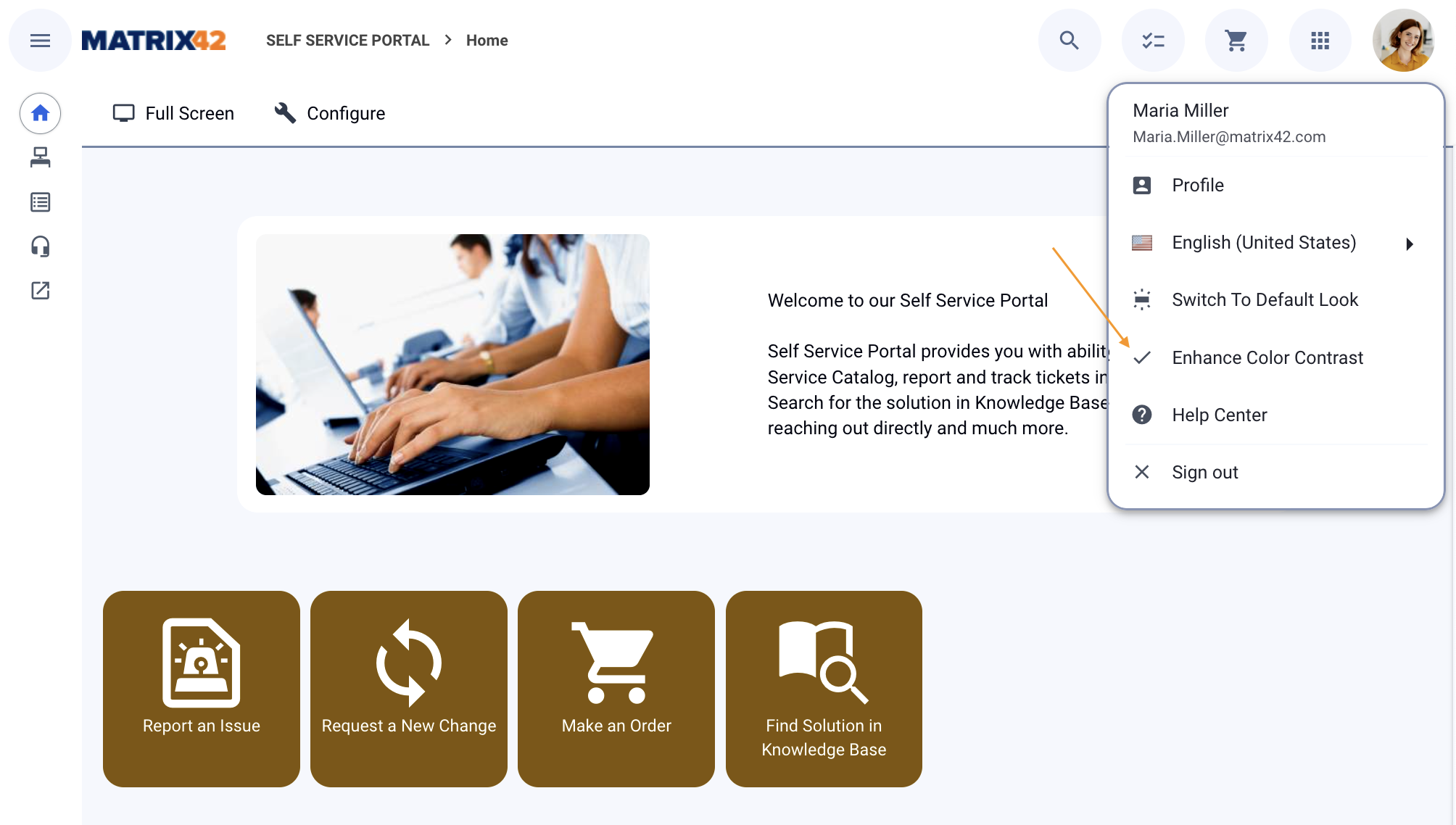
Click on the Enhance Color Contrast mode again to return to the standard view.
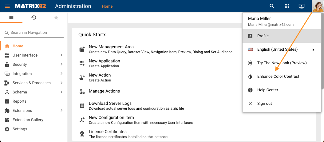
The Default Look has the same option to switch to the Enhance Color Contrast mode:
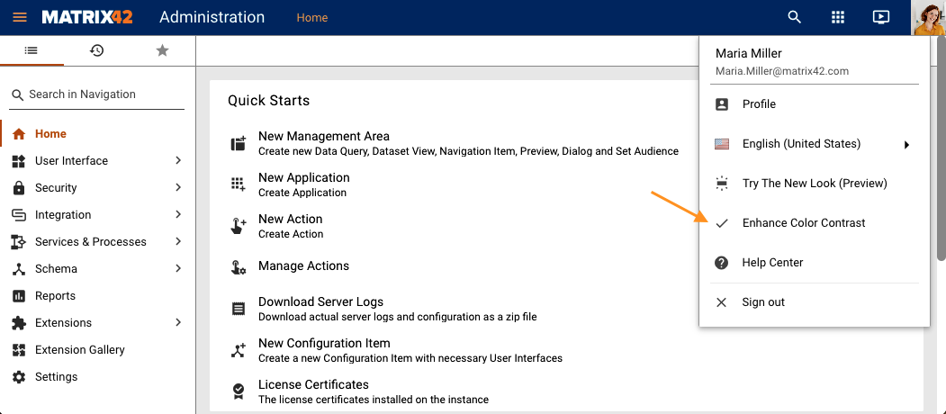
Similarly, the checkmark icon next to this mode denotes that the Enhanced Color Contrast is currently active:
New Look
Contrast mode is applied for the entire application and additionally highlights some of the user interface elements.
The following examples show the difference between the standard (on the left) and enhanced contrast (on the right) modes on different pages.
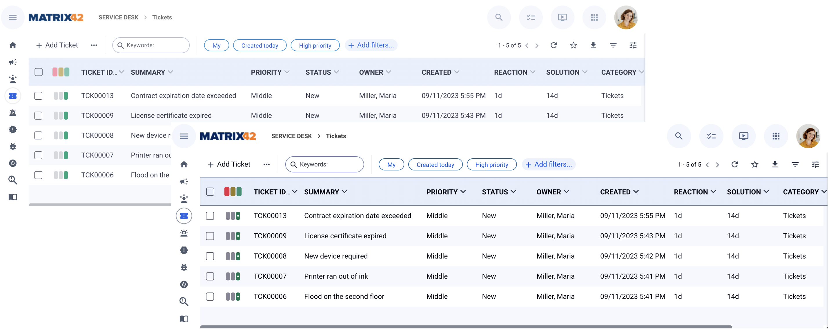
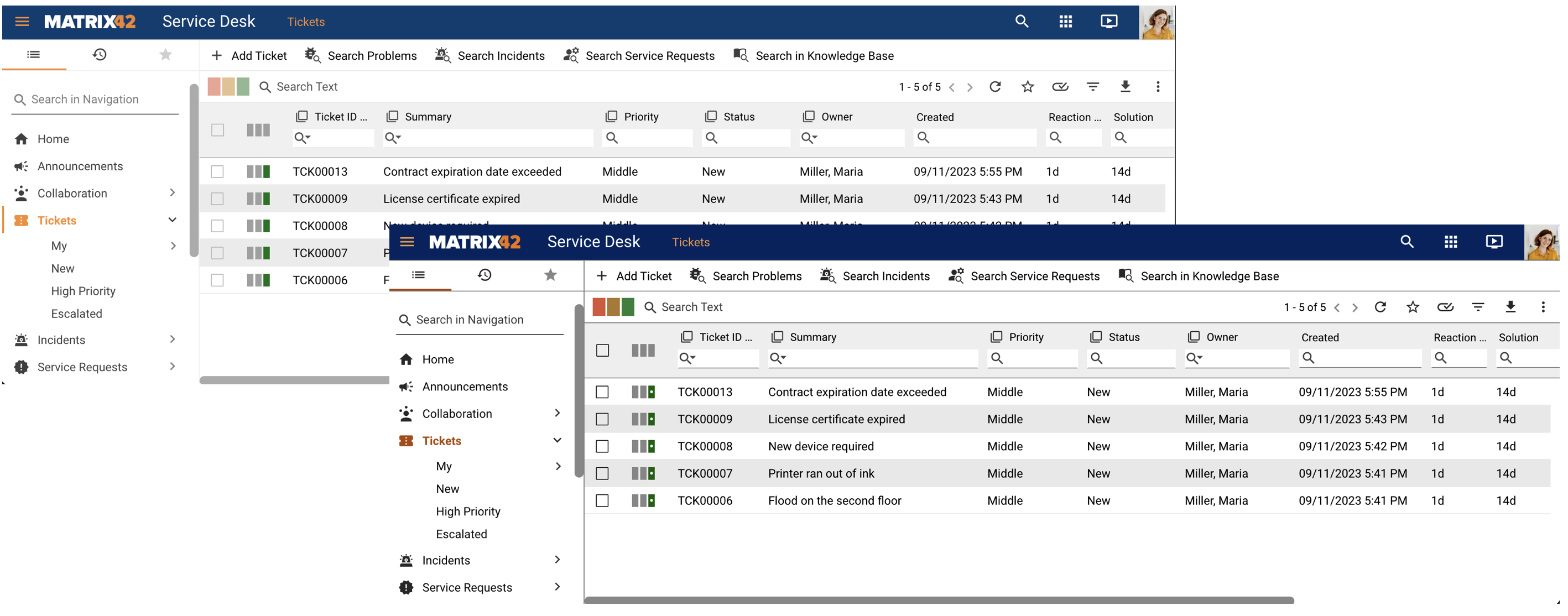
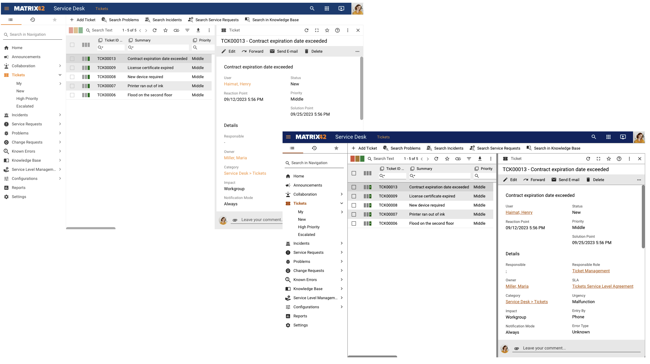
- Grid: on the grid below the enhanced color contrast mode has intensified the text color, icons color, quick filters, and other graphic elements of the page and added borders to some elements
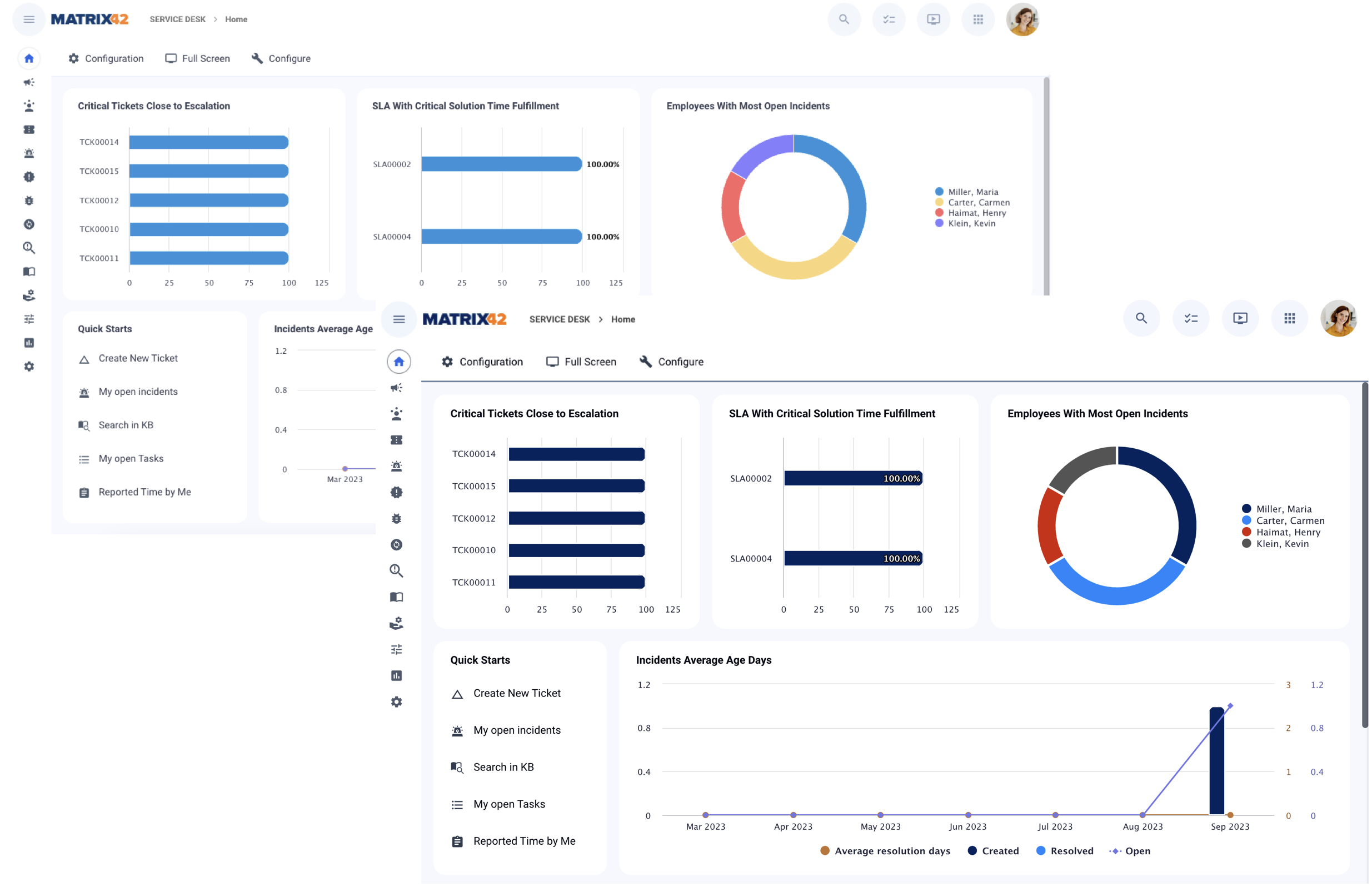
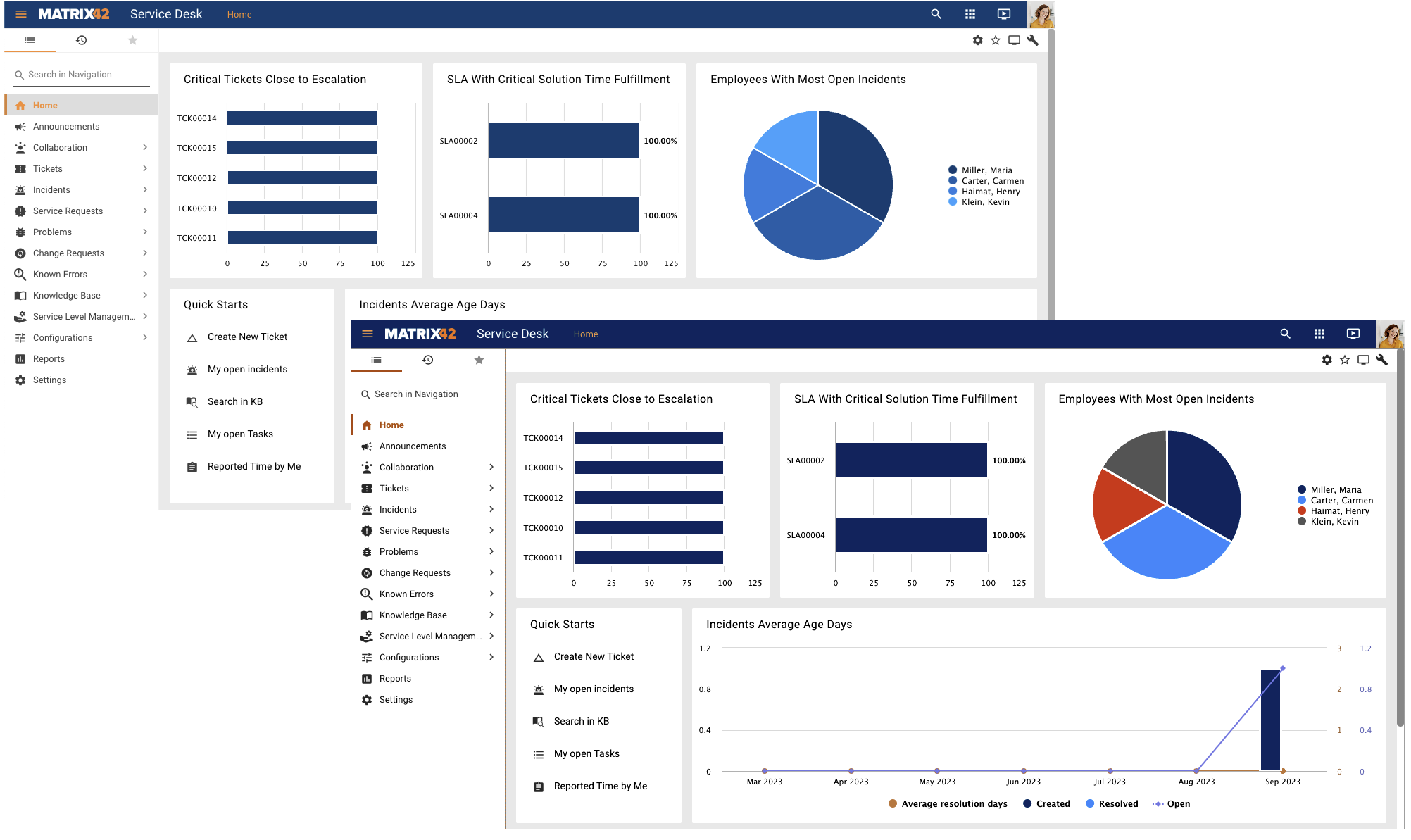
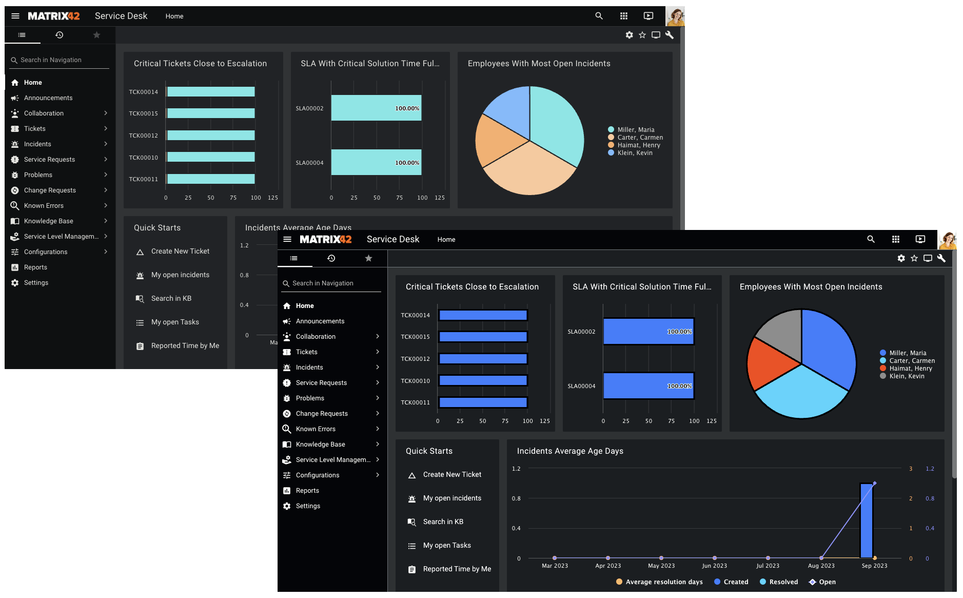
- Charts also have additional borders and fragmentation of the chart elements for better perception:
See also Keyboard shortcuts and navigation page.
-
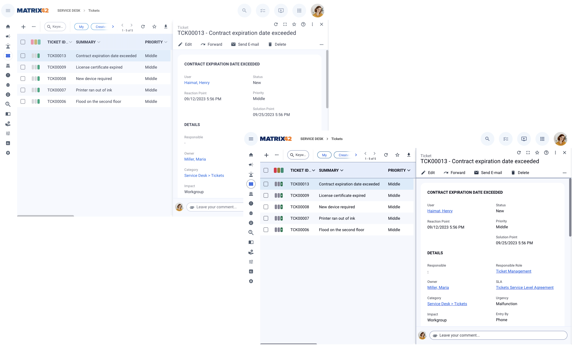
Previews, like other layouts, have contrast borders, scrollbars, and additionally underlined link elements:
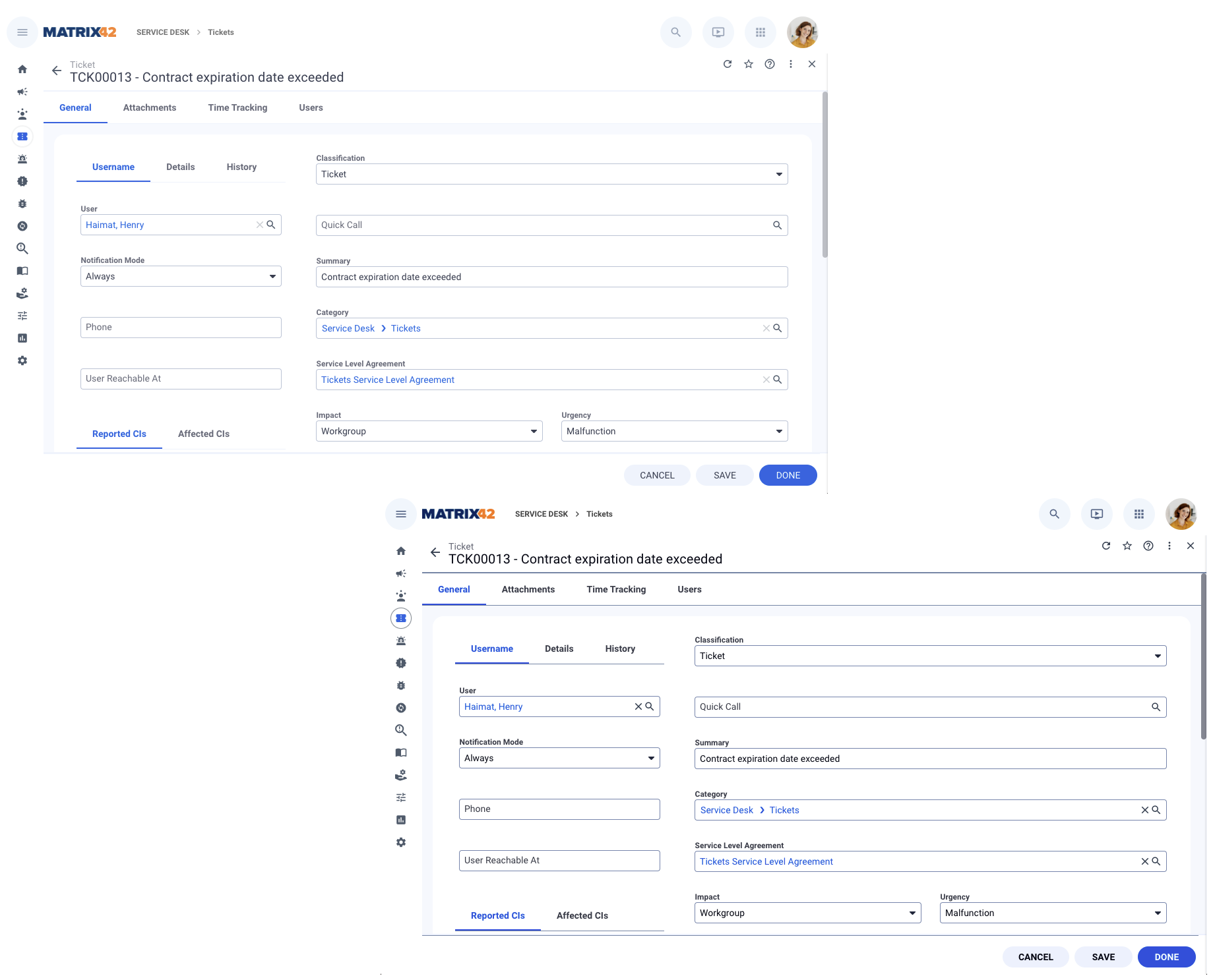
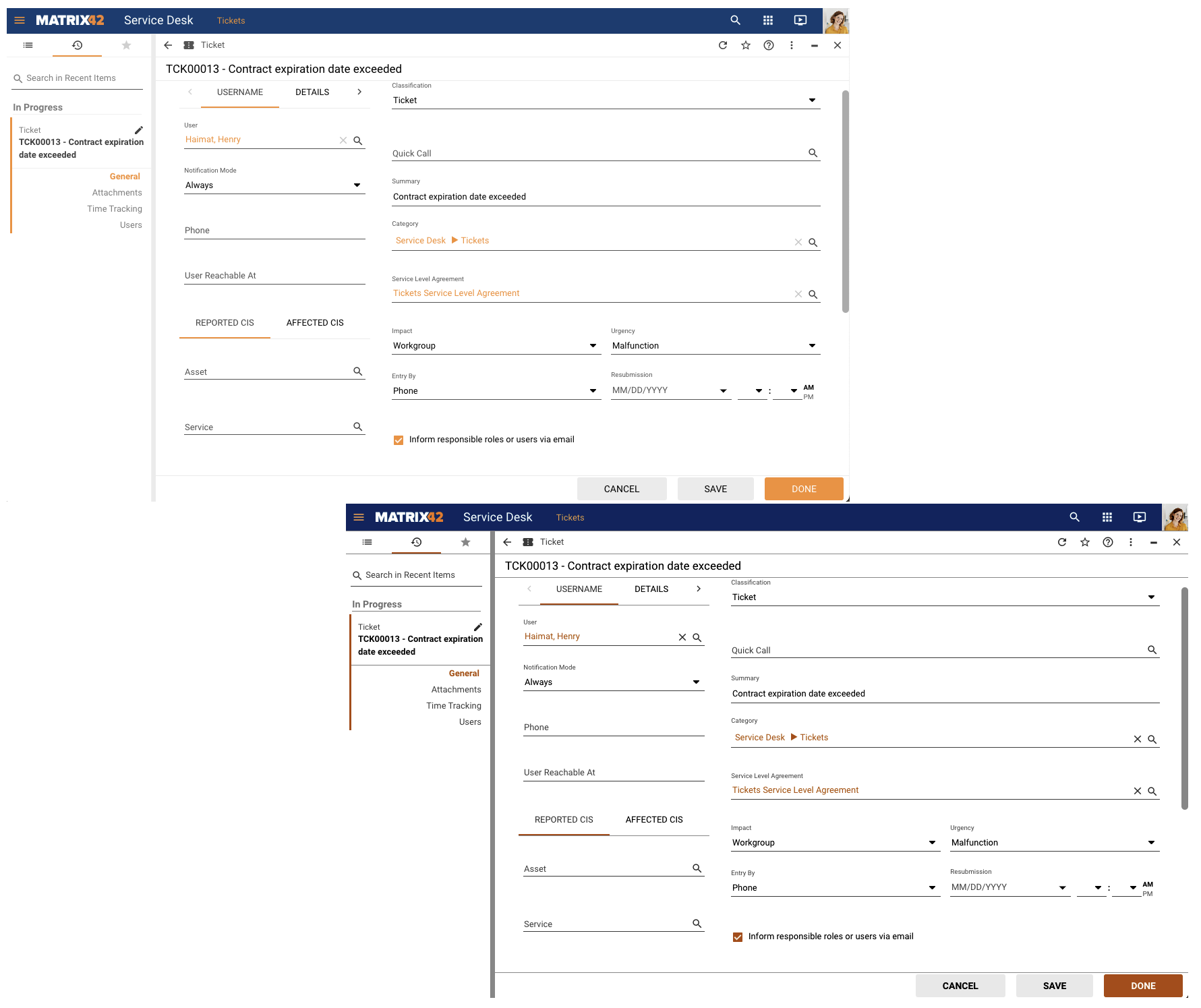
- Dialogs along with standard text contrast, borders, and graphic elements' color contrast additionally have a bold font in the buttons:
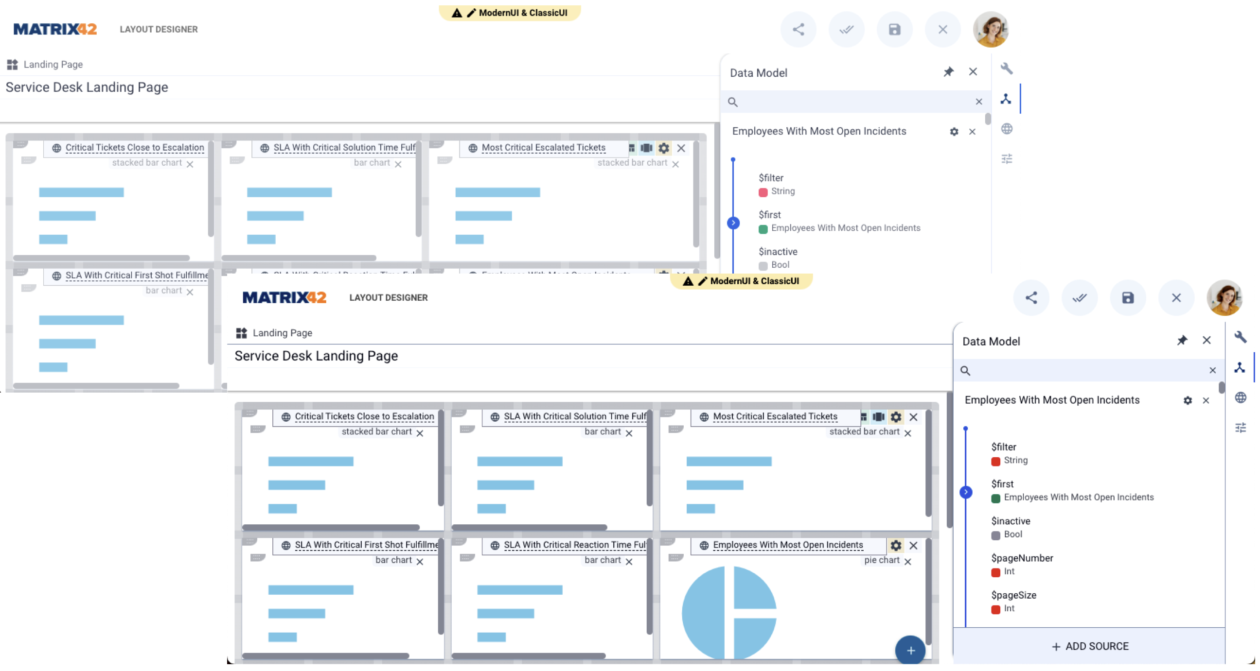
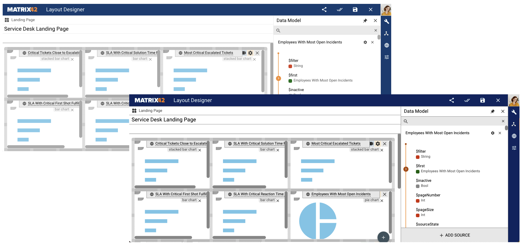
- Layout Designer runs in this mode as follows:
- Other available standard Themes are also automatically adjusted for this mode, for instance, the MX42 Dark Theme is adjusted as follows:
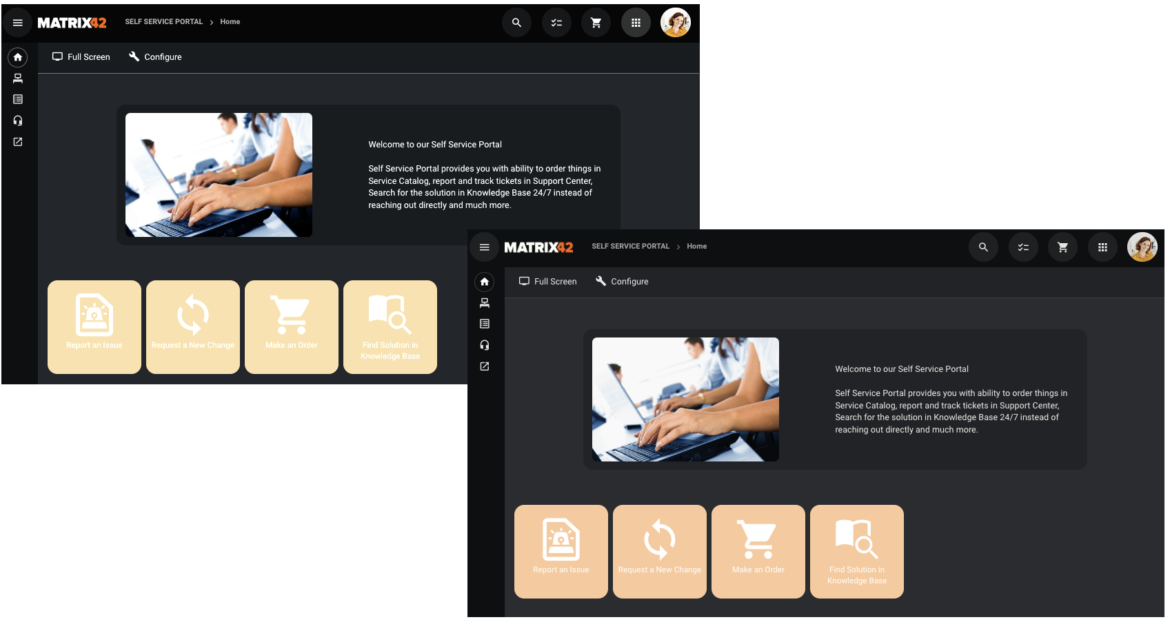
Default Look
When the system still has the Default Look design, the difference between the standard and enhanced color contrast looks as follows:
- Grids:
- Charts:
- Previews:
- Dialogs:
- Layout Designer:
- Other Themes:
The list mentioned above with examples is not a comprehensive list but is provided as an example of the most commonly used layouts and applied changes.
Custom themes
New Themes and modified copies of the standard Themes, both in the Default Look and New Look designs are also automatically adjusted to achieve the necessary contrast as recommended by the guidelines. Still, for better results, the selected colors should be additionally checked with the accessibility tools and modified accordingly.
To check and adjust the color contrast level according to the site accessibility recommended standards you may install browser extensions, for instance, WCAG Color contrast checker or Color Contrast Checker for Chrome browser.