Use Case: Creating Dashboards with Chart controls
Overview
Solution Builders provides a big variety of the Chart controls which can be easily integrated to any user Interface Layout, e.g. Landing Pages.
Goal
To demonstrate how a simple Chart can be added to an already existing Landing Page. In this tutorial, we add a Pie Chart which displays the number of Incidents grouped by priority to the Service Desk Landing Page. When a pie chart sector is clicked, all the related Incidents are displayed in a side panel.
1. Define the Chart Data
First of all, you need to figure out how to obtain the data to be display in the Chart. Any chart in Solution Builder expects an array of objects with at least two properties which represents the item Legend and the number of items. It means that for our goal, we need to obtain data in the following format:
[
    {"Priority": "Low", "Amount": 123},
    {"Priority": "Middle", "Amount": 12}
]
There are plenty of ways to get such data in the Layout Designer. They can be compiled using the Calculated Property which aggregates data from different Data Sources and outputs the array of objects. An alternative, more popular way would be integrating a Data Source which already provides the required array of data, like a Web Service which returns some statistics, or Data Query Data Source which uses and SQL query to obtain the data, to the Data Model. For our case, we use a Data Definition Data Source as the most appropriate.
1. In the Layout Designer of the "Service Desk" Landing page, open the Data Modeler.
2. Click "ADD SOURCE" to define a new Data Source which represents data for the Chart.
3. Configure the new Data Source:
| Name | Incidents_by_Priority |
| Source Execution Mode |
On Init (the data is not volatile and does not rely on User interaction, which means it is enough to load them once when the page is initialized) |
| Implementation | Data Definition |
| Data Definition | SPSActivityPickupPriority, multiple items |
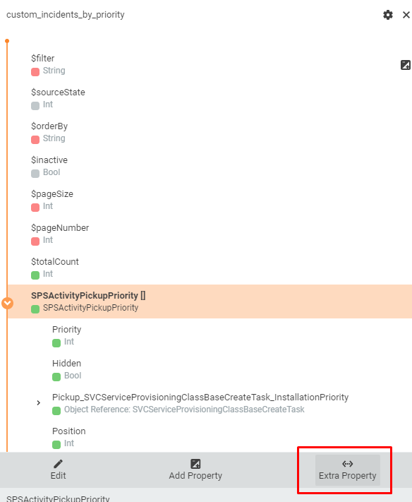
4. Define additional property for just added Data Source which represents the number of Incidents related to each Priority.
Find the Data Source in the bottom of the Layout Data Model. Click "Extra Property" for the Data Source Node

In opened dialog add the ASQL column expression for getting Incidents count:
| Field Name | Amount |
| Type | Integer |
| Expression (ASQL) | SUBQUERY(SPSActivityClassBase as A, Count(A.*), A.Priority = base.Priority and A.UsedInTypeSPSActivityTypeIncident IS NOT NULL) |
5. This Data Source will be loaded only if its property $filter has a value, so it is necessary to set it.
Find added DataSource in the DataModel and its property $filter. Click on it and then click on "Edit". Choose "Advanced mode" and input "Expression":
return "1 = 1";
This means that all items will be loaded. Or any other filter can be used. For example, if it is needed to show only priorities with more than 10 incidents than filter fill be:
return "Amount > 10";
2. Configure Chart appearance
Once the data is integrated to Layout Data Model, we can take care of the visual element. Find the suitable chart in Layout Designer Toolbox (PieChart for our case), and drop it on Layout Canvas, the System automatically opens the selected control properties in Properties Grid.
Define Model
Find Properties section "Model", and bind the previously created Data Source data to the Control. For the Data, pick the Data Model property which keeps the array of Priorities. The System automatically set properties for Legend and Value. If it is wrong to select the right object properties from the drop downs. For our chart correct values are:
3. Configure Chart data details.
Solution Builder allows to handle the clicks on the chart, and show the list of related objects in UUX Side Panel.
For our example, we will open a list of incidents with selected priority.
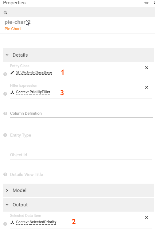
In section "Details" set property "Entity Class" as "SPSActivityClassBase" (see 1. on picture). We any click on any section of the chart will open the list with all activities in the system, without a filter by priority.

To configure the right filtering of the Activities list by the selected Priority do the following steps:
- Introduce a Data Model Property which keeps the data of the Chart selected sector (e.g. clicked sector for Pie Chart, or clicked bar for Stack Bar).
To do that, click on "Context" in "DataModel", click "Add property". In opened dialog set "Field name" = "SelectedPriority", "Data Type" = "Object" - Bind the just created Property "SelectedPriority " to the PieChart control property "Selected Data Item" (see 2. on picture)
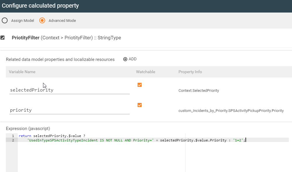
The Property will keep the data related to the selected Chart section. - Now create new property "PriorityFilter" in "Context". The property will keep the A-SQL filter for data Incident List, which corresponds the selected PieChart secttion.
- For the "Context" data source, click to add new Property, and specify Data Type "String", and name "PriorityFilter"
- In Advanced mode, set dependencies to properties "SelectedPriority" and "Priority"
- Construct the Property value depends on dependent properties value
return selectedPriority.$value ?
'UsedInTypeSPSActivityTypeIncident IS NOT NULL AND Priority=' + selectedPriority.$value.Priority : '1=2';

- Setup filtering for the PieChart (see 3. on the picture)