Container Controls
Overview
On this page, you may find a list of container controls and their configuration in the Layout Designer.
Dialog Container
Dialog Container is configured in a Layout to serve as a container for another layout on the page, for instance, when a specific property is chosen on the main layout and it might need some additional properties configuration that is not displayed until this option is selected and thus a layout can show an additional dialog in it.
Dialog Container can be used on the following layout types:
- Dialog
- Wizard
Instead of Dialog Container, use the Composite Control Descriptor to configure the same behavior with more advanced options and simpler configuration.
Properties and Settings
For an example of Dialog Container configuration, open the Service Dialog in the Layout Designer. Service Dialog is used in the Service Catalog application → Service Catalog navigation item → Services → Provisioning view or in the Shopping Cart wizard for the Self Service Portal.
| Property Group | Property Name | Description | Default | Property Setting Example |
|---|---|---|---|---|
Appearance |
Hide Message Panel |
This property allows preventing showing warning or error message duplicates:
|
Selected | 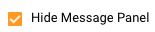 |
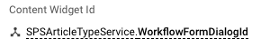
Content Widget ID |
Defines the ID of the Dialog that should be displayed on the Layout: Choose a source from one of the configurable options:
|
❌ |  |
|
Single View |
If a Dialog has several views, with this option being enabled only the first view of the dialog is shown in the Dialog Container.
|
Disabled |  |
|
Available Views |
This option allows showing only specified views on the layout. Choose a source from one of the configurable options:
Note that while configuring this option, the Single View property should be disabled. |
❌ | ||
Visibility |
Container display on the page modes:
|
True |  |
|
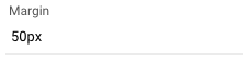
Margin |
Margin clears an area outside the border. Set the control's margin in CSS format, for instance:
|
❌ |  |
|
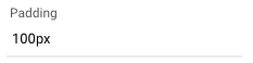
Padding |
Padding clears an area around the content. Set the control's padding in CSS format, for instance:
|
❌ |  |
|
Flex option |
obsolete |
Fixed | 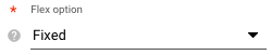 |
|
Model |
Entity Data |
Is an output field of a string type, it's a model of the dialog saved as a string. Gets a value only when the Watch entity data option is enabled. | ❌ | 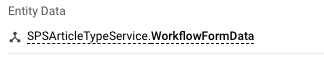 |
Entity Name |
(mandatory) Entity type of the edited object. | ❌ | 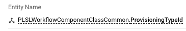 |
|
Preset Fields |
The property defines the pre-filled fields of the dialog container. | ❌ | 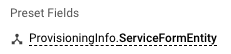 |
|
Entity |
Returns an object that can be edited in the Dialog Container | ❌ | 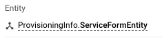 |
|
Object ID |
(mandatory) ID of an object, handled by a dialog | ❌ | 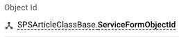 |
|
Common |
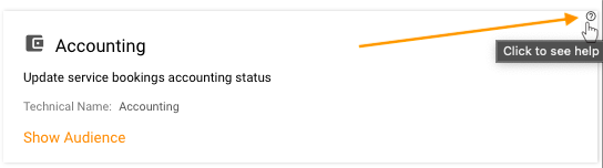
Help |
help icon and tooltip for information displaying as:
|
❌ | |
Watch entity data |
See Entity Data property of the Dialog Container. Available options:
|
enabled |  |
|
Name |
automatically generated name or identifier of the container. | auto-generated | 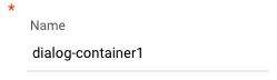 |
|
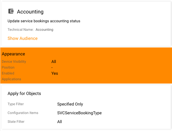
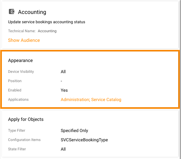
Device Visibility |
Desktop |
This property allows improving user experience by managing device visibility options. The application checks the user device's screen resolution and shows or hides the container based on the selected check-box options settings:
|
Enabled | 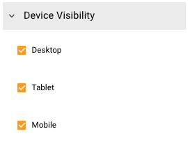 |
Tablet |
Enabled | |||
Mobile |
Enabled |
Layout Container
Layout Container is a part of the Layout canvas which serves as a container for the Control Descriptors that are added from the Toolbox and has configurable style properties.
Layout Container can be used on the following layout types:
- Dataset View
- Dialog
- Wizard
- Preview
- Base widget
- Landing Page
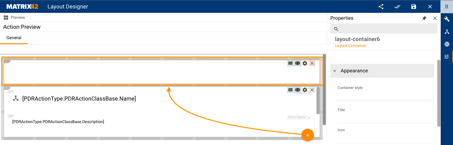
To add a new Layout Container in the Layout Designer use the following options:
- Drag&drop the Control Descriptor from the Toolbox to a new area on the Canvas. The new control is added to the empty Layout Container.
- Another way is to click Add an icon on the Layout's canvas to add an empty Layout Container:
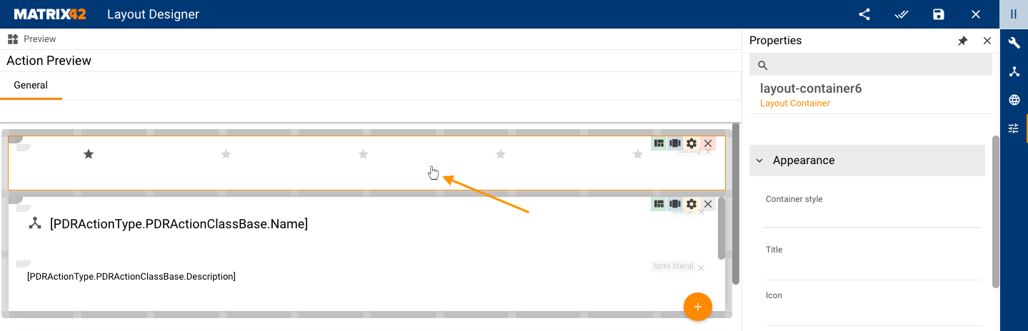
To configure the Layout Container properties, double-click on the container to select it:
Properties and Settings
| Property Group | Property Name | Description | Default | Property setting example |
|---|---|---|---|---|
Appearance |
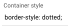
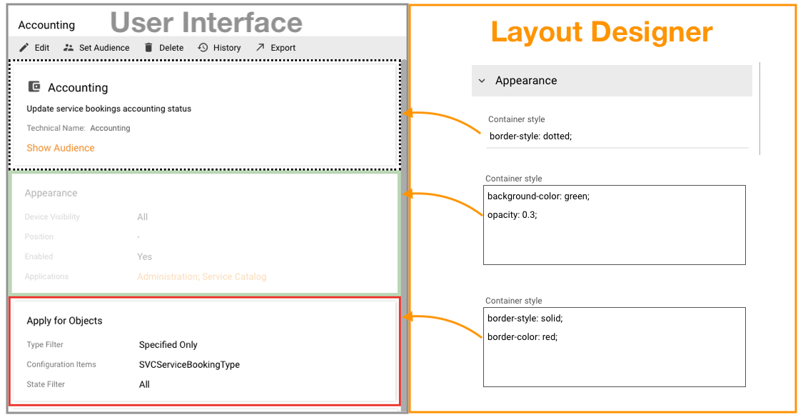
Container style |
Allows defining additional custom CSS styles:
It is not recommended to configure this option as in case of breaking changes in the Layout Container they may affect the container and cause conflicts in its display. See also Style property. |
❌ |  |
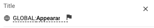
Title |
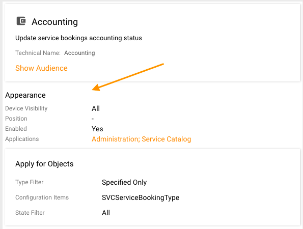
Define the title of the container via one of the following options:
Layout Container Title display example |
❌ |  |
|
Icon |
not supported | ❌ | - | |
Layout Direction |
Defines the layout direction of the control descriptors added to the container. Available options:
|
Vertical | 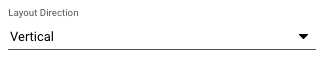 |
|
Alignment in Layout Direction |
Alignment of the controls in the container applied to elements according to the selected Layout Direction. Available options:
|
Default | 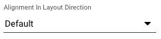 |
|
Alignment in Perpendicular Direction |
Alignment of the controls in the container applied to elements perpendicularly to the selected Layout Direction. Available options:
|
Default | 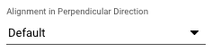 |
|
Mode |
The display mode of the container. Available options:
|
Default | 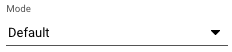 |
|
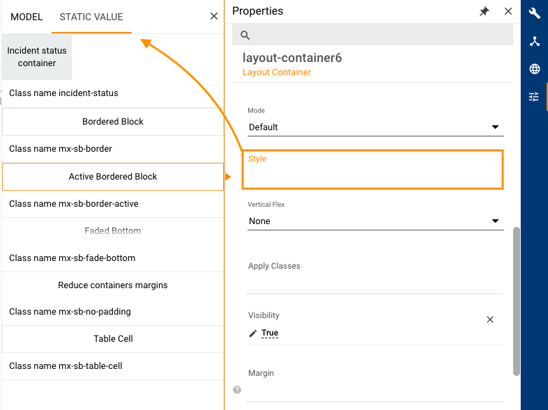
Style |
Defines the additional style of the Layout Container. Possible options:
Style Static Value examples with the style preview |
❌ |  |
|
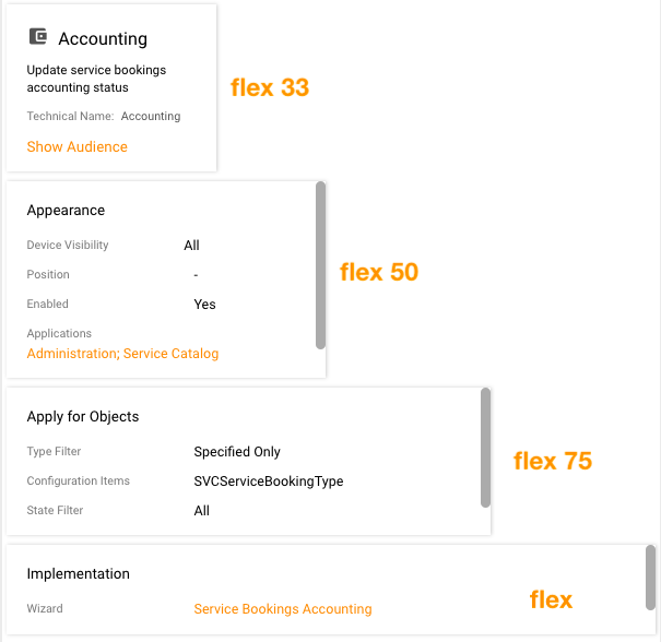
Vertical flex |
This option defines how much the controls fill up the space of the container. Despite the title, the property is applied in the horizontal direction of the container. Available options:
Example:
|
None | 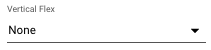 |
|
Apply Classes |
Along with the Container Style and Style properties in the Layout Container configuration, this option can be also used as an alternative way to define additional CSS styles for the container. Here you can specify the class(es) that have previously been added via Front-End Workspaces. |
❌ | ||
Visibility |
Container display on the page modes:
|
True |  |
|
Background Color |
The background color of the container. Available options:
The background color is applied to the container also based on the current Mode value, for instance:
|
❌ |  |
|
Hide if empty |
Checkbox options:
|
True |  |
|
Common |
Help |
help icon and tooltip for information displaying as:
Help icon with a tooltip displaying example |
❌ |  |
Name |
automatically generated name or identifier of the container | auto-generated |  |
|
Device Visibility |
Desktop |
This property allows improving user experience by managing device visibility options. The application checks the user device's screen resolution and shows or hides the container based on the selected check-box options settings:
|
Enabled | |
Tablet |
Enabled | |||
Mobile |
Enabled |
Tile Container
Tile Container defines the width and height of the container, for instance, Catalog Services Tiles layout in the Self Service Portal:
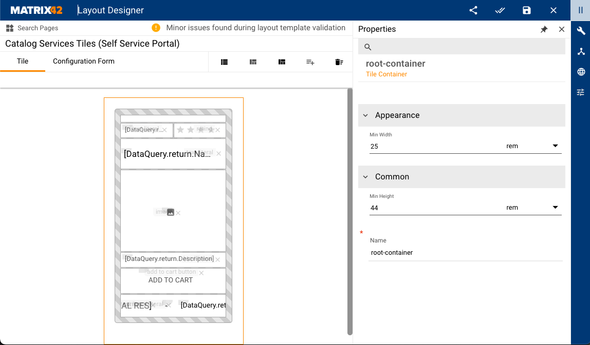
Tile Container can be used on the following layout types:
- Dataset View
Properties and Settings
| Property Group | Property Name | Description | Property Setting Example |
|---|---|---|---|
Appearance |
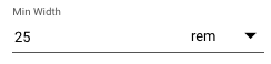
Min Width |
Allows defining the minimum width of the container. Set the numeric value and choose the unit of measurement from the list:
|
 |
Common |
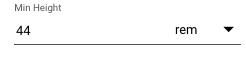
Min Height |
Allows defining the minimum height of the container. Set the numeric value and choose the unit of measurement from the list:
|
 |
Name |
automatically generated name or identifier of the container | 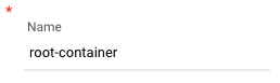 |