Choice Control
Overview
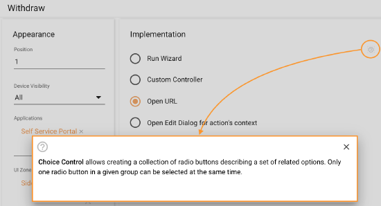
Choice Control allows creating a collection of radio buttons describing a set of related options. Only one radio button in a given group can be selected at the same time. Each choice option of the control has a configurable panel:
- Choice options (radio buttons)
- A panel of the selected option
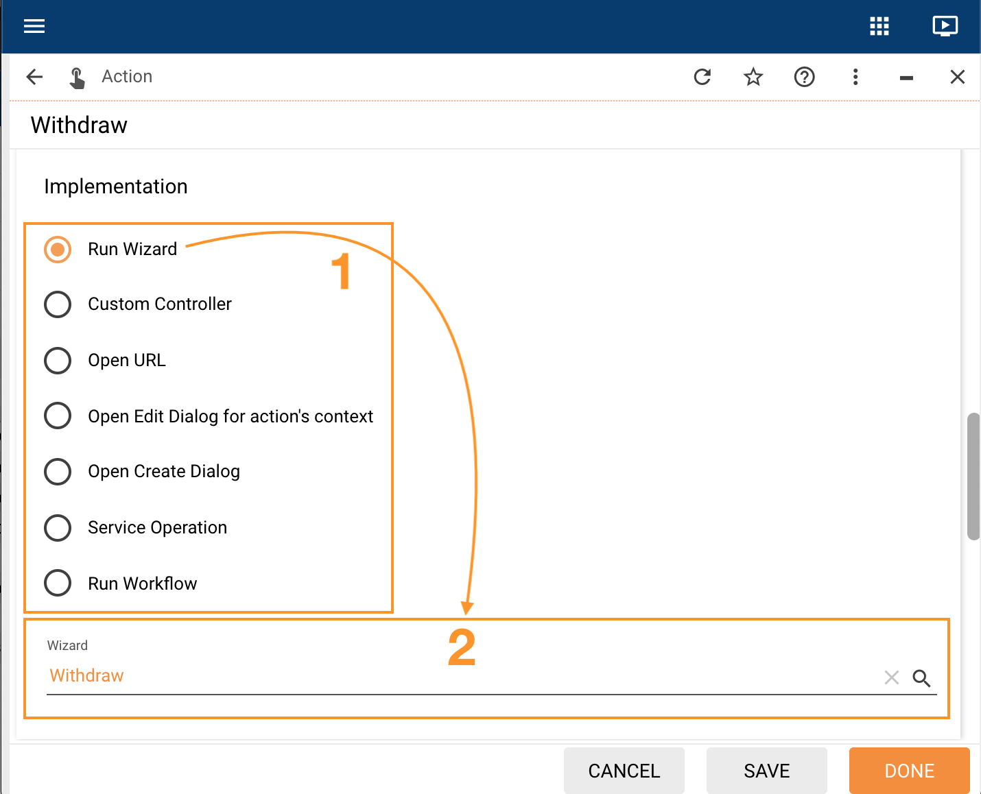
The content of the Choice Control also depends on the selected view modes:
- Radio buttons with Panel
- Radio buttons
- Selected Panel
Supported Layout Types
Choice Control can be used in the following Layouts:
Users with Administrator rights can change the default settings and add the control to other types of layouts via Supported Widget Types field in the Administration application → User Interface → Control Descriptors → Edit action → Advanced tab.
Configuration
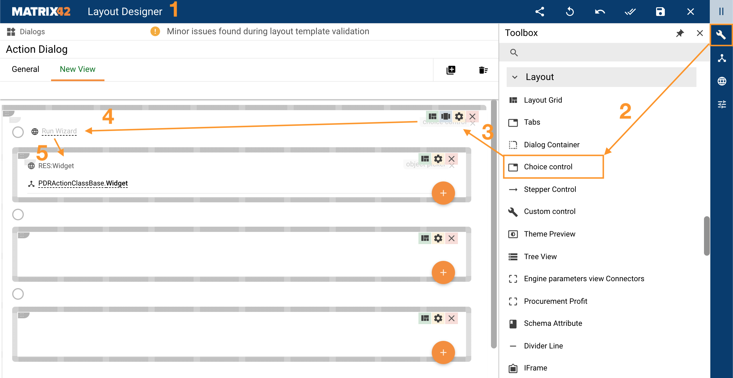
To configure the Choice Control for one of the supported Layout types:
- Open the Layout Designer
- In the Toolbox, choose Choice Control
- Drag&drop the Choice Control on the canvas of the edited Layout
- Add necessary Choice Options
- Configure the Panels by adding and configuring necessary controls from the Toolbox:
Properties and Settings
| Property group | Property name | Description | Default | Example |
|---|---|---|---|---|
Model |
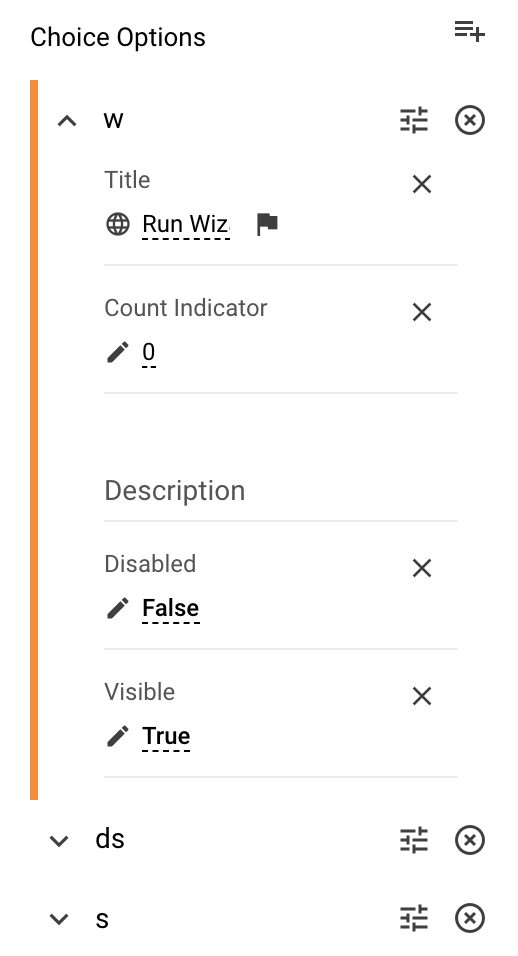
Choice Options |
To add and configure the choice option use the following buttons:
|
❌ |  |
Selected Option |
The data source name for the option that is pre-selected by default in the Choice Control. | ❌ | 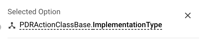 |
|
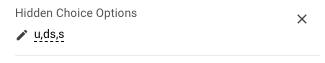
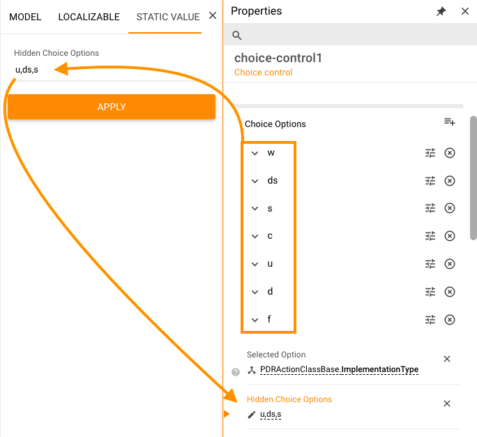
Hidden Choice Options |
Optional field that provides another way for configuration of the Choice Options visibility. For instance, to hide necessary Choice Options you can enumerate their Names as comma-separated static values:
Hidden Choice Option configuration example with Static Value |
❌ |  |
|
Common |
Disabled |
Defines the entire Choice Control display mode:
|
False | 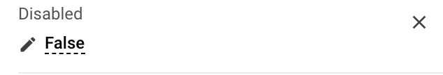 |
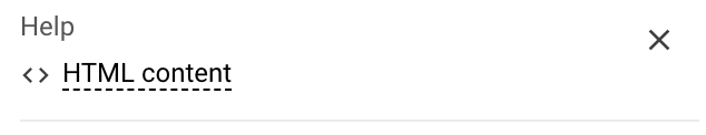
Help |
help icon and tooltip for information displaying as:
|
❌ |  |
|
Name |
automatically generated name or identifier of the control. | auto-generated |  |
|
Appearance |
View Mode |
Possible options:
|
Radio buttons with Panel | 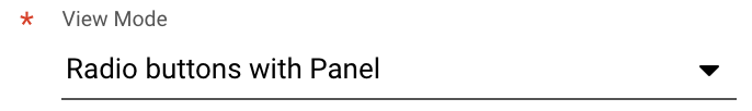 |
Direction |
Defines the direction of the radio buttons alignment on the layout. Possible options:
|
Vertical | 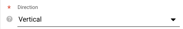 |
|
Visibility |
Control display modes:
|
True | 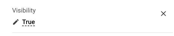 |
|
Margin |
obsolete | ❌ | ||
Padding |
obsolete | ❌ | ||
Flex option |
obsolete | Fixed | ||
Device Visibility |
Desktop |
This property allows improving user experience by managing device visibility options. For instance, the control can be hidden from the preview when it is too large and contains a lot of columns that cannot fit the small screen of a mobile device. The application checks the user device's screen resolution and shows or hides grid preview based on the selected check-box options settings:
|
True | 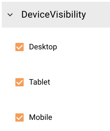 |
Tablet |
True | |||
Mobile |
True |
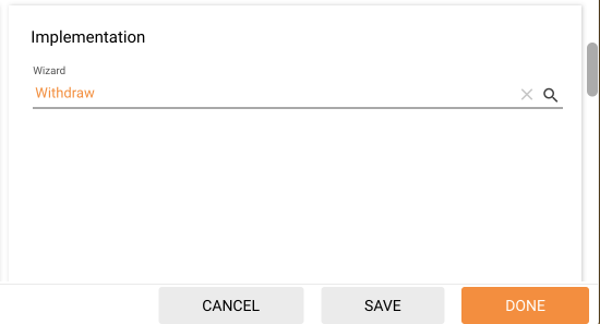
 adds a new choice option. Define the internally used Name and Position of the new option and click Save.
 allows edition the Name and Position of the Choice Option
 removed the Choice Option
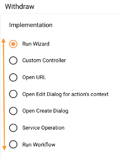
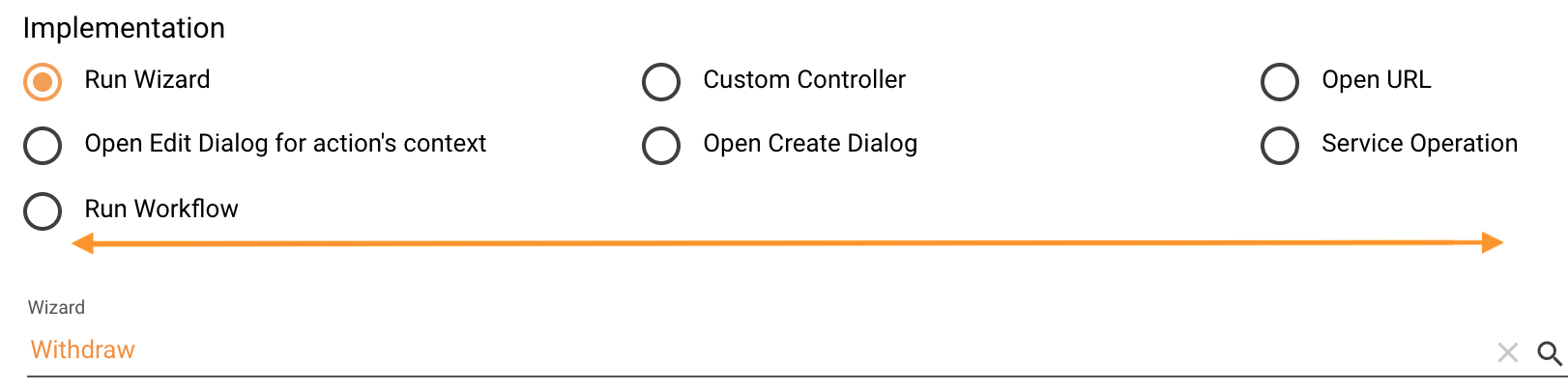
 expands the Choice Option configuration and allows defining the following properties:
❌ - not set