Objects Grid
Goal
This how-to explains the basics of the Object Grid settings and provides examples of the properties configuration.
For more information about Grid Control types and use cases see Grid Controls page.
Prerequisites
Object grid is added and configured after the following steps:
- Administration application: open a Solution Builder;
- User Interface → Layouts: create new or edit existing layout;
- Toolbox: search for the Objects Grid control in the toolbox and drag&drop it on the layout.
- Configure necessary fields for the proper data displaying in the Objects Grid.
Object grid can be used on such layouts:
- Dialog
- Preview
- Wizard
- Landing page
Minimal required property settings
The following data model properties are minimum required for the grid displaying:
- Entity Class Name: defines the source of the data that will be displayed in the grid.
The rest of the properties are assigned by default and can be optionally modified if necessary.
Default object Grid characteristics
By default, each object grid with the configured minimum required properties results in the following page elements:
- Heading row;
- Column with a check-box for records multiple selection;
- Columns data sorting order (ascending/descending);
- Search field for displayed data filtering (global search and per each displayed field);
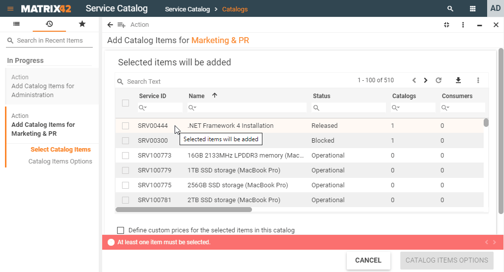
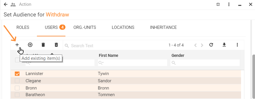
- Add record from a list of existing items;
- Pagination: all records are not shown on the same page but can be navigated through by selecting the next or previous page;
- Refresh button for new records retrieval;
- Export data (download .xlsx spreadsheet);
- Column preview mode (show/hide specific columns).
Object Grid: preview example with default grid characteristics
Properties and settings
The table provides a detailed list of configurable object grid properties, their settings, and particularities overview.
| Property group | Property name | Description | Default | Property setting example |
|---|---|---|---|---|
Model |
an array of data objects that should be retrieved to the grid. Acts as an additional filter to the data defined by the Entity class name, Allowed type and Filter. |
❌ |  |
|
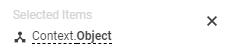
Selected Items |
optional property of a data model that acts as a variable. Allows passing the manually selected items of the grid to a specified data model field. Additionally requires Enable Row Selection property set to true to enable multiple items selection column displaying in the grid. |
❌ |  |
|
Entity class name |
Defines which data will be displayed in the grid. This field is required and should be selected manually:
Entity class name may also serve as a source of the columns retrieved to the grid's heading row. The system checks the following settings and displays columns based on the first available source: a. Column definition field value; b. default Data query for the selected Class name; c. Data Definition's Display expression field settings as each suggested Class name is actually a data definition with a set of configured for displaying columns (see Administration application → Schema → Data Definition → Edit → Display expression field). Stored in the system Data Definition is a database table with its own specific structure. This Data Definition can have a default Data query which defines a set of columns that can be displayed in the grid (applicable for cases when the Data query is based on a Data Definition). |
❌ |  |
|
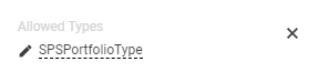
Allowed types |
|
❌ |  |
|
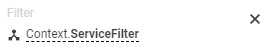
Filter |
A combination of the specified in the Model property group fields are applied one after another and filter out the records to show:
|
❌ |  |
|
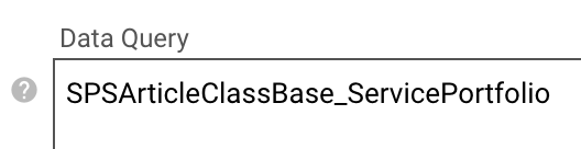
Data Query |
the property defines a set of columns displayed in the object's grid heading row.
|
❌ |  |
|
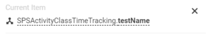
Current item |
optional property of a data model that acts as a variable. Allows passing the data of a just clicked item of the grid to a specified data model field. Select the necessary source from a list of suggested data model fields of an Object data type only or create a new Calculated property data source of an Object type and assign Calculated property to the Current Item field: Example: a row of a grid is edited using a wizard. Current item usage is as follows:
|
❌ |  |
|
Common |
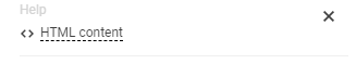
Help |
help icon and tooltip for information displaying as:
Help icon with a tooltip displaying example |
❌ |  |
Label |
title of the grid. Can be set via one of the following options:
Localizable grid label example |
❌ |  |
|
Show label |
Check-box options:
|
Disabled |  |
|
Disabled |
|
False | 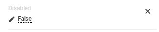 |
|
Read-only |
|
False | 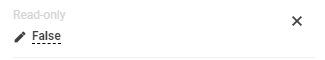 |
|
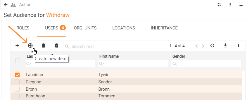
Enable row selection |
|
True | 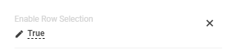 |
|
Name |
automatically generated name or identifier of the grid. The only required field for the grid saving, although without properly configured Entity Class name property the entire grid is poorly displayed. |
auto-generated | 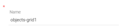 |
|
Appearance |
Full Height |
Check-box options:
|
Disabled |  |
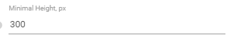
Minimal Height, px |
defines the fixed height of the grid displayed on the page.
The specified height is spread upon the entire grid representation, including grid's header with default buttons area (export, columns preview), grid heading row and displayed records data. |
❌ |  |
|
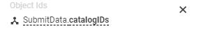
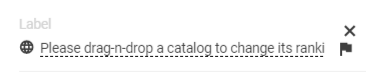
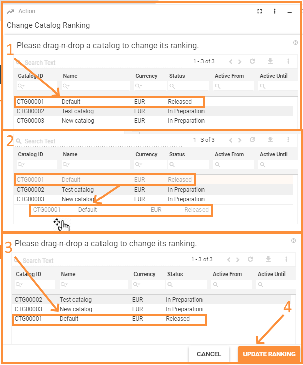
Enable Drag-n-Drop |
Check-box options:
For proper functioning use enabled Drag-n-Drop property in pair with Object IDs property of the objects grid. For instance, changing the ranking of the service catalogs using drag-n-drop property:
|
Disabled |  |
|
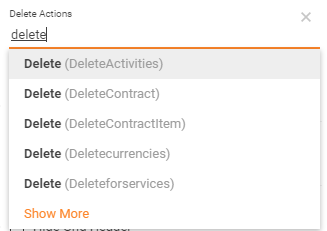
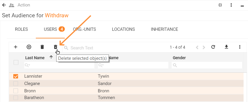
Delete actions |
manually entered field value:
For Actions management see Administration application → User Interface → Actions. As a result, selected delete action allows deleting the displayed item from the grid and directly from the system via Delete selected object(s) button of the objects grid:
|
❌ |  |
|
Disable add |
|
False | 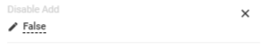 |
|
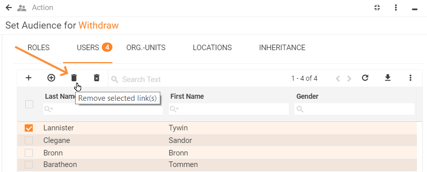
Disable remove |
|
False | 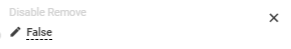 |
|
Disable create |
|
True | 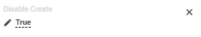 |
|
Hide Grid Header |
Check-box options:
|
Disabled |  |
|
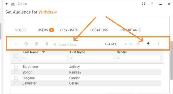
Show "Selected items" panel |
Check-box options:
Selected items panel provides an overview of multiple items selected on different pages of the grid:
The panel shows the Display Name of the selected items. The Display Name property value is retrieved from the Configuration Item of the selected object. |
False |  |
|
Visibility |
Grid display on the page modes:
|
True | 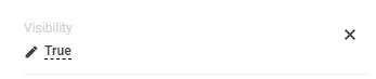 |
|
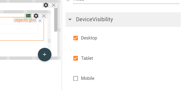
Device visibility |
Desktop |
This property allows improving user experience by managing device visibility options. For instance, the grid can be hidden from the preview when it is too large and contains a lot of columns that cannot fit the small screen of a mobile device. The application checks the user device's screen resolution and shows or hides grid preview based on the selected check-box options settings:
Device visibility settings example: objects grid is displayed for desktop devices and tablets. |
Enabled | 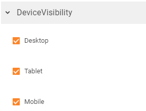 |
Tablet |
Enabled | |||
Mobile |
Enabled |
 .
.