Multi Fragment Grid
Goal
This how-to explains the basics of the Multi Fragment Grid settings and provides examples of the properties configuration.
Data type: multi-fragment array.
The main purpose of the multi-fragment grid type is to display data that is stored as an array. In this case, an array is a data structure that contains a group of elements that cannot exist as isolated data and are a part of an independent object of a higher level. For instance, offered in the catalog Service and a multi-fragment containing Service Ratings: the same service can have multiple records with service ratings that can be displayed to the application users in the multi-fragment grid.
Data sources: data can be retrieved and displayed by means of a multi-fragment grid from
- configured in the Martix42 platform Configuration Items applying various filtering conditions before actually displaying data in the grid;
- the Web Services connected to the Matrix42 platform. This data source can also be optionally configured and filtered before displaying data to the application users.
For more information about Grid Control types and use-cases see Grid Controls page.
Prerequisites
Multi-fragment grid is added and configured after the following steps:
- Administration application: open a Solution Builder;
- User Interface → Layouts: create new or edit existing layout;
- Layout implementation type is based on the data from a Configuration Item or a Web Service.
- Data model: click "Customize" layout action and drag&drop an array with multi-fragment data from the Data Model section on the layout designer canvas.
Multi-fragment grid is most often used in such layouts:
- Dialog
- Wizard
- Preview
- Landing page
Minimal required property settings
For proper grid displaying it is necessary to define the source of data retrieval to the grid and columns to show.
The following data model properties are minimum required for the grid displaying based on the layout implementation type
- Data: records and entries to be displayed in the grid;
- Class name or Column definition: columns displayed in the grid's header row.
The rest of the properties are assigned by default and can be optionally modified if necessary. Other properties define the add, edit, delete modes of the grid records and grid's look&feel.
Default Multi Fragment Grid characteristics
By default, each multi-fragment grid with the configured minimum required properties results in the following page elements:
- Header row;
- Column with a check-box for records multiple selection;
- Columns data sorting order (ascending/descending);
- Export data (download .xlsx spreadsheet);
- Column preview mode (show/hide specific columns);
- Records scrolling (no pagination);
- Read-only mode of grid data management.
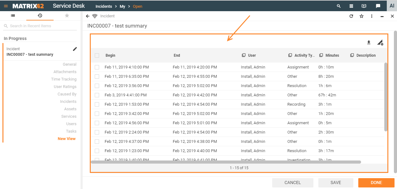
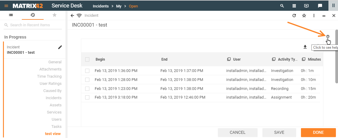
Multi Fragment Grid: preview example with default grid characteristics
Properties and settings
The table provides a detailed list of configurable multi-fragment grid properties, their settings, and particularities overview.
| Property group | Property name | Description | Default | Property setting example |
|---|---|---|---|---|
Model |
Data |
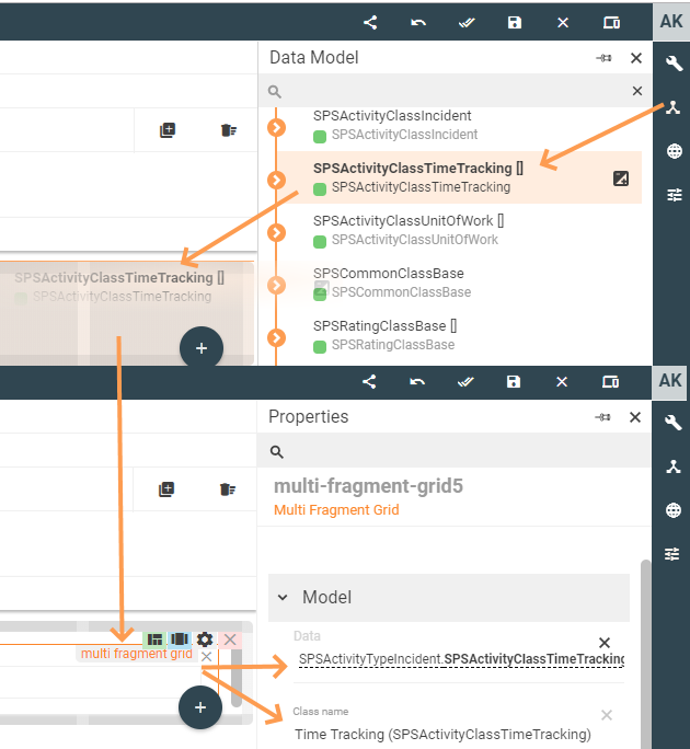
Defines which data will be displayed in the grid. Select necessary data of an array type which serves as a multi-fragment of the main object it belongs to (marked with square brackets):
Data field suggests data from the model of an array type only. Selected array value acts as a raw data source that is filtered before displaying in the application's runtime according to the set Class name or Column definition property. For proper multi-fragment grid displaying define interdependent Data and Class name or Column definition properties as well. |
❌ |  |
Class name |
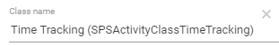
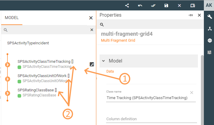
Defines which columns will be displayed in the grid and ensures proper data retrieval to the grid's heading row. Possible options:
The following example is applicable to the Layout based on a Configuration Item implementation type: Appropriate Class name for a multi-fragment grid is pre-filled automatically when the Data with array type is drag&dropped on the Layout Designer canvas from the Data Model:
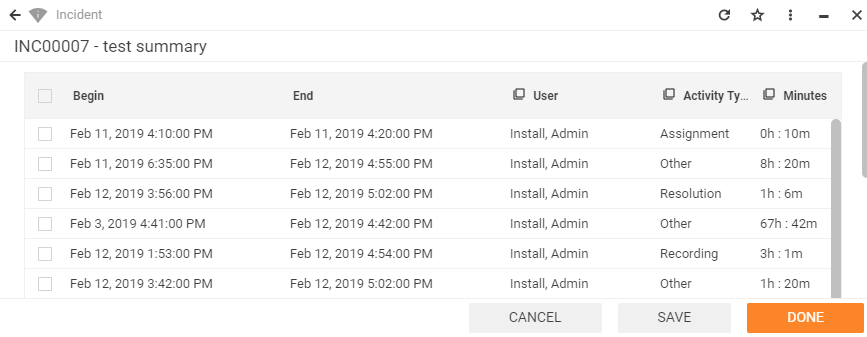
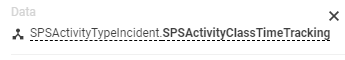
The selected class defines which columns will be displayed in the header of the grid. The system checks the following settings and displays columns based on the first available source: a. Column definition field value; b. default Data query for the selected Class name; c. Data Definition's Display expression field settings as each suggested Class name is actually a data definition with a set of configured for displaying columns (see Administration application → Schema → Data Definition → Edit → Display expression field). The selectedClass name should match with the Data field, otherwise, no data will be retrieved to the grid. For instance, both settings match as they are intended to retrieve time tracking entries :
|
❌ |  |
|
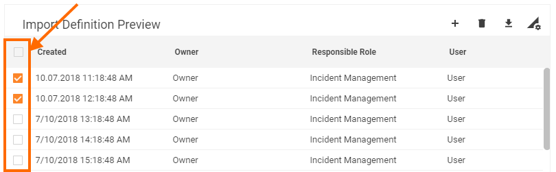
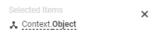
| Selected Items |
optional property of a data model that acts as a variable. Allows passing the manually selected items of the grid to a specified data model field. Additionally requires Enable Row Selection property set to true to enable multiple items selection column displaying in the grid. |
❌ |  |
|
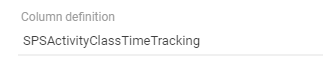
Data Query |
along with the Class name property, this property defines a set of columns to be displayed in the grid, their search mode, sorting, graphics, showing data of a specific range or filtering, and other settings defined in a particular Data query.
Column definition can be: a. a single source of the grid's heading row data (Class name field is empty). In this case, make sure that the manually entered Data Query name exists as there is no field validation. If the Data Query does not exist the page with such a grid will be blank and the system will result in an error message only during the application's runtime. It is recommended to specify the Class name property unless the data retrieval is based on a Web Service. This will reduce cases when the changes made in the Data query affect the grid and the specified in the Data query source is no longer applicable, (e.g. binding other Data Definition to a Data query). The specified Class name will serve as an alternative source for the displayed in the grid's heading row columns. b. specified along with the Class name: such properties combination allows to specify a custom Data Query that has a specific configuration of the columns to be displayed and differs from the default Data query available for the selected Class name. |
❌ |  |
|
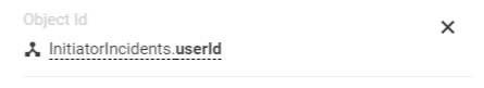
Object Id |
ID of the main object the multi-fragment belongs to. This option is used when there is more than one source of the main data objects.
For instance, when configuring Wizard layouts the wizard may not have a unique and specific object or main data source like Dialog or Preview layouts which are based on the data from the Configuration Item. Another case is when the additional Configuration Item is added as a data source to configured layout and it is necessary to specify where the displayed and edited multi-fragment should belong to. |
❌ |  |
|
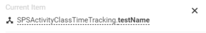
Current item |
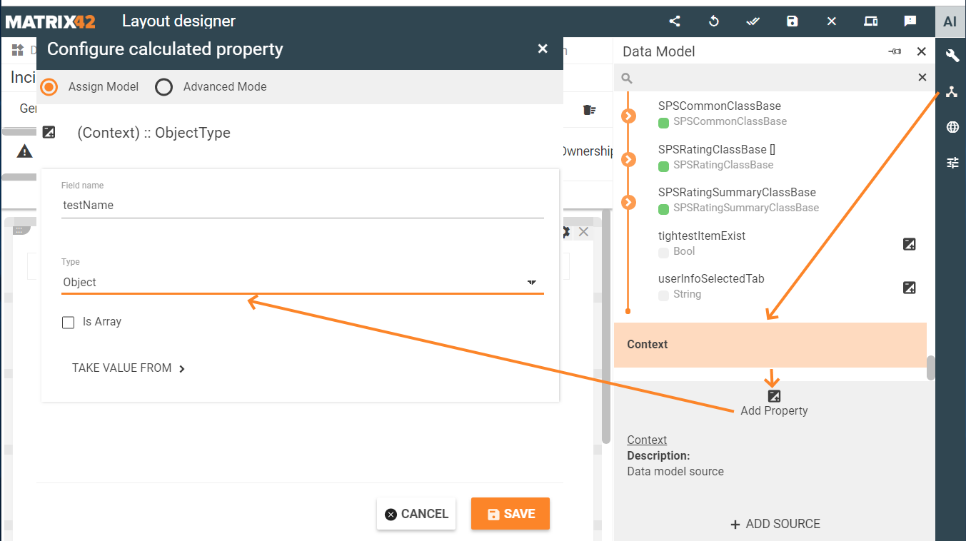
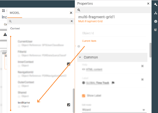
optional property of a data model that acts as a variable. Allows passing the data of a just-clicked item of the grid to a specified data model field. Select the necessary source from a list of suggested data model fields of an Object data type only or create a new Calculated property data source of an Object type:
Example: a row of a grid is edited using a wizard. Current item usage is as follows:
|
❌ |  |
|
Common |
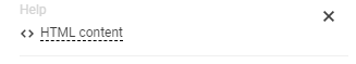
Help |
help icon and tooltip for information displaying as:
Help icon with a tooltip displaying example |
❌ |  |
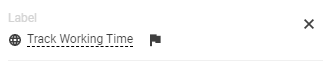
Label |
title of the grid. Can be set via one of the following options:
Localizable grid label example |
❌ |  |
|
Show label |
Check-box options:
|
Disabled |  |
|
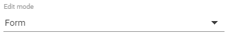
Edit mode |
Defines how the new record can be added and edited in the grid. Available options of the drop-down list:
For proper functioning of the properties listed below, Edit mode field requires Appearance property "Disable Edit" set to any other option except for "Yes". When "Disable Edit" is set to "Yes" the listed below options of the Edit mode field are ignored.
An alternative way to add records to the multi-fragment grid dynamically (programmatically) is to add records to a grid via a Configured calculated property field without the need of creating a new record by filling out a form, inline record editing, or via an external wizard. |
❌ |
 |
|
Name |
automatically generated name or identifier of the grid. The only required field for the grid saving, although without properly configured Data model and Class name properties the entire grid is poorly displayed. |
auto-generated | 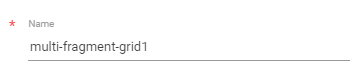 |
|
Appearance |
Full Height |
Check-box options:
|
Disabled |  |
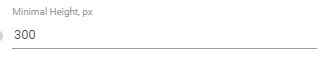
Minimal Height, px |
defines the fixed height of the grid displayed on the page. Set and measured in pixels, for instance: "100". The specified height is spread upon the entire grid representation, including the grid's header with default buttons area (export, columns preview), grid heading row, and displayed records data. |
❌ |  |
|
Enable Row Selection |
|
True |  |
|
Visibility |
Grid display on the page modes:
|
True | 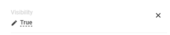 |
|
Hide Grid Header |
Check-box options:
Grid preview with enabled Hide Grid Header property |
Disabled |  |
|
Margin |
set property creates additional blank space outside of the borders of the element containing the grid. Set control's margin in CSS format measured in px or rem:
|
❌ | ||
Padding |
the property is used to generate additional blank space around the grid's content, inside of the borders of the element containing the grid. Set control's padding in CSS format measured in px or rem:
|
❌ |  |
|
Flex option |
intended to automatically adjust the width of the grid. Possible options:
|
Fixed | 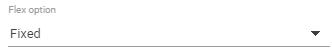 |
|
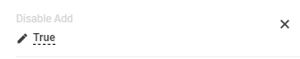
Disable Add |
specify the mode of adding a new record to the grid. The field depends on the Common → Edit mode property settings. If Edit mode is not set or set to "No", the Disable Add property settings listed below are not applicable.
|
❌ |  |
|
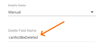
Disable Delete |
specify the mode of deleting a record from the grid. The field depends on the Common → Edit mode property settings. If Edit mode is not set or set to "No", the Disable Delete property settings listed below are not applicable.
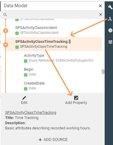
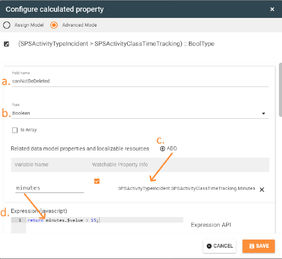
Example #1It is required to disable Delete button for all entries of the grid that have a time tracking duration of more than 15 minutes:
a. set custom field name; b. choose a boolean data type for a calculated property; c. optionally set related data model source fields; d. specify the necessary condition as the JavaScript expression: 4. Manually assign the created field to Disable Delete properties:
Example #2To allow removing entries but restrict editing existing entries apply the following properties configuration:
|
❌ |  |
|
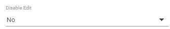
Disable Edit |
Grid records editing also depends on the Common → Edit mode property settings. Available options:
|
❌ |  |
|
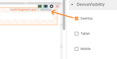
Device visibility |
Desktop |
This property allows improving user experience by managing device visibility options. For instance, the grid can be hidden from the preview when it is too large and contains a lot of columns that cannot fit the small screen of a mobile device. The application checks the user device's screen resolution and shows or hides grid preview based on the selected check-box options settings:
Device visibility settings example: multi-fragment grid enabled for desktop devices only. |
Enabled | 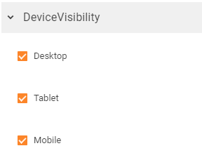 |
Tablet |
Enabled | |||
Mobile |
Enabled |
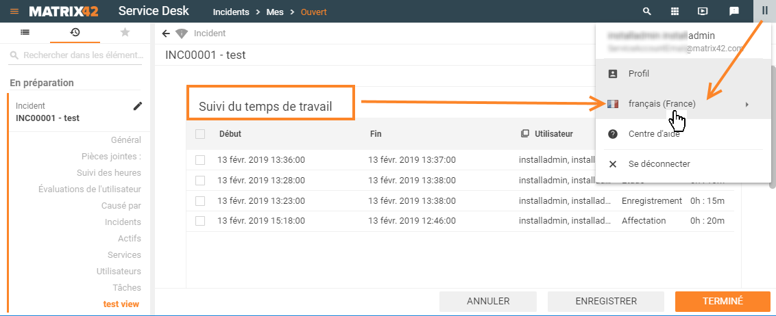
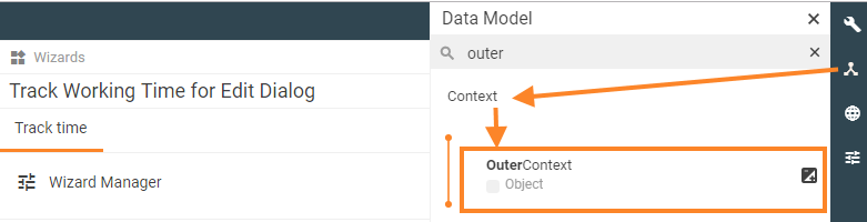 Example: a specific wizard is initially intended for processing time tracking entries. Additionally specified Outer Context takes some extra data that is related to the time tracking from the edited Incident like Incident's initiator/attachments/etc. and allows displaying this data in the wizard.