Layout Grid
Overview
The Layout Grid control allows you to easily create versatile, flexible, and adjustable layouts for your applications, without any limitations. The inner structure based on cells supported by the Layout Grid control allows you to create multi-level structures for your layouts - Tiles, Lists, Dialogs, etc. - that are easily scaled to fit the screen on desktop and mobile devices.
How to Use Layout Grid in Layout Designer
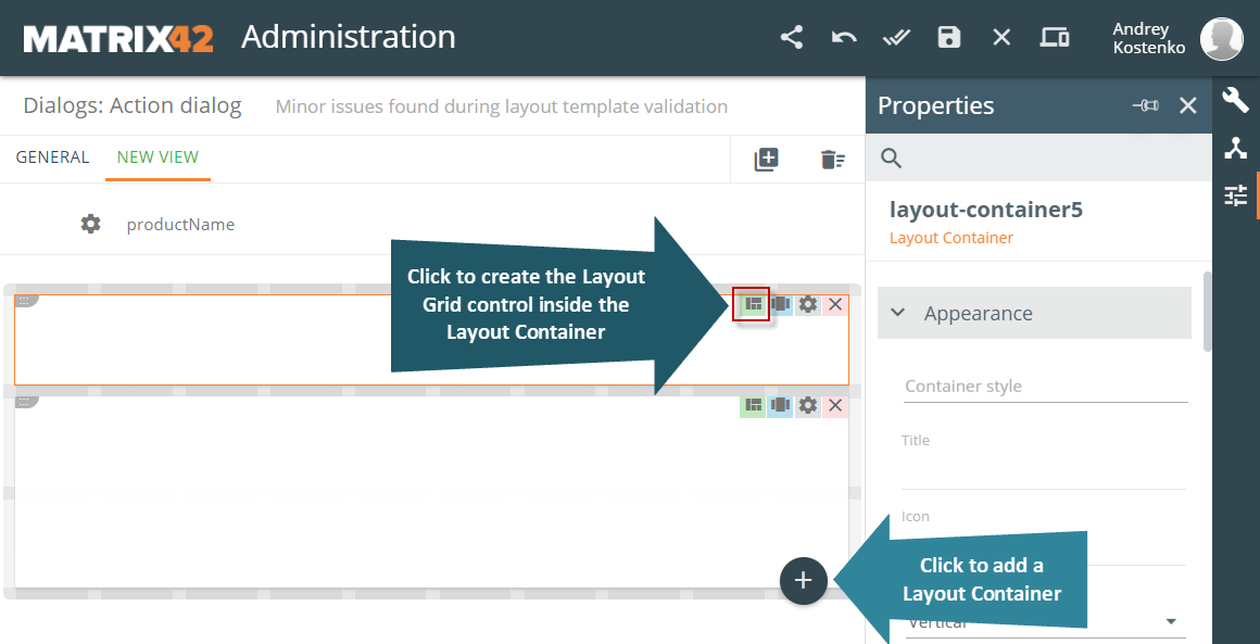
To create the Layout Grid control, add a control to the canvas in Layout Designer and click the Advanced: set Inner structure with Layout Grid button (outlined in red below) in the top right-hand corner of the Layout Container.
The Action Panel that appears below the Layout Grid allows you to create an inner structure based on cells.
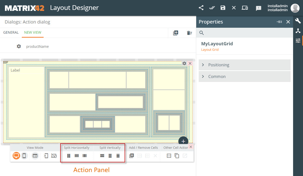
You can split the Layout Container and every cell horizontally and vertically with the help of the corresponding buttons located in the Action Panel (see outlined in red in the above screenshot). Once you split a Layout Container, you can select any of the cells to also split it with the help of the same buttons.
You can split both the Layout Container and the cells horizontally and vertically:
- By 2 Equal Cells
- By 3 Equal Cells
- By 20-60-20
Each cell can have an inner structure which consists of other cells or controls. You can add controls to a cell from the Toolbox and Data Model views of the right-hand panel by means of simple drag-and-drop. You can also drag-and-drop the controls from one cell to another. The Properties panel allows you to specify positioning parameters for the cells and change the name of the layout grid.
Properties: Positioning Parameters
Child Elements Behaviour
You can specify different parameters for the Desktop and Mobile versions here.
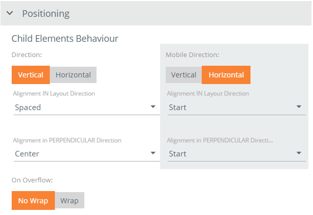
Direction: select direction for controls in the selected cell: Vertical or Horizontal.
Alignment in Layout Direction: select an alignment option in the layout's direction for the controls added to the cell - Start, Center, End, Justify, or Spaced.
Alignment in PERPENDICULAR Direction: select how the controls added to the cell will be aligned perpendicular to the layout's direction - Stretch, Start, Center, or End.
On Overflow: use the setting to determine how the cells that do not fit the screen will behave:
- Select Wrap to move the cells that do not fit the screen to the next line.
- Select No Wrap to narrow the cells so that they all will fit the screen.
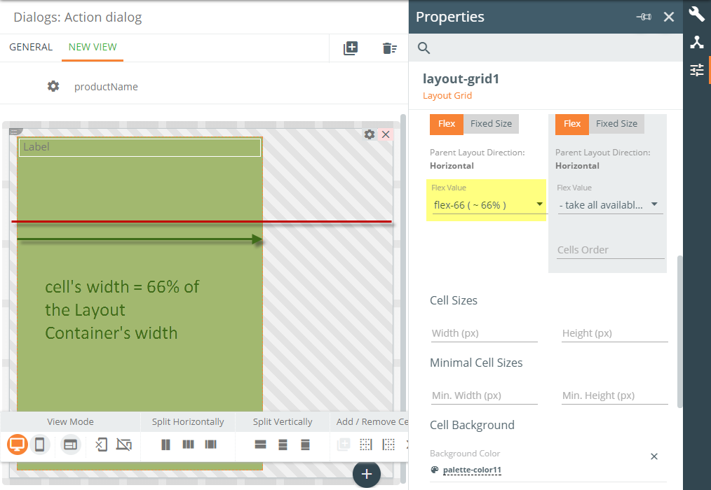
Flex Options, Cell Sizes, Minimal Cell Sizes determine the size of cells.
You can specify different parameters for the Desktop and Mobile versions here.
- Select a Flex Value for the cell: take all available space of the parent container, ~ 100% of the parent container, ~ 95% of the parent container, ~ 90% of the parent container, etc.
- You can also set a Fixed Size for a selected cell by specifying its width and height in pixels, or Minimal Cell Size for a selected cell by specifying the minimal cell width and height in pixels.
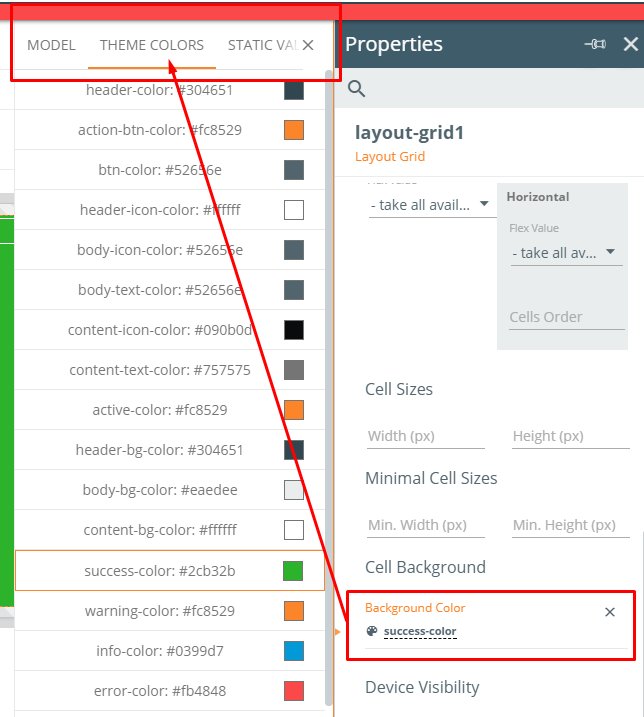
Cell Background
Background Color: click to select a background color for the cell; you can select a color from one of the three tabs: (DATA) MODEL, THEME COLORS, STATIC VALUE.
Device Visibility
Device Visibility: Desktop, Mobile; leave selected checkbox(es) next to device(s) for which the cell is visible (provided the Visibility control explained below is set to 'True').
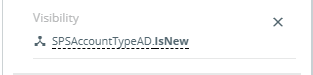
Visibility: select ‘True’ to make the cell visible (on any device); select ‘False’ to hide the cell (from any device).
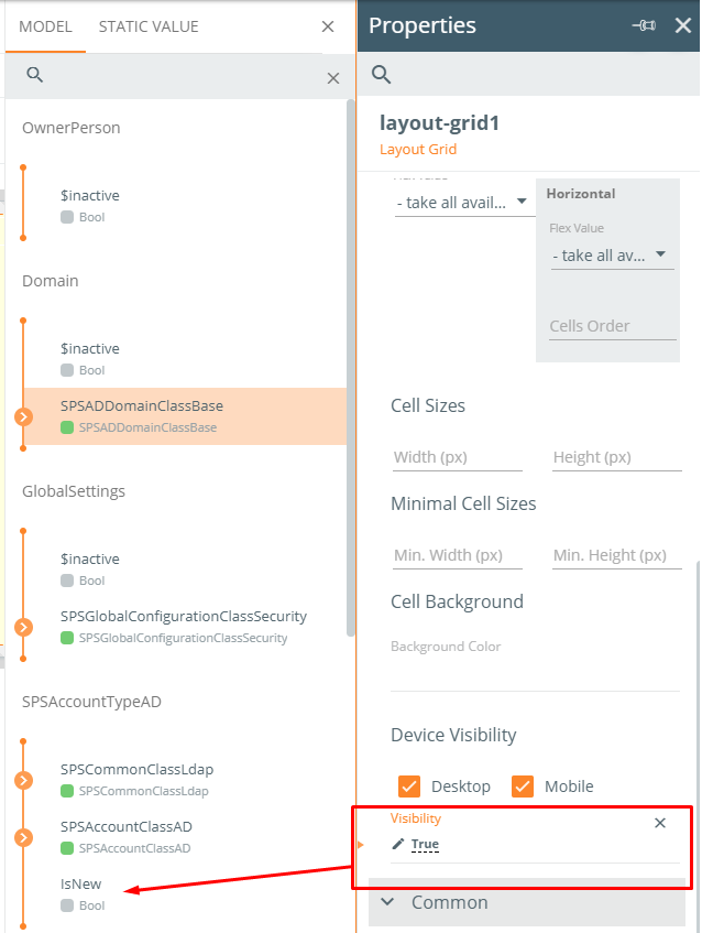
You can not only set a static True or False value here but also bind the control with a data model property.
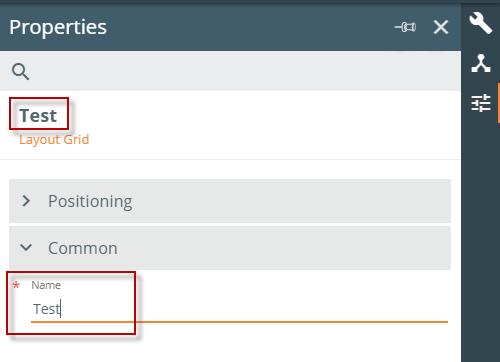
Properties: Common Parameters
In the Common collapsible panel, you can change the Name of the Grid Layout.
Action Panel
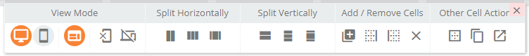
View Mode Group
- Desktop View Mode: click to switch to the Desktop View Mode.
- Mobile View Mode: click to switch to the Mobile View Mode.
- Show Cells Structure: click to view cells from all the levels of the grid; deselect the control to see only the top level of cells.
- Reset Cell’s Mobile Overrides: click to reset mobile overrides for the current cell; the cell’s mobile settings will be the same as the desktop settings.
- Reset All Mobile Overrides: click to reset all the mobile overrides; all the mobile settings will be the same as the desktop settings.
Split Horizontally Group
Split the Layout Container or a selected cell horizontally:
- By 2 Equal Cells
- By 3 Equal Cells
- By 20-60-20
Split Vertically Group
Split the Layout Container or a selected cell vertically:
- By 2 Equal Cells
- By 3 Equal Cells
- By 20-60-20
Add / Remove Cells
- Add Child Cell: click to add a child cell to the current cell.
- Add Cell Before Cell: click to add a cell before the current cell.
- Add Cell Next to Selected: click to add cell next to the selected cell.
- Remove Cell: click to remove the selected cell.
Other Cell Actions:
- Merge Selected Cells: click to merge the selected cells.
- Wrap Cell With New One: click to wrap the cell with a new cell.
- Select Parent Cell: click to select the parent cell of the current cell.