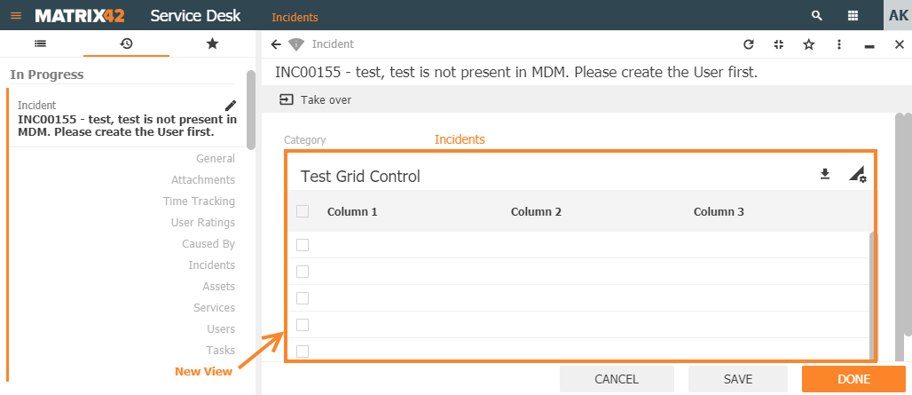
Grid Controls
Details
This page provides an overview of the Layout Designer's Grid Controls, their types, configurable properties, and use cases.
Grid Controls are one of the data representation types intended for proper display, navigation, and editing information organized in the form of spreadsheets. Grid Controls display spreadsheet data in the user interface not as a stand-alone page entirely filled out with the listings but as a grid within a page. Grid controls are a constituent part of a layout template placed along with the other data elements also referred to as Control Descriptors.
Appropriate Grid Controls are automatically prompted for usage in the Layout Designer during the layout template configuration process. Suggested grid types are based and depend on the selected for the display Data Model item.
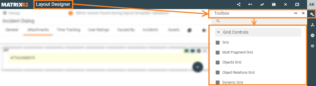
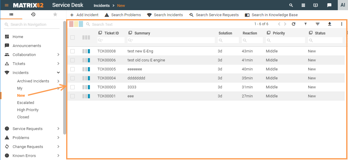
Path: all available in the application Grid Controls can be found in Administration application → User Interface→ Layouts → Customize layout → Layout Designer → Toolbox → Grid Controls:
Prerequisites
Grid Controls can be automatically suggested in the Layout Designer after the following sequence of user actions:
- User Interface → Layouts menu: create and fill out basic required settings or click the "Customize" button to edit one of the following Layout types:
- Dialog (most commonly used with Grid Controls layout type);
- Preview;
- Wizard;
- Landing Page.
- Data Model: drag&drop necessary for display data item on the layout template canvas:
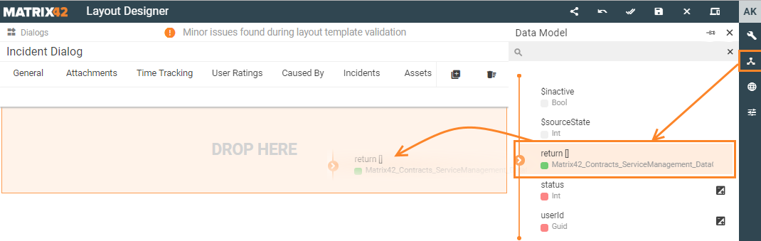
- Control Descriptor: select data representation type among the automatically suggested options:
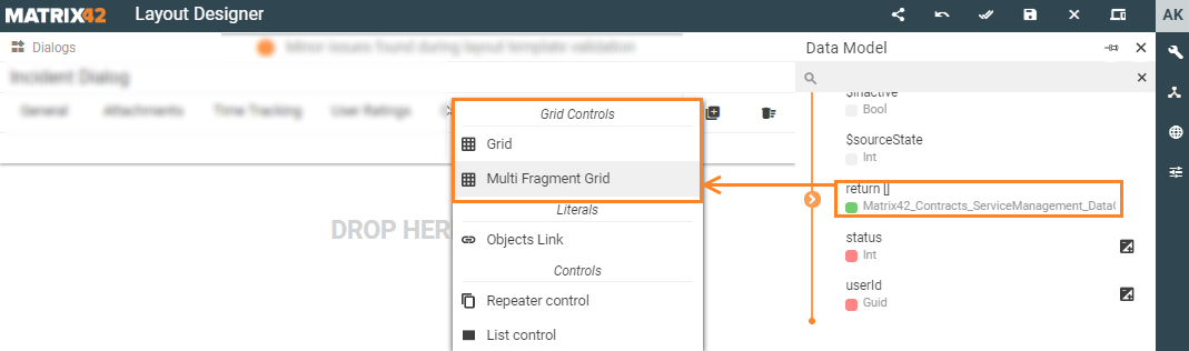
In a case when the suggested data representation option is :
- Grid
- Multi Fragment Grid
- Objects Grid
- Object Relations Grid
- Dynamic Grid
then you are dealing with Grid Controls.
Grid Controls vs. Dataset Views
At the very first glance Grid Controls and Dataset Views can seem to have a lot in common as for data visual representation in grids but their usage and configuration differs.
| Characteristics | Grid Controls | Dataset Views |
| Definition |
can be defined as spreadsheets or table data display according to the appropriate Data Model or data input type |
imply that data listings are represented as a grid but without recurring to Grid Controls |
| Location on the page layout | such grids are included in the page but do not take the entire space of the Layout |
Dataset Views are represented to the end-user as a grid that takes the entire page of the Layout.
|
| Data representation form |
|
each of the data representation forms of the Dataset View is configured separately and can be displayed to the end-users as
|
| Data management mode |
Extra options for data modification:
|
|
| Example | 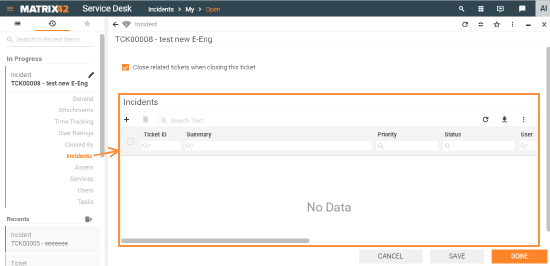 |
 |
Grid Control types and use cases
Matrix42 Solution Builder application provides the following types of Grid Controls data representation right out of the box:
|
a basic grid type that presents records of the spreadsheet or a database table as rows and columns. Displayed data has a pre-defined static structure of the columns, for instance:
|
|
|
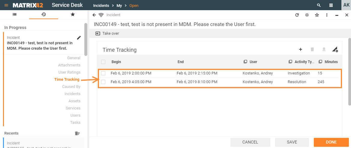
is used to group and display a set of dependent objects attached to an independent one, for instance:
We recur to the Multi Fragment Grid in order to show how long did it take to complete specific actions required for the incident resolution, implying that without the relation to a specific incident the time tracking record will make no sense:
Thus the Multi fragment grid objects are in subordinate dependency where one object directly relies on another. The subordinate Object has its own structure and cannot exist without another stand-alone Object. |
|
|
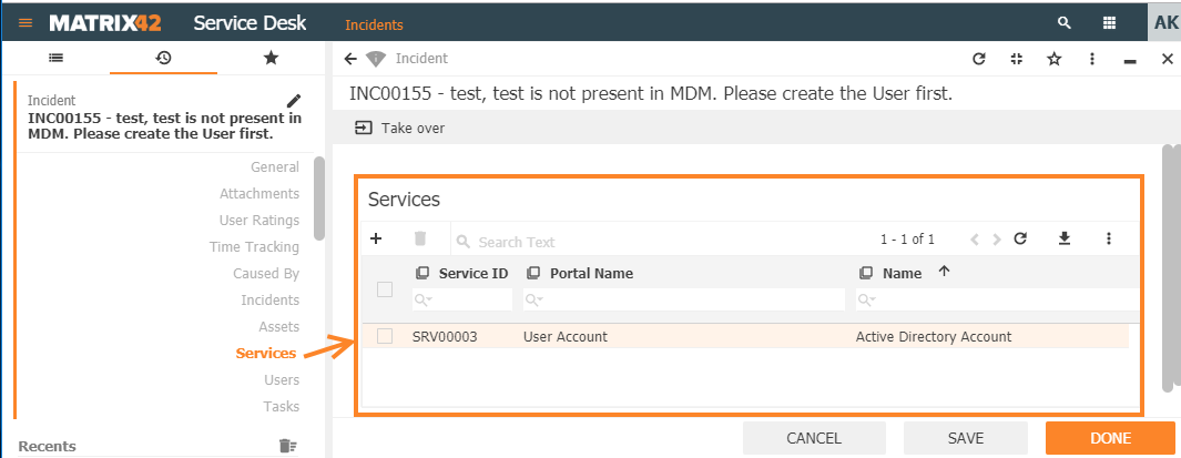
is used to group and display data of the independent objects having established relations due to some context or circumstances, for instance:
By linking these independent and previously created Objects we recur to the Object Relations Grid in order to show all services that were affected by a specific incident. Displayed data has a pre-defined static structure or the displayed columns, for example:
At the same time, each incident is a stand-alone object of the system that can have one, multiple or even do without the relation to any of the services. Services are also represented in the system as stand-alone objects, as they are assigned or detached from the incident, ticket or problem and will still be available in the service catalog and can be ordered multiple times by different users. |
|
|
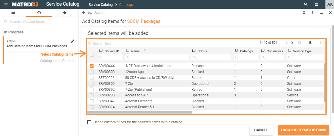
is used to group and display a set of related and additionally filtered objects. Objects Grid can be considered as a stand-alone type of grid as it:
Objects Grid is widely used in Wizards, for example, a list of available services that can be added to the catalog:
The Object Grid displays all services that are available in the system (related service as an object) but were not added to the currently edited catalog (currently excluded services as a filtering criterion). |
|
|
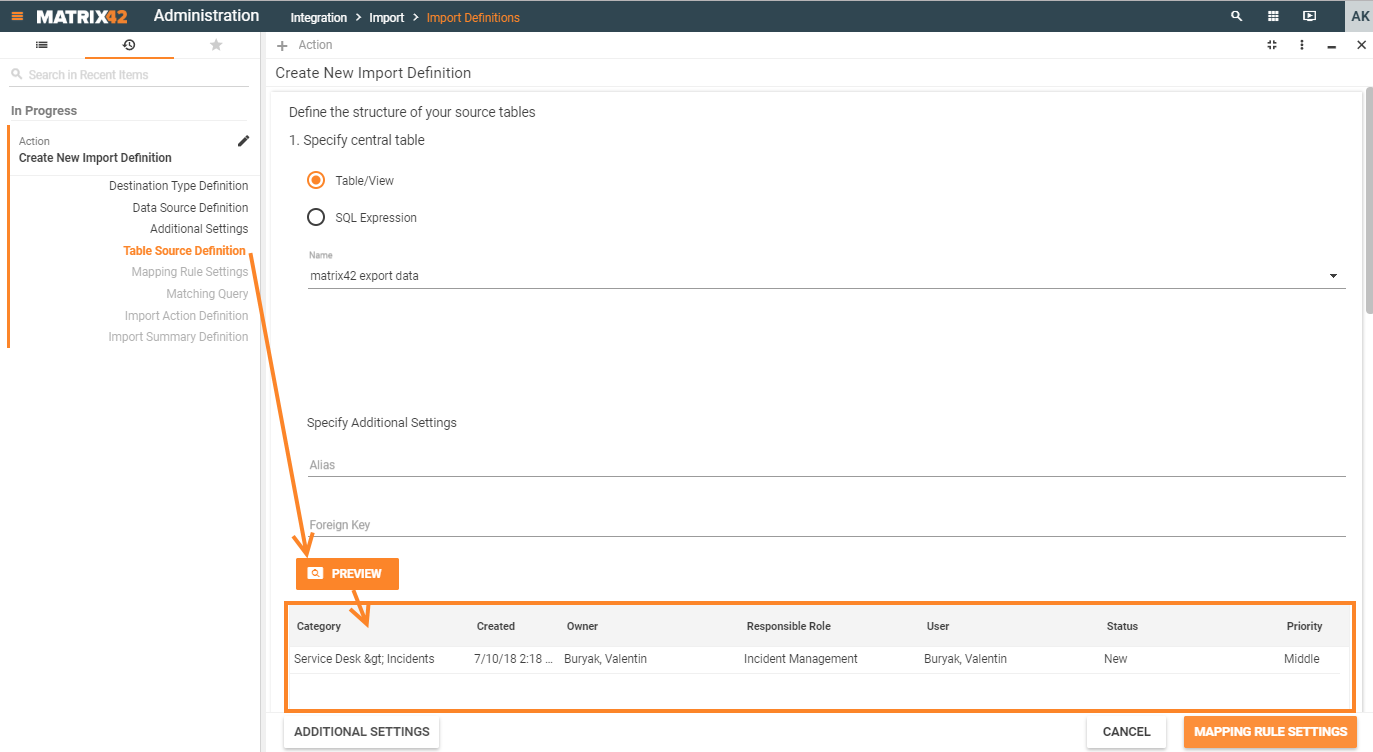
is used to group and display data that doesn't have a static structure of the displayed columns, as each time their number depends on the data from the initial input source and therefore may vary, for instance:
For instance, there is a data source which should be imported into the application. The data source is provided in a certain format with a specific structure of the data (text file, .csv, .xml, .xlsx, MSSQL data etc.) but each time the data and its structure differ. Uploaded file preview renders the data in the dynamic grid according to the provided data source as follows:
|
Generic property Groups
There are the following groups of configurable properties suggested based on the grid type:
| Model | contains a set of rules defining data retrieval and filtering sources for the edited element of the page layout template. |
|---|---|
| Common | specifies such basic properties as data access and editing mode, the title of the grid, required fields of the grid. |
| Paging | defines the records' pagination settings such as the total number of rows displayed per page, pagination navigation mode. |
| Appearance |
defines end-user interaction rules with the standard components of the currently edited template element, such as:
|
| Device visibility |
defines the rules of the edited element displaying based on the end user's device type and screen resolution:
|
Grid Controls properties list
|
Property group |
Grid type → Properties ↓ |
Grid | Multi Fragment Grid | Objects Grid | Object Relations Grid | Dynamic Grid |
|---|---|---|---|---|---|---|
| Model | ||||||
| Data | ✔️ | ✔️ | ❌ | ❌ | ✔️ | |
| Selected items | ✔️ | ❌ | ✔️ | ❌ | ✔️ | |
| (Entity) Class name | ❌ | ✔️ | ✔️ | ❌ | ❌ | |
| Relation | ❌ | ❌ | ❌ | ✔️ | ❌ | |
| Allowed types | ❌ | ❌ | ✔️ | ✔️ | ❌ | |
| Filter | ❌ | ❌ | ✔️ | ✔️ | ❌ | |
| Browse where clause | ❌ | ❌ | ❌ | ✔️ | ❌ | |
| Data Query | ❌ | ✔️ | ✔️ | ✔️ | ❌ | |
| Object ID(s) | ❌ | ✔️ | ✔️ | ❌ | ❌ | |
| Columns | ✔️ | ❌ | ❌ | ❌ | ✔️ | |
| Current item | ✔️ | ✔️ | ✔️ | ❌ | ✔️ | |
| Common | ||||||
| Help | ✔️ | ✔️ | ✔️ | ✔️ | ✔️ | |
| Label | ✔️ | ✔️ | ✔️ | ✔️ | ✔️ | |
| Show Label | ✔️ | ✔️ | ✔️ | ✔️ | ✔️ | |
| Inline mode | ❌ | ❌ | ❌ | ❌ | ✔️ | |
| Disabled | ❌ | ❌ | ✔️ | ✔️ | ❌ | |
| Read-only | ❌ | ❌ | ✔️ | ✔️ | ❌ | |
| Edit mode | ❌ | ✔️ | ❌ | ❌ | ✔️ | |
| Is new object | ❌ | ✔️ | ❌ | ❌ | ❌ | |
| Required | ❌ | ❌ | ❌ | ✔️ | ❌ | |
| Enable filter of configuration item | ❌ | ❌ | ❌ | ✔️ | ❌ | |
| Multi Selection | ❌ | ❌ | ✔️ | ❌ | ❌ | |
| Name | ✔️ | ✔️ | ✔️ | ✔️ | ✔️ | |
| Paging | ❌ | ❌ | ❌ | ❌ | ✔️ | |
| Allow paging | ❌ | ❌ | ❌ | ❌ | ✔️ | |
| Page size | ❌ | ❌ | ❌ | ❌ | ✔️ | |
| Page number | ❌ | ❌ | ❌ | ❌ | ✔️ | |
| Total items count | ❌ | ❌ | ❌ | ❌ | ✔️ | |
| Appearance | ||||||
| Enable row selection | ✔️ | ✔️ | ❌ | ❌ | ✔️ | |
| Full height | ✔️ | ✔️ | ✔️ | ✔️ | ✔️ | |
| Minimal height, px | ✔️ | ✔️ | ✔️ | ✔️ | ✔️ | |
| Enable Drag'n'Drop | ❌ | ❌ | ✔️ | ❌ | ❌ | |
| Delete actions | ❌ | ❌ | ✔️ | ✔️ | ❌ | |
| Hide export button | ❌ | ❌ | ❌ | ❌ | ✔️ | |
| Show "Selected Items" Panel | ❌ | ❌ | ✔️ | ✔️ | ❌ | |
| Visibility | ✔️ | ✔️ | ✔️ | ✔️ | ||
| Hide Grid Header | ✔️ | ✔️ | ✔️ | ✔️ | ✔️ | |
| Margin | ✔️ | ✔️ | ✔️ | ✔️ | ✔️ | |
| Padding | ✔️ | ✔️ | ✔️ | ✔️ | ✔️ | |
| Flex option | ✔️ | ✔️ | ✔️ | ✔️ | ✔️ | |
| Disable add | ❌ | ✔️ | ✔️ | ✔️ | ❌ | |
| Disable create | ❌ | ❌ | ✔️ | ✔️ | ❌ | |
| Disable Delete | ❌ | ✔️ | ❌ | ❌ | ❌ | |
| Disable remove | ❌ | ❌ | ✔️ | ✔️ | ❌ | |
| Disable edit | ❌ | ✔️ | ❌ | ❌ | ❌ | |
| Show add button | ❌ | ❌ | ❌ | ❌ | ✔️ | |
| Show remove button | ❌ | ❌ | ❌ | ❌ | ✔️ | |
| Device visibility | ||||||
| Desktop | ✔️ | ✔️ | ✔️ | ✔️ | ✔️ | |
| Tablet | ✔️ | ✔️ | ✔️ | ✔️ | ✔️ | |
| Mobile | ✔️ | ✔️ | ✔️ | ✔️ | ✔️ | |