Themes
Overview
A theme is a predefined set of colors for the application UI. Use any of the out-of-the-box themes to configure the look and feel of the UI of the DWP
You are encouraged to use themes to change the look and feel of a multitude of entities at once rather than set all the options individually.
You can modify the out-of-the-box themes or create custom themes to customize the look and feel of the applications you build.
Default Themes
The Administrator can change the theme for the entire system at once via Administration application → User Interface → Themes:
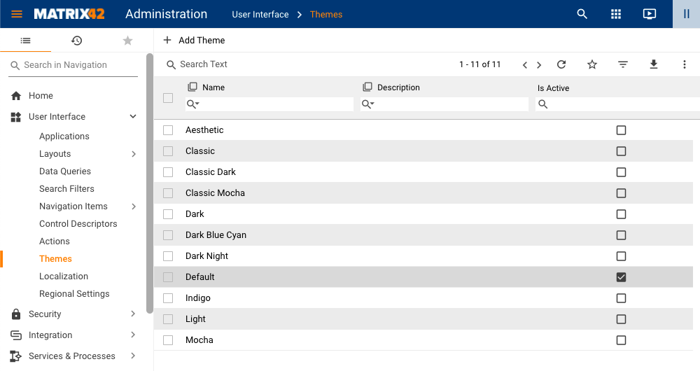
The extended list of 11 out-of-the-box themes is available in 10.1.0 DWP release version. It has 8 new color themes for the products from a neutral default to refreshing light themes to mellow dark ones. All themes are contrast optimized to ensure legibility and reduce eye strain.
Earlier DWP versions offer only 3 themes: Default, Dark, and Mocha, featured in the new release as Classic Themes.
Themes Overview
Click on the Theme to see a preview before applying the theme:
| Theme | Preview |
|---|---|
Aesthetic |
 |
Classic (former Default) |
 |
Classic Dark (former Dark) |
 |
Classic Mocha (former Mocha) |
 |
Dark |
 |
Dark Blue Cyan |
 |
Dark Night |
 |
Default |
 |
Indigo |
 |
Light |
 |
Mocha |
 |
USING Themes in NEW LOOK
The system has a default list of themes for the Classic Look and at the same time a set of the equivalent Themes in the New Look.
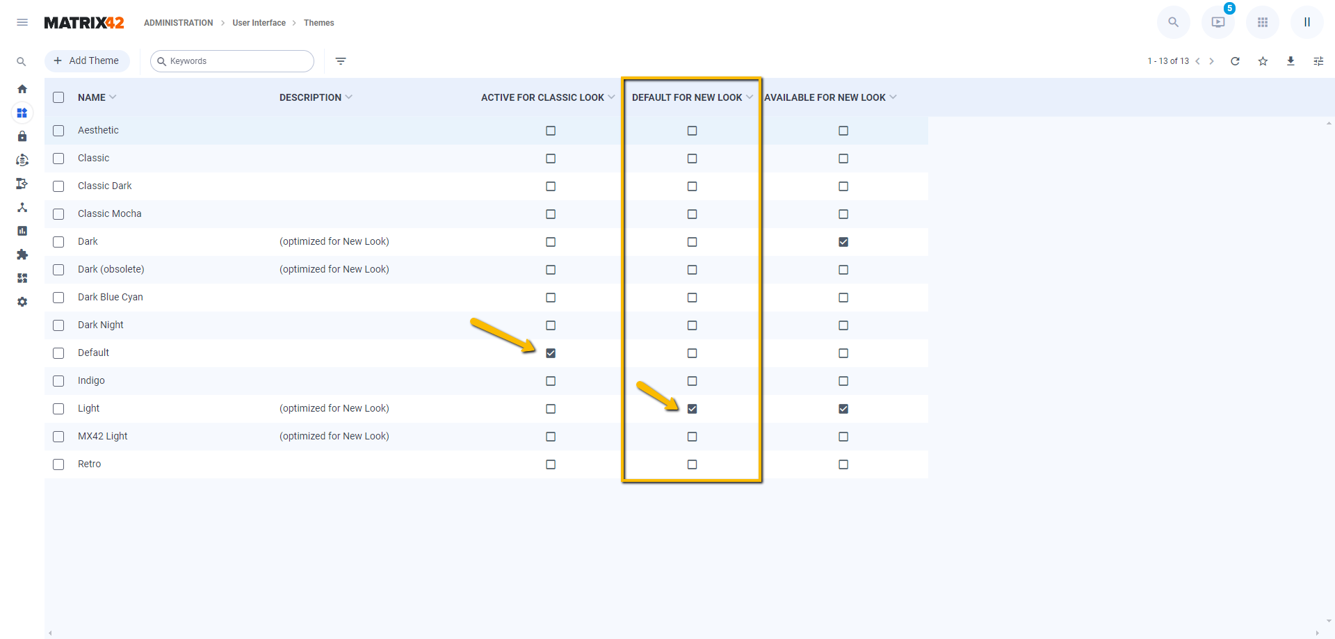
Themes are managed from the Administration application → User Interface → Themes area.
An additional column Default For New Look indicates the currently active Theme in the new application design. By default, a Light theme is applied for the New Look.
Please note, that the currently active themes for Classic and New Look running on the same instance may differ, for instance:
If your system has a custom theme and it doesn't look good in the New Look design, for example, the company logo is not displayed properly. Consider creating a copy of your theme with a Copy Theme action, adjusting it for the New Look, and activating it for the New Look.
Click on the Theme for more actions and a preview of the New Look design and scroll down for the Classic Look preview:
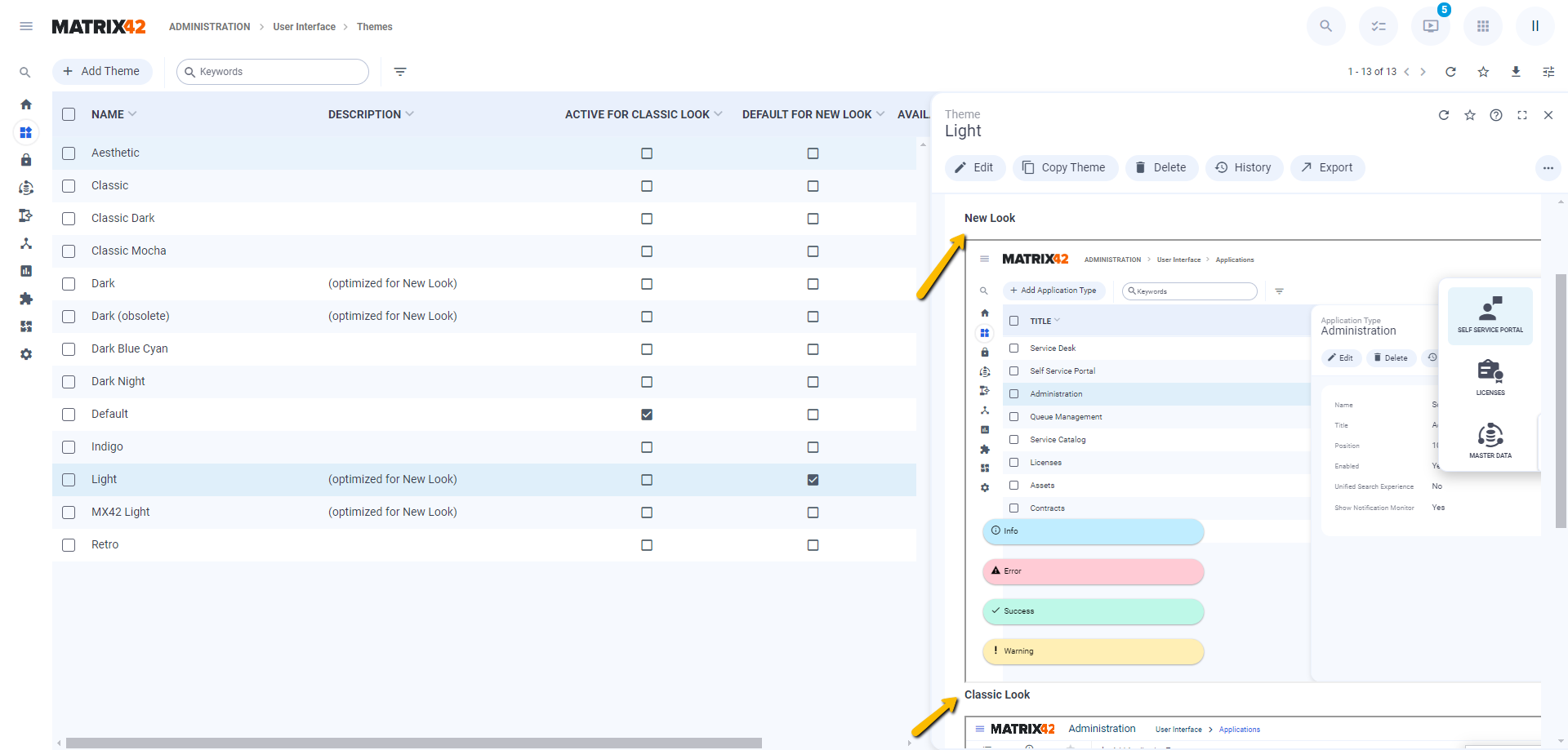
The Apply theme action also suggests the New Look and Classic Look options within the same theme.
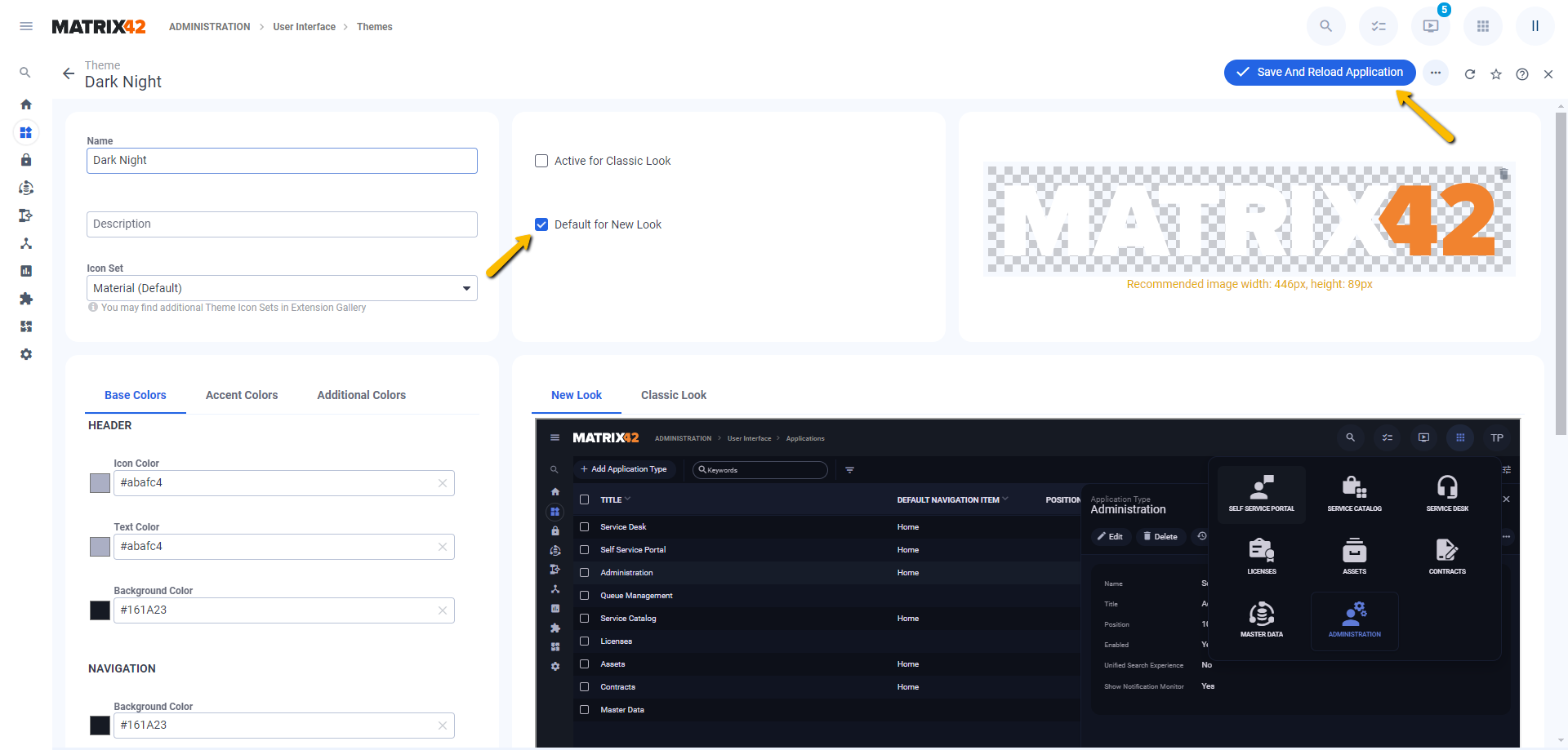
Choose the Theme and on the Theme preview, click the Save and Reload Application action on the following page:
- Select the checkbox for the necessary options to apply the Theme for the New Look only, only Classic Look, or both. In the image below, the Dark Night theme is selected only for the New Look.
- Click Save and Reload Application to reload the page in the new design.
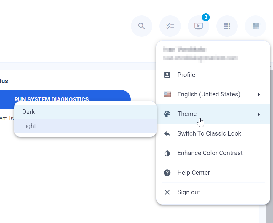
In New Look there's a possibility to allow users to select a theme on the fly from the list of available themes.
There's a default theme for new look that will be selected initially when user sign in for the first time ever or the first time after the update from DWP 12.0.3 or earlier versions to DWP version 12.0.4 or above.
Administrator can manage available themes to be selected by users by checking/unchecking checkbox Is available in addition to default theme (New Look only)
Administrator can also set default theme for new look by checking checkbox Is default for New Look.
On clean installation two themes are available to be selected in New Look by default: the light one and the dark one.
When user selects a theme it is stored in his profile and will be applied for him also after re-login or on other devices.
Theme can be picked from the avatar menu like it is displayed on a next screenshot.
Apply Theme FOR CLASSIC LOOK
To switch between the existing themes:
- Go to Administration → User Interface → Themes;
- Double-click the theme to open the edit dialog;
- Check Is active for Classic Look checkbox;
- Save;
The selected theme will be immediately applied to Classic Look. The applied theme is marked on the theme's grid as Is Active For Classic Look.
In Classic Look applied Theme is the same for the entire system and can not be personalized per user or role.
Modifying Existing Themes
To modify the existing theme:
- Go to Administration → User Interface → Themes;
- Choose the theme you would like to modify: click the theme to open the Preview page;
- Click Copy Theme action;
- Provide the new theme name and click the Copy Theme button;
- In the Themes grid, click on the new theme you have created;
- Click the Edit action in the main toolbar of the preview;
- Introduce necessary changes, for instance, change Icon Set or any other property;
- Click Done.
The Default theme is a system theme that can not be modified, but you can create a copy of the Default theme with Copy Theme action, introduce any required changes.
It is recommended to modify the out-of-the-box themes with the Copy Theme action. If you apply any changes directly in the out-of-the-box theme and save them, they can not be reverted.
Creating a New Theme
To create a new theme:
- Go to Administration → User Interface → Themes;
- Click the Add Theme action on top of the Themes grid page;
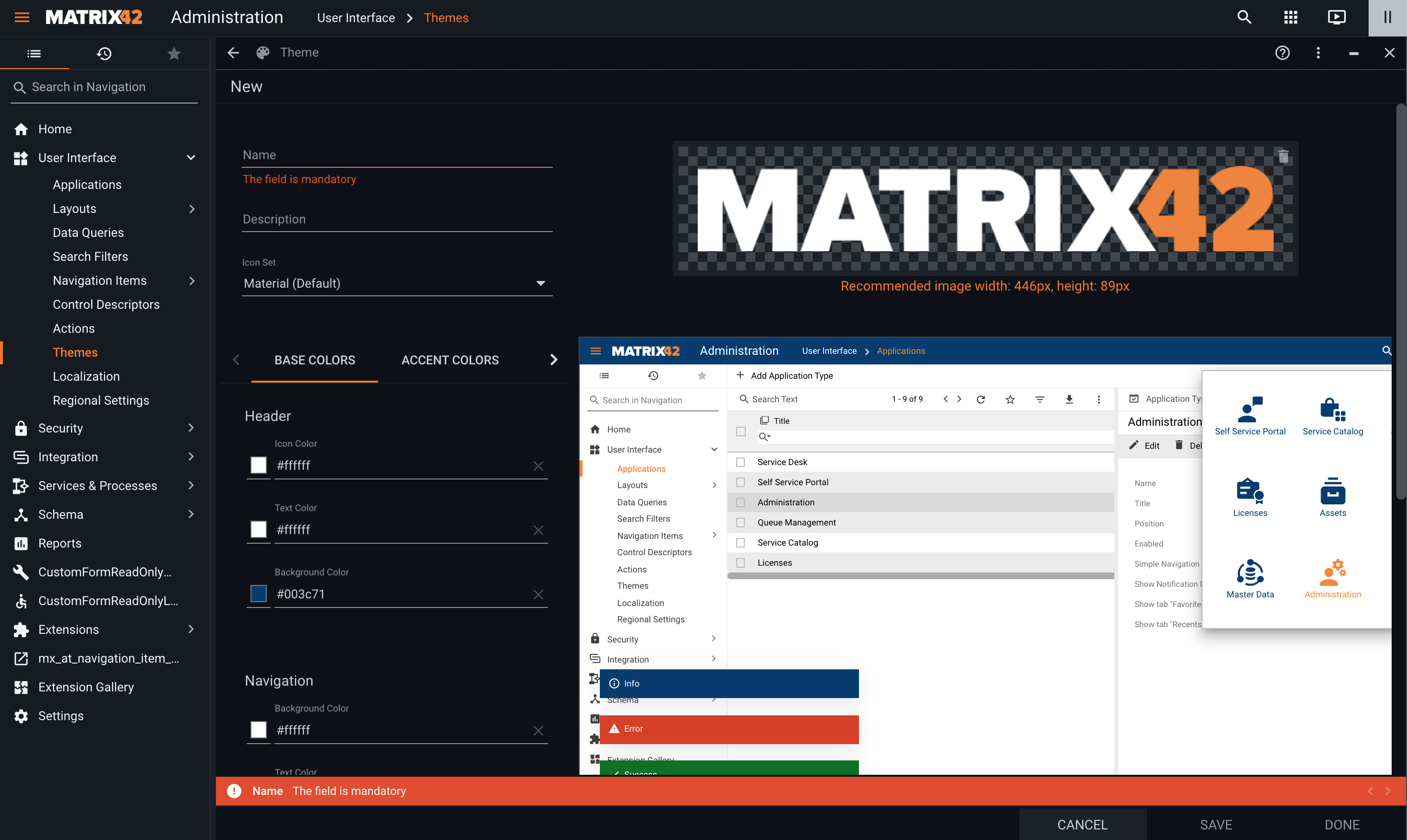
- In the New Theme dialog that appears specify necessary information:
The New Theme is pre-filled with values from the Default Theme that can be modified according to your choice.
- Name: provide a name for the new Theme;
- Description: optional description;
- Icon Set: choose from the suggested list or install a new Icon Set via Extension Gallery. For more information, see also Nucleo Icons Set.
- Logo: change the company logo. Click the Upload icon in the top left corner on the placeholder of the current logo. Recommended image width: 446px, height: 89px;
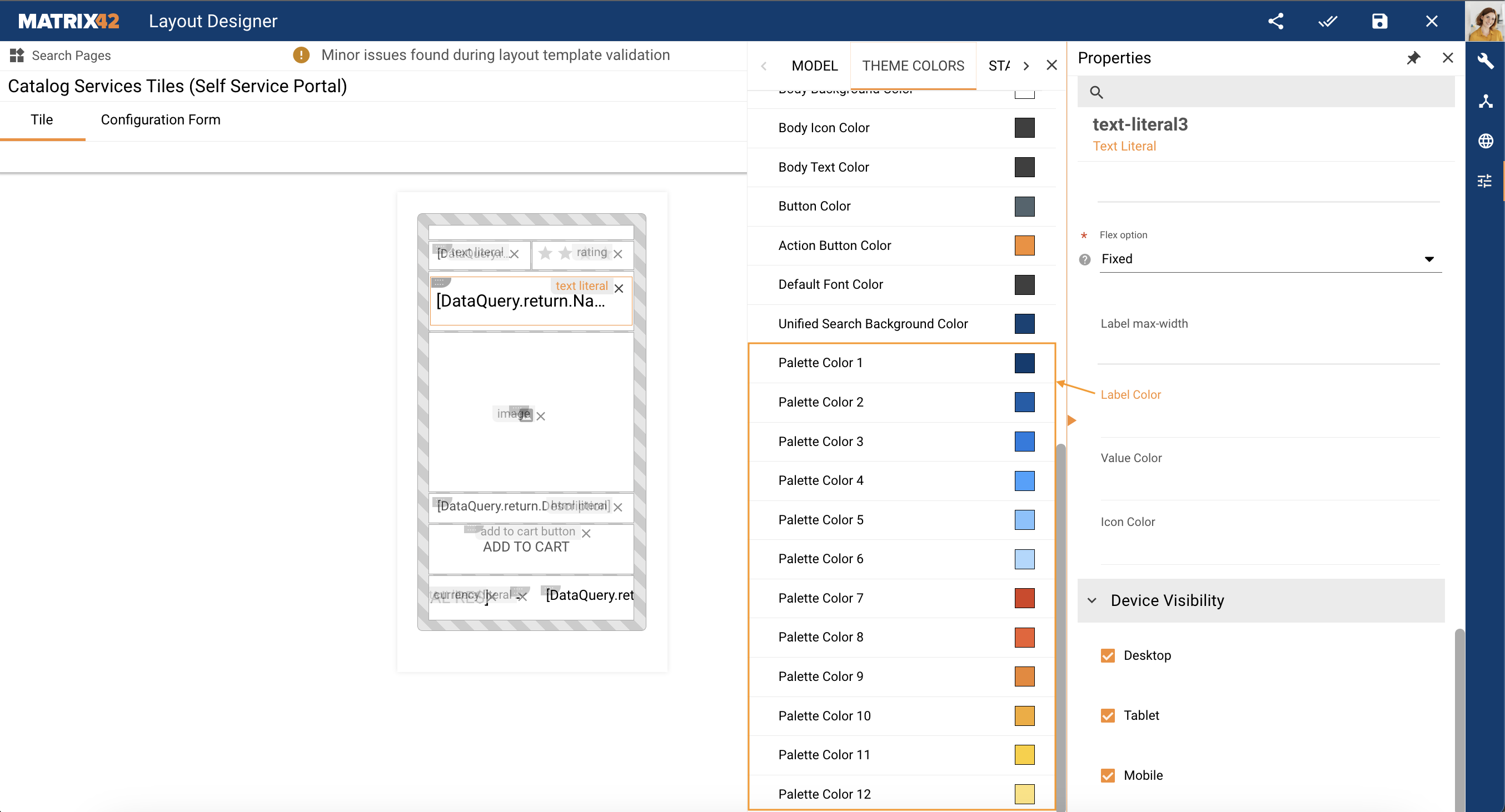
- Colors: enter a HEX color code or choose a value with RGB color picker in the suggested fields and instantly preview the changes in the theme editor.
Define colors for the following UI elements of the applications in the suggested tabs:- Base Colors:
- Header:
- Icon Color: select the color of icons displayed in the Application Header.
- Text Color: select the color of the text displayed in the Application Header.
- Background Color: select the background color for the Header.
- Navigation:
- Background Color: select the background color for the Navigation Panel.
- Text Color: select the color for the text displayed in the Navigation Panel.
- Icon Color: select the color for the icons located in the Navigation Panel.
- Content:
- Icon Color: select the color for the icons located in the body of the application, i.e. in grids, dialogs, wizards, etc.
- Text Color: select the color for the text displayed in the body of the application, i.e. in grids, dialogs, wizards, etc.
- Background Color: select the color for the background of the application body and all the entities (e.g. dialogs) located in the body of the application.
- Default Font Color: the default color for text that does not fall under any of the text color categories available under the Base Colors tab.
- Header:
- Accent Colors:
- Primary Color: select the color to highlight currently active entities in the application UI. For example, the active color is used to highlight the currently active navigation item in the Navigation Panel and in the breadcrumbs in the Application Header. The active color is also used to highlight the currently active row in grids, currently active tab in dialogs, selected checkboxes, and radio buttons, as well as the currently active application in the Application picker and as the default title color of the First title line and Second title line properties for the activated Unified Search Experience.
- Buttons:
- Action Button Color: select the color for the action buttons, such as Add and Configure usually displayed in the bottom right-hand corner of the screen and buttons in wizards taking you to the next step or completing the wizard.
- Button Color: select the color for all the other buttons, the ones that do not fall under the Action Buttons category. There are only a few such buttons in the system. An example would be the Run Search button in Advanced Search.
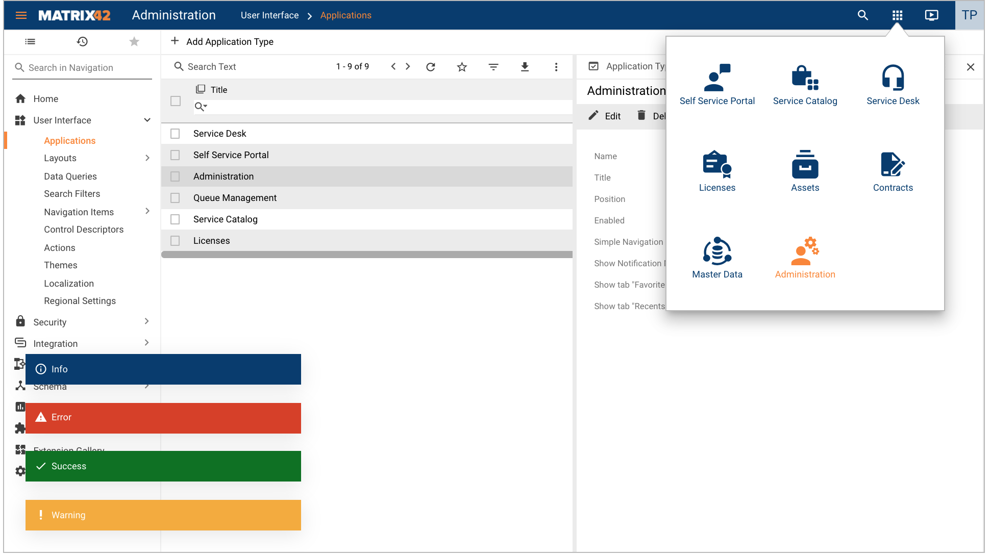
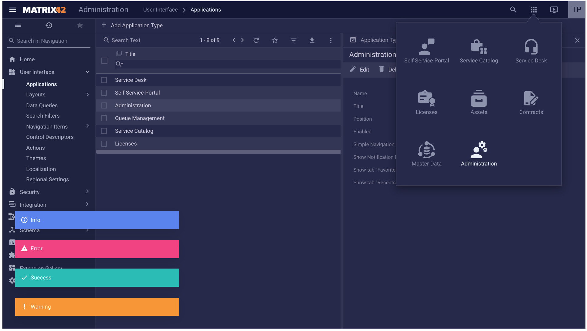
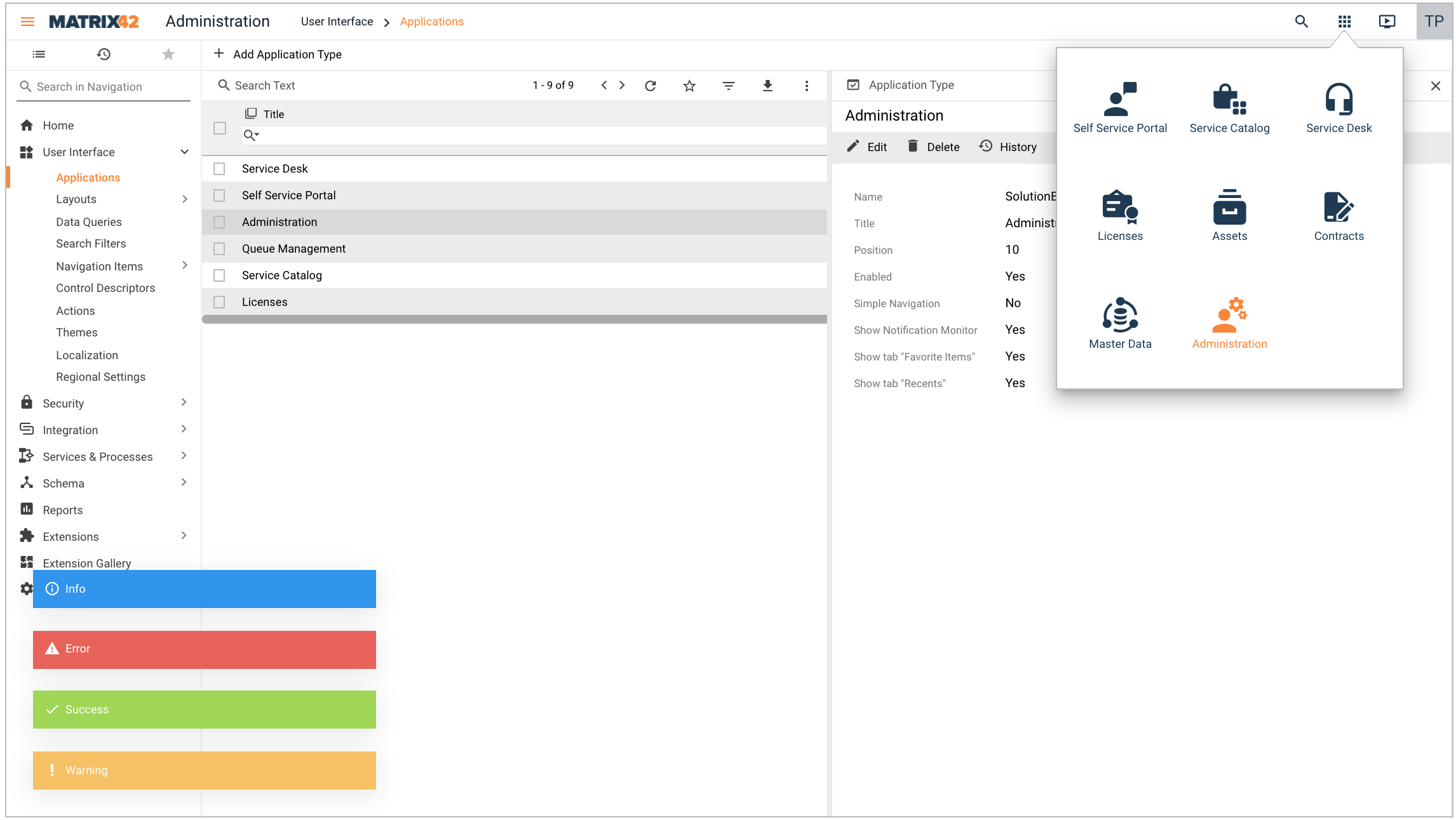
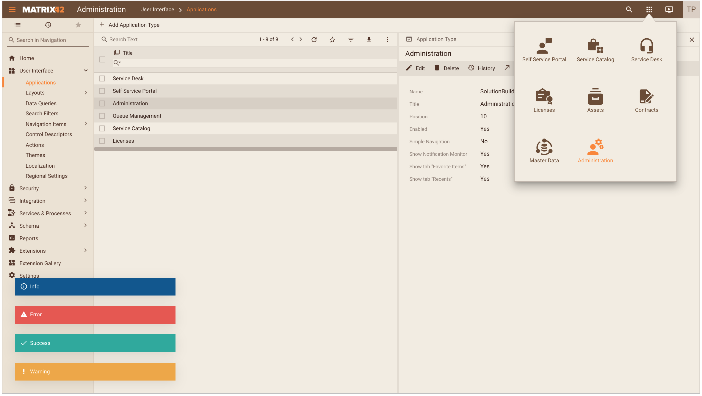
- Messages:
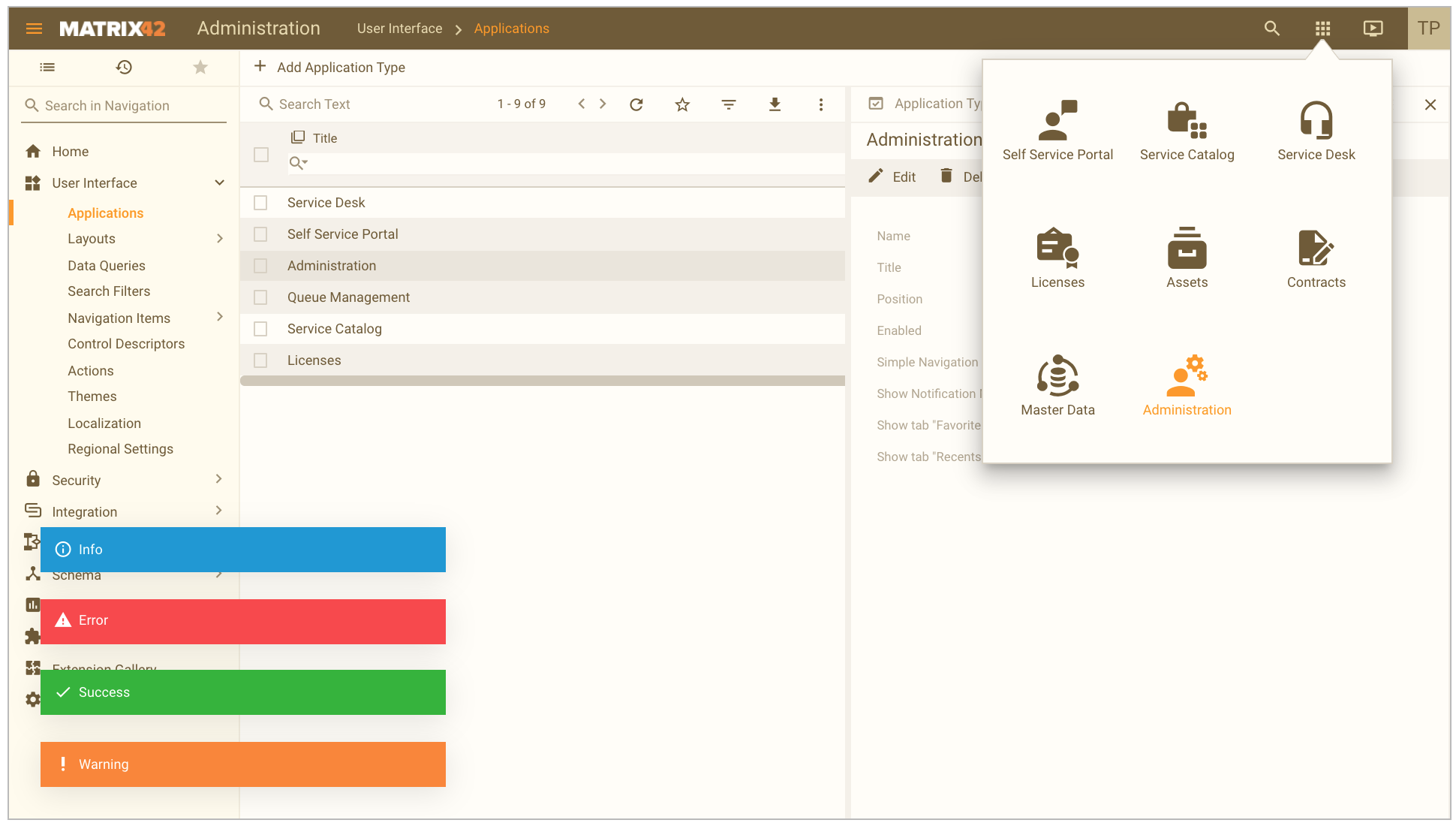
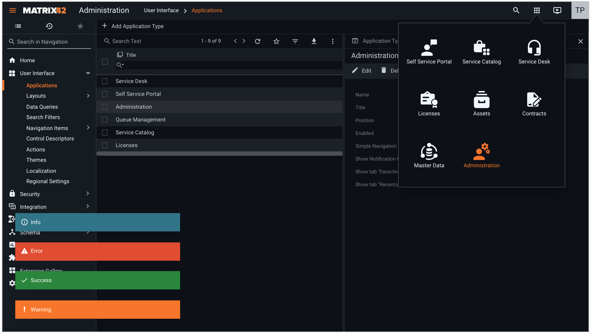
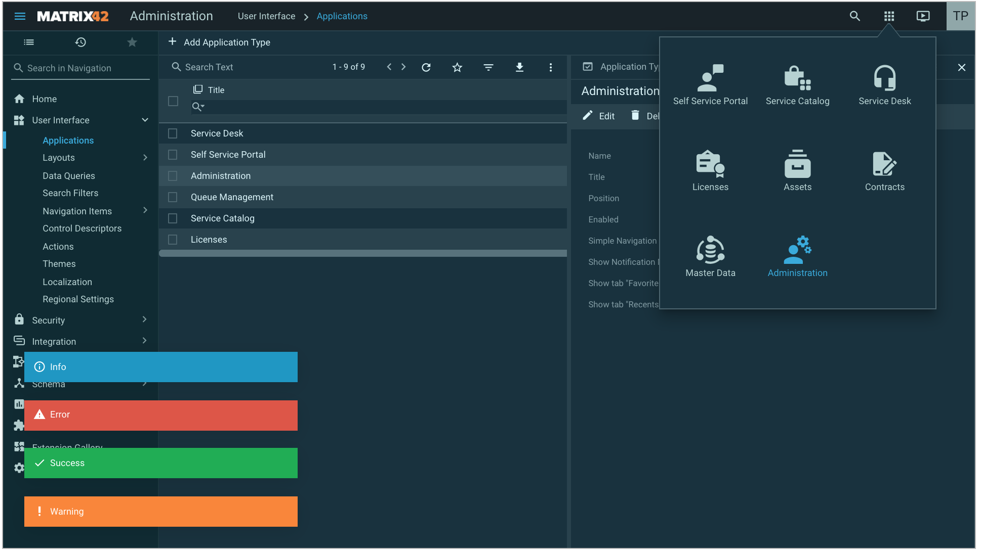
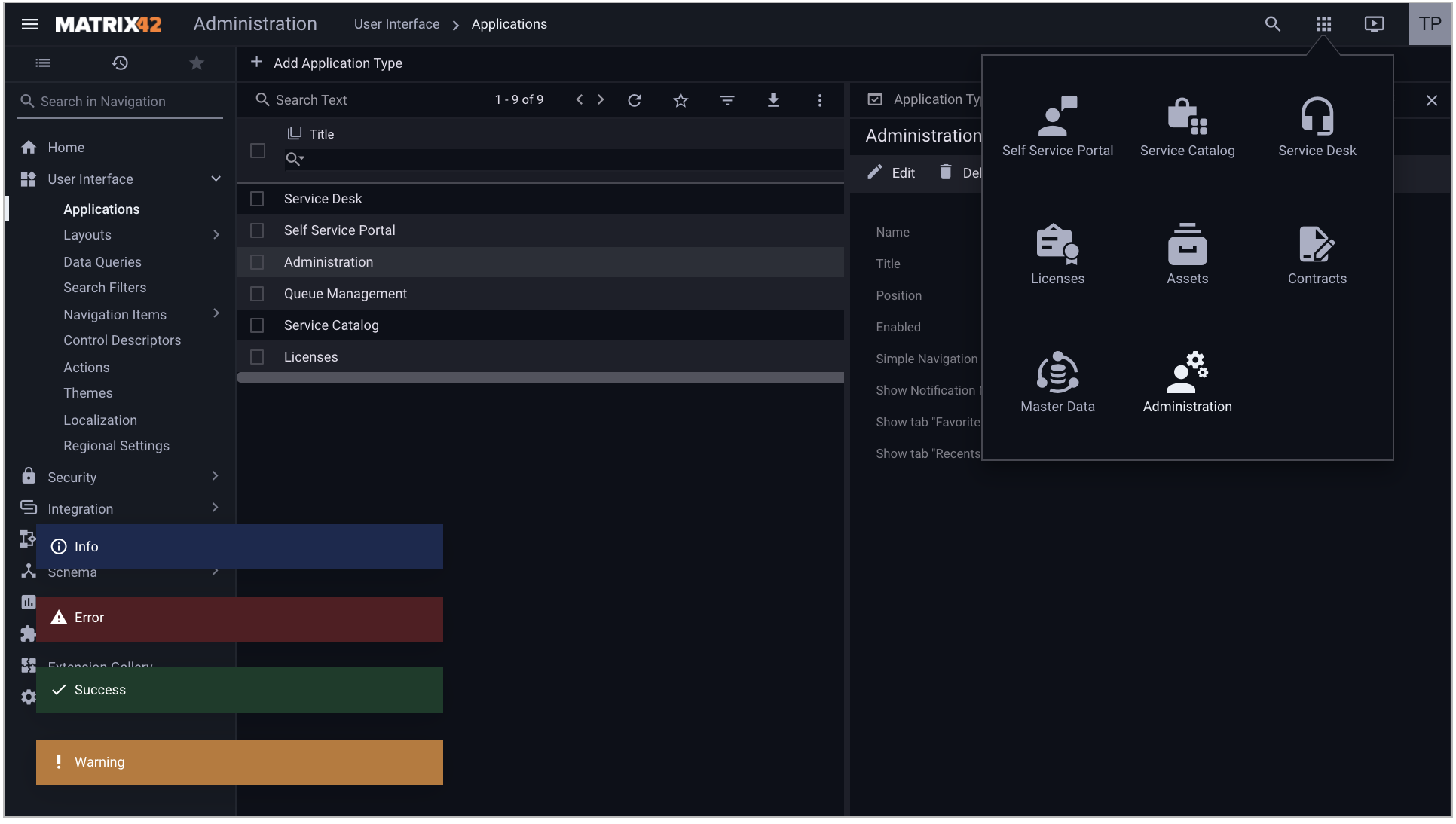
- Success Color: select the color for success messages.
- Warning Color: select the color for warning messages.
- Info Color: select the color for information messages.
- Error Color: select the color for error messages.
- Search:
- Unified Search Background Color: the color used for the background image of the activated Unified Search Experience control if the custom image is not set. For more details, see Unified Search Experience page.
- Additional Colors: select additional colors for the Theme. These colors are used in Charts. Also, you will be able to pick the colors selected here in the Layout Designer, in particular in the color picker control:
Starting from DWP v.12.0.2 all color pickers no longer have technical names and display the name based on the area, where this color is applied, similarly to the Theme color settings in the Administration application.
- Base Colors:
Extra colors were introduced in the color picker since DWP v.12.0.2, among them:
- Success Text Color
- Error Text Color
- Warning Text Color
- Info Text Color
- Faded color
- Fadest color
They are dynamically calculated based on the current text color and background color used in the Theme and suggested in the picker, therefore they will always fit into the color palette of the current Theme and when selected, just like the other colors of the Theme, are automatically adjusted to the Enhanced Color Contrast mode.
Make sure to Save the changes or click Done.
Click Apply action to apply the new custom theme.
Links
For more details please read also: