Object Picker
Overview
An Object Picker is a control that looks like an ordinary field in run time and allows you to locate and select a single object.
There are several types of controls that allow you to locate and select object(s) in Solution Builder, for example:
- Object Picker: allows you to locate and select an object;
- Hierarchical Picker: allows you to select an object from a hierarchy;
- Related Objects Picker: allows you to locate and select multiple objects (better fits for Dialogs);
- Objects Picker: allows you to locate and select multiple objects (suitable for using in Wizards),
All of the above controls inherit the Object Picker, among others, and, therefore, have much in common.
How to Use Object Picker in Run Time
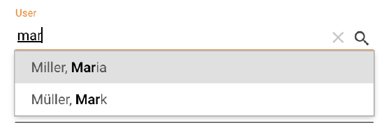
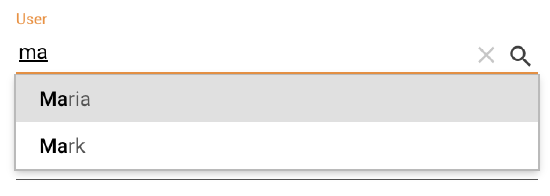
- Click an Object Picker field in run time and start typing the name of the object you would like to add to the field. The control will suggest up to 5 options to select from as you type:
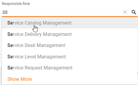
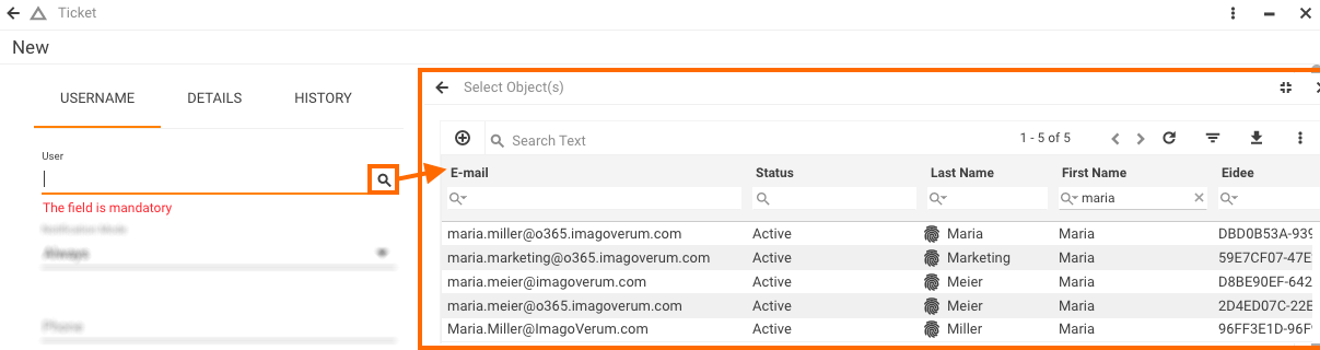
If the option you need is not on the suggested list, click the Show More link or click the magnifying glass inside the field to open the Select Object(s) page.
- Use the Search Text field at the top of the page to locate the object you need; then click the object to add it to the object picker field and close the Select Object(s) page. Alternatively, use the advanced search
 icon to locate the object:
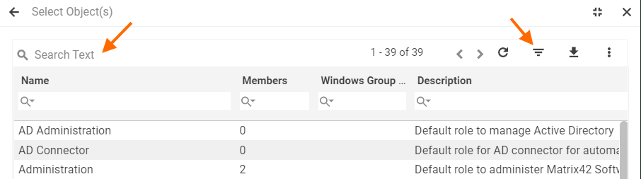
- You can sort the grid by any of the grid columns (A-Z or Z-A). You can also scroll down the page and use the paging controls at the bottom to locate the object you need. You can add a new object to the grid from the Select Object(s) page by clicking the Add new + button (if available) in the top right-hand corner of the page and filling out the New Object dialog that appears.
- Click the CANCEL button in the bottom right-hand corner of the Select Object(s) page to close the page without selecting an object.
- Click the remove X icon in the object picker field to clear the field.
How to Set up Object Picker Control
An Object Picker control, just like any other control in Solution Builder, has its own Control Descriptor (located under Administration application → User Interface → Control Descriptors), which defines how the control is set up, what fields the control has, and how it behaves. Users with Admin rights can modify the Control Descriptor, if needed, to suit their specific business needs.
Layouts
By default, the Object Picker Control is available for the following types of Layouts:
- Dialog
- Wizard
To enable the Object Picker control usage in other types of Layouts see Administration application → User Interface → Control Descriptors → Object Picker settings.
Layout Designer
Your next step is to set up the Object Picker control in Layout Designer:
- Locate an existing Object Picker on the canvas in Layout Designer, add a new one from the Toolbox, or drag&drop the necessary Data Model attribute that has suitable for the Object Picker control data type (Object Reference or Guid). The controls are suggested as follows:
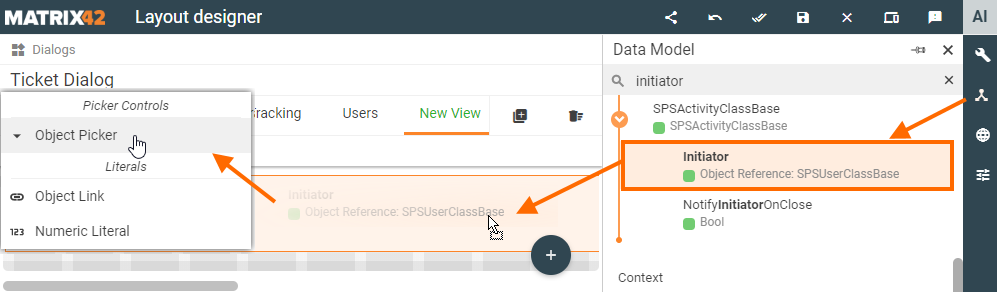
- Click the control on the canvas to open its properties in the right-hand panel. Properties that the Object Picker has in Layout Designer are defined in the Object Picker Control Descriptor.
Minimal required property settings
The following data model properties are minimum required for the object picker display in the runtime:
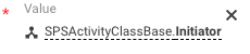
- Value: the attribute of the Data Definition that stores the chosen from the object picker value;
- Data Definition: entity class that serves as a source of suggested in the object picker values;
- Label: the title of the displayed field.
Use drag&drop to automatically pre-fill Value, Data Definition, and Label properties. Drag&drop the attribute of Object Reference or Guid type from the Data Model on the canvas and choose Object Picker control from the suggested options.
These properties are enough for correctly displaying the object picker field in the application. Other properties can be adjusted as described below.
Object Picker Specific Properties
| Property group | Property name | Description | Default | Property setting example |
|---|---|---|---|---|
Model |
Value |
Enter the attribute of the Data Definition that stores the chosen from the object picker value. |
❌ |  |
Data Definition |
Source of suggested in the object picker values. Select an entity class for the Object Picker. In the runtime, the suggested for the object picker list shows the options filtered according to the Allowed Types, Filter Expression, and the option titles are based on the Display Expression property. |
❌ |  |
|
Allowed Types |
Optional filtering criteria for the data retrieved from the specified Data Definition.
|
❌ |  |
|
Filter Expression |
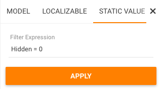
Additional filtering criteria for the options retrieved to the object picker. Optional field. The filter is applied to the specified Data Definition. Specify a default ASQL filter expression for the search results displayed in the suggested options list and Select Object(s) page in run time, if needed:
The example above filters and suggests in the object picker options that: a. are from the Allowed Types (if configured) and; b. the value of the specified Data Definition attribute "Hidden" is set to false (0). For this data filtering step, the Allow Reset Filter is set to Disabled (default). You can set a static value or bind the control with a data model property (from the Model tab). |
❌ |  |
|
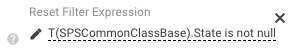
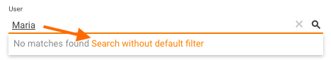
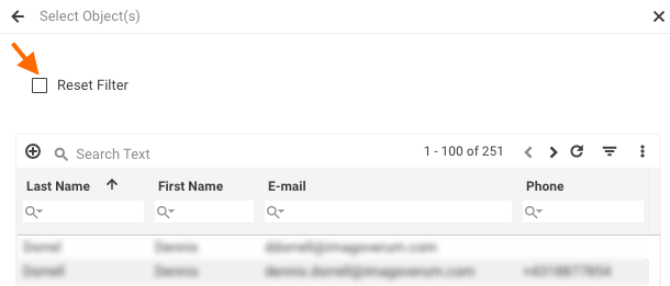
Allow Reset Filter |
Select the checkbox to allow users to reset the filtering conditions for the suggested object picker options in the run time:
The enabled check-box resets the Filter Expression condition and applies the Reset Filter Expression, if it is specified. Thus, the enabled check-box allows displaying all search results without the default filter applied. The applied default filter depends on the properties and combinations of the following fields of the object picker configuration:
The configuration of these fields is optional and should be configured to achieve the necessary data filtering results. Example 1
Example 2
Example 3
|
Disabled |  |
|
Reset Filter Expression |
Specify an additional ASQL filter expression, if needed, to allow users to filter the search results by the additional criteria. If the user selects the Reset Filter checkbox in run time, the Reset Filter Expression specified here will apply to the search results, while the Default Filter Expression specified in the Filter Expression field will not apply. Additionally requires Allow Reset Filter property set to Enabled. |
❌ |  |
|
Use Object ID |
Check-box options:
|
Disabled |  |
|
Data Query |
Former Column Definition field that was renamed in DWP v.12.0.1. Defines a set of columns that are displayed on the Select Object(s) page when the user clicks Show More link or the
|
❌ | 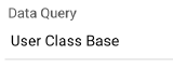 |
|
Data Query Column To Display |
Former Display Expression property that was substituted with Data Query Column to Display starting from DWP v.12.0.1. To show the Display Expression edit the Data Query column Expression and specify the name of the Data Query Column in this property. A Data Query column is used to display a value in the autocomplete dropdown list instead of a default display expression of the Data Definition.
|
❌ | 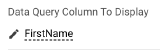 |
|
Output |
Use the Output section to save the current state of the control: | |||
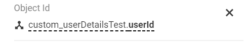
Object Id |
Select where to store the Id of the object selected by a user in the Object Picker field in the run time. You can set up these returned values (Object Id and Display Name) to trigger something else in the application or perform a certain operation, for example, see the Custom Validation configuration using the Object Id property value. |
❌ |  |
|
Display Name |
select where to store the Display Name of the object selected by a user in the Object Picker field in run time. You can set up these returned values (Object Id and Display Name) to trigger something else in the application or perform a certain operation, etc. |
❌ | ||
Common |
Help |
help icon and tooltip for information displaying as:
|
❌ |  |
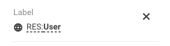
Label |
The title of the object picker field:
Can be set via one of the following options:
|
❌ |  |
|
Disabled |
|
False | 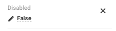 |
|
Hint |
Hint text or an example of the information required for the field.
Hint example displaying |
❌ |  |
|
Required |
Defines whether the data for the object picker is required for the layout.
|
False | 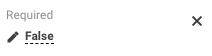 |
|
Read-only |
|
False |  |
|
Name |
Mandatory field with auto-generated name or identifier of the edited object picker control. | auto-generated | 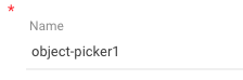 |
|
Validation |
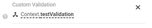
Custom Validation |
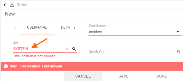
Additional validation of the selected in the object picker value. Configure this property in case the standard filtering conditions of the Allowed Types, Filter Expression and Reset Filter Expression fields configuration are not enough. The Custom Validation is handy in cases when the selected value should be additionally validated by another service, for instance:
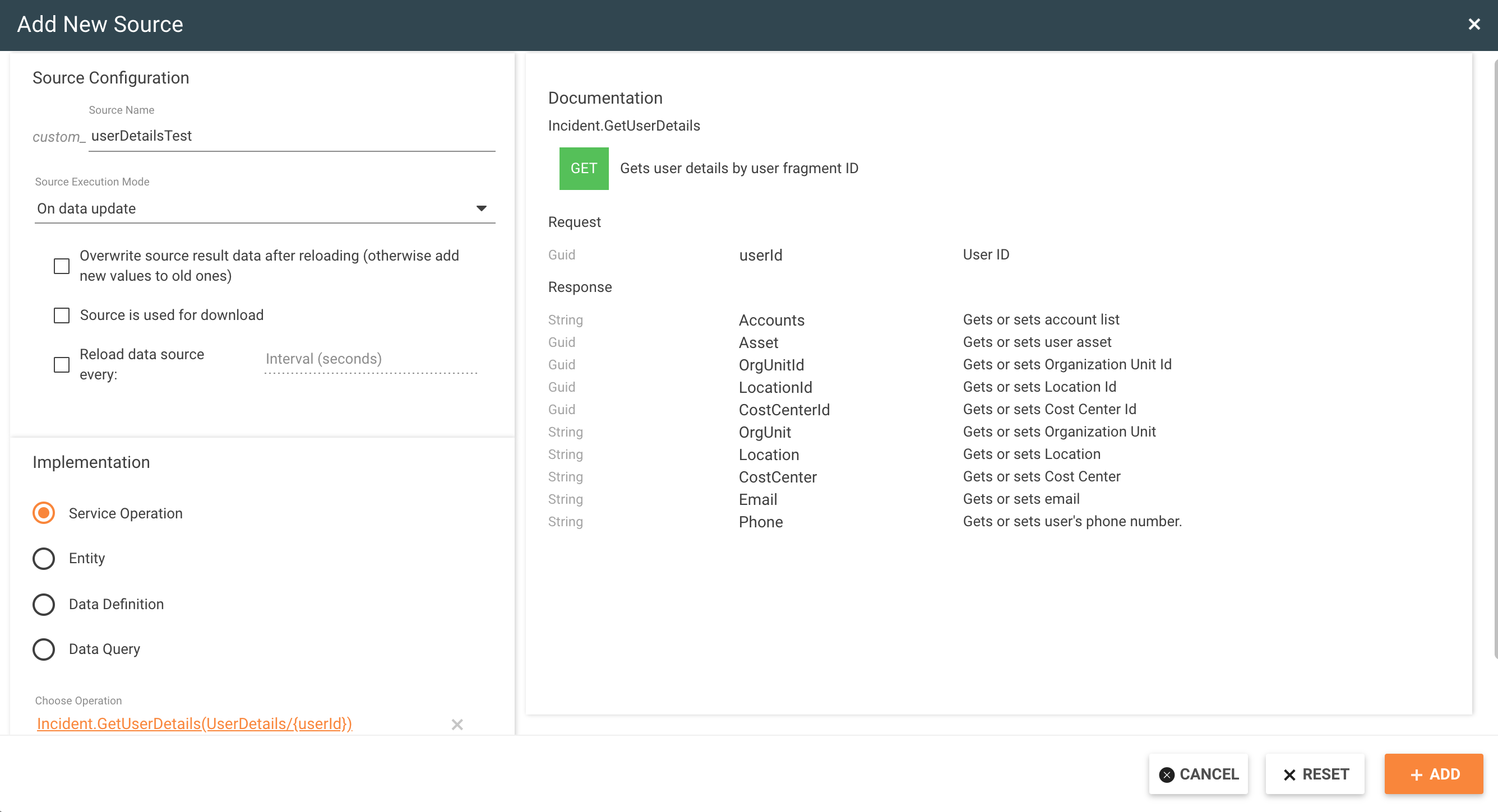
The selected user has 'Global' location. Based on the Custom Validation settings this location returns an error and the dialog can not be saved. The Custom Validation configuration for this example may include the following steps:
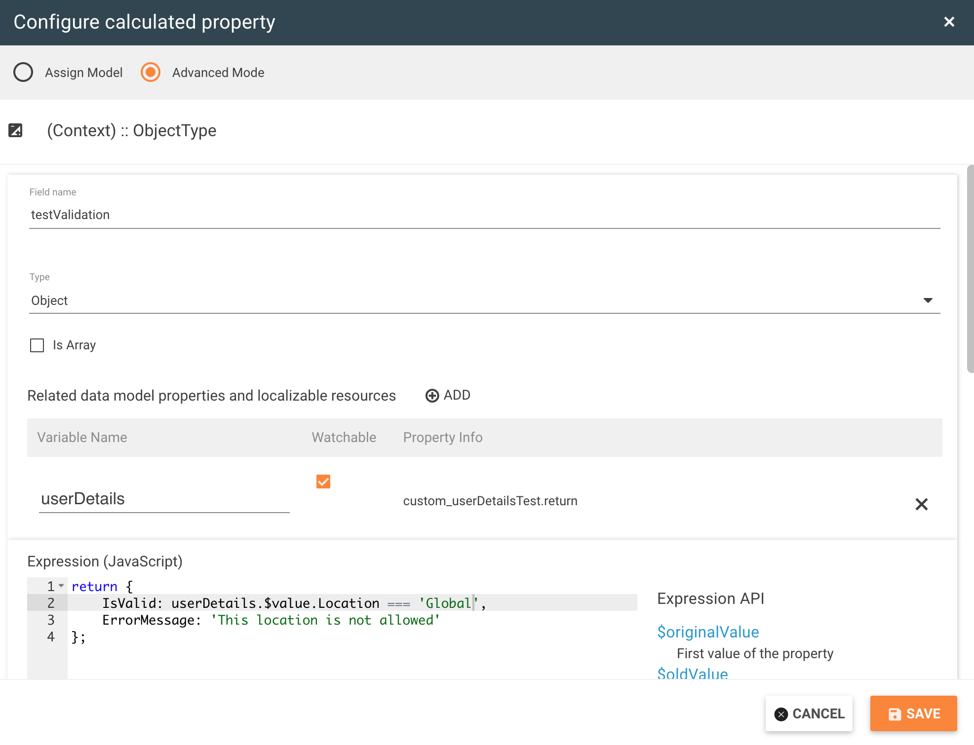
2. Configure Custom Validation:
The Custom Validation property allows setting up selected value validation in the format:
The configuration will validate the user data in the run time as shown in the example above. |
❌ |  |
Appearance |
Visibility |
Grid display on the page modes:
|
True |  |
Margin |
set property creates additional blank space outside of the borders of the element containing the object picker control. Set control's margin in CSS format measured in px or rem:
|
❌ |  |
|
Padding |
the property is used to generate additional blank space around the object picker, inside of the borders of the element containing the object picker control. Set control's padding in CSS format measured in px or rem:
|
❌ |  |
|
Flex Option |
intended to automatically adjust the width of the displayed in the run time field. Possible options:
|
Fixed |  |
|
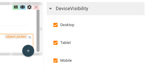
Device Visibility |
Desktop |
The application checks the user device's screen resolution and shows or hides the object picker element based on the selected check-box options:
Device visibility settings example: object picker control is displayed for all types of devices |
Enabled | |
Tablet |
Enabled | |||
Mobile |
Enabled |
 lookup icon: