Literals
Overview
There are two types of Literals: simple Literals and Links. Simple Literals work with simple types, such as text, currency, HTML, time, Boolean true or false value, etc. You can view data in Literals but cannot modify it. Literals are used mostly in Previews. Use mapped Text Boxes (e.g. in dialogs) together with Watchable Text Literals (in Previews) in order to be able to modify values in those Text Boxes and watch the changes displayed in Text Literals.
Simple Literals
Basic Properties
Model
- Value: this is some data received from a server. You can map any value from Model, Localizable, or Static Value tabs. Value is the main property of Literals.
Common
- Label: label for the field. You can map a label also from Model, Localizable, or Static Value. Label can be set up to appear to the left of, above, or below the literal’s value with the help of the Label Position property located in the Appearance category.
- Help: help for the field displayed when the ? icon is clicked in run time.
- Name: name of the control.
Appearance
- Style: formatting style for the value of the Literal in run time, such as Small Text, Label, Main Message, Headline, Title, Sub Header, Warning, etc.
- Label Position: position of the Label
- Left (default): to the Left of the Literal’s value (recommended for desktops),
- Top: above the Literal’s value (recommended for mobile devices),
- Bottom: below Literal’s value (recommended for mobile devices).
- Icon: icon displayed next to the Literal in run time.
- Reserve icon space: select to reserve icon space for a Literal without an icon; space reserved for an icon next to the Literal is empty in run time.
- Hide on empty value: the Literal is hidden from run time if its value is empty. Definition of “empty” is type specific.
- Visibility: select ‘True’ to hide the Literal from run time; you can not only set a static True or False value here but also bind the control with a data model property (from the Model tab); in this case, the value of the field (True or False) will change dynamically depending on the value/option of the bound field the user selects in run time.
- Watchable: when selected, value changes are displayed in run time; if deselected (default), values displayed in the preview are initialized (come from the server) once, when the preview is opened.
- Margin: Set control’s margin offset in CSS format: ‘10px’, ‘1rem’, ‘1rem 2rem’ (top, right, bottom, left).
- Padding: set control’s padding in CSS format: ‘10px’, ‘1rem’, ‘1rem 2rem’ (top, right, bottom, left).
- Value min-width: minimal width of the value in pixels, %, rem, or other CSS units; for example, use % or rem, for the value to adjust to the size of the screen.
- Flex option: select flex behavior for the control: Fixed (default; fixed width) or Flex (flexible width).
- Label min-width: minimum width for the Label.
- Label max-width: maximum width for the Label.
- Label color: the color of the label text.
- Value color: the color of the value.
- Icon color: the color of the icon.
- Device Visibility: select devices for which the control is visible: Desktop, Tablet, or Mobile. You can add and set up a separate control for each of the devices.
Label Literal
Label Literals, unlike Literals, have no Value. Label Literals are used to display text.
Deprecated since version 9.1.2. Please use Text Literal instead. Previous customizations will still work properly.
Text Literal
Text Literal has additional options:
- Phone option in the Text Type field; select the Phone option in Layout Designer to display a phone number in run time. Users can call the number by clicking it with the help of a calling/messaging app, such as Skype.
- Single Line: when selected, the text is displayed in one line.
HTML Literal
HTML Literal is more complex than Literal and allows you to specify HTML tags that will be displayed in run time.
- Compile HTML: when selected HTML is compiled.
Currency Literal
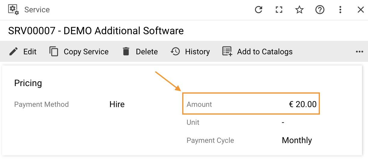
Currency Literal is culture-specific, knows what the currency is, and how to display it based on the selected culture.

Add a property of type Currency to the Model in Layout Designer. Expression (javascript): return {Value: 30, CC: “EUR”};
The Currency Literal will display the above code as €30.00 in run time. Being culture-specific, the Currency Literal knows where the currency symbol is supposed to be displayed, preceding the amount, as with €, or perhaps, following the amount.
DateTime Literal
Use to display a date.
- Date Format field allows you to select the format for the date: Short, Medium, Full, Long, etc.
Enum Literal
Use to display a Picker or Enumerable which allows you to select a value from a set of predefined values. Enumerables are stored in Pickups in the database. Pickups are numeric values.
Boolean Literal
Use to display a Yes or No value in run time for True and False in Layout Designer, respectively.
Links
Links work with objects. Objects, unlike simple literals, have several fields. Objects need to be represented somehow; i.e. you need to specify their Display Name, user-friendly text, etc. There are several types of such link entities that work with objects in Solution Builder described in this section.
Link
A Link is a URL to an external site. You can pick a value from the Model, Localizable, or Static Value tabs. When a user clicks a link in run time, it opens in a separate tab.
Object Link
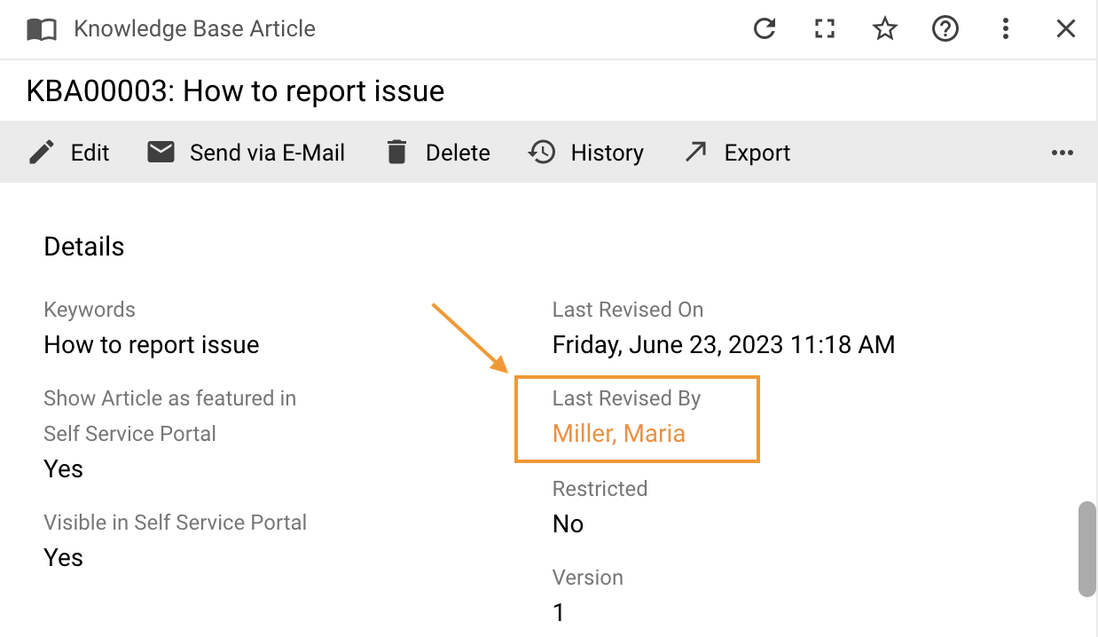
An Object Link is a link to an object, an attribute in a Data Definition which contains an identifier:

- Model:
- Value: an attribute of a Data Definition, e.g. SPSActivityClassBase.Initiator which has ID;
- Data Definition: specify the internal name of the Data Definition, e.g. SPSUserClassBase;
- Data Query: defines columns to be associated with the selected Data Definition; the field is optional because each Data Definition has a Data Query by default which can be replaced with the Data Query of your choice specified here.
- Use ID From: select Class (Data Definition) or Object.
- Value label: e.g. User; if not specified, Display Name for the object will be taken by default.
- Data Query Column To Display: A Data Query column used to display a value instead of a default display expression of the Data Definition
- Common:
- Label: label for the field; Label can be set up to appear to the left of, above, or below the literal’s value with the help of the Label Position property located in the Appearance category.
- Advanced:
- Root Name: name of the column from Data Definition that says where the parent element of the hierarchical structure is located; use this field if the parent is located in the table you are working with; if the parent is located in some other table, not the one you are working with, use the Parent Expression field instead.
- Parent Expression: use the column for complex structures located in a table other than the one you are working with; ASQL expression which says where the parent element for the complex structure is.
Objects Link
An Objects Link is used for the collection of elements. This is a link to a collection of identifiers of a class or an object. If the collection consists of only one item, the Objects Link works as an Object Link.
Related Object Link
A Related Object Link is a link to an object, a Relation in a Data Definition.
Schema Link
A Schema Link is a link to an identifier (specified through the Value field) that belongs to either a Class or a Type. Users will see the description of the Schema when they click the Schema Link in run time.
Multi Schema Link
Multi Schema Link: similar to the Schema Link, the only difference is that it works with a collection (of identifiers to a Class or a Type) that needs to be specified. If the collection consists of only one item, the Multi Schema Link works as a Schema Link.
Quick Link
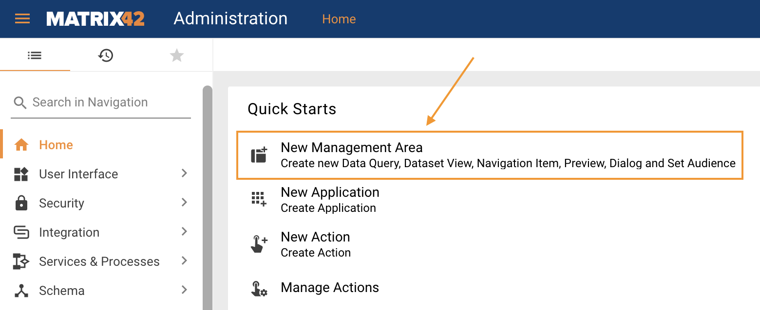
Quick Links are usually located on the Home page under Quick Starts:

- Quick Link Type:
- Navigation: when users click such a link in run time, they are redirected to the corresponding page of the navigation tree; the exact page is specified in the Filter field in Layout Designer; while the Navigation Item to which the specified page belongs is selected in the Navigation Item field in Layout Designer.
- Dialog: when users click such a link in run time, a specified Dialog opens.
- Action: when a user clicks such a link in run time, an Action is called.
- External: specify the URL in the suggested External Link property.
- Landing Page: choose the Landing Page that will be opened.
- Dataset View: choose a Dataset View to be shown.