List Control
Overview
List Control is one of the controls in Layout Designer. It is intended for representing a collection of some objects from the Data Model on the template. Control is rendered as a list of configured layouts.
Example: list of knowledge base articles.
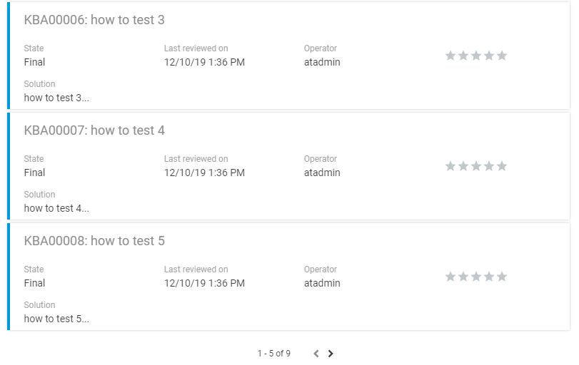
List control can be added to the template in 2 ways:
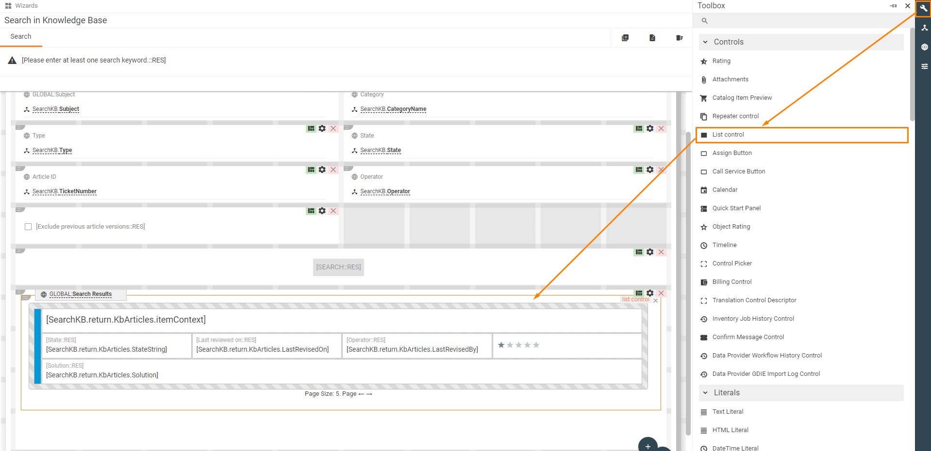
1. Drag&drop the "List control" from the Toolbox of the Layout Designer to the template:
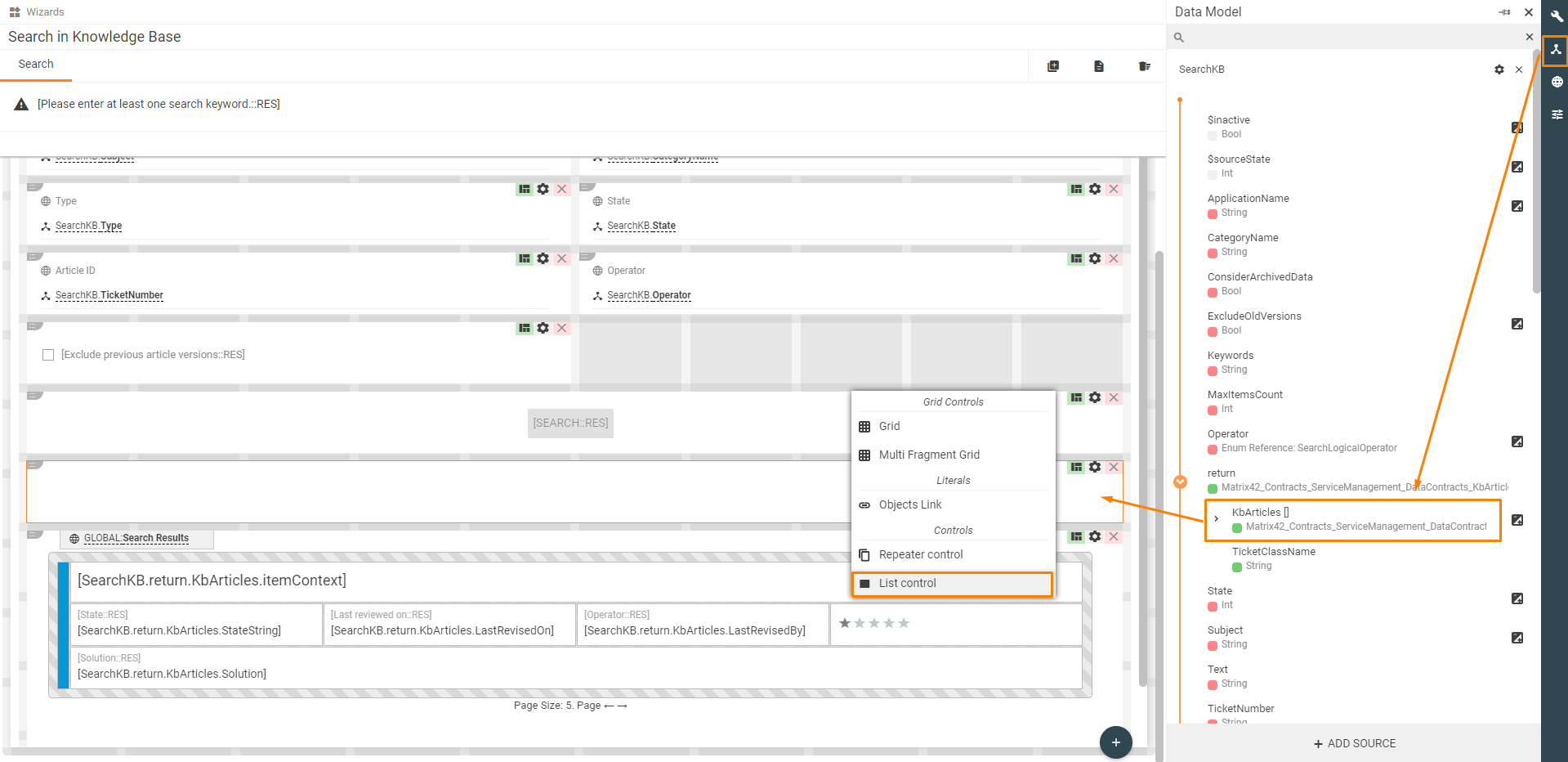
2. Drag&drop some collection from the Data Model to the template and select "List control" from the proposed variants. In this case, property "Items" of the control will be prefilled automatically with the selected collection from the Data Model:
Properties & settings
| Property group | Settings | Description |
|---|---|---|
Model |
Items |
collection of objects from the Data Model which should be represented with List Control |
Loading State |
A boolean parameter to show the loading indicator. When value equals true then the loading indicator will be shown. It is useful when the collection of objects is loaded from the server page by page. Then the loading indicator should be shown while the next page is loading. To do it the property should be bind to a calculation field with $sourceState of Data Source which returns the collection of objects.
|
|
Use Checkboxes |
A boolean parameter to show checkboxes which can be used to select some objects from the collection. |
|
Selected Items |
Property which can be used to save selected with checkboxes objects to some Data Model property. | |
Paging |
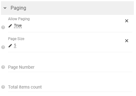
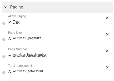
The control supports 2 types of paging: 1. Client paging - a whole collection of objects is loaded initially and paging is used to just to show some part of this collection without additional loading of data from the server; 2. Server paging - just the first page of the collection is loaded initially, and paging is used to load other pages from the server. DataSource of the collection has to support paging and has properties like "Page Number", "Page Size" and returns property like "Total Items Count". Configurations to enable paging: 1. Client-side:
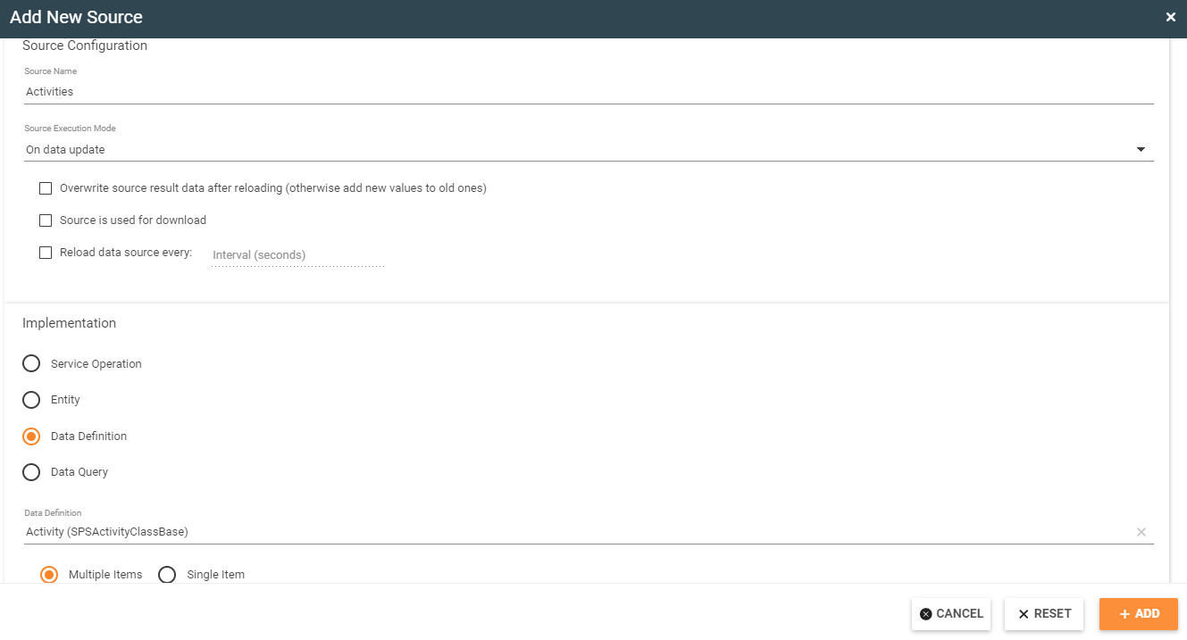
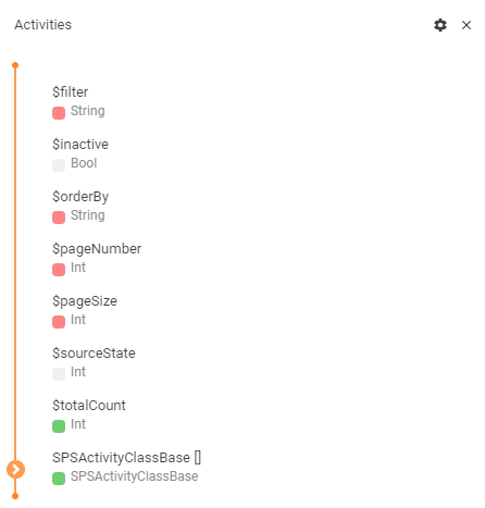
2. Server-side: First of all, DataSource has to be configured correctly. For example, DataDefinition source with multiple items can be used to load activities. To add a DataSource go to the Data Model and click "Add Source" button.
Added DataSource example:
DataSource configuration:
List Control configuration:
|
|
Allow Paging |
If true than paging will be enabled in the control and paging buttons will be visible on the template. | |
Page Size |
Size of the page. For server-side paging should be equal to a parameter which is set to DataSource |
|
Page Number |
Output parameter for server paging. Returns the current page. Should be bind to the corresponding field of DataSource. Should be empty for client-paging |
|
Total items count |
Input parameter for server paging. It should contain a total number of objects on all pages. Should be bind to the corresponding field of DataSource. Should be empty for client-paging |
|
Advanced |
Search text |
If set, then List control show only objects which have some string attribute that contains specified text. |
Layout
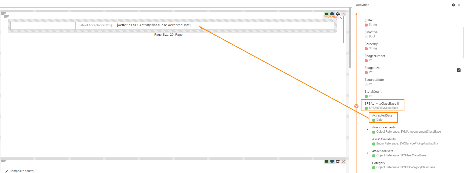
List control is represented as Layout Grid in Designer. Any property of an object from the collection can be added to the Layout Grid and it will be rendered for all objects.
Ex.: Collection of SPSActivityClassBase and attribute AcceptedDate was added to List Control.
