Image Picker
Overview
The Image Picker control (outlined below) in dialogs allows you to select images from the following sources:
- Server Image: a server of your choice
- Icon: the Matrix42 icons library
- Object Attachment: an image uploaded from your device.

Image picker example in the Services of the Service Catalog
The Image control in Preview displays the image selected via the Image Picker control in the entity’s Edit Dialog:

Selecting an Image from UI
To select an image via the universal Image Picker control:
- Open the entity in the Edit mode and click the Search (magnifying glass) icon in the Image field.
- In the dialog that appears, click one of the available tabs: IMAGE FROM SERVER, ICON, or OBJECT ATTACHMENT.
Availability of tabs depends on whether checkboxes are selected next to corresponding Image Picker Properties in Layout Designer, Appearance group: Allow Icons, Allow Attachment, and Allow Server Image.
- Under the selected tab, locate and select the image you would like to add:

Layouts
By default, the Image Picker control is available for the following types of Layouts:
- Dialog
- Wizard
- Base Widget
To enable Image Picker control usage in other Layouts, see Administration application → User Interface → Control Descriptors → Object Picker settings.
Setting up an Image Picker in Layout Designer
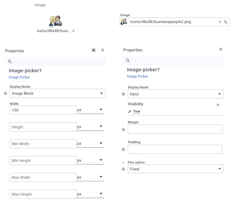
Image Picker Properties
Model group
-
Value: this is the image path, icon name, or uploaded attachment URL, depending on the selected mode.
-
Allow Icons: select to allow users to set icons as a value (the Icon tab will be available in the image selection dialog).
-
Allow Attachment: select to allow users to use an object attachment as a value (the Object Attachment tab will be available in the image selection dialog).
-
Allow Server Image: select to allow users to pick a server image (the Server Image tab will be available in the image selection dialog).

- Server Folder: path to the folder on the server where static images are stored.
Appearance group
- Display Mode: select how the image control will appear in the UI: input or image block (dimensions for the image block may also be specified here).