Dynamic Grid
Overview
This how-to explains the basics of the Dynamic Grid settings and provides examples of the properties configuration.
The main purpose of the dynamic grid type is to display data that is dynamically uploaded, processed, parsed, and represented in the application like a spreadsheet.
Use cases and data sources:
- data import: data can be retrieved and displayed by means of a dynamic grid from an external source, such as manually uploaded files, files from the LAN network, or available at a web resource. Data intended for displaying in the grid can come in different formats (.csv, .xls, .xlsx, .xml, .txt, MS SQL,etc.), therefore it is considered as dynamic as the source and the content varies for each specific case.
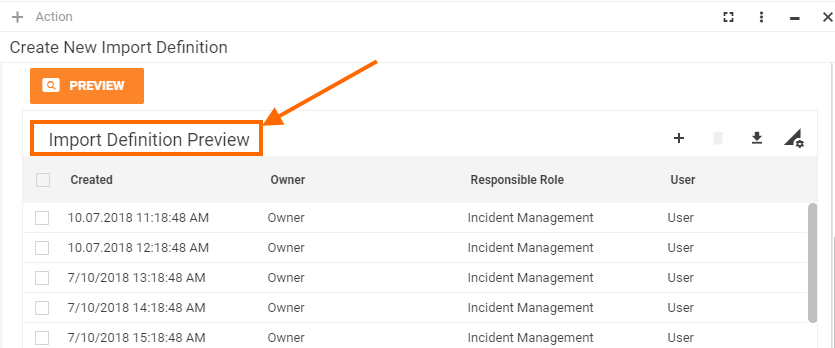
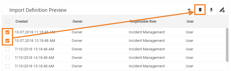
An example of the dynamic grid configuration for the data import can be found in the out-of-the-box version of the Martix42 Administration application → Integration menu → Import → Import Definitions → Create New Import Definition → Table Source Definition Step → Preview data from the import source is rendered to the dynamic grid.
The data retrieved to the dynamic grid can be additionally edited, extended, filtered, or deleted before being imported to the application's database and without modifying the data source file. - dynamic data displaying: data configured on one page of the application instantly affects the other. An example of such a case is a Pickup Data Definition settings in Administration application: Data Definition Attributes are added in the appropriate tab are immediately added as new columns of the dynamic grid of the Data tab:
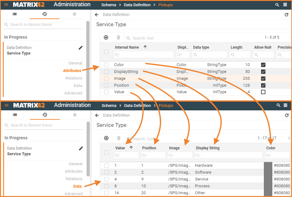
Data displaying in the dynamic grid: Pickup Data Definition settings
Additionally, the application's Layout Designer allows configuring a number of settings that predefine the default look&feel and elements of the dynamic grid, while the represented content varies and depends on the input data source.
For more information about Grid Control type see also Grid Controls page.
Prerequisites
Dynamic grid is added and configured after the following steps:
- Administration application: open a Solution Builder;
- User Interface → Layouts: create new or edit existing layout;
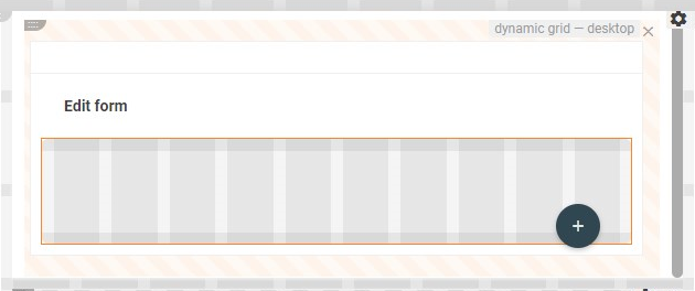
- Toolbox: click "Customize" layout action and drag&drop the Dynamic Grid control descriptor on the layout designer canvas.
- Proceed to the data configuration and define the minimum required properties.
Dynamic grid can be used in such layouts:
- Dialog
- Preview
- Wizard
Minimum required property settings
For proper grid displaying it is necessary to define the sources of the data that should be displayed in the grid.
The following data model properties are minimum required for the grid displaying:
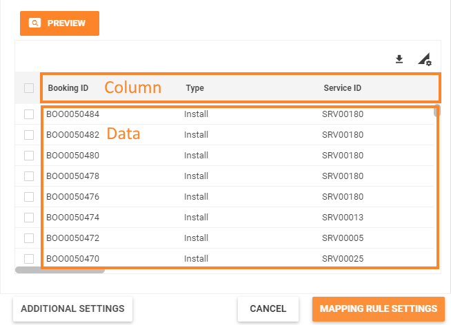
- Data: defines the data source for the grid's content;
- Column: the source of the header row data.
The rest of the properties are assigned by default and can be optionally modified if necessary. Other properties define the grid's header elements, multiple rows selection mode, edit, add and delete previewed in the grid data properties.
Default Dynamic Grid characteristics
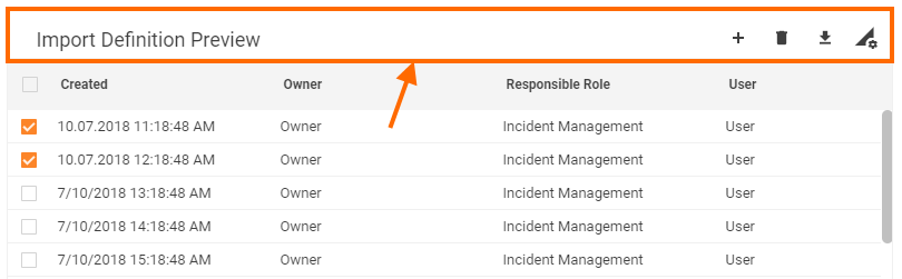
By default, each dynamic grid with the configured minimum required properties results in the following page elements:
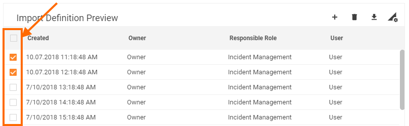
- Column with a check-box for records multiple selection;
- Columns data sorting order (ascending/descending);
- Export data;
- Column preview mode (show/hide specific columns);
- Records scrolling (no pagination);
- Read-only mode of grid data management.
Dynamic Grid: preview example with default grid characteristics
Properties and settings
The table provides a detailed list of configurable dynamic grid properties, their settings, and particularities overview.
| Property group | Property name | Description | Default | Property setting example |
|---|---|---|---|---|
Model |
Data |
Defines the source of the data intended for display in the grid. Data type: an array of data items. |
❌ |  |
Columns |
Defines the source of the data heading columns. Is similar to the Data Query column definition, but is configured manually as described in Column property configuration section of this document. Data type: an array of data items. |
❌ |  |
|
Selected Items |
optional property of a data model that acts as a variable. Allows passing the manually selected items of the grid to a specified data model field. Additionally requires Enable Row Selection property set to true to enable multiple items selection column displaying in the grid. |
❌ |  |
|
Current item |
optional property of a data model that acts as a variable. Allows passing the data of a just clicked item of the grid to a specified data model field. Select the necessary source from a list of suggested data model fields of an Object data type only or
Example: a row of a grid is edited using a wizard. Current item usage is as follows:
|
❌ |  |
|
Common |
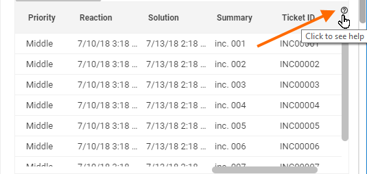
Help |
help icon and tooltip for information displaying as:
Help icon with a tooltip displaying example |
❌ |  |
Label |
title of the grid. Can be set via one of the following options:
Localizable grid label example |
❌ |  |
|
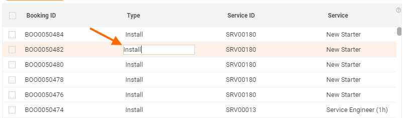
Inline mode |
Check-box options:
|
Disabled |  |
|
Edit mode |
Available options of the drop-down list:
|
None |
 |
|
Name |
automatically generated technical name which serves as an identifier of the grid. The only required field for the grid saving, although without properly configured Data and Columns properties the entire grid is poorly displayed. |
auto-generated |  |
|
Appearance |
Full Height |
Check-box options:
|
Disabled |  |
Minimal Height, px |
defines the fixed height of the grid displayed on the page. Set and measured in pixels, for instance: "100". The specified height is spread upon the entire grid representation, including the grid's header with default buttons area (export, columns preview), grid heading row, and displayed records data. |
❌ |  |
|
Hide Export button |
Not supported |
|||
Enable Row Selection |
|
True |  |
|
Visibility |
Grid display on the page modes:
|
True |  |
|
Hide Grid Header |
Check-box options:
Grid preview with enabled Hide Grid Header property |
Disabled |  |
|
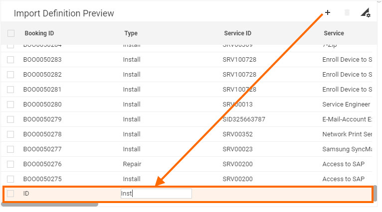
Show add button |
Check-box options:
Selected option additionally requires:
Dynamic grid with enabled inline mode editing and selected show add button property |
Disabled |  |
|
Show remove button |
Check-box options:
Selected option additionally requires:
|
Disabled |  |
|
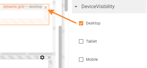
Device visibility |
Desktop |
This property allows improving user experience by managing device visibility options. For instance, the grid can be hidden from the preview when it is too large and contains a lot of columns that cannot fit the small screen of a mobile device. The application checks the user device's screen resolution and shows or hides grid preview based on the selected check-box options settings:
Device visibility settings example: multi-fragment grid enabled for desktop devices only. |
Enabled | 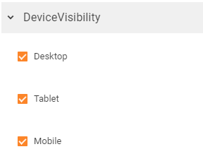 |
Tablet |
Enabled | |||
Mobile |
Enabled |
Column properties configuration
Data Query serves as a column display source for such types of grids, like Objects grid, Object Relations grid. Data Query defines which data to show and how to show it according to the Data Query columns configuration.
Dynamic Grid columns are not set by the selected Data Query, but are defined manually. The columns and values for the columns are set according to the described below rules and syntax.
You may use as Dynamic Grid Columns configuration reference an example from the default DWP installation:
- For the internal properties configuration example, open Administration application → User Interface → Layouts→ Dialogs → Data Definition Dialog → click Change Layout action to open the Layout Designer. In the Layout Designer, open the Data view of the dialog → click on the Dynamic grid control on the canvas → click on the Columns property.
- To see how the configuration looks in the user interface, go to Object State Data Definition in the Administration application → open Schema → Data Definition.
Colums value is an object of a Data Model that has been created according to the described rules and can be bound to the Columns value.
Minimum required properties
To retrieve a column to the dynamic grid add the following minimum required properties:
- Name: a technical name of the data source attribute
- Title: a name of the column that will be retrieved to the title of the dynamic grid and shown in the application UI.
return [
    {
        Name: 'catalogName',
        Title: 'Catalog Name',
    }
];
Type property
Type property defines the type of data that is retrieved to the column.
By default, if the data Type is not explicitly set, the system applies string data type.
To redefine the data type, explicitly set one of the supported data types:
- string (default)
- icon
- color
- integer (see number)
- number
- decimal
- float
- date
- currency
- boolean
- enumeration
- pickup
Add the Type key to the minimum required properties, for instance:
return [
    {
        Name: 'Visible',
        Title: 'visible',
        Type:  'boolean',
    }
];
The grid column will display a checkbox in the rows.
Below you will find some specific data types and examples.
Enumeration
Enumeration configuration differs based on the data source.
Retrieving values from the database
Use this type if the column should suggest a value from the database, e.g. for choosing a country or a ticket status from a drop-down list.
To be able to choose a value and select it from the drop-down list set the Inline Mode to selected in the Dynamic Grid configuration.
Set minimum required properties (Name and Title), explicitly define the type, and add the following properties:
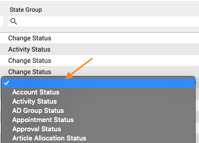
- ReferenceTo (mandatory) requires a class name or an internal name of a Data Definition of a pickup type that will be used as a source of the provided options you can choose from.
- ReferenceFilter is an ASQL expression that filters the values of the Data Definition specified in the ReferenceTo property.
- ValuePropertyName: redefines the data source for the column. The value for the column will be searched and retrieved from the data source not by the Name property value, but using the ValuePropertyName. This property allows saving an additional property for the same column. For instance, ValuePropertyName holds the raw data from the data source, while Name, in this case, retrieves the display string of the attribute from the specified Data Definition (see ReferenceTo property).
Example:
return [
    {
      Name: 'stateGroup',
      Title: 'State Group Title',
      Type: 'enumeration',
      ReferenceTo: 'SPSCommonPickupStateGroup',
      ReferenceFilter: 'Hidden = 0',
      ValuePropertyName: 'State'
    }
];
Showing static data
Enumeration can also use as source data from the dialog or static data which is not stored in the database.
To be able to choose a value and select it from the drop-down list set the Inline Mode to selected in the Dynamic Grid configuration.
Set minimum required properties (Name and Title), explicitly define the type, and add the following properties:
- Enumeration: specify an array of objects
For static data in the example below, the grid will show the title from the Enumeration property.
return [
    {
       Name: 'countryTitle',
       Title: 'Country Title',
       Type:  'enumeration',
       Enumeration: [{
            title: 'Germany',
            value: 3
       }],
    }
];
An array of objects from the calculated field value specified in the Enumeration property may look as follows:
return [
     {
        Name: 'сountryTitle',
        Title: 'Country Title',
        Type:  'enumeration',
        Enumeration: calcFieldName.$value,
     }
];
Calculated field property must return title and value as a part of an object, similarly to the example with static enumeration.
Object picker
Use object picker to retrieve data from the data source of a GUID type.
To be able to choose a value and select it from the object picker set the Inline Mode to selected in the Dynamic Grid configuration.
Set minimum required properties (Name and Title), explicitly define the type, and add the following properties:
- ReferenceTo (mandatory) requires a class name or an internal name of a Data Definition that will be used as a source of the provided options you can choose from. Here you can specify any Data Definition type except for the pickup Data Definition type.
- ValuePropertyName: redefines the data source for the column. The value for the column will be searched and retrieved from the data source not by the Name property value, but using the ValuePropertyName. This property allows saving an additional property for the same column. For instance, ValuePropertyName holds the raw data from the data source, while Name, in this case, retrieves the display string of the attribute from the specified Data Definition (see ReferenceTo property).
return [
     {
        Name: 'computerTitle',
        Title: 'Computer',
        Type: ‘pickup’,
        ReferenceTo: ‘PDRComputerClassBase',
        ValuePropertyName: 'Computer'
    }
];
With such configuration, the cell of the dynamic grid column will suggest you an option from the data source when you start typing its name and you can select one of the suggested values:
Additional properties
To modify the column display, add and define the following properties to the column definition:
- Width: column width defined in px;
- Alignment:
- Left: 0
- Center: 1
- Right: 2
- Sorting:
- None: 0 (default, the column data is not sorted, but you can click on the column title to apply ascending/descending sorting)
- Ascending: 1
- Descending: 2
- Disabled: 4 (column data cannot be sorted)
- SortingPriority: allows sorting by several columns at the same time. Specify the priority as a number, e.g. 10, 20, etc. For proper functioning, set the Sorting value for the column with SortingPriority. Both properties set the default sorting of the grid, i.e. when you open a page with the dynamic grid the data in the grid will be sorted according to the specified criteria by default. Further, you can change the sorting manually and reorder values according to your needs by clicking the title of the grid's column (if the Sorting is not Disabled for the column).
- DisplayType: another way to manage column visibility. Possible options are similar to the dialog settings:
- Visible: 0. The column is visible on the grid by default
- InvisibleByDefault: 1. The column is hidden in the grid, but column visibility can be changed in Grid Settings on the right side of the grid.
- None: 2. The column is not present in the grid. The data for the column is not retrieved.
- Hidden: 3. The column is not present in Grid, but the System returns column data to Client, and this data can be used for internal operations, e.g. filtering of the available Actions
- Format: the Format property setups custom format for the data. For more examples see Data Query Page: Format property
- Color: specify the code of the color, e.g. #FF0000. This property corresponds to the "Column Background Color" of the Data Query configuration. It has a higher priority than the ColorScript configuration.
- ColorType: is similar to the "Use Color For" property of the Data Query configuration. Possible values:
- None: 0,
- CellText: 1,
- CellBackground: 2,
- RowText: 3,
- RowBackground: 4
- ColorScript: Javascript expression that configures the color of the Cell Text / Cell Background / Row Text / Row Background set in ColorType. The expression can return either the code of the color, e.g. #FF0000, or the whole definition of the CSS style, like 'font-weight:bold'. As well as for the Image Script, it is possible to use variables $item and $value to specify the logic.
See the Graphics Configuration section of the Data Query page for more information. - ImageScript: a Javascript expression that returns the reference to the image. An image can be represented by the name of the available SVG icon, or just a relative or full URL to the image. You can operate with two variables in Script to specify the logic, $item - represents the whole data in grid row, and $value - value of the column where the Image script is defined. See the Graphics Configuration section of the Data Query page for more information.
- DisplayImage: is similar to the “Display Image" property of the Data Query configuration. Possible values:
- None: 0
- Image: 1
- ImageWithText: 2
Example:
return [
     {
        Name: 'Date',
        Title: 'StartFrom',
        Type:  ‘date',
        Alignment: 1,
        Sorting: 2,
        DisplayType: 3,
        Width: 100
     }
];
The listed properties are common for all data types.