Dashboard Widget (Classic Look)
Overview
Dashboard Widget is a graphical element of a user interface that serves as a container for other control descriptors that can hold information:
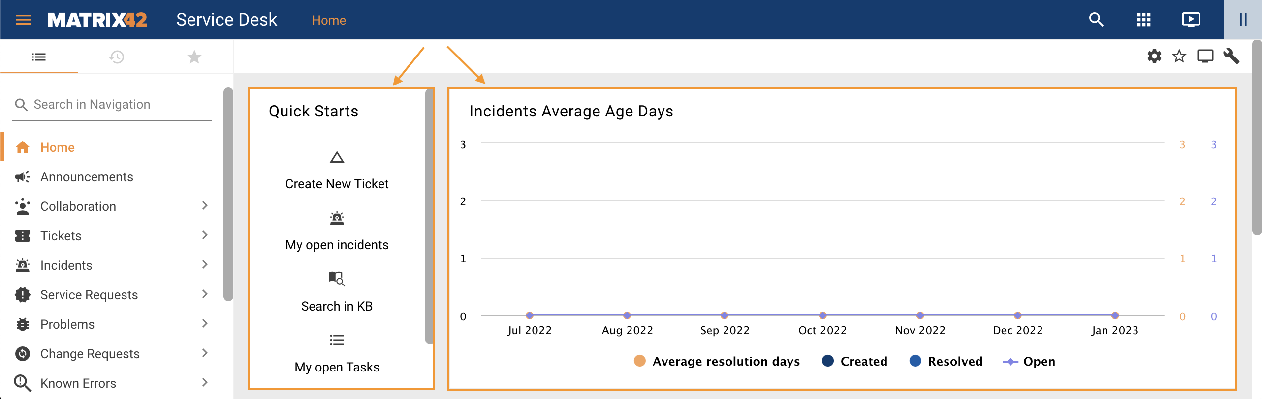
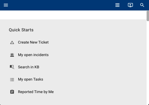
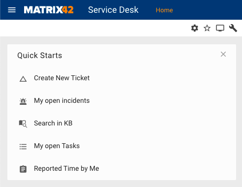
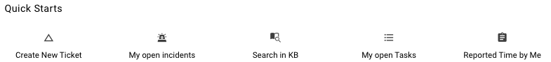
Dashboard Widgets display example on the Home page of the Service Desk
Dashboard Widget itself does not have any properties that are actually related to the data retrieval to the layout as it is only a block or area on the layout canvas. Due to its particular purpose, the Dashboard Widget properties allow configuring only the visual representation of this area on the layout.
Starting from ESMP v.12.1.0 a new Widget Layout with a set of standard Widget Library where you can also retrieve and filter data is introduced.
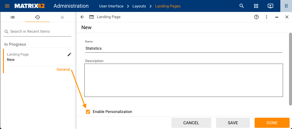
Dashboard Widget can be used on the Landing Page layout type that has Enable Personalization property selected:
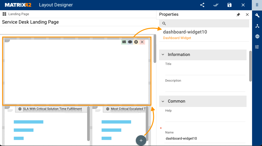
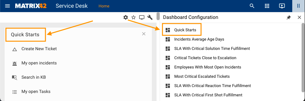
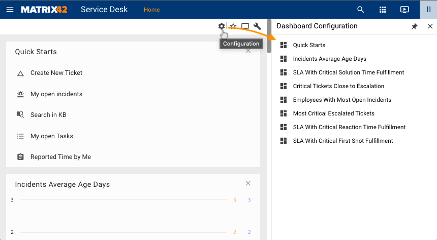
To configure a new Dashboard Widget, open the Landing Page in the Layout Designer and click the + icon:
Properties and Settings
Dashboard Widget has the following configurable properties:
| Property Group | Property Name | Description | Default | Property Setting Example |
|---|---|---|---|---|
Information |
Title |
The title of the widget is shown in the application runtime on the Landing Page and in the Dashboard Configuration area as follows:
|
not set | 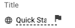 |
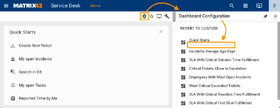
Description |
Optional short description of the widget that is shown to the users in the dashboard configuration area:
Description can be a Static value, Localizable, or retrieved from the Model. |
not set | 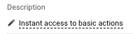 |
|
Common |
Help |
help icon and tooltip for information displaying as:
|
not set | 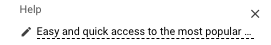 |
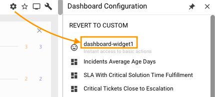
Name |
the auto-generated internal name of the control used in the layout | auto-generated | 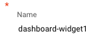 |
|
Appearance |
Icon |
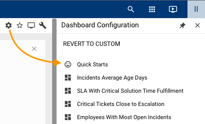
An icon of the widget is shown in the Dashboard Configuration area as follows:
|
not set | 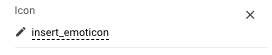 |
Layout Direction |
If applicable, defines the elements' layout direction in the widget that contains more than 1 control descriptor:
|
vertical | 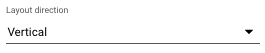 |
|
Horizontal Alignment |
Elements' horizontal alignment options:
|
not set | 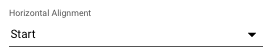 |
|
Vertical Alignment |
Elements' vertical alignment options:
|
not set | 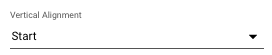 |
|
Dynamic Height |
Automatically adjust the height of the widget when the content height is changed | Disabled | 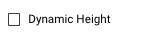 |
|
Availability |
Defines whether a widget will be available for the user. Possible options:
All available user widgets are shown in the dashboard configuration panel:
Availability option can also hide the widget from the users who have configured personalization for this widget. |
true | 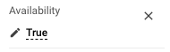 |
|
Initial Visibility |
Defines the initial visibility state of the widget, until a user does a personalization.
For proper Initial Visibility configuration make sure the Availability property is configured as well. In this case, a personalization is a configuration of the widgets that are displayed on the Landing Page. Personalized widgets example is as follows:
Personalized widgets example has the following options:
If the Landing page has the above-mentioned personalization, the Initial Visibility property value is ignored and the user sees only the widgets from the personalized configuration. |
Selected |  |
|
Transparent Background |
Available options:
|
Disabled | 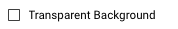 |
|
Device Visibility |
Desktop |
This property allows improving user experience by managing device visibility options. For instance, the widget can be hidden from the layout when it is too large and contains a lot of data that cannot fit the small screen of a mobile device. The application checks the user device's screen resolution and shows or hides the graphic element based on the selected check-box options settings:
|
True | 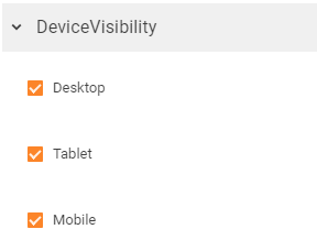 |
Tablet |
True | |||
Mobile |
True |

 to personalize the shown widgets.
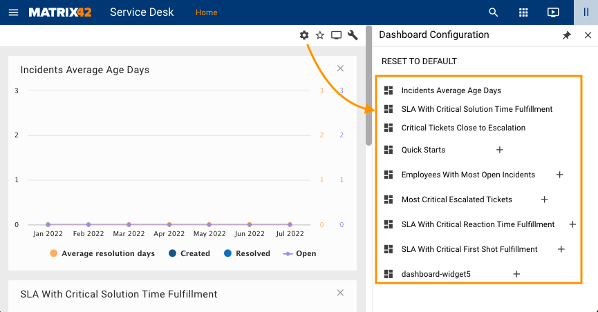
 plus icon shows the widget on the Landing Page;
 close icon hides the widget from the Landing Page. It is still available to the user but is not displayed;