Attachments Control
Overview
If it is needed to attach files to an object or show already attached files you may use the Attachments control.
Appearance
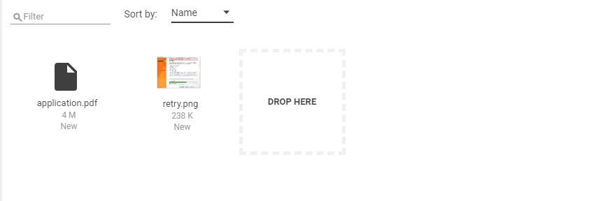
To add an attachment one may click on a "DROP HERE" tile or drag and drop files to this tile.
To delete an attachment move the mouse cursor upon it and click the Delete button.
To download an attachment move the mouse cursor upon it and click the Download button.
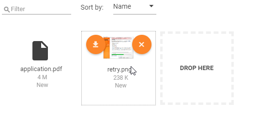
To preview an attachment click on the file icon. See also Document Preview page.
It is possible to sort files by File Name, Size or Date Uploaded.
It is possible to filter attached files by file name. The filter is applied automatically as soon as the user types five or more characters to the Filter field.
Configuration
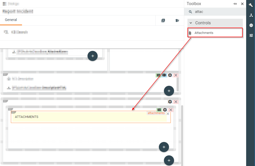
To add an attachment control just drag-drop it into the layout.
Parameters
| Property group | Property name | Description |
|---|---|---|
| Model | Entity | Type: String Type name of an object this control is related to. |
| Lazy Mode | Type: Boolean Show attachments control only after the user clicks on a link button "Click here to show attachments". This option could optimize widget load performance. |
|
| ObjectId | Type: GUID Id of an object this control is related to. By default, Id is taken from a context object. |
|
| ObjectIds | Type: Array of GUID Ids of objects whose attachments are to display. Should be used in read-only mode. E.g. to display attachments in some wizard's summary. |
|
| Hide Files | Type: Array of GUID An array of file Ids to be hidden in attachment control. |
|
| Value | Type: String Filter attachments by specified attachments folder id. |
|
| Skip Initial Load | Type: Boolean Skip attachments loading on control initialization. |
|
| Common | Help | Type: String Content of a context help to be displayed under a help icon. |
| Read Only | Type: Boolean Defines whether a control is read-only. |
|
| Upload multiple files | Type: Boolean Allow users to upload several files at a time. Otherwise, only one file is allowed to be uploaded. |
|
| Name | Type: String Control's technical name. |
|
| Appearance | Files Exist | Type: Boolean The output parameter returns true if files exist. |
| Visibility | Type: Boolean Defines if the control is visible. |
|
| Margin | Type: String Set the control's margin offset in CSS format. |
|
| Padding | Type: String Set the control's padding offset in CSS format. |
|
| Flex option | Type: Option Flex or Fixed - defines flex behavior on a control. |
|
| Device Visibility | Desktop | Type: Boolean Defines if control is visible on desktop devices. |
| Tablet | Type: Boolean Defines if control is visible on tablet devices. |
|
| Mobile | Type: Boolean Defines if control is visible on mobile devices. |